Chapter 24 Advanced ggplot
Here we’ll see some more advanced features of ggplot. It is a pretty random collection of stuff, that also includes features that we can use only if we download other packages.
24.1 Adding layers
Often people build their graph a bit differently, to save intermediate results. So this code:
ggplot(mpg, aes(x=displ, y=cty)) +
  geom_point() +
  geom_smooth(method="lm", se=FALSE)
Is the same as:
plot <- ggplot(mpg, aes(x=displ, y=cty))
plot2 <- plot + geom_point()
plot3 <- plot2 + geom_smooth(method="lm", se=FALSE)
plot3
24.2 Layers in code
Layers are important in ggplot, so it might be handy to realise that geom_point() really is a short-hand for the following code:
ggplot(mpg, aes(x=cty, y=hwy)) +
  layer(
    mapping = NULL,
    data = NULL,
    geom = "point",
    stat = "identity",
    position = "identity"
  )
or:
ggplot() +
  layer(
    mapping = aes(x=cty, y=hwy),
    data = mpg,
    geom = "point",
    stat = "identity",
    position = "identity"
  )
24.3 ..count.. / ..density.. /
We’ve seen the ..something.. before. This signifies variables that are created by some stat function. Typically more than one option is available.
This:
ggplot(mpg, aes(x=cty)) + geom_histogram(binwidth=1)is the same as:
ggplot(mpg, aes(x=cty, y=..count..)) + geom_histogram(binwidth=1)
But we could have also used a different variable that was calculated, ..density..:
ggplot(mpg, aes(x=cty, y=..density..)) + geom_histogram(binwidth=1)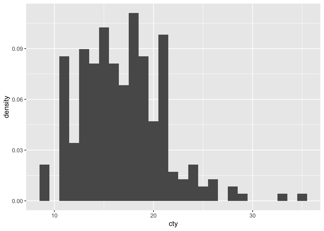
See also the ggplot-cheatsheet
24.4 Different summary-functions
Remember how we used the stat="summary", fun.y="mean" code to let ggplot do the work for us? As you might have guessed, you can also use different functions:
ggplot(mpg, aes(x=manufacturer, y=cty)) + geom_bar(stat="summary", fun.y="median") ## Warning: Ignoring unknown parameters: fun.y## No summary function supplied, defaulting to `mean_se()`
The beauty of R is that you can also define your own function. To show a proof of principle, we can create a function that returns the mean, i.e. function(x) {mean(x)}. We can use this function in our ggplot arguments. This should be identical to fun.y=“mean”.
ggplot(mpg, aes(x=manufacturer, y=cty)) + geom_bar(stat="summary", fun.y=function(x) {mean(x)}) ## Warning: Ignoring unknown parameters: fun.y## No summary function supplied, defaulting to `mean_se()`
It is identical. So now we can also create new functions! Let’s add all the numbers and subtract 13 with the following function: function(x) {sum(x) - 13}
ggplot(mpg, aes(x=manufacturer, y=cty)) + geom_bar(stat="summary", fun.y=function(x) {sum(x) - 13}) ## Warning: Ignoring unknown parameters: fun.y## No summary function supplied, defaulting to `mean_se()`
Not a very useful plot (or function), but it works.
24.5 ggplotgui
I’ve developed a Graphical User Interface (GUI) for ggplot, that might be useful if you quickly want to explore some graph options.
install.packages("ggplotgui")library("ggplotgui")
ggplot_shiny()You can also find an online version here: https://site.shinyserver.dck.gmw.rug.nl/ggplotgui/
24.6 Showing all data in facets
One neat little trick is to have the raw data present in each facet. You can do this by using a dataframe that does NOT include the facetting variable. The data = transform(mpg, drv = NULL) below means for this geom we will use a different dataset, which is the mpg-dataset with the drv-variable set to NULL):
ggplot(mpg, aes(x=displ, y=cty)) +
  geom_point(data = transform(mpg, drv = NULL), colour = "grey85") +
  geom_point() +
  geom_smooth(method="lm", se=FALSE) +
  facet_wrap(~drv)
## `geom_smooth()` using formula 'y ~ x'
This also works beautifully for histograms:
ggplot(mpg, aes(x=cty)) +
  geom_histogram(data = transform(mpg, manufacturer = NULL), fill="grey85", colour = "grey85", binwidth=1) +
  geom_histogram(binwidth=1) +
  facet_wrap(~manufacturer)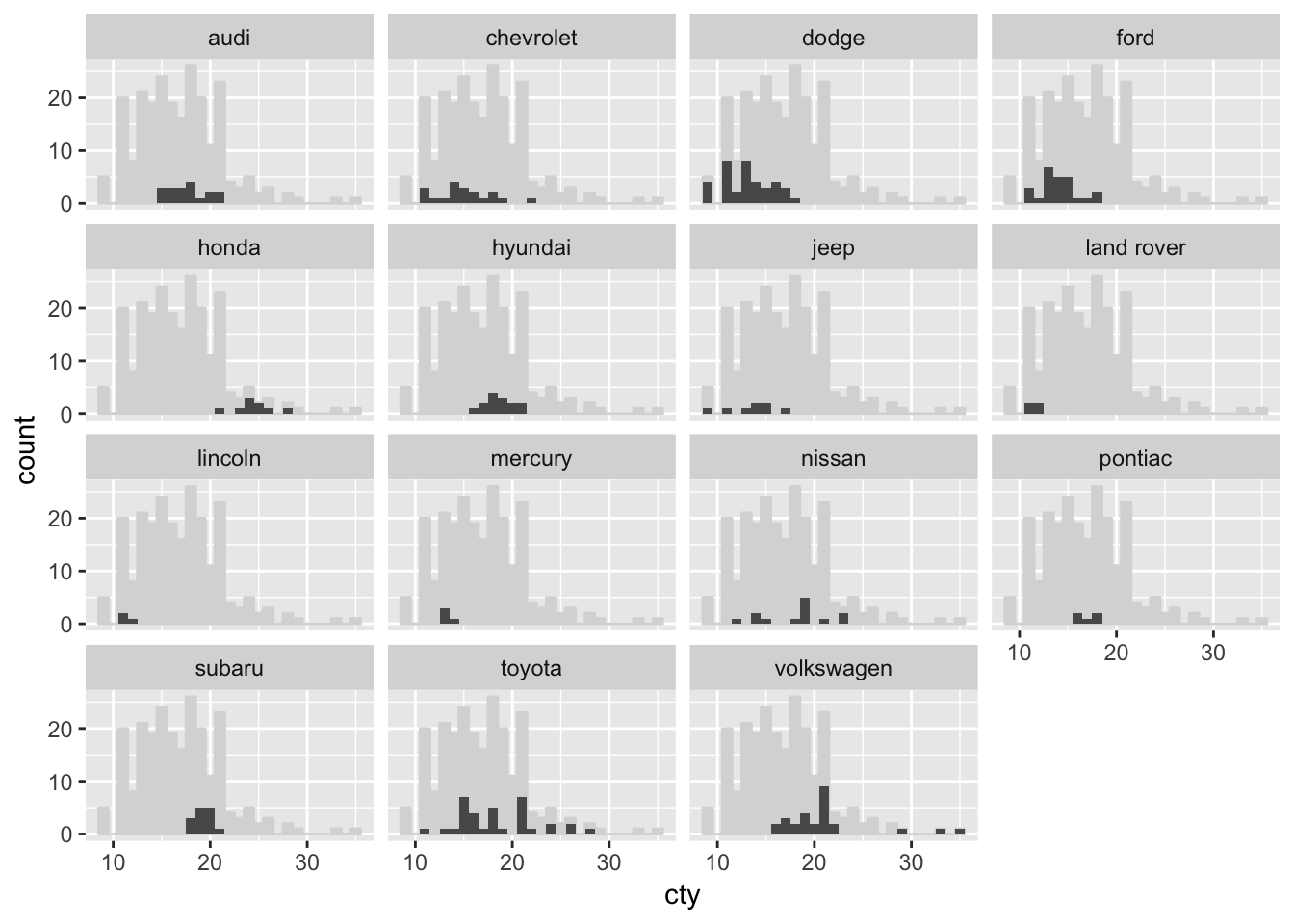
24.7 Maps
You will need some additional packages to create maps.
library(ggmap)## Google's Terms of Service: https://cloud.google.com/maps-platform/terms/.## Please cite ggmap if you use it! See citation("ggmap") for details.With the function get_map you can get all sorts of cool maps! Let’s get a map from Groningen from google:
map_gron <- get_map("Groningen", source="google")We can visualise this map using ggmap:
ggmap(map_gron) 
Cool! Let’s try and get a map from the building we’re in now. I’ve used maps.google.com to find the coordinates of the “Academiegebouw” (53.219245, 6.563051). Let’s use this information to get a map, and let’s zoom in a bit more and visualise the map:
map_uni <- get_map(location = c(6.563051, 53.219245), zoom = 16, source="google")
ggmap(map_uni)
Now let’s visualise the Sociology department at the Faculty of Behavioural and Social Sciences, which is at the coordinates: 53.222266, 6.557550
df_sociology <- data.frame(lon = 6.557550, lat = 53.222266)

 ggmap(map_uni) +
   geom_label(data = df_sociology,
              aes(x=lon, y=lat, label = "Sociology"),fill = "#9933FF", colour = "white", size = 3) +
  theme(axis.line = element_blank(),
        axis.text = element_blank(),
        axis.ticks = element_blank(),
        axis.title = element_blank())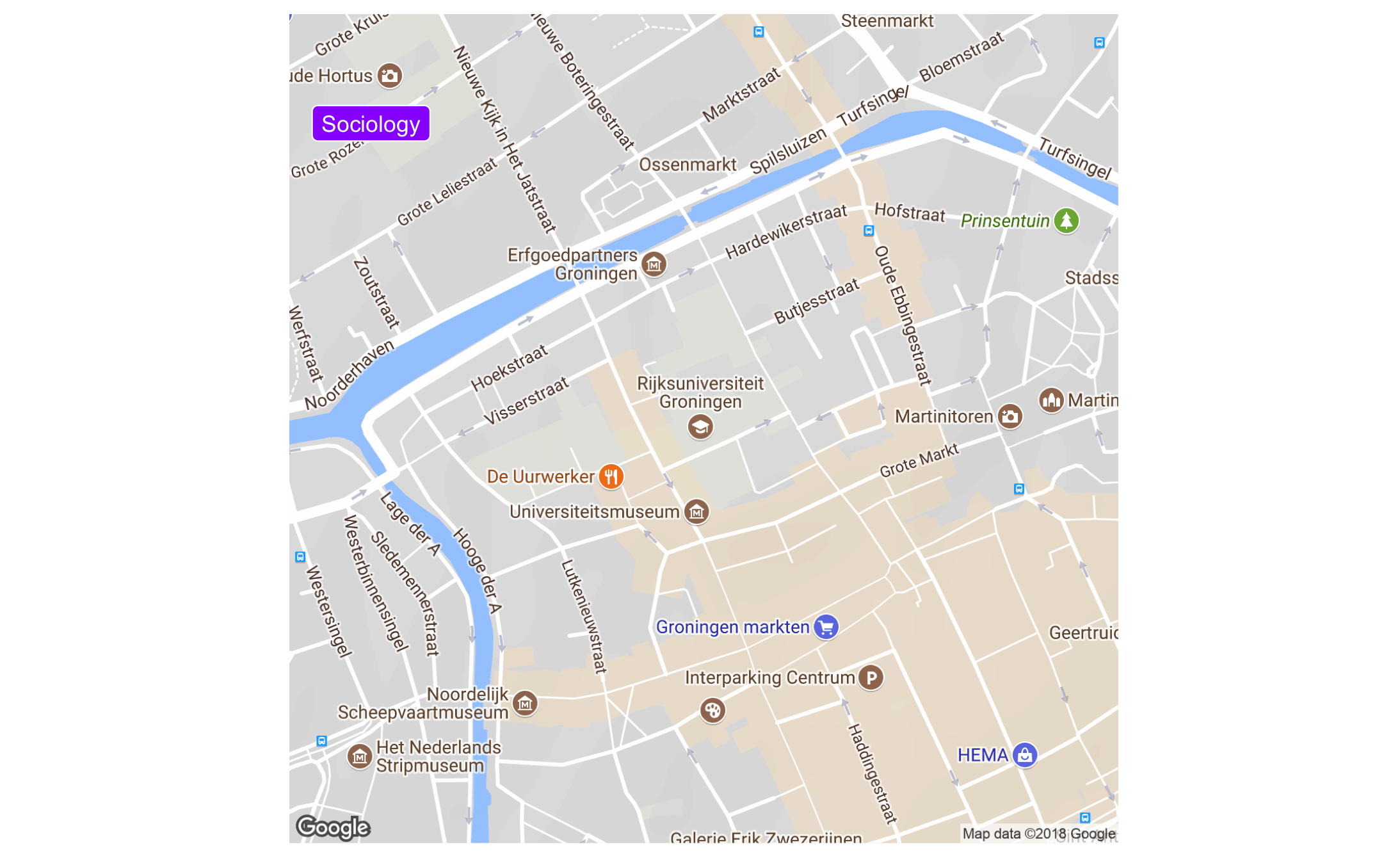
There are also other beautiful maps you can use; how about this (from here):
map_stm <- get_map("netherlands", zoom = 7, maptype="watercolor", source="stamen")
ggmap(map_stm)
24.8 Networks
Networks are gaining in popularity. We need to put a bit more effort in to get a network graph. We will require these packages:
# install.packages("tidygraph")
# install.packages("ggraph")
library(tidygraph)
library(ggraph)
df_edges <- data.frame(from = c("Gert",
"Gert",
"Gert",
"Gert",
"Gert",
"Ben",
"Anne"),
to = c("Anne",
"Ben",
"Winy",
"Vera",
"Laura",
"Winy",
"Vera"))
df_nodes <- data.frame(name = c("Gert","Anne","Ben","Winy","Vera","Laura"),
relation = c("Ego", "Partner", "Family", "Family",
"Friend", "Friend"))
df_network <- tbl_graph(nodes = df_nodes,
edges = df_edges,
directed = FALSE)
df_network## # A tbl_graph: 6 nodes and 7 edges
## #
## # An undirected simple graph with 1 component
## #
## # Node Data: 6 x 2 (active)
## name relation
## <chr> <chr>
## 1 Gert Ego
## 2 Anne Partner
## 3 Ben Family
## 4 Winy Family
## 5 Vera Friend
## 6 Laura Friend
## #
## # Edge Data: 7 x 2
## from to
## <int> <int>
## 1 1 2
## 2 1 3
## 3 1 4
## # … with 4 more rowsLet’s visualise!
ggraph(df_network, layout = "kk") +
  geom_node_point() +
  geom_edge_link()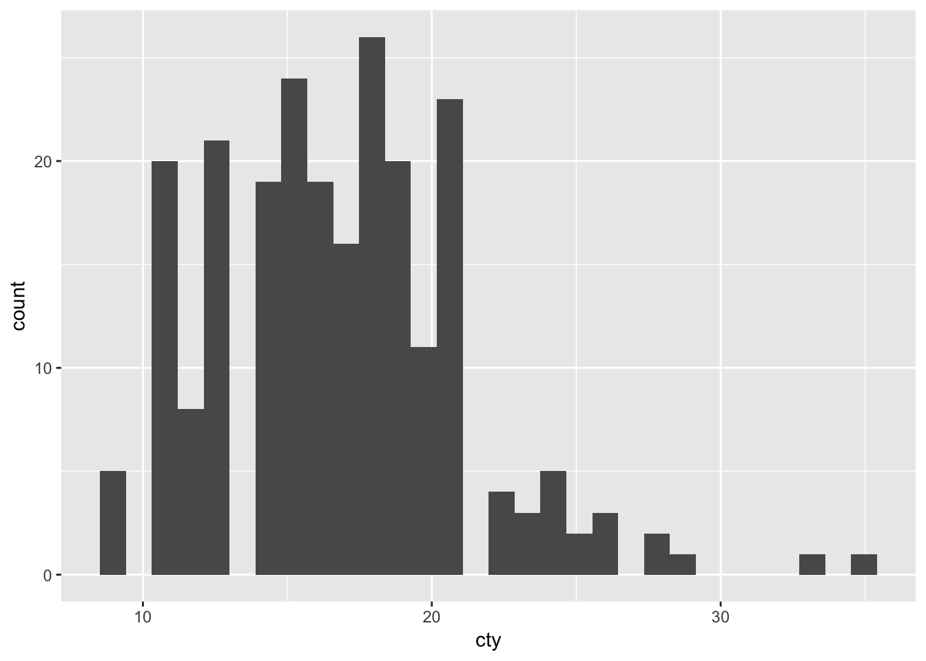
Let’s improve
ggraph(df_network, layout = "kk") +
  geom_edge_link() +
  geom_node_point(aes(colour = relation), size = 13) +
  geom_node_text(aes(label = name), colour = "white") +
  theme_void() +
  scale_color_brewer(palette = "Set2")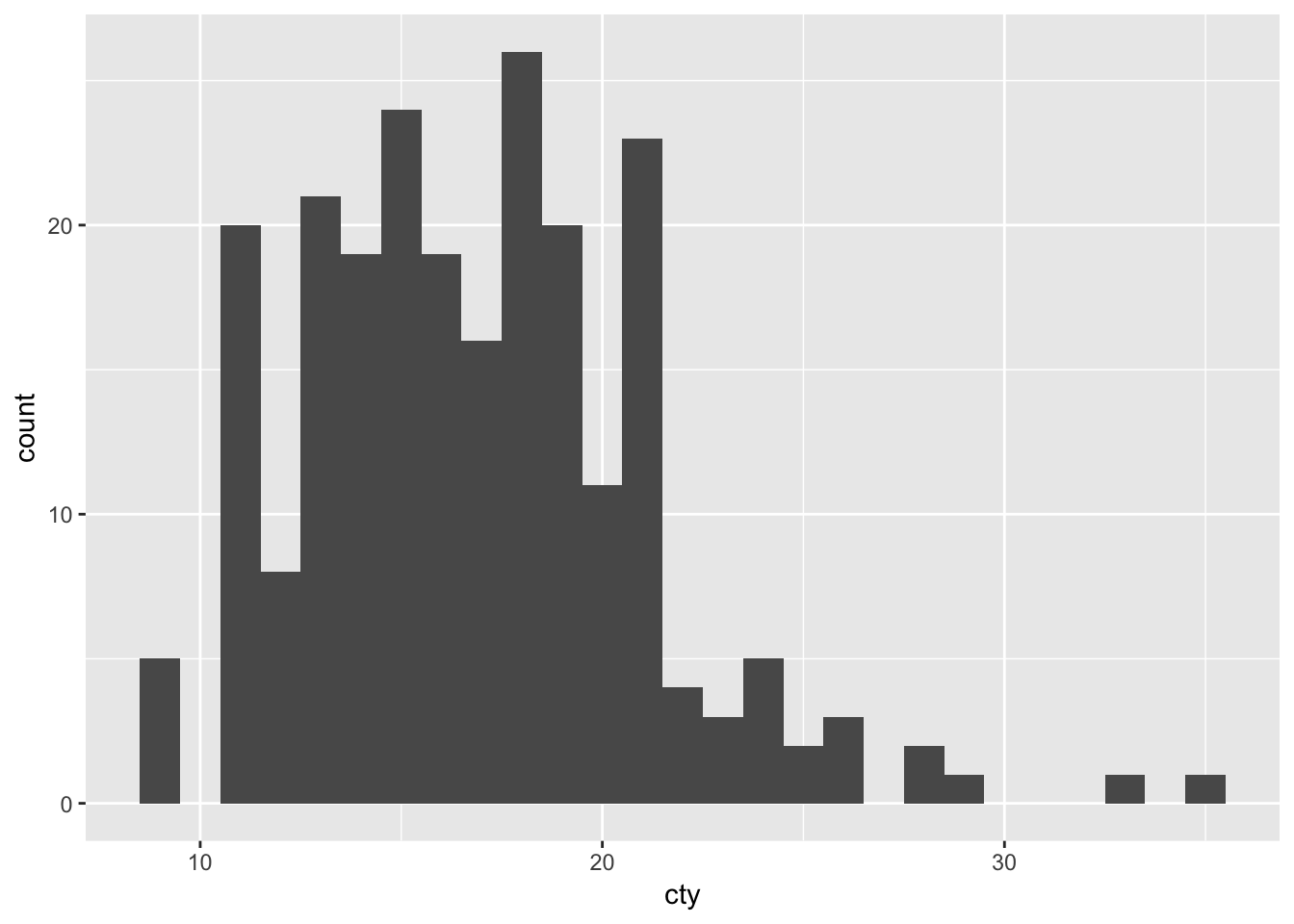
24.9 ggridges
Ridge plots, formally known as ‘joyplots’, are pretty awesome
#install.packages("ggridges")
#install.packages("viridis")
library(ggridges)
library(viridis)
## Loading required package: viridisLiteggplot(lincoln_weather, aes(x = `Mean Temperature [F]`, y = `Month`, fill = ..x..)) +
geom_density_ridges_gradient(scale = 3, rel_min_height = 0.01, gradient_lwd = 1.) +
scale_x_continuous(expand = c(0.01, 0)) +
scale_y_discrete(expand = c(0.01, 0)) +
scale_fill_viridis(name = "Temp. [F]", option = "C") +
labs(title = 'Temperatures in Lincoln NE',
subtitle = 'Mean temperatures (Fahrenheit) by month for 2016\nData: Original CSV from the Weather Underground') +
theme_ridges(font_size = 13, grid = TRUE) + theme(axis.title.y = element_blank())## Picking joint bandwidth of 3.37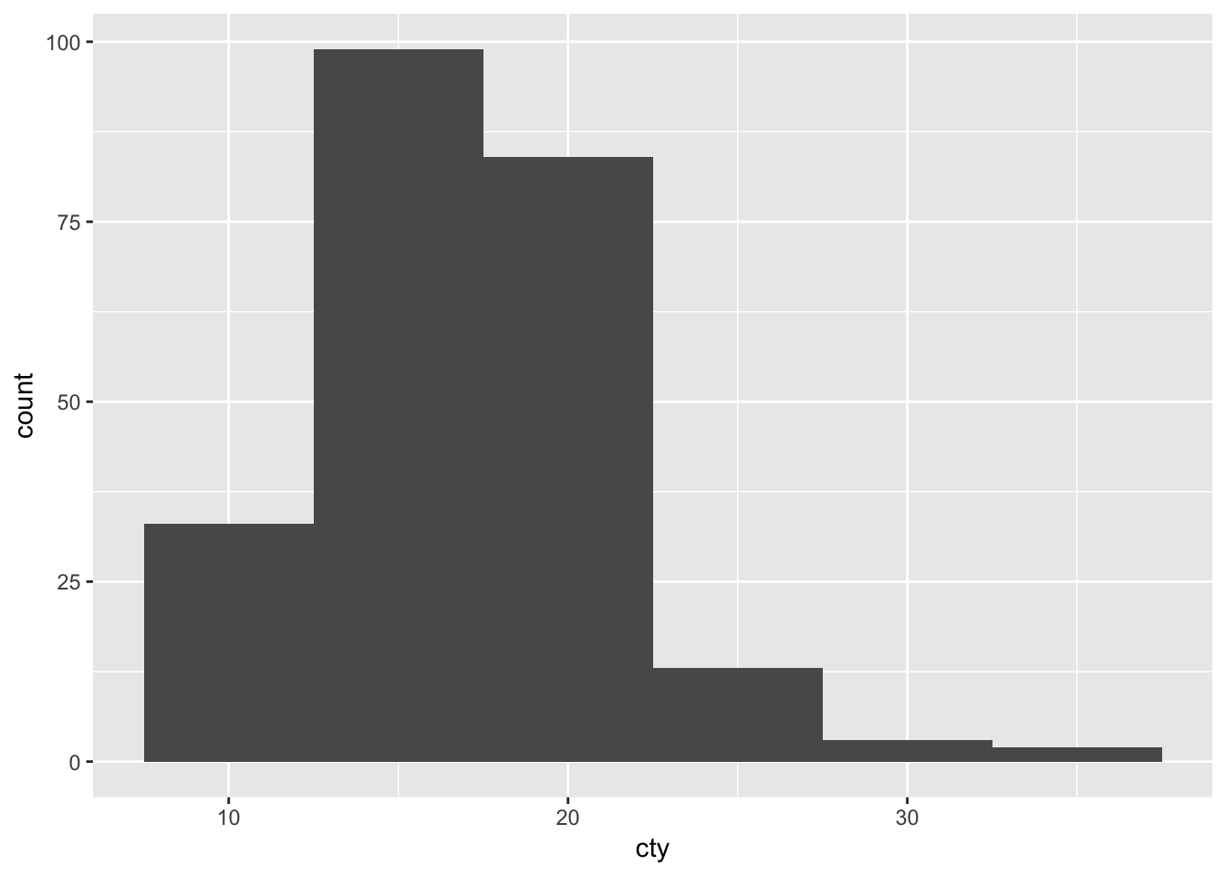
24.10 Animation
#devtools::install_github("dgrtwo/gganimate")
#install.packages("gapminder")
library(gganimate)
library(gapminder)

p <- ggplot(gapminder, aes(gdpPercap, lifeExp, size = pop, color = continent, frame = year)) +
  geom_point() +
  scale_x_log10()

gganimate(p)
24.11 Reactive graphs with shiny
Take a look a https://shiny.rstudio.com/! You can quite easily build reactive and interactive graphs in R. [strictly speaking, we’re not talking about ggplot any more]
This is one example: https://site.shinyserver.dck.gmw.rug.nl/ggplotgui/
Also for teaching I have built some apps, e.g.: https://shiny.gmw.rug.nl/Week2/Week2a.html
Others have made much more amazing things: https://www.showmeshiny.com/
24.12 ggplot extensions
Go here and be amazed by the extensions on ggplot (some of which shown above).