Chapter 6 ggplot - some theory
The “gg” in ggplot stands for the “grammar of graphics” developed by Leland Wilkinson (Wilkinson 2005), and describes the “deep features that underlie all statistical graphics” (Wickham 2016). In essence, it’s a way of thinking about how to create graphs. This all sounds a bit esoteric, so let’s try and be a bit more specific.
Wickham writes:
In brief, the grammar tells us that a statistical graphic is a mapping from data to aesthetic attributes (colour, shape, size) of geometric objects (points, lines, bars). The plot may also contain statistical transformations of the data and is drawn on a specific coordinate system.
Every graph consists of data within a coordinate system with the data being represented by geometric objects (or geoms), like points, lines, or bars. The data that you want to visualize are mapped to aesthetic attributes, like shape, colour, location.
The ggplot-cheatsheet is tremendously helpful in representing this process: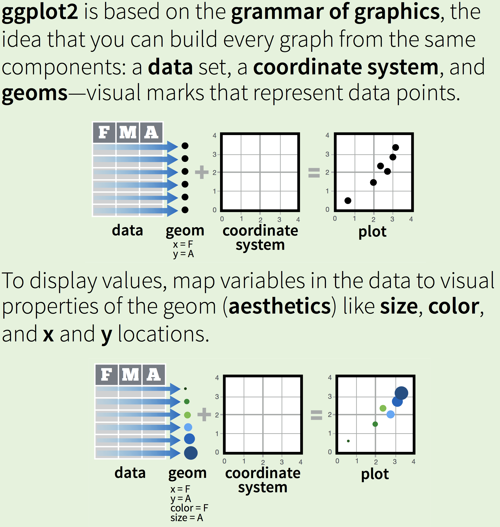
Figure 6.1: The grammar of graphics
Now let’s revisit one of our earlier graphs:
ggplot(mpg, aes(x=cty, y=hwy, colour=drv)) + geom_point() 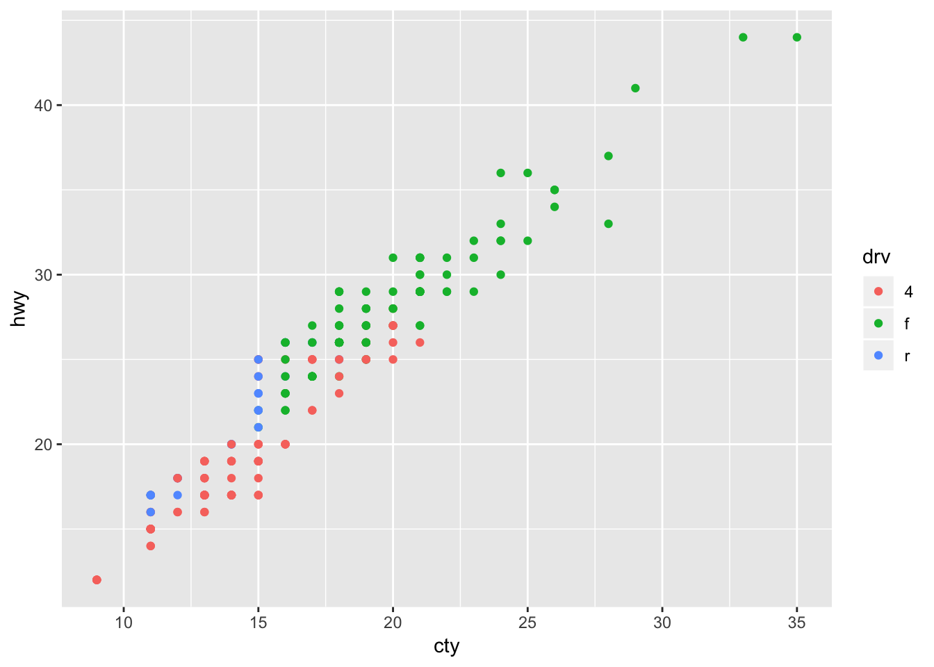 The data here is “mpg”. The data will be represented by points (the geom). We have mapped the variables in the data to visual properties of the geom, the aesthetics; in this case the x- and y-location (based on variables “cty” and “hwy”) and a colour (based on the variable “drv”). We haven’t specified a coordinate system, so ggplot takes the default cartesian coordinate system (but other options are available!).
Figure 6.2: The grammar of graphics
For a quick overview of ggplot, the chapter on visualization in “R for data science” (Garrett Grolemund (2017)) is also excellent.
6.1 Layers
ggplot works with layers, meaning that additional visualizations (or representations of data elements) can be added to a plot. We already saw an example of a plot with two layers:
ggplot(mpg, aes(x=cty, y=hwy)) + geom_point() + geom_smooth() ## `geom_smooth()` using method = 'loess' and formula 'y ~ x'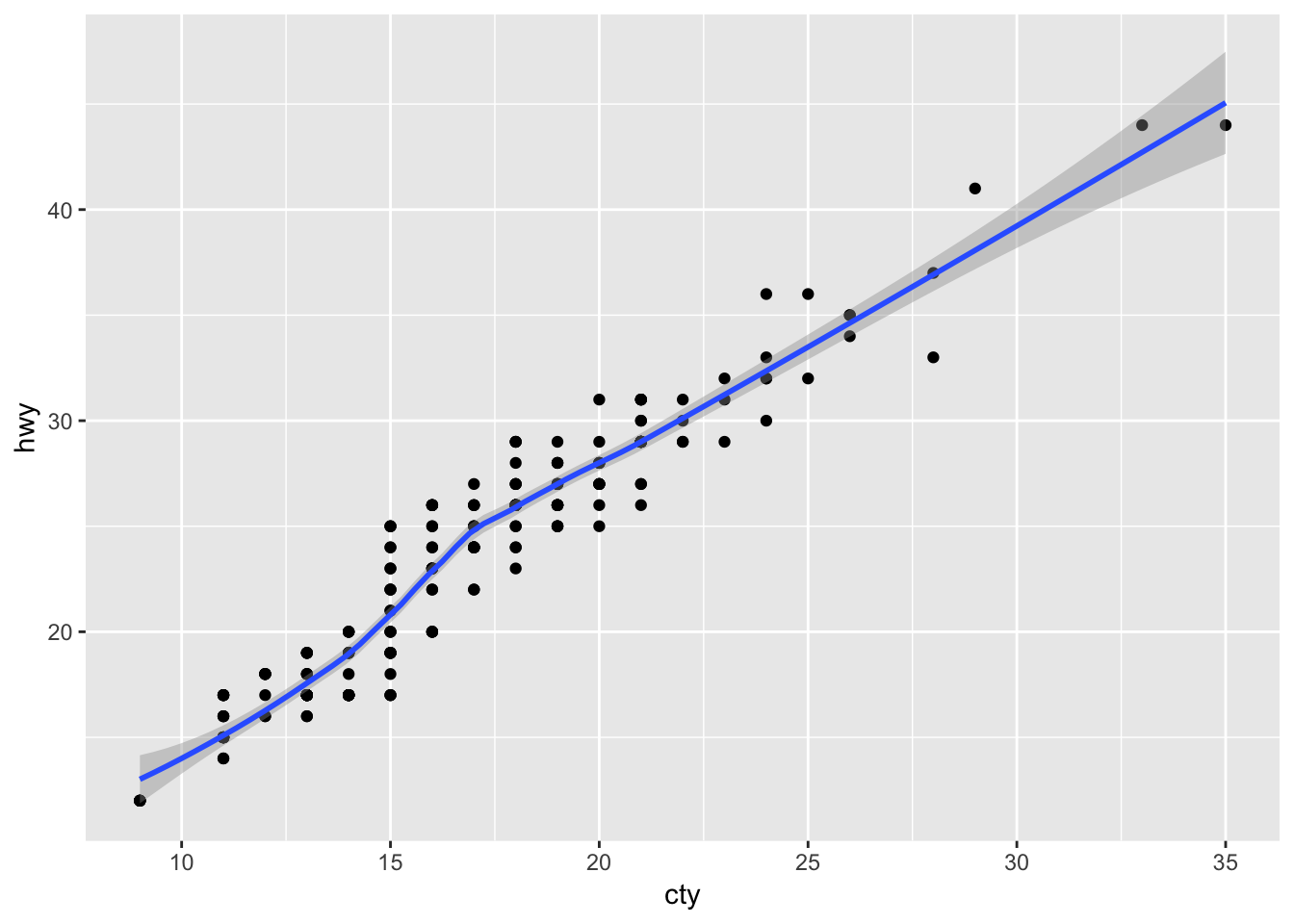
Importantly, each layer can have a different aesthetic mapping, and can be based on different datasets. This allows for the combinations of visualizations from multiple data sources, allowing near-infinite possibilities.
To learn more about layers, click here
References
Wilkinson, Leland. 2005. The Grammer of Graphics. 2nd ed. New York: Springer Science. http://www.springer.com/us/book/9780387245447.
Wickham, Hadley. 2016. Ggplot2: Elegant Graphics for Data Analysis. 2nd ed. Cham, Switzerland: Springer International Publishing. http://www.springer.com/br/book/9780387981413.
Healy, Kieran. 2018. Data Visualization for Social Science: A Practical Introduction with R and Ggplot2. 1st ed. world: the internet. http://socviz.co/.
Garrett Grolemund, Hadley Wickham &. 2017. R for Data Science. 1st ed. California, US: O’Reilly Media. http://r4ds.had.co.nz.