Chapter 8 Visualising data
Now we’ll move on to an amazing feature of R: visualising data. For this, we’ll use the package ggplot2 (Wickham et al. (2018))! We’ll first get a quick glimpse of what ggplot can do, before we look at the different types of visualizations that are possible in R.
We must of course tell R that we will be using the ggplot2-package. Note that this package is already loaded within the tidyverse, so you don’t have to run the following code:
library(ggplot2)ggplot is not difficult to use. It is particularly straightforward when you want to make a quick graph as part of exploring your data. [remember, your data needs to be “tidy”]
ggplot(your_data, aes(x = x_variable, y = y_variable)) + geom_point()You can interpret this code as follows: create a ggplot-object (a graph) on the basis of the data(frame) “your_data” that you supply, and more specifically, use as data for the x-axis the variable named “x_variable” and as data for the y-axis the variable named “y_variable” (which both must exist in “your_data”). “aes” refers to “aesthetics”, and it essentially refers to how the data are structured. We’re almost there, but ggplot does not know yet what it has to do with the x_variable and y_variable in terms of visualising. As you might have guessed “geom_point()” does this exactly: it specifies that we are interested in points (or dots). These commands together will create a scatter-plot. “geom” refers to “geometrics” and this specifies what type of graph you are interested in.
In many cases, you also want to include some grouping variable (maybe you want to show the pattern seperately for men and women). This is also easy in ggplot; in the aesthetics you can specify either a colour or a fill or a group depending on the function:
ggplot(your_data, aes(x = x_variable, y = y_variable, colour = group_variable)) + geom_point()You see that the code makes some sense, although it is still rather abstract, so let us create an actual visualisation!
To see ggplot in action, we will again use the mpg-data (http://ggplot2.tidyverse.org/reference/mpg.html) that comes with the ggplot-package.
df <- mpg8.1 Our first scatterplot
We will now try to create a scatter-plot using the code above.
ggplot(df, aes(x = cty, y = hwy)) + geom_point() 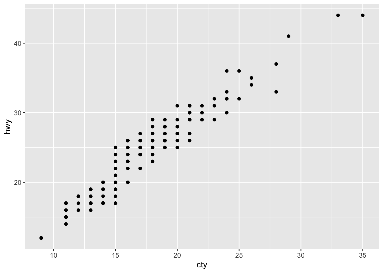
Our first ggplot-graph! Looks pretty good already! What does it mean? Cars that can drive more mile per gallon in the city (i.e. are less fuel consuming) can also drive more mile per gallon on the highway. Not a very remarkable conclusion.
It’s very easy to include a grouping variable; ggplot assigns nice colours! Let’s include the grouping variable “drv”; which refers to three different groups of cars: those that have front-, rear-, and 4-wheeldrive.
ggplot(df, aes(x = cty, y = hwy, colour = drv)) + geom_point() 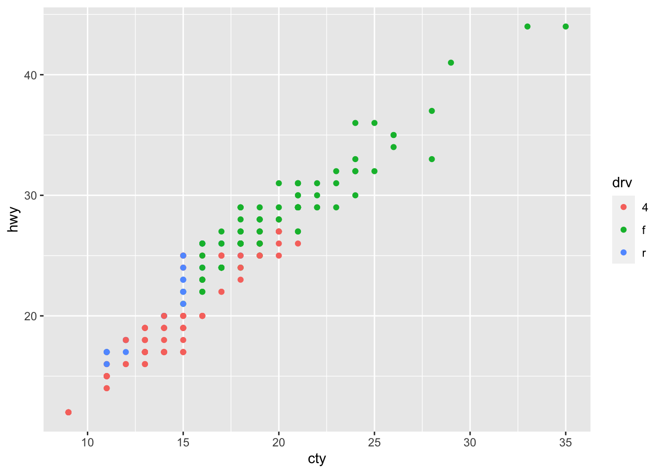
The beauty of ggplot is that using different a different “geom”-function will create a different graph:
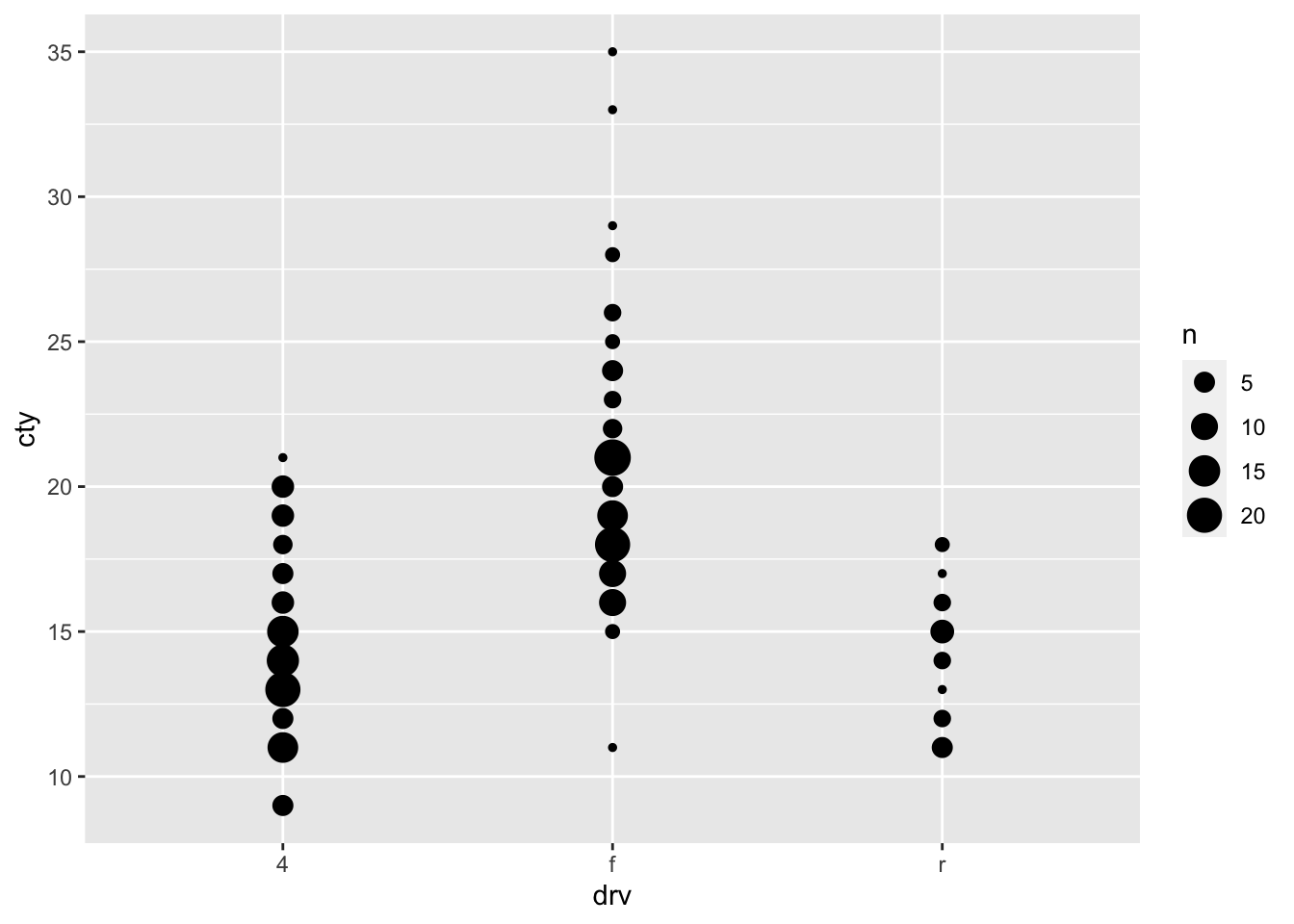
ggplot(df, aes(x = cty, y = hwy)) + geom_count() 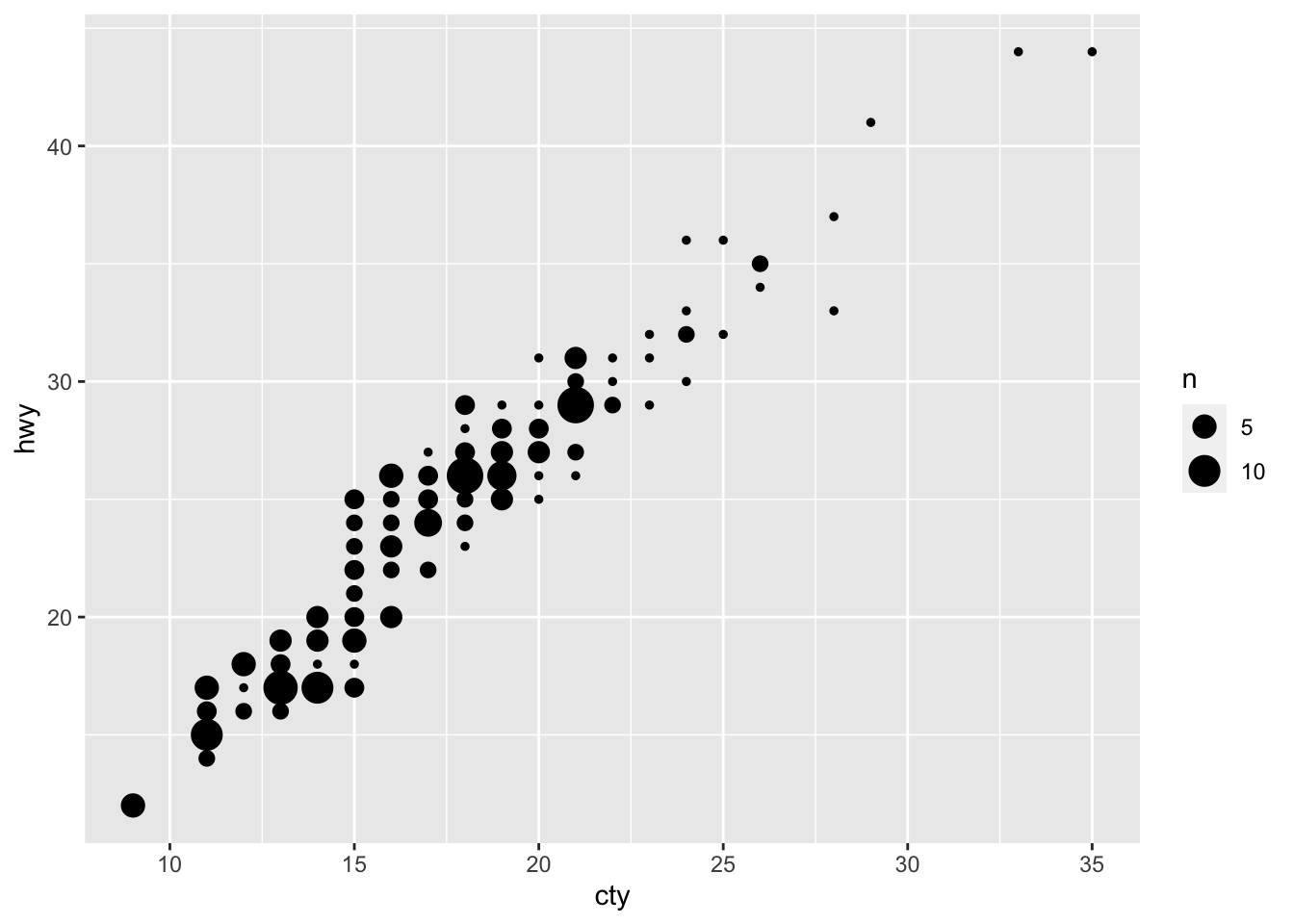
A bubbleplot! There was some overlap in points in the previous graph; in this graph, this overlap is represented by the size of the points.
Let’s try another scatterplot:
ggplot(df, aes(x = cty, y = hwy)) + geom_point() + geom_smooth() ## `geom_smooth()` using method = 'loess' and formula = 'y ~ x'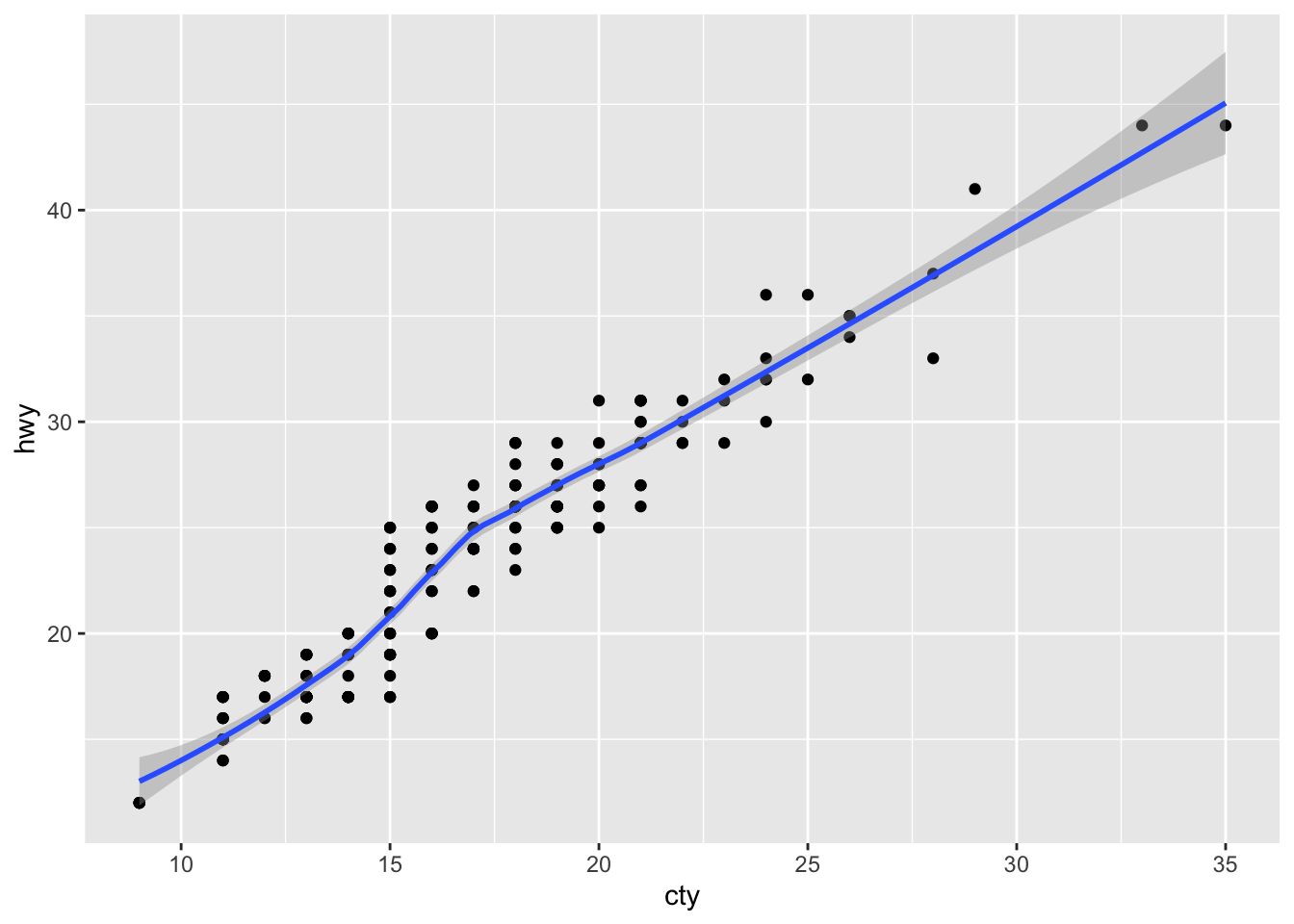
We have added a prediction line between the variables “cty” and “hwy” and a confidence band around the predictions! The message tells us that we have used the “loess” method to estimate the line. Other options are possible.
Such simple code already gives us very useful and pretty-good quality graphs! The beauty of ggplot is that you can easily combine multiple geom_-functions, and that you can tweak any detail that you’d like.
Adapting and modifying the graph by tweaking the details might take some more effort, but even here the “language” of ggplot is rather clear. Below is an example of the same data, plus some additional features that give you an idea of what you can do and how you can do it:
ggplot(df, aes(x = cty, y = hwy, colour = drv)) +
  geom_point(size = 3, shape = 13, alpha = 0.5) + # Change the size and shape of the points and make them see-through
  geom_smooth(method = "lm") + # Add linear regression lines
  scale_colour_brewer(palette = "Set1") + # Change the colours
  labs(x = "Mileage per gallon in the city", y ="Mileage per gallon on the highway",
       title = "Cars that consume more fuel per mile in cities also do so on the highway") +  # Change labels of axes and add title
  theme_bw() # Remove the gray background
## `geom_smooth()` using formula = 'y ~ x'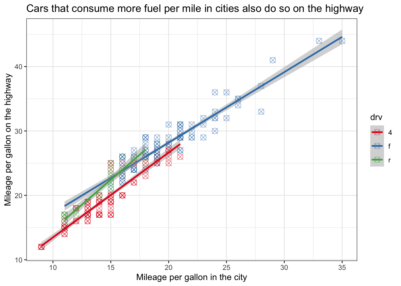
8.2 ggplot - the geoms
There are many different type of graphs you can make in ggplot. For a quick overview, see the ggplot2-cheatsheet: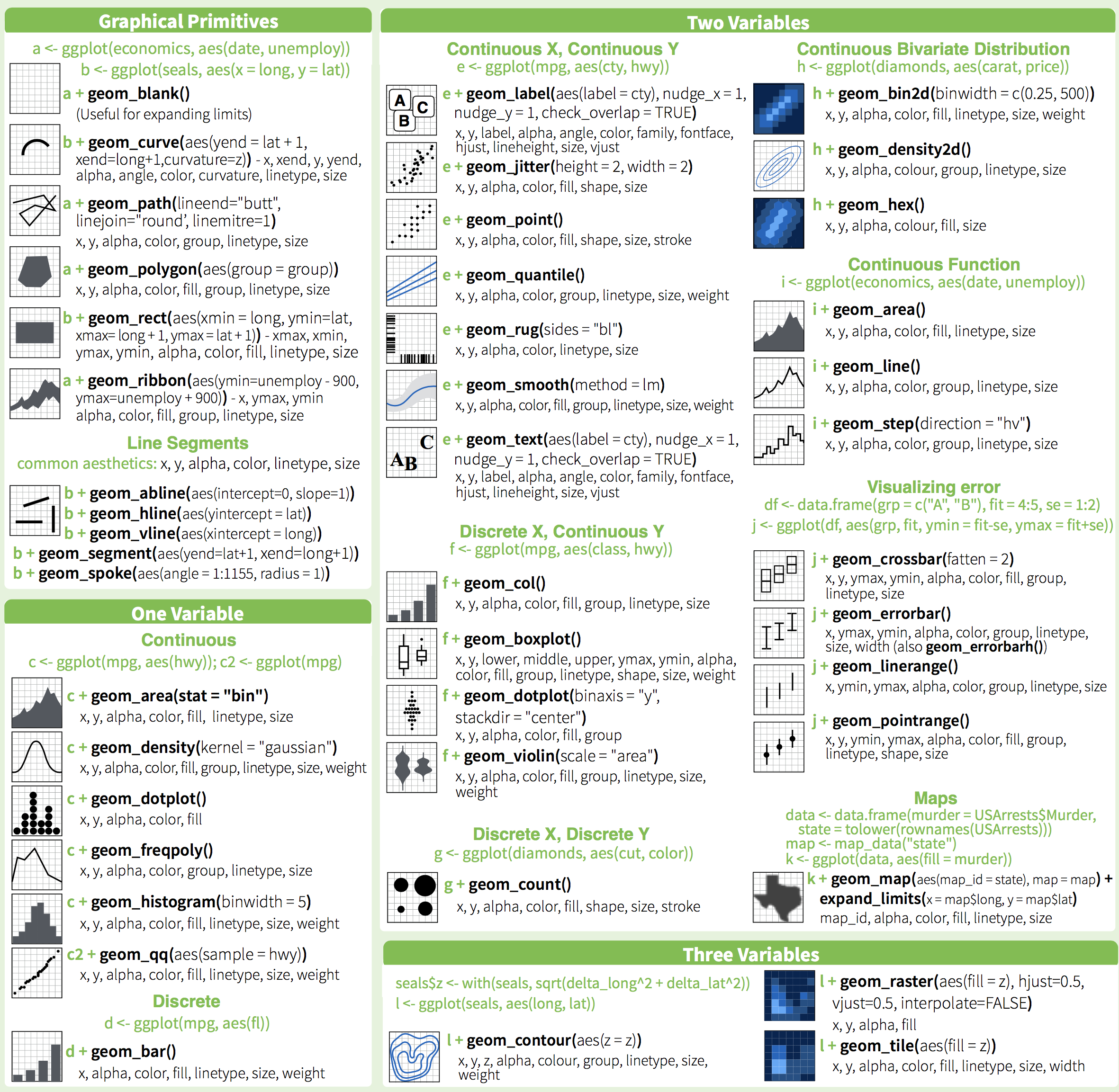
We’ll now look at different ways of visualising our data via ggplot (Wickham et al. (2018)). We’ll categorise these visualisations by types of variable, how many, and whether we want to display distributions or summaries
8.3 Distribution of a single variable
Typically a first step when analyzing data, is checking the distributions of the variables given their central role in deciding which analysis strategy to follow. We’ll look at some ways to do this, while at the same time changing some elements of the graphs that we get.
Two popular ways of showing a distribution are histograms and density plots; both give good ideas about the shape of the distribution.
8.3.1 Histogram
Making histograms is rather straightforward in ggplot, because there is a seperate “geom” for it, namely geom_histogram. Let’s make a histogram of the mileage per galon of fuel for the cars in the “mpg” dataset.
ggplot(df, aes(x = cty)) + geom_histogram()## `stat_bin()` using `bins = 30`. Pick better value with `binwidth`.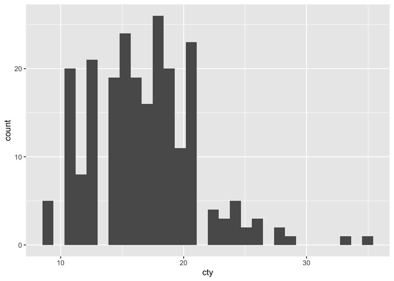
We have a histogram!
Although the graph is fine, R tells us that “stat_bin() using bins = 30. Pick better value with binwidth”. To understand this a bit better, we must realise that a histogram counts the occurrences of particular values of the variable. For this, it makes use of “bins”, ranges of values. For instance, if we would choose a “binwidth” of 5, this would mean that the first bin equals 0-4, the second bin equals 5-9, et cetera. Choosing a binwidth that is too large or too small will result in somewhat funky histograms.
Now let’s try and choose a different binwidth; R already gives us a hint as to how: by specifying binwidth:
ggplot(df, aes(x = cty)) + geom_histogram(binwidth = 1)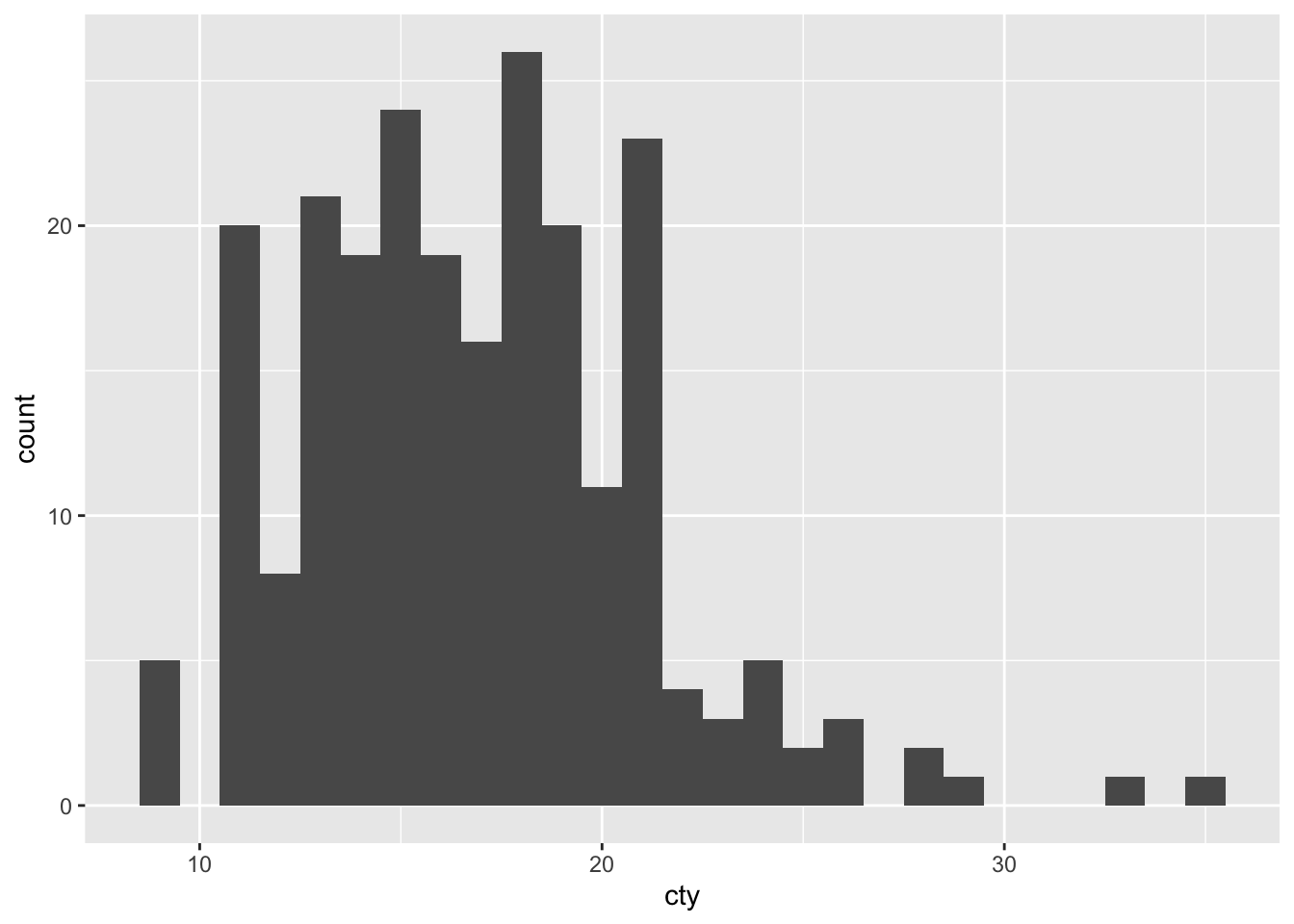
This graph resembles the previous one, but isn’t identical!
8.3.2 Density plot
Another way of plotting a distribution of a single variable, is to make use of density plots. This is similar to a histogram, except that the distribution is based on a smoothening-function:
ggplot(df, aes(x = cty)) + geom_density()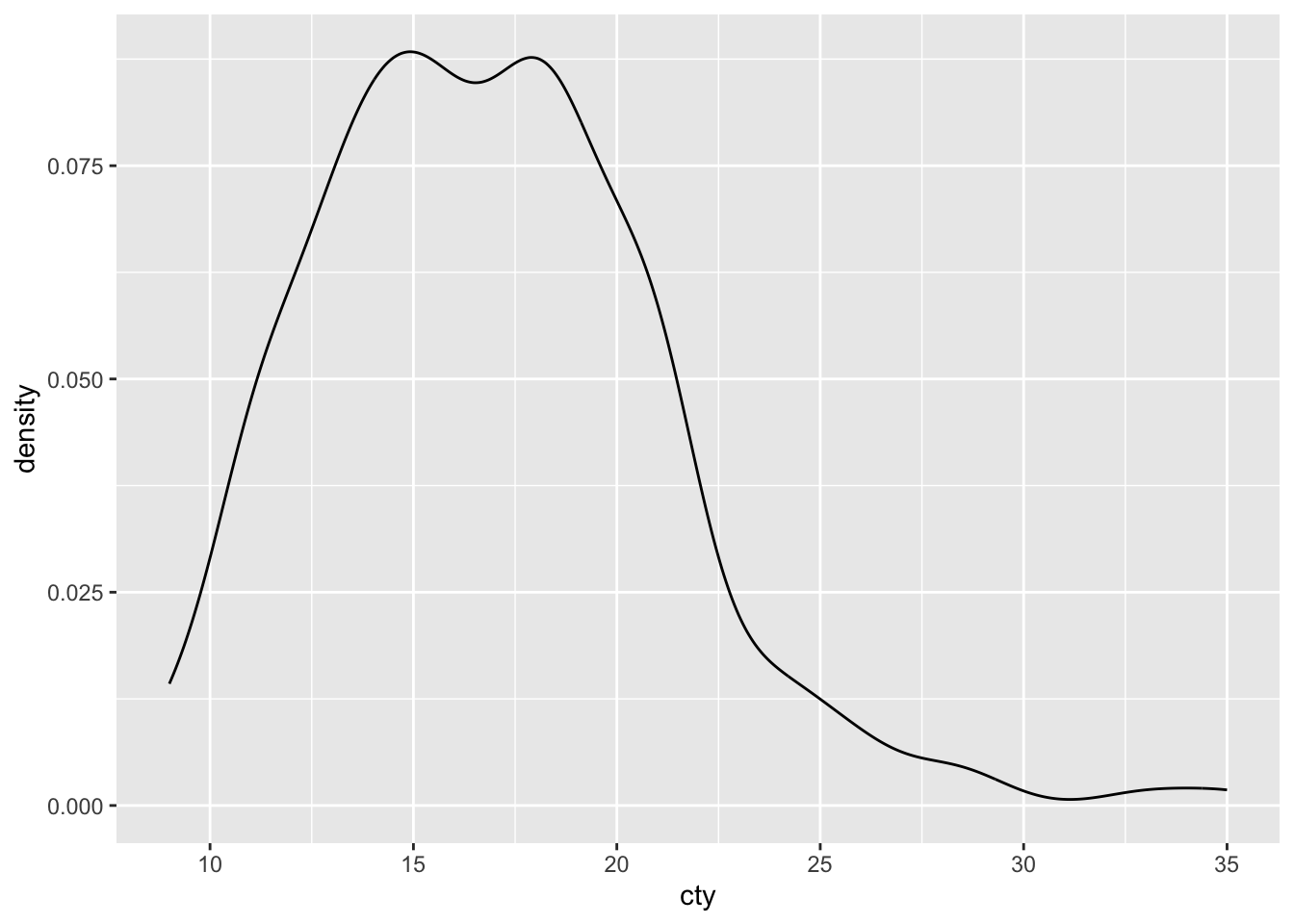
Not quite as informative as the histogram, but density plots can be handy when comparing distributions (as we’ll see shortly).
8.3.2.1 Tweaking the density plot
We can tweak some of the features of the plot. The ggplot-cheatsheet tells us some of the other appearence-features we can use with a density plot: “alpha, color, fill, linetype, size” (“weight” can be used to weigh the cases). Let’s try them all:
ggplot(df, aes(x = cty)) +
  geom_density(colour = "purple", # Make the borders purple
               fill = "yellow", # Make the fill of the bars yellow
               alpha = 0.5, # Make the fill see through 50%
               linetype = "dashed", # Make the borders dashed
               size = 0.5 # Make the size of the borders smaller
  )
## Warning: Using `size` aesthetic for lines was deprecated in ggplot2 3.4.0.
## ℹ Please use `linewidth` instead.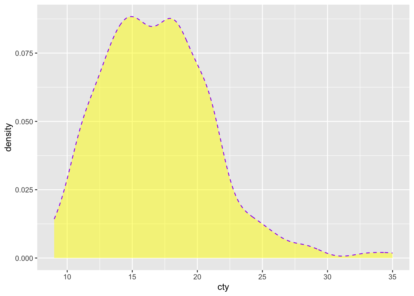
Very ugly!
8.4 Comparing distributions
Visualising the distribution of our variables is an important first step in exploring and analysing data. Often, a next step would be to compare the distributions of two or more groups. First we’ll learn how to do that with histograms and density plots that we have already learned about. We’ll also learn some novel ways that are often a bit more informative.
8.4.1 Density plots
Histograms can be used to compare distributions, but they are not always ideal. Sometimes, density plots are more informative:
ggplot(df, aes(x = cty, fill = drv)) + geom_density(alpha = 0.5)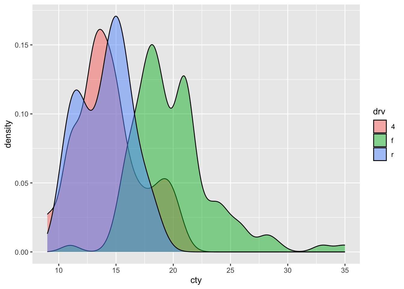
8.4.2 Violin plots
A particular neat way of visualising a comparison of distributions, is to use “violin plots”. These are essentially density plots next to one another (rather than overlapping). Note that we are now specifying an x-variable and a y-variable:
ggplot(df, aes(x = drv, y = cty)) + geom_violin()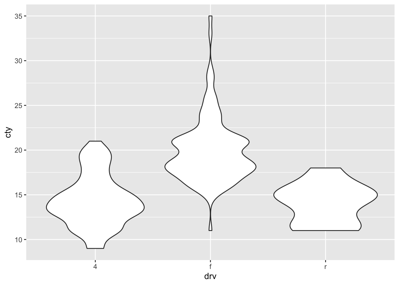
8.4.3 Scatter plots
An underused but particularly useful way of comparing distributions is by use of a scatterplot:
ggplot(df, aes(x = drv, y = cty)) + geom_point()
A somewhat problematic feature of this graph, is that there are many more datapoints in the dataset, than we can see in the graph. This is because the datapoints are overlapping. Two ways for resolving this are to jitter the points (add a bit of random noise to the data, so that the datapoints will deviate slightly) or to adjust the size of the points dependent on their frequency (bubble-plots).
8.4.4 Jitter
ggplot(df, aes(x = drv, y = cty)) + geom_jitter()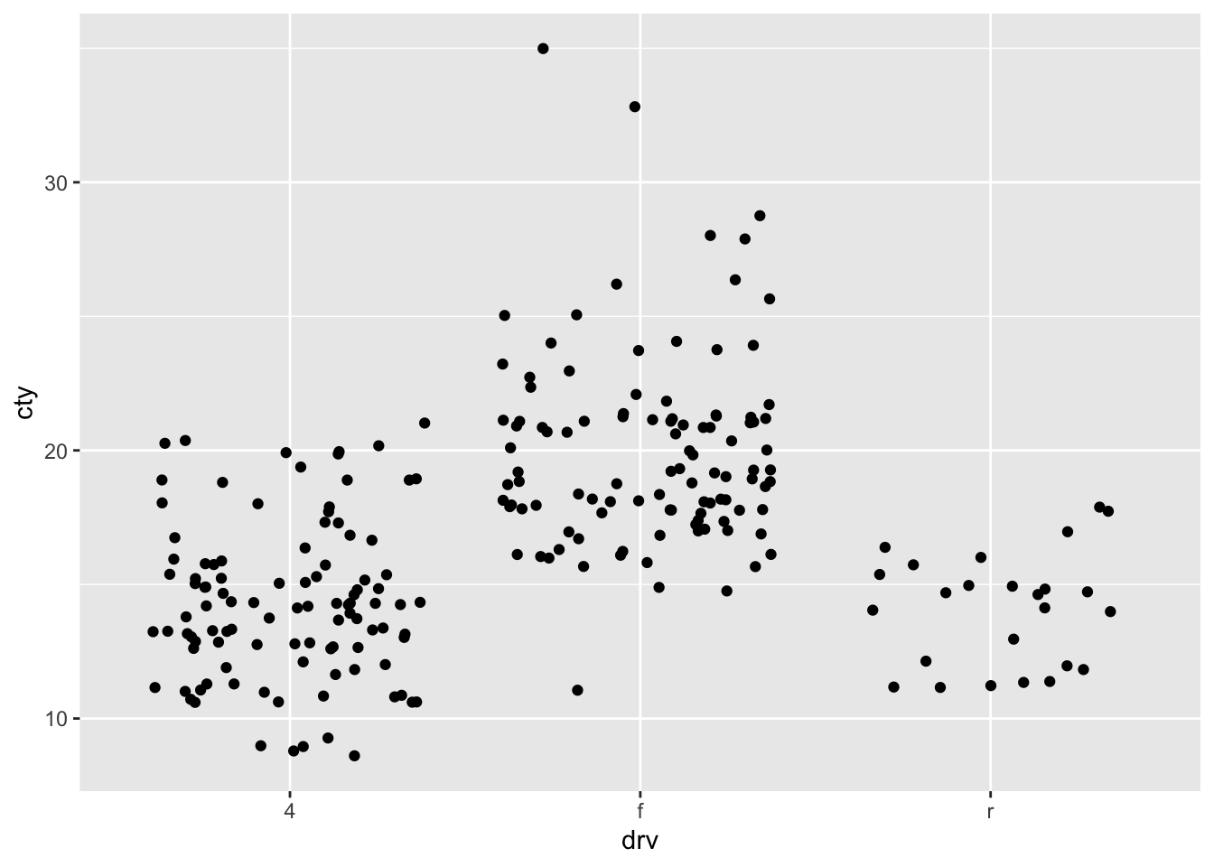
ggplot(df, aes(x=drv, y=cty)) + geom_jitter(width = 0.2, height = 0)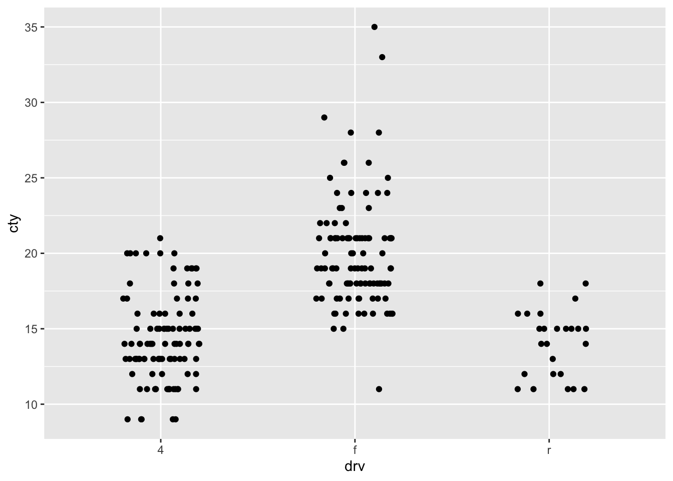
8.4.6 Boxplots
A different ways of comparing distributions is through boxplots. In contrast to the above graphs, with boxplots the actual distributions are not displayed, but several summary statistics of the distributions (e.g., median, interquartile range, outliers). Still boxplots are incredibly useful to get a quick view of the differences between the groups, where the bulk of the data lies between, and whether there are outliers:
ggplot(df, aes(x = drv, y = cty)) + geom_boxplot()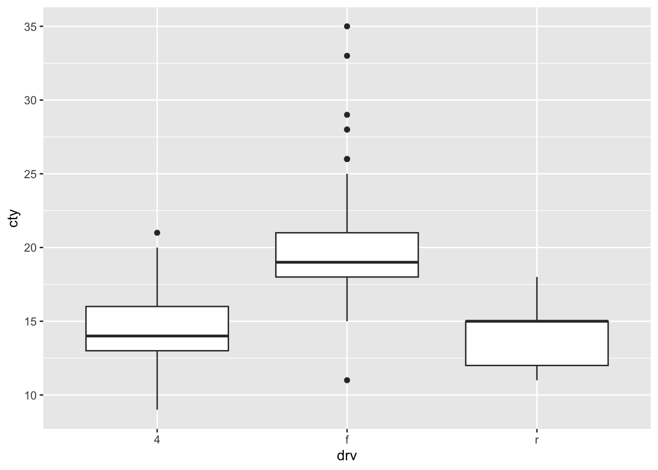
8.4.7 Comparing distributions 2.0
My strong preference when it comes to graphs is to show the raw data in addition to some sort of summary based on the data. This almost always involves showing the raw datapoints with geom_point() (or geom_jitter() or geom_count() when points are overlapping). An example:
ggplot(df, aes(x = drv, y = cty)) + geom_violin() + geom_count(alpha = 0.5)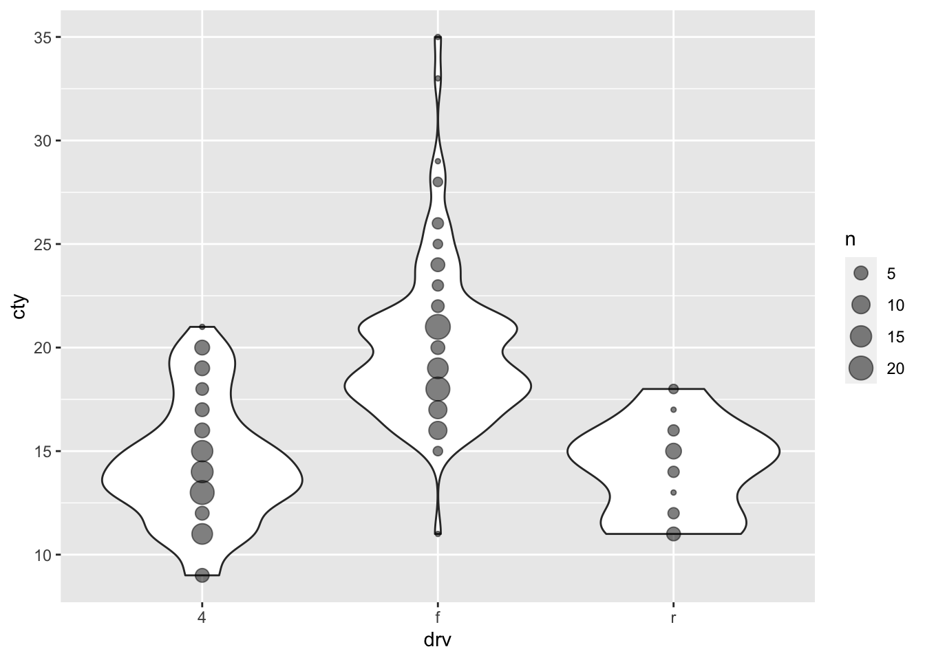
8.5 Comparing group statistics
Because we are not always able to assess differences between groups “by eye” in particular cases (particularly when there are many datapoints), we often rely on a comparisons of group statistics (for example, the mean, or the median). Such group statistics are also important when statistically comparing groups, through, for instance, ANOVAs, t-tests, and non-parametric alternatives. In fact, the comparison of means may be the most popular statistical test out there, and the visualisation of group means the most popular form of graph (regrettably). Here we’ll focus on boxplots and mean-errorbar-plots.
8.5.1 Boxplots
We’ve already seen boxplots in the previous chapter, so let’s have another look at boxplots. Let’s visualise the fuel efficiency for the different car-manufacturers:
ggplot(df, aes(x = manufacturer, y = cty)) + geom_boxplot()
Honda, apparently, makes fuel-efficient cars, but rover and lincoln do not. Volkswagen has produced the most fuel-efficient cars.
8.5.1.1 Tweaking boxplots
Perhaps the boxplot would look better when we would order the manufacturers on their median fuel efficiency (this may seem a bit daunting). Also, let’s tweak some other features:
ggplot(df, aes(x = reorder(manufacturer, cty, FUN = median), y = cty)) +
  geom_boxplot(outlier.colour = "red", # Change colour of outliers
               outlier.shape = 3 # Change shape of outliers
               ) +
  labs(x = "Manufacturer", y = "Fuel efficiency") + # Specify axes labels
  theme(axis.text.x = element_text(angle = 45, hjust = 1)) # Change text direction x-axis labels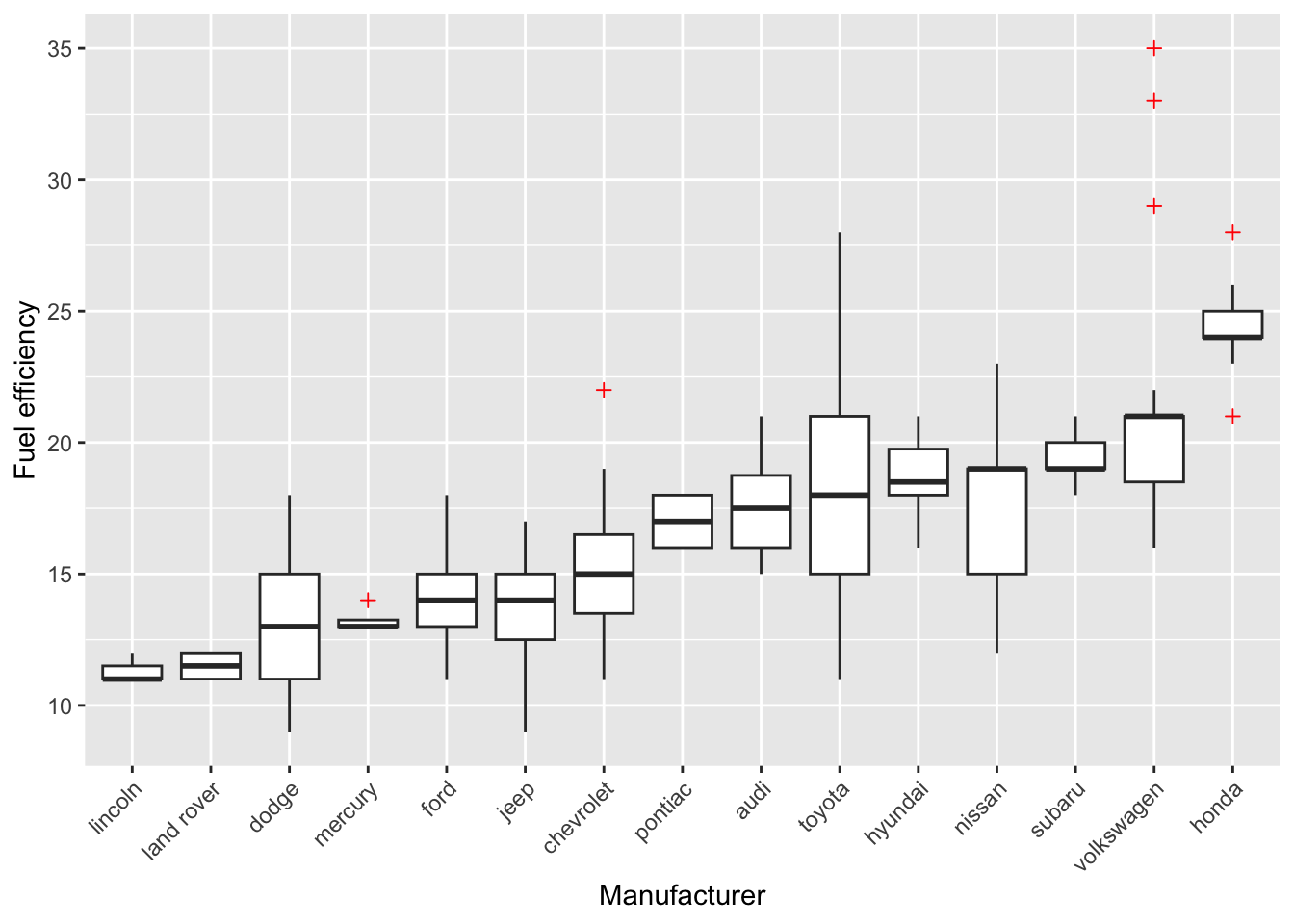
8.5.2 Mean-errorbar-plots
8.5.2.1 Creating barplots of means
Often, people want to show the different means of their groups. This is mostly done through either bar-plots or dot/point-plots. Because a mean is a statistical summary that needs to be calculated, we must somehow let ggplot know that the bar or dot should reflect a mean.
We can do this by using ggplot’s built-in stat-functions. Again, the cheatsheet is helpful (“Data Visualization Cheat Sheet”; https://www.rstudio.com/resources/cheatsheets/).
8.5.2.2 Creating point-plots of means
Let’s do the same for point-plots of the means.
ggplot(df, aes(x = manufacturer, y = cty)) + geom_point(stat = "summary", fun = "mean") 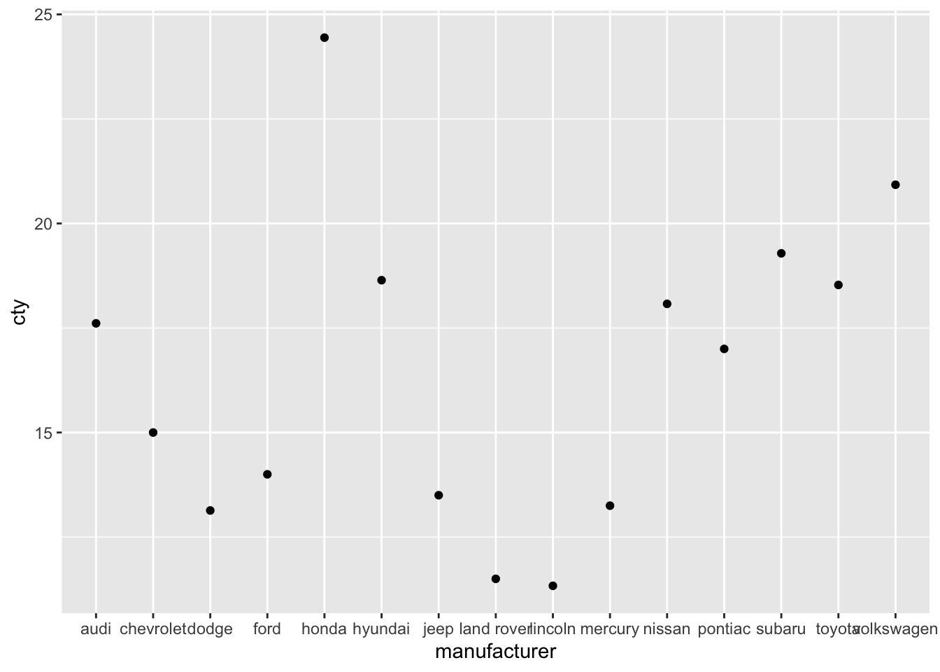
8.5.2.3 Adding error bars
Often, mean plots are associated with errorbars (e.g., 1 standard error around the mean, or 95% confidence intervals). We can use the geom_errorbar-function to achieve this.
ggplot(df, aes(x = manufacturer, y = cty)) +
  geom_bar(stat = "summary", fun = "mean") +
  geom_errorbar(stat = "summary", fun.data = "mean_se")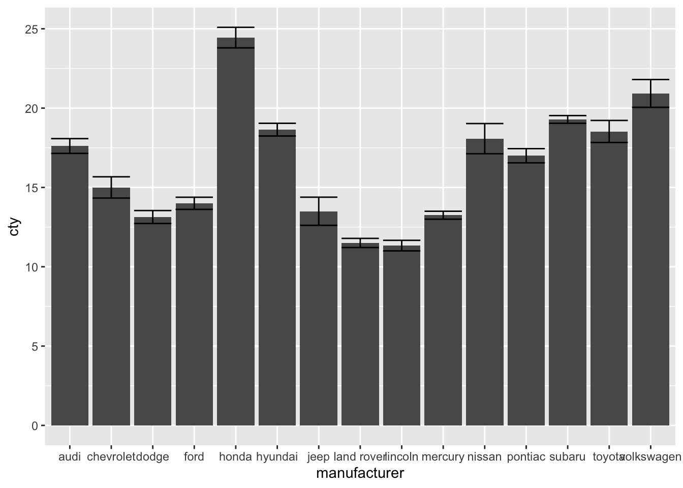
(To find more information on the mean_se() function, see: http://ggplot2.tidyverse.org/reference/mean_se.html)
8.5.3 Point-error plots
All these methods can also be used for the (common) point-error plot. Rather than adding standard errors to the graph, we have now added a 95% confidence interval (a 95% confidence interval equals to 1.96 times the standard error, we can pass that multiplier as arguments).
ggplot(df, aes(x = manufacturer, y = cty)) +
  geom_point(stat = "summary", fun = "mean") +
  geom_errorbar(stat = "summary", fun.data = "mean_se", fun.args = list(mult = 1.96))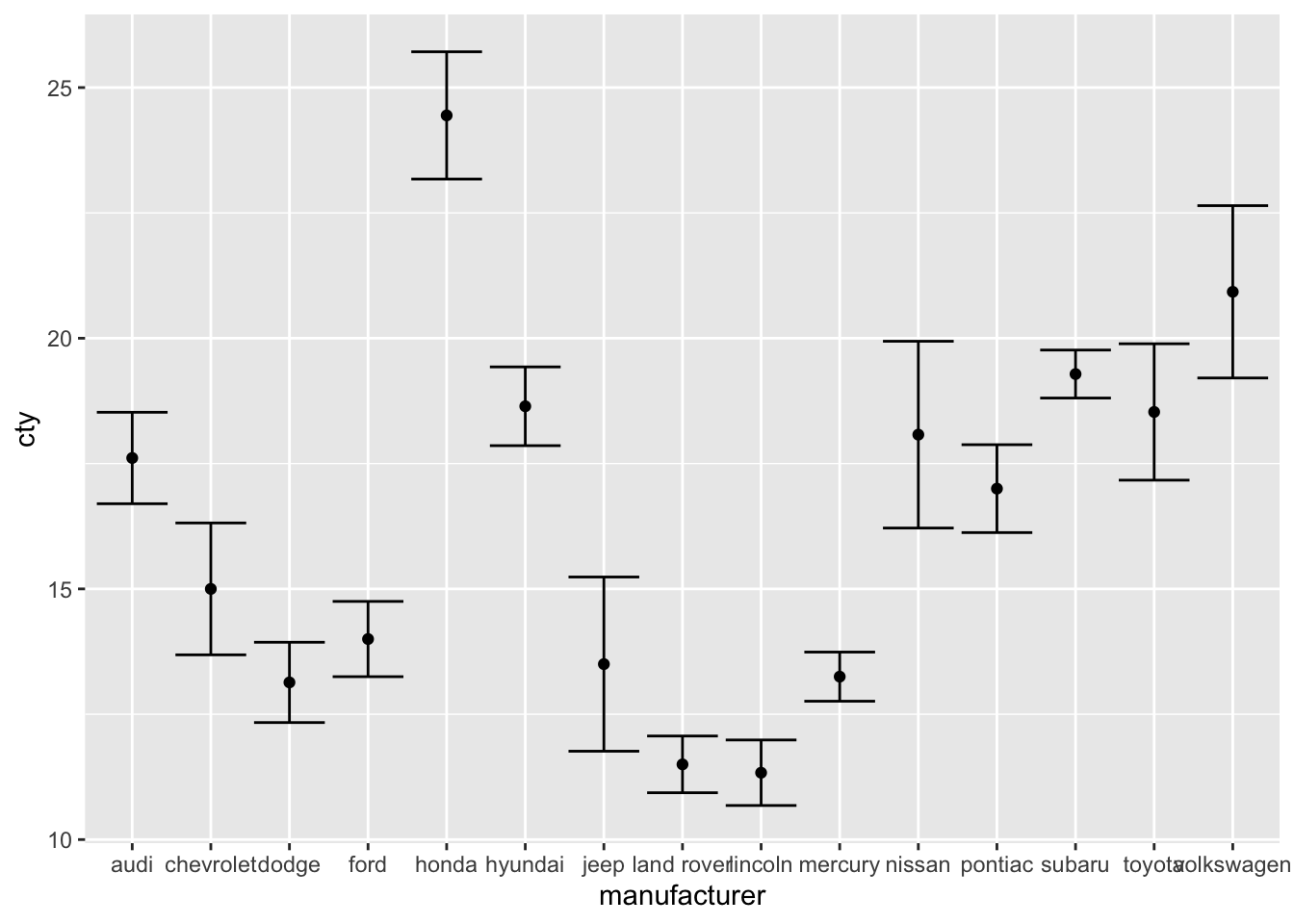
Also this plot might benefit from reordering the x-axis on the basis of the mean. I’ll also change the width of the errorbar:
ggplot(df, aes(x = reorder(manufacturer, cty, FUN = mean), y = cty)) +
      geom_point(stat = "summary", fun = "mean") +
      geom_errorbar(stat = "summary", fun.data = "mean_se",
                    fun.args = list(mult = 1.96), width = 0)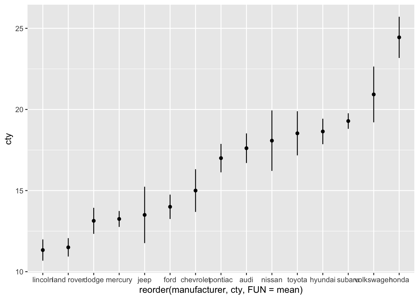
8.5.4 Comparing group statistics 2.0
We can improve this graph by showing raw data.
ggplot(df, aes(x = reorder(manufacturer, cty, FUN = mean), y = cty)) +
  geom_jitter(colour = "lightblue", alpha = 0.5, width = 0.1) +
  geom_point(stat = "summary", fun = "mean") +
  geom_errorbar(stat = "summary", fun.data = "mean_se",
                fun.args = list(mult = 1.96), width=0) +
  labs(x = "Manufacturer", y = "Mileage per gallon of fuel (mean + 95%CI)") +
  theme_bw() +
theme(axis.text.x = element_text(angle = 45, hjust = 1)) 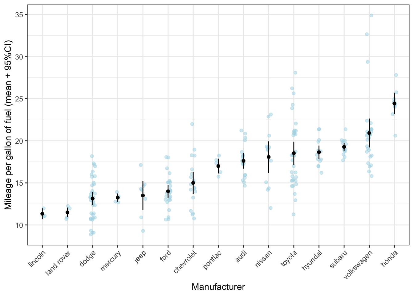
What can be seen much more clearly in this graph, is, for instance, that, while toyota on average makes rather fuel-efficient cars, there is quite some variation. However, the confidence interval is rather small, giving the impression that there is little variation within the cars produced by toyota. The reason is that the standard error is calculated by dividing the standard deviation by the square root of the sample size; given the sample size is rather large, the resulting standard error will be rather small (despite the variation as measured by the standard deviation is large).
8.6 Visualising two continuous variables
8.6.1 Scatterplots
Scatterplots are a popular and good way to visualise the relationship between two continuous variables. We’ll go into them quite a bit, because scatterplots lend themselves well for incorporating information from other variables and for changing features of the geoms.
Let’s plot the relationship between fuel efficiency (cty) and the engine displacement (in litres; displ):
ggplot(df, aes(x = displ, y = cty)) + geom_point()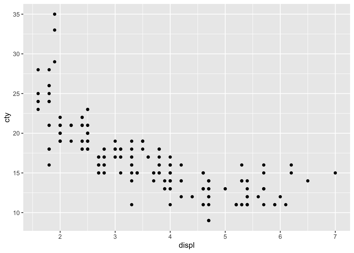
Looks like there is a strong pattern in the data; cars with higher engine displacement have lower fuel efficiency. The relationship doesn’t seem to be entirely linear, because the curve flattens in the lower right corner. If we want to delve a bit more into this pattern, we can also try visualising how type of car (front-, rear-, 4-wheel drive; drv) affects this pattern. This is rather easy:
ggplot(df, aes(x = displ, y = cty, colour = drv)) + geom_point() 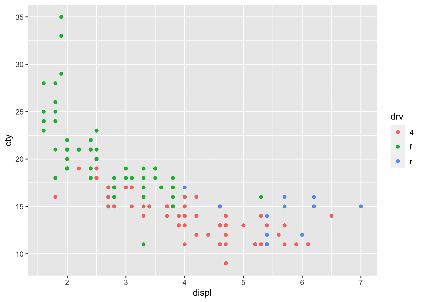
We have given the points a colour depending on the type of drive of the car! It’s clear that front-wheel drives have lowest displacement and highest fuel efficiency! Now let’s do something similar, but now we want to incorporate fuel efficiency on the highway (hwy) as our colour variable:
ggplot(df, aes(x = displ, y = cty, colour = hwy)) + geom_point() 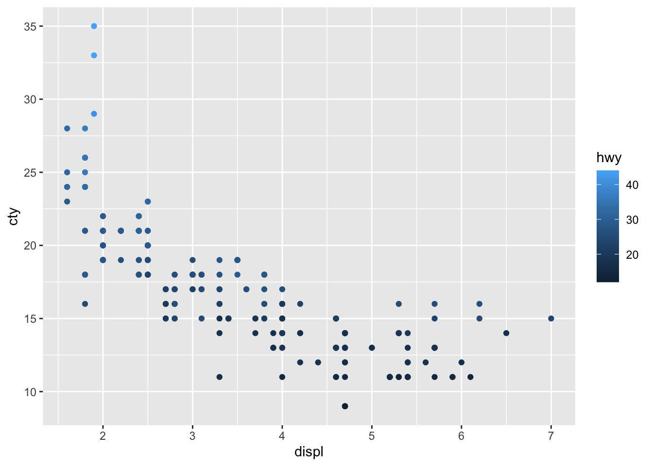
The different ways of colouring these points is due to the fact that drv is a character variable (with three different groups), whereas hwy is a numerical variable.
8.6.1.1 Adding regression lines
It is easy to add a prediction line to a scatterplot:
ggplot(df, aes(x = displ, y = cty)) +
  geom_point() +
  geom_smooth()
## `geom_smooth()` using method = 'loess' and formula = 'y ~ x'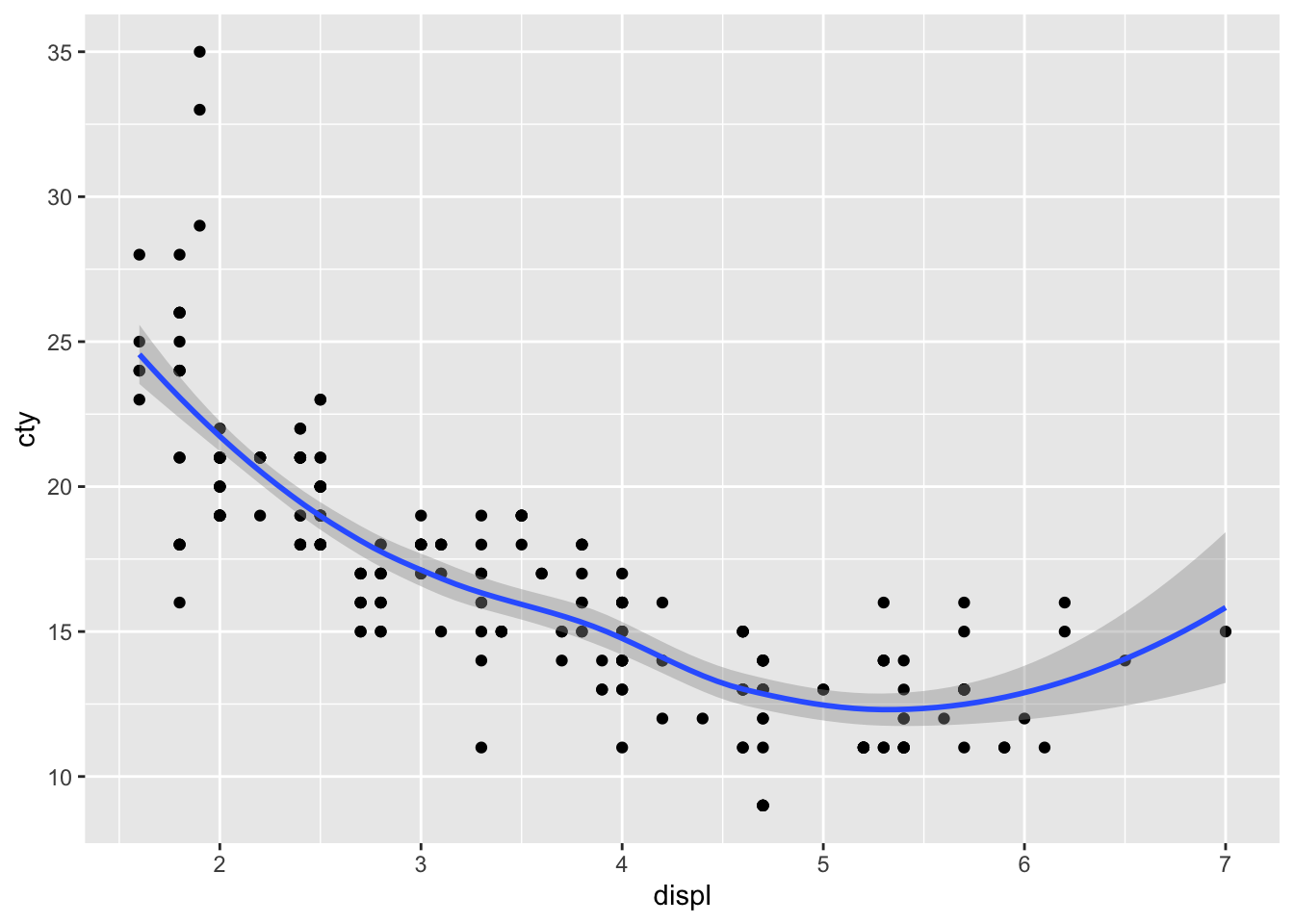
geom_smooth() defaults to the loess-method of fitting and includes confidence interval around the prediction line. Let’s change it to a linear regression model without confidence intervals and in red:
ggplot(df, aes(x = displ, y = cty)) +
  geom_point() +
  geom_smooth(method = "lm", se = FALSE, colour = "red")
## `geom_smooth()` using formula = 'y ~ x'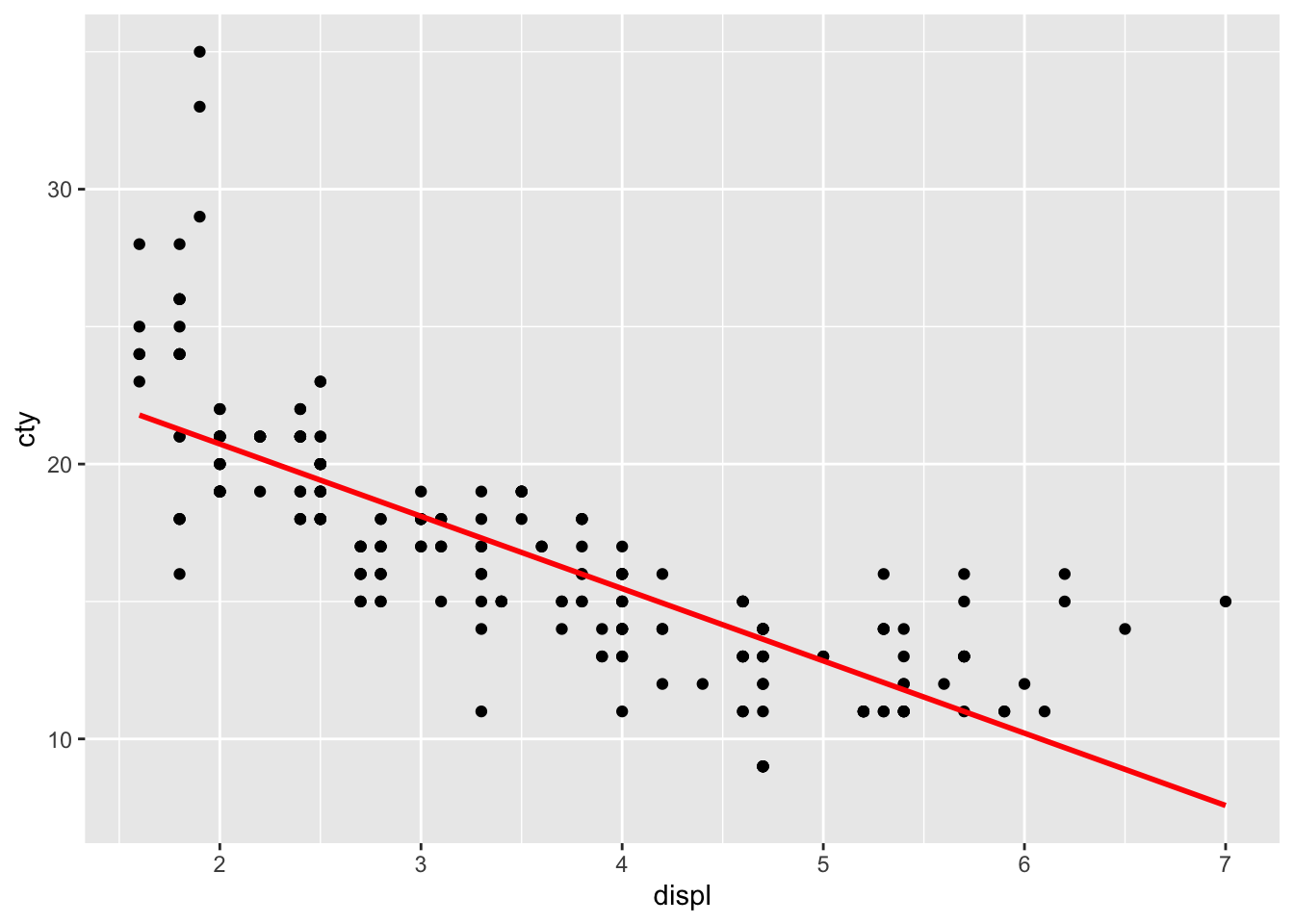
The line doesn’t quite seem to fit the most left and right parts of the graph.
The beauty of ggplot is that adding regression lines are drawn for the different groups too:
ggplot(df, aes(x = displ, y = cty, colour = drv)) +
  geom_point() +
  geom_smooth(method = "lm", se = FALSE)
## `geom_smooth()` using formula = 'y ~ x'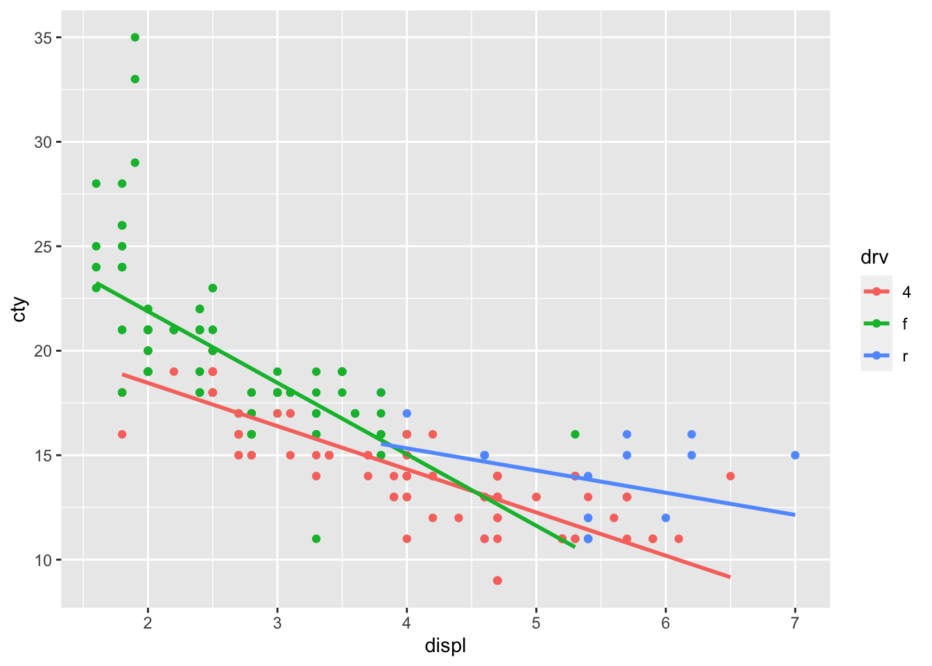
8.7 Visualising two discrete variables
Plotting two discrete variables is a bit harder, in the sense that graphs of two discrete variables do not always give much deeper insight than a table with percentages. Let’s try to make some graphs nonetheless.
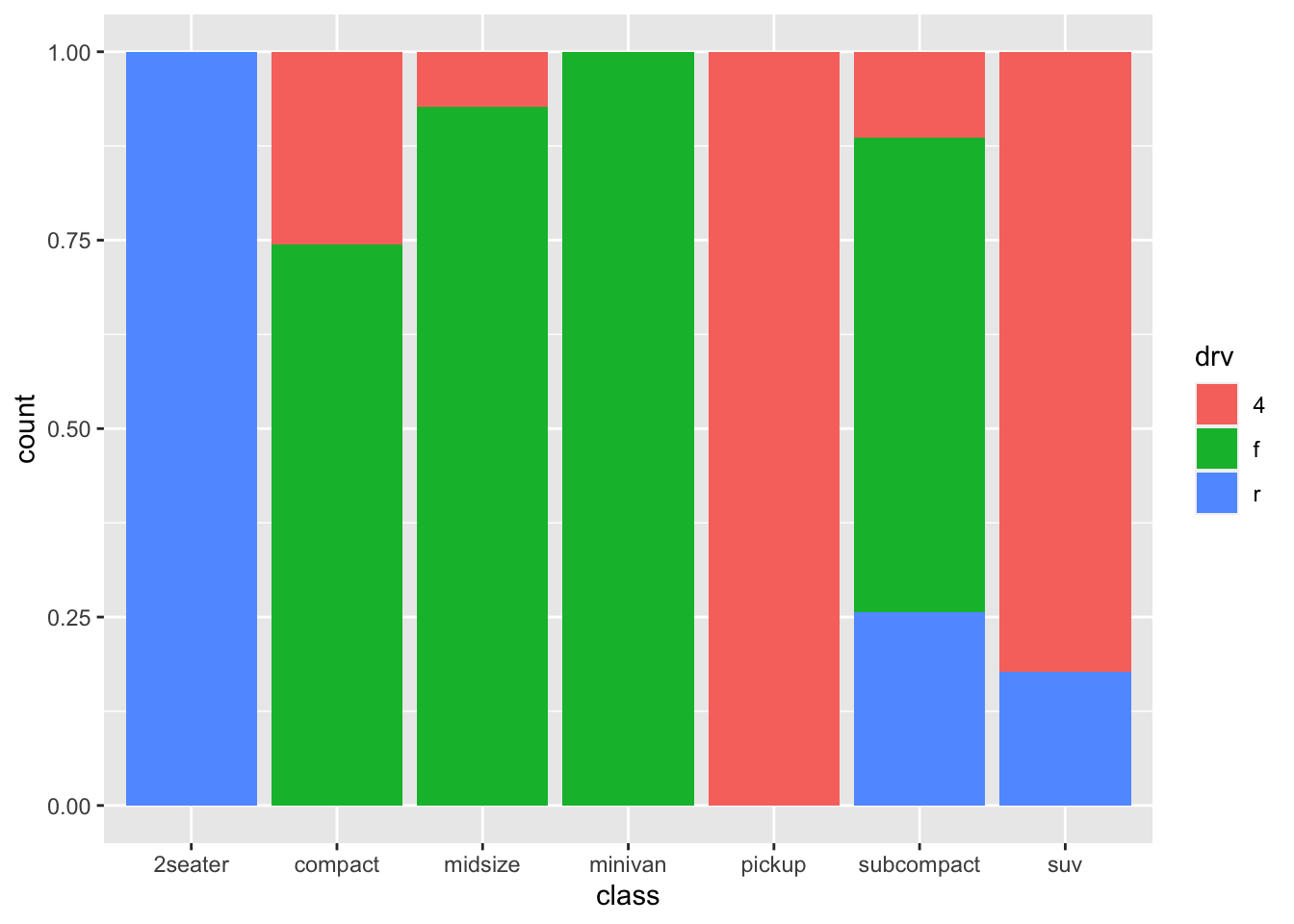
Let’s see what the relationship is between the class of a car (e.g., suv, minivan, pickup, et cetera) and whether it is a front-, rear, or 4-wheeldrive.
table(mpg$class, mpg$drv)##
## 4 f r
## 2seater 0 0 5
## compact 12 35 0
## midsize 3 38 0
## minivan 0 11 0
## pickup 33 0 0
## subcompact 4 22 9
## suv 51 0 11Apparently all pickup-trucks make use 4-wheel drive, whereas 2seaters are only rear-wheel drive. Fascinating stuff.
8.8 Facets
An amazing features of ggplot, is facetting. Rather than explaining what they are, I will just show you:
ggplot(df, aes(x = cty)) +
  geom_histogram(binwidth = 1) +
  facet_wrap(~manufacturer)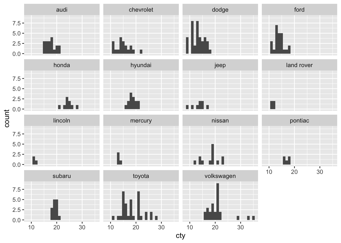
Another example:
ggplot(df, aes(x = displ, y = cty)) +
  geom_point() +
  geom_smooth(method = "lm", se = FALSE) +
  facet_wrap(~drv)
## `geom_smooth()` using formula = 'y ~ x'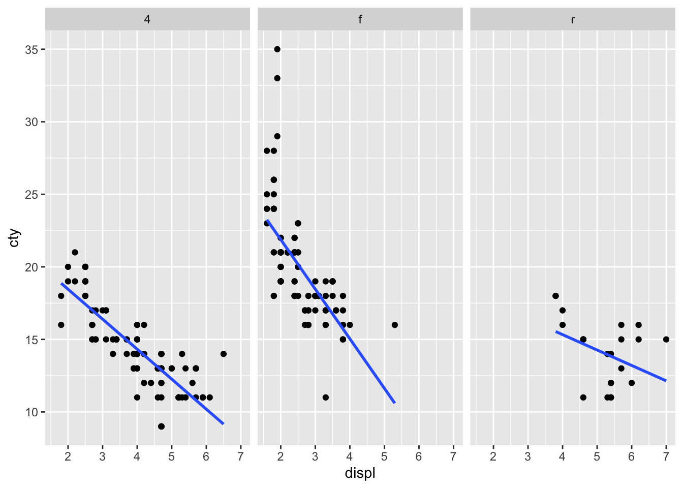
There are many other cool visualisations you can do in R, let’s focus on two special cases that you might use in the future: maps and networks.
8.9 Maps
You will need some additional packages to create maps. Also, due to some regulations changes in Google, you can only use the Google Maps API when you give them your credit card number, although they won’t charge you. Seems legit.
library(ggmap)With the function get_map you can get all sorts of cool maps! Let’s get a map from Groningen from google:
map_gron <- get_map("Groningen", source="google")We can visualise this map using ggmap:
ggmap(map_gron) 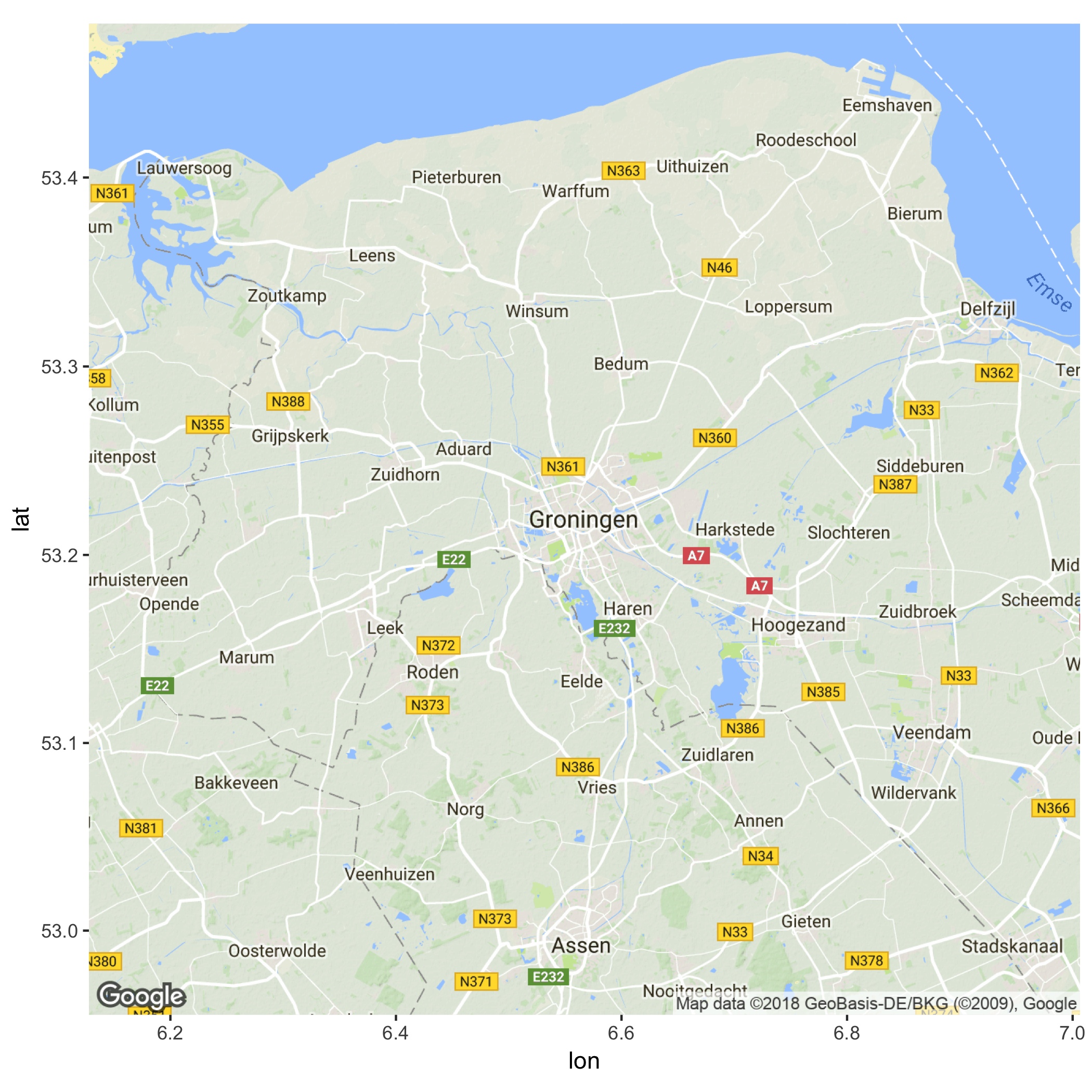
Cool! Let’s try and get a map from the building we’re in now. I’ve used maps.google.com to find the coordinates of the “Academiegebouw” (53.219245, 6.563051). Let’s use this information to get a map, and let’s zoom in a bit more and visualise the map:
map_uni <- get_map(location = c(6.563051, 53.219245), zoom = 16, source="google")
ggmap(map_uni)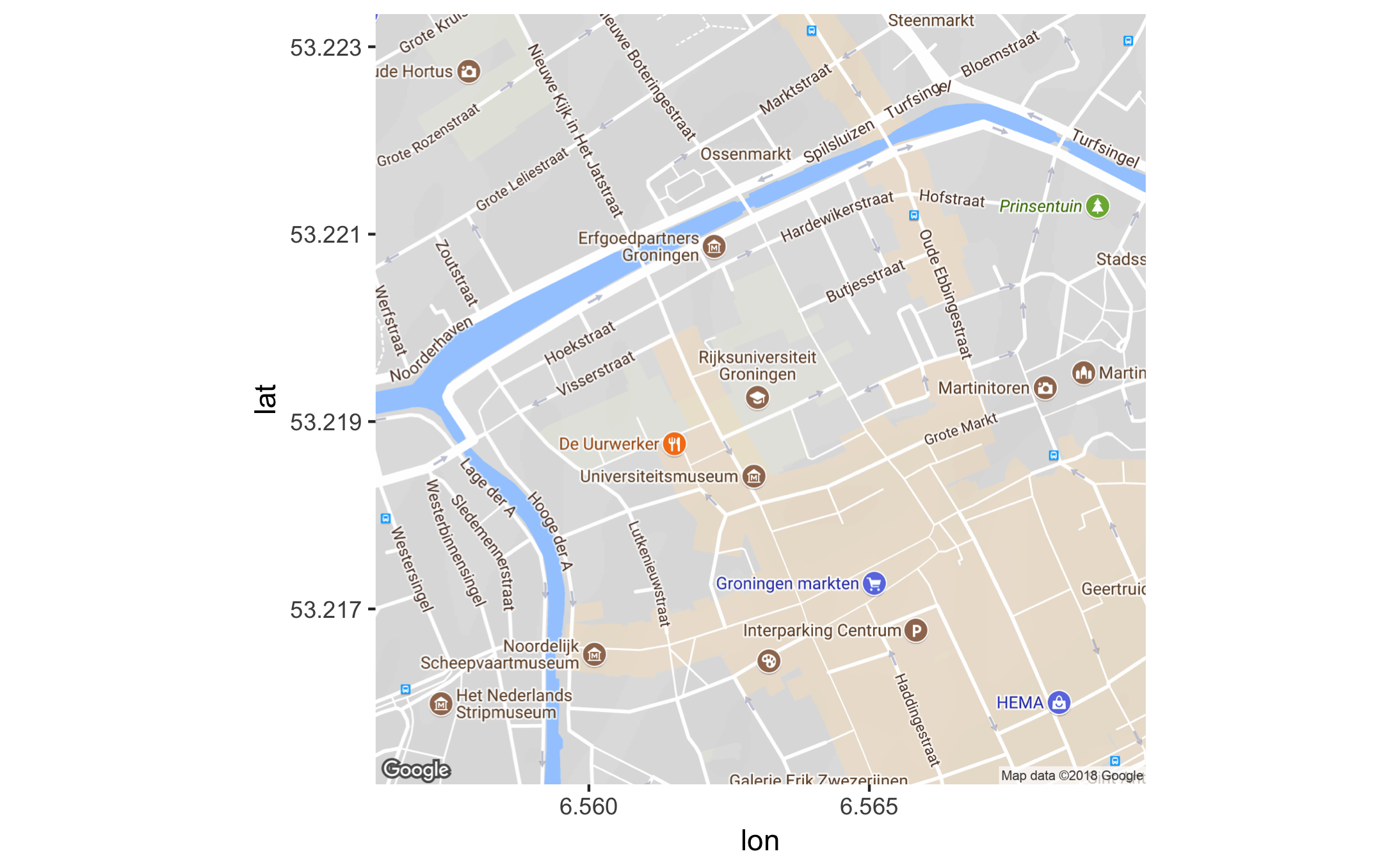
Now let’s visualise the Sociology department at the Faculty of Behavioural and Social Sciences, which is at the coordinates: 53.222266, 6.557550
df_sociology <- data.frame(lon = 6.557550, lat = 53.222266)
ggmap(map_uni) +
geom_label(data = df_sociology,
aes(x = lon, y = lat, label = "Sociology"),
fill = "#9933FF", colour = "white", size = 3) +
theme(axis.line = element_blank(),
axis.text = element_blank(),
axis.ticks = element_blank(),
axis.title = element_blank())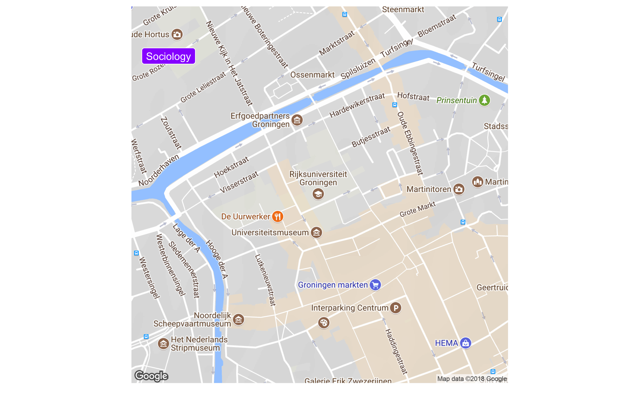 There are also other beautiful maps you can use; how about this (from here):
map_stm <- get_map("netherlands", zoom = 7, maptype="watercolor", source="stamen")
ggmap(map_stm)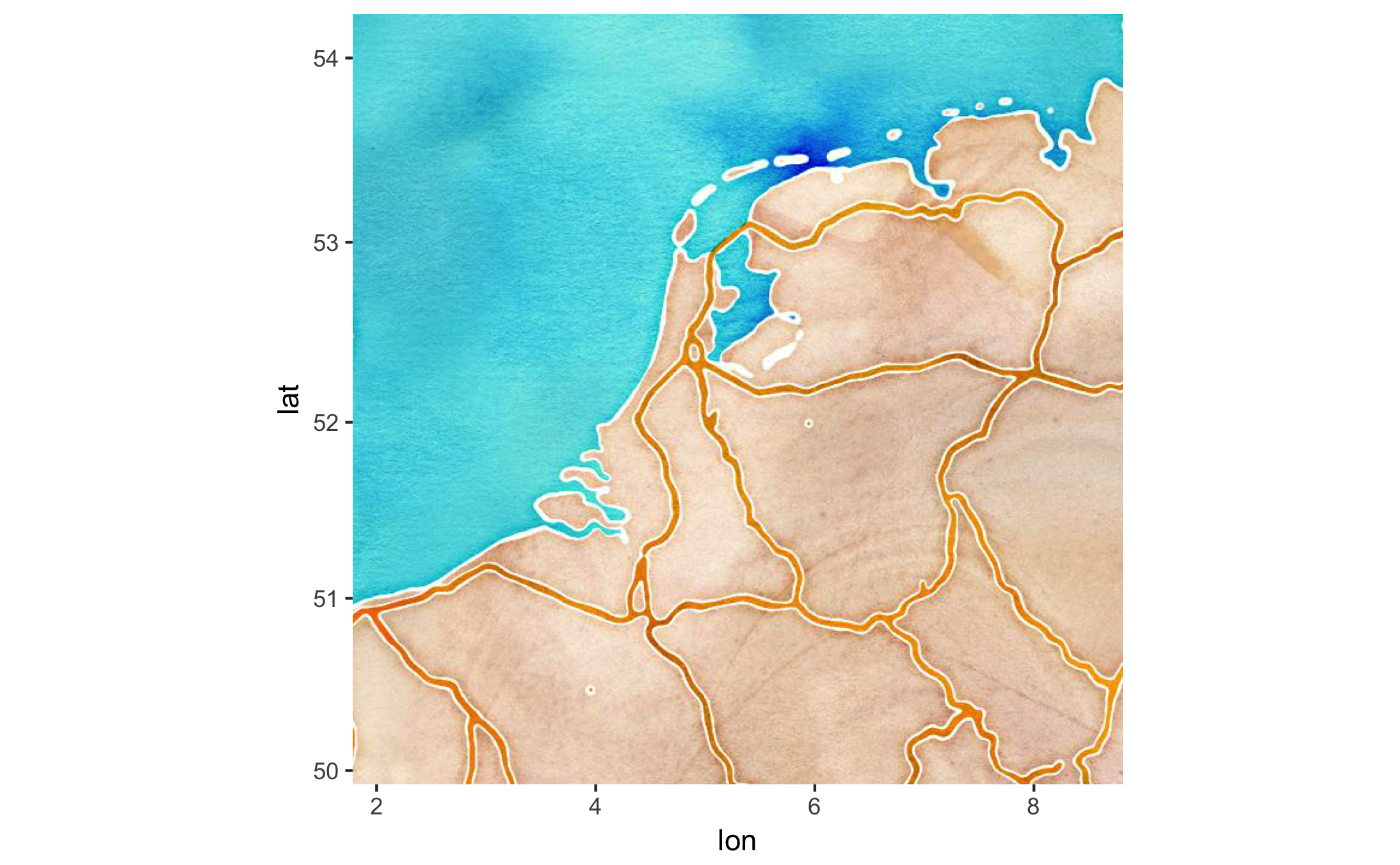
8.10 Networks
Networks are gaining in popularity. We need to put a bit more effort in to get a network graph. We will require these packages:
# install.packages("tidygraph")
# install.packages("ggraph")
library(tidygraph)
##
## Attaching package: 'tidygraph'## The following object is masked from 'package:stats':
##
## filterlibrary(ggraph)
df_edges <- data.frame(from = c("Gert",
"Gert",
"Gert",
"Gert",
"Gert",
"Ben",
"Anne"),
to = c("Anne",
"Ben",
"Winy",
"Vera",
"Laura",
"Winy",
"Vera"))
df_nodes <- data.frame(name = c("Gert","Anne","Ben","Winy","Vera","Laura"),
relation = c("Ego", "Partner", "Family", "Family",
"Friend", "Friend"))
df_network <- tbl_graph(nodes = df_nodes,
edges = df_edges,
directed = FALSE)
df_network## # A tbl_graph: 6 nodes and 7 edges
## #
## # An undirected simple graph with 1 component
## #
## # Node Data: 6 × 2 (active)
## name relation
## <chr> <chr>
## 1 Gert Ego
## 2 Anne Partner
## 3 Ben Family
## 4 Winy Family
## 5 Vera Friend
## 6 Laura Friend
## #
## # Edge Data: 7 × 2
## from to
## <int> <int>
## 1 1 2
## 2 1 3
## 3 1 4
## # … with 4 more rowsLet’s visualise!
ggraph(df_network, layout = "kk") +
  geom_node_point() +
  geom_edge_link()
## Warning: Using the `size` aesthetic in this geom was deprecated in ggplot2 3.4.0.
## ℹ Please use `linewidth` in the `default_aes` field and elsewhere instead.
Let’s improve
ggraph(df_network, layout = "kk") +
  geom_edge_link() +
  geom_node_point(aes(colour = relation), size = 13) +
  geom_node_text(aes(label = name), colour = "white") +
  theme_void() +
  scale_color_brewer(palette = "Set2")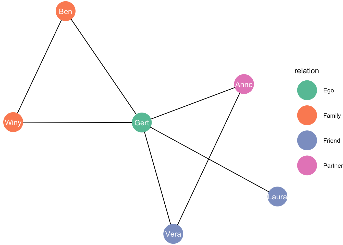
Please note that I also have an entire (short) workshop on network data visualization: https://stulp.gmw.rug.nl/patio
8.11 Further reading
For more information, see Wickham’s book (Wickham 2016) and the official ggplot documentation. R for Data Science. (Garrett Grolemund 2017) is also good (http://r4ds.had.co.nz).I also recommend the new (and also open-access!) book by Kieran Healy – Data Visualization for Social Science. (Healy 2018) see here. Winston Chang’s R-graphics cookbook (Chang 2012) see here is also excellent. The cheatsheet on RStudio (“Data Visualization Cheat Sheet”) is also very helpful: https://www.rstudio.com/resources/cheatsheets/.
My own short workshop on ggplot2 might also be useful: http://stulp.gmw.rug.nl/ggplotworkshop/ .
Or a different workshop in which three graphs are drastically improved: https://stulp.gmw.rug.nl/NBTT/
My own course on data visualization might also be useful: https://stulp.gmw.rug.nl/dataviz
Please note that I also have an entire (short) workshop on network data visualization: https://stulp.gmw.rug.nl/patio
ggplot is very extensive, but the beauty of using R is that others are also contributing to its development. When a particular type of graph does not exist in ggplot, chances are that others already have made a package that you can use. For some examples of excellent extension, see https://www.ggplot2-exts.org.
8.11.1 References
Wickham, Hadley, Winston Chang, Lionel Henry, Thomas Lin Pedersen, Kohske Takahashi, Claus Wilke, and Kara Woo. 2018. Ggplot2: Create Elegant Data Visualisations Using the Grammar of Graphics. https://CRAN.R-project.org/package=ggplot2.
Wickham, Hadley. 2016. Ggplot2: Elegant Graphics for Data Analysis. 2nd ed. Cham, Switzerland: Springer International Publishing. http://www.springer.com/br/book/9780387981413.
Garrett Grolemund, Hadley Wickham &. 2017. R for Data Science. 1st ed. California, US: O’Reilly Media. http://r4ds.had.co.nz.
Healy, Kieran. 2018. Data Visualization for Social Science: A Practical Introduction with R and Ggplot2. 1st ed. world: the internet. http://socviz.co/.
Chang, Winston. 2012. R-Graphics Cookbook. 1st ed. California, US: O’Reilly Media. http://www.cookbook-r.com.