Chapter 3 Improving visualisation I
Below we are creating data which are the results of word-recognition-task experiment.
data <- data.frame(
  sex = c("male", "male", "male", "male", "male",
          "male", "male", "male", "male", "male",
          "female", "female", "female", "female", "female",
          "female", "female", "female", "female", "female"),
  score = c(6.41, 6.34, 2.46, 3.93, 4.5, 6.47, 3.52, 5.4, 3.91, 7.06,
            3.06, 2, 3.75, 3.18, 3.22, 9.94, 11.49, 11.19, 11.36, 10.94)
)
A researcher concludes on the basis of the below graph that women have higher verbal intelligence than men on the basis of word-recognition-task. What do you think?
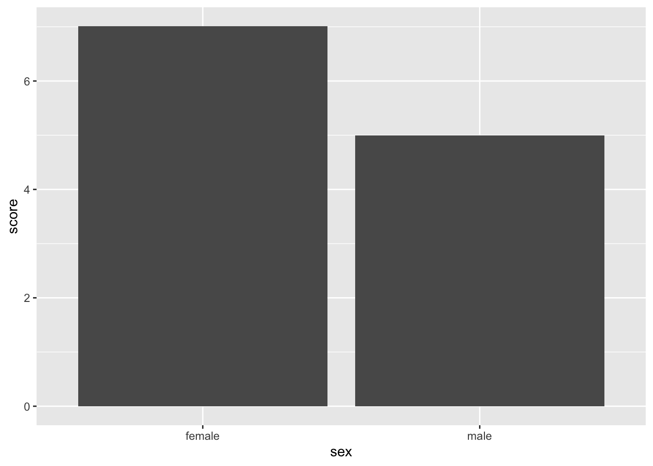
3.1 Above all else …
The above graph is far from showing all the table. In fact, all that fuss to represent two averages. That could have been expressed in one sentence! Let’s try showing all the data.
ggplot(data, aes(x = sex, y = score)) +
geom_bar(stat = "summary", fun = "mean") +
geom_point(colour = "blue")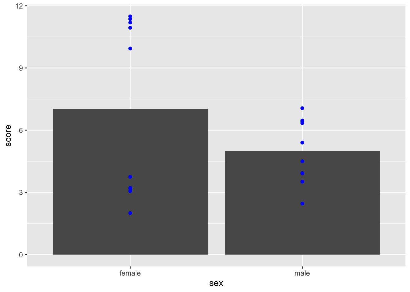
Better! How do you feel about the conclusion now?
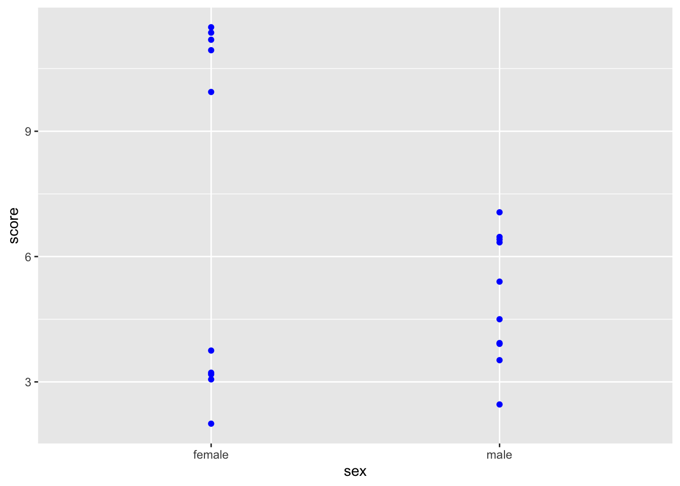
3.3 But I want averages!
ggplot(data, aes(x = sex, y = score)) +
geom_point(colour = "blue") +
geom_point(stat ="summary", fun = "mean", shape = 15,
colour = "purple", size = 7, alpha = 0.5)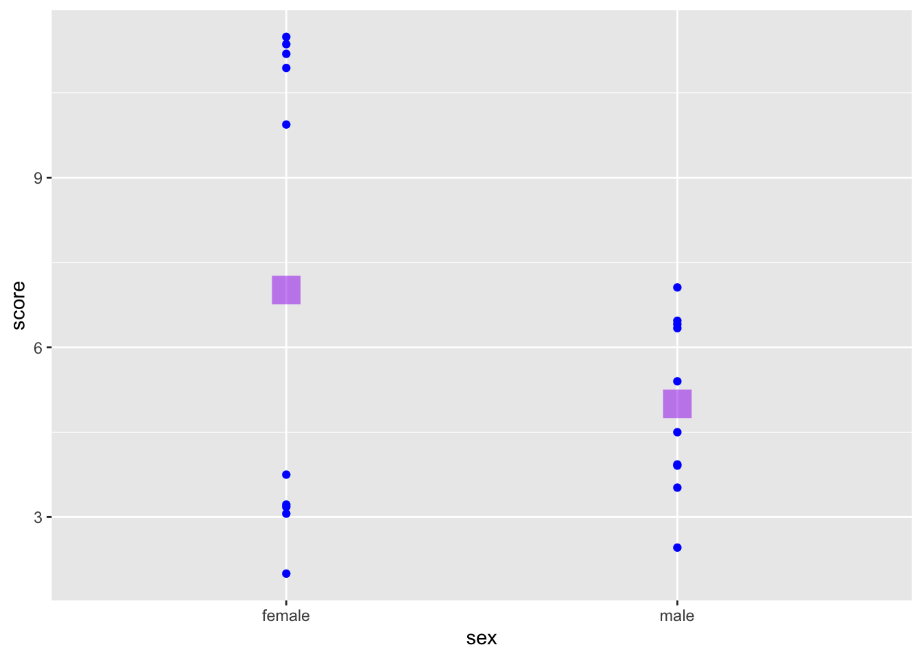
3.4 What about 95% CI!?
If you must stick to inferential statistics:
ggplot(data, aes(x = sex, y = score)) +
  geom_point(colour = "blue") +
  geom_point(stat ="summary", fun = "mean", shape = 15,
colour = "purple", size = 7, alpha = 0.5) +
geom_errorbar(stat = "summary", fun.data = "mean_se",
fun.args = list(mult = 1.96),
colour = "purple", alpha = 0.5) 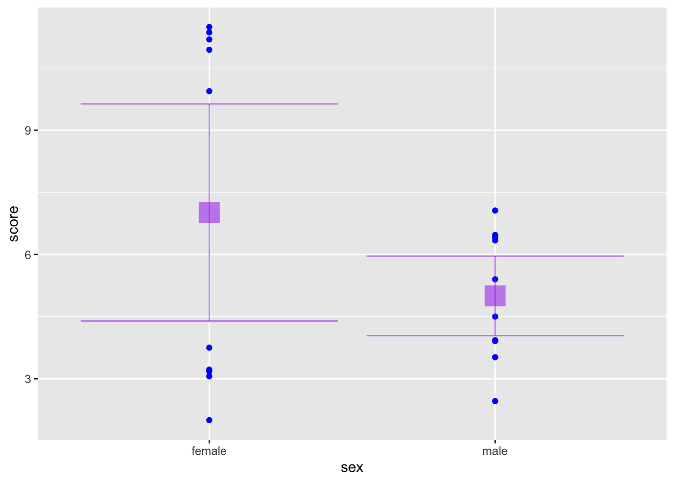
3.5 Onions have layers
ggplot(data, aes(x = sex, y = score)) +
  geom_violin(aes(fill = sex)) +
  geom_point(stat ="summary", fun = "mean", shape = 15,
             colour = "purple", size = 5, alpha = 0.5) +
  geom_errorbar(stat = "summary", fun.data = "mean_se",
                fun.args = list(mult = 1.96),
                width = 0, colour = "purple", alpha = 0.5) +
geom_point(colour = "blue", size = 4, alpha = 0.3) 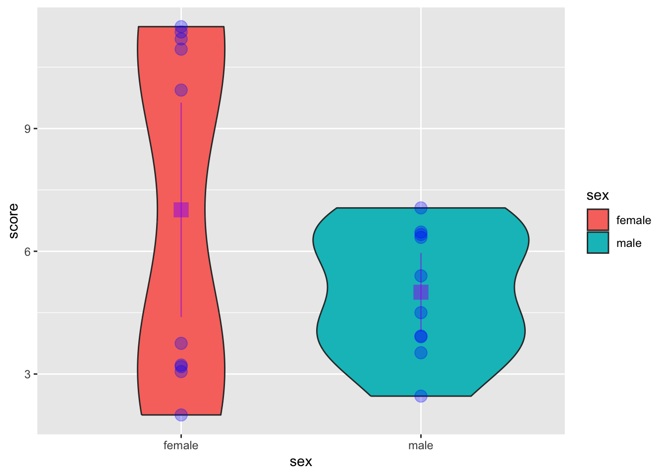
Oh my god, so much information, also oh my god my eyes hurt. And why is that legend there!?!
3.5.1 Let’s do better
Let’s try to improve, by making use of a ggplot-extension:
ggplot(data, aes(x = sex, y = score)) +
  geom_half_violin(aes(fill = sex), side = "l", colour = NA) +
  geom_half_point(side = "r", transformation = position_jitter(height = 0)) +
  geom_point(stat ="summary", fun = "mean", shape = 15,
             colour = "black", size = 3) +
  geom_errorbar(stat = "summary", fun.data = "mean_se",
                fun.args = list(mult = 1.96),
                width = 0, colour = "black") +
  guides(fill = "none")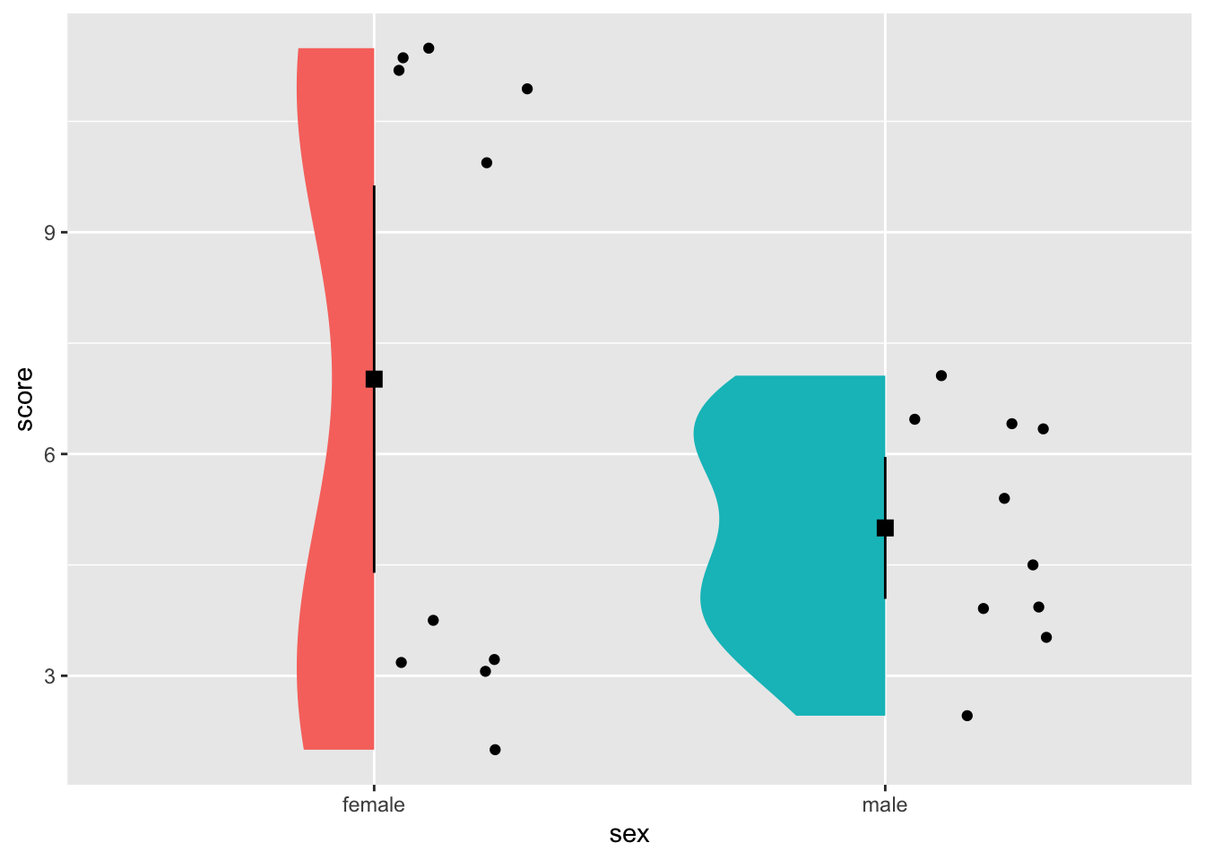
3.5.1.1 Flip the script
Flipping the axes leads to a cloud-and-rain-plot:
ggplot(data, aes(x = sex, y = score)) +
  geom_half_violin(aes(fill = sex), side = "r", colour = NA) +
  geom_half_point(side = "l", transformation = position_jitter(height = 0)) +
  geom_point(stat ="summary", fun = "mean", shape = 15,
             colour = "black", size = 3) +
  geom_errorbar(stat = "summary", fun.data = "mean_se",
                fun.args = list(mult = 1.96),
                width = 0, colour = "black") +
  guides(fill = "none") +
  coord_flip()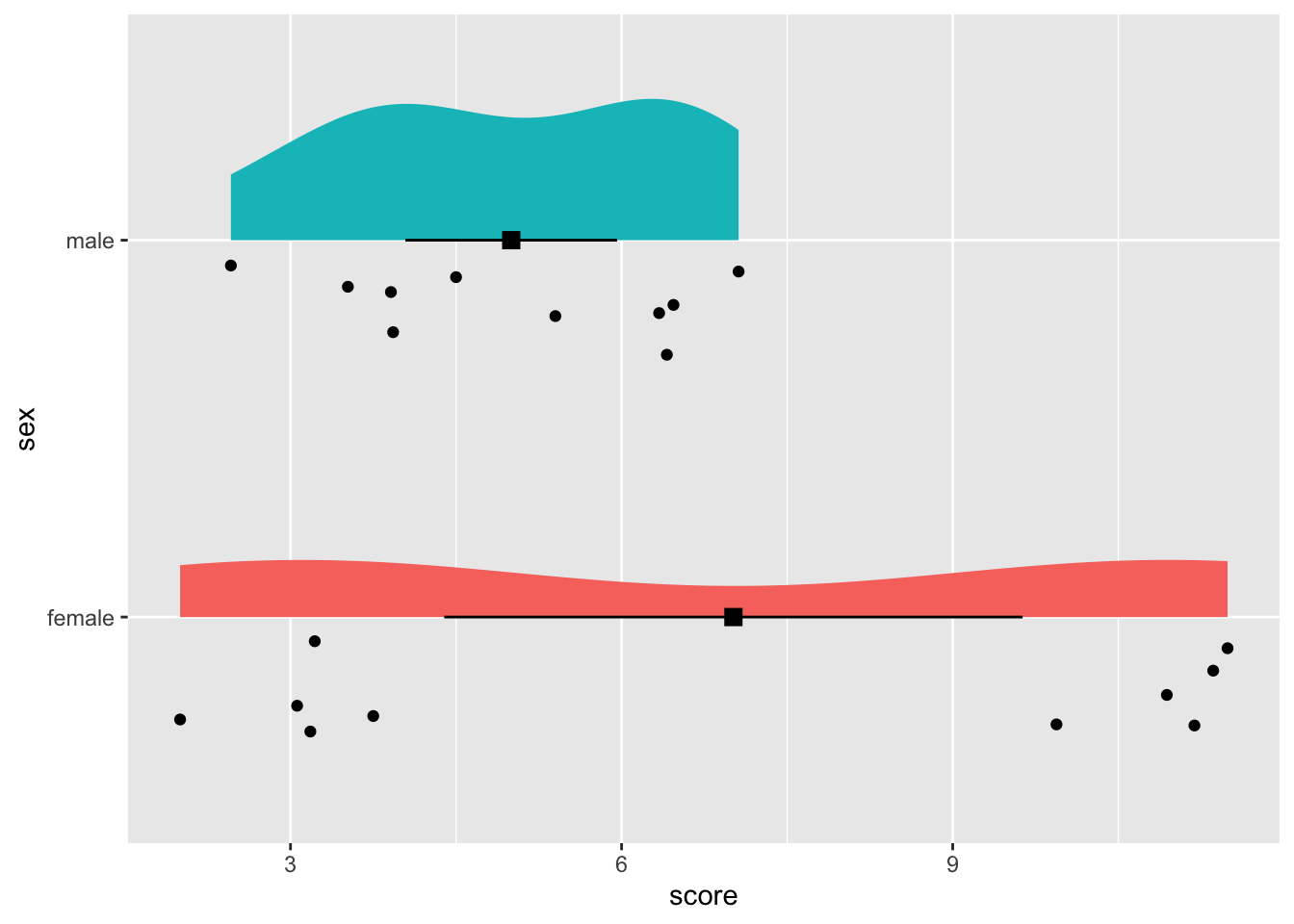
3.6 Customising your graph
3.6.1 A grey background!?
Grey is the default theme because, believe it or not, contrasts work better on a grey background. That might be a pro, aesthetically, it’s a bit less nice. Let’s try a different theme (see also the section on themes!).
ggplot(data, aes(x = sex, y = score)) +
  geom_half_violin(aes(fill = sex), side = "r", colour = NA) +
  geom_half_point(side = "l", transformation = position_jitter(height = 0)) +
  geom_point(stat ="summary", fun = "mean", shape = 15,
             colour = "black", size = 3) +
  geom_errorbar(stat = "summary", fun.data = "mean_se",
                fun.args = list(mult = 1.96),
                width = 0, colour = "black") +
  guides(fill = "none") +
  coord_flip() +
  theme_minimal()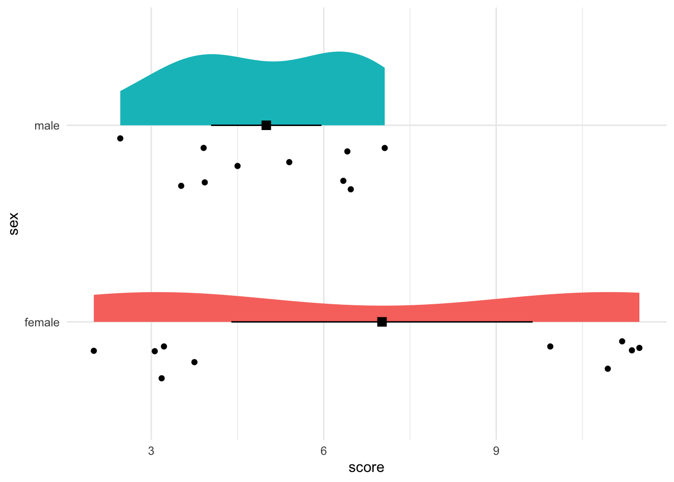
3.6.2 Give it some colour
Defaults colour are useful because they are chosen on how dissimilar they are. We might want to go for aesthetically pleasing colours. See the section on colours.
# install.packages("wesanderson")
library(wesanderson)

ggplot(data, aes(x = sex, y = score)) +
  geom_half_violin(aes(fill = sex), side = "r", colour = NA) +
  geom_half_point(side = "l", colour = "grey", size = 4,
                  transformation = position_jitter(height = 0)) +
  geom_point(stat ="summary", fun = "mean", shape = 15,
             colour = "black", size = 3) +
  geom_errorbar(stat = "summary", fun.data = "mean_se",
                fun.args = list(mult = 1.96),
                width = 0, colour = "black") +
  guides(fill = "none") +
  coord_flip() +
  theme_minimal() +
  scale_fill_manual(values = wes_palette("FantasticFox1"))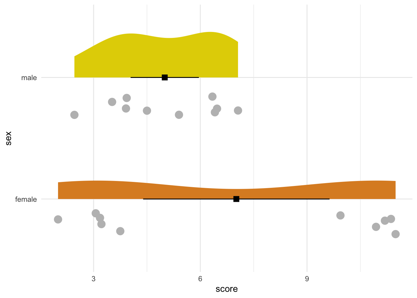
3.6.3 Adding appropriate labels
ggplot(data, aes(x = sex, y = score)) +
  geom_half_violin(aes(fill = sex), side = "r", colour = NA) +
  geom_half_point(side = "l", colour = "grey", size = 4,
                  transformation = position_jitter(height = 0)) +
  geom_point(stat ="summary", fun = "mean", shape = 15,
             colour = "black", size = 3) +
  geom_errorbar(stat = "summary", fun.data = "mean_se",
                fun.args = list(mult = 1.96),
                width = 0, colour = "black") +
  guides(fill = "none") +
  coord_flip() +
  theme_minimal() +
  scale_fill_manual(values = wes_palette("FantasticFox1")) +
  labs(x = NULL, y = "score on word-recognition-task") +
  scale_x_discrete(labels = c("male" = "men", "female" = "women"))
3.6.4 Titles are useful
ggplot(data, aes(x = sex, y = score)) +
geom_half_violin(aes(fill = sex), side = "r", colour = NA) +
geom_half_point(side = "l", colour = "grey", size = 4,
transformation = position_jitter(height = 0)) +
geom_point(stat ="summary", fun = "mean", shape = 15,
colour = "black", size = 3) +
geom_errorbar(stat = "summary", fun.data = "mean_se",
fun.args = list(mult = 1.96),
width = 0, colour = "black") +
guides(fill = "none") +
coord_flip() +
theme_minimal() +
scale_fill_manual(values = wes_palette("FantasticFox1")) +
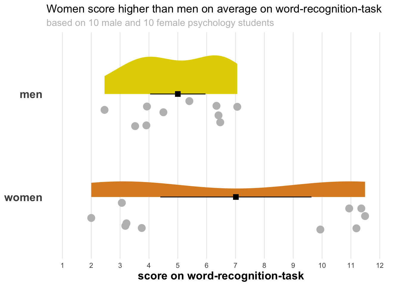
labs(x = NULL, y = "score on word-recognition-task",
title = "Women score higher than men on average on word-recognition-task",
subtitle = "based on 10 male and 10 female psychology students") +
scale_x_discrete(labels = c("male" = "men", "female" = "women"))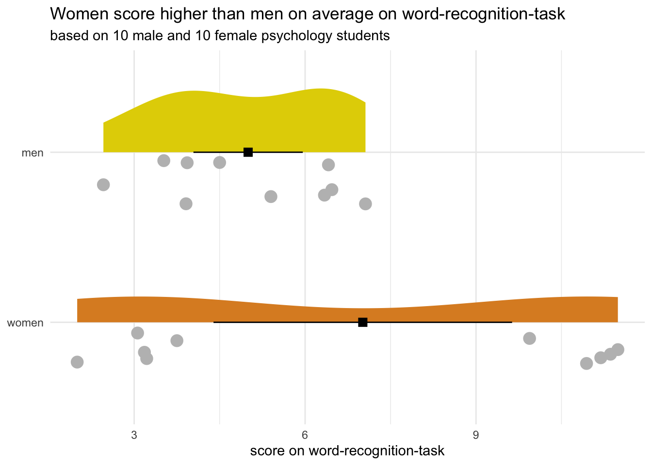
3.6.5 Changing the axes
What if I told you the minimum possible score on the word-recognition-task is 1, and the maximum is 12. Perhaps we want to visualise that:
ggplot(data, aes(x = sex, y = score)) +
  geom_half_violin(aes(fill = sex), side = "r", colour = NA) +
  geom_half_point(side = "l", colour = "grey", size = 4,
                  transformation = position_jitter(height = 0)) +
  geom_point(stat ="summary", fun = "mean", shape = 15,
             colour = "black", size = 3) +
  geom_errorbar(stat = "summary", fun.data = "mean_se",
                fun.args = list(mult = 1.96),
                width = 0, colour = "black") +
  guides(fill = "none") +
  coord_flip() +
  theme_minimal() +
  scale_fill_manual(values = wes_palette("FantasticFox1")) +
  labs(x = NULL, y = "score on word-recognition-task",
       title = "Women score higher than men on average on word-recognition-task",
       subtitle = "based on 10 male and 10 female psychology students") +
  scale_x_discrete(labels = c("male" = "men", "female" = "women")) +
  scale_y_continuous(limits = c(1, 12), breaks = seq(0, 12, 1))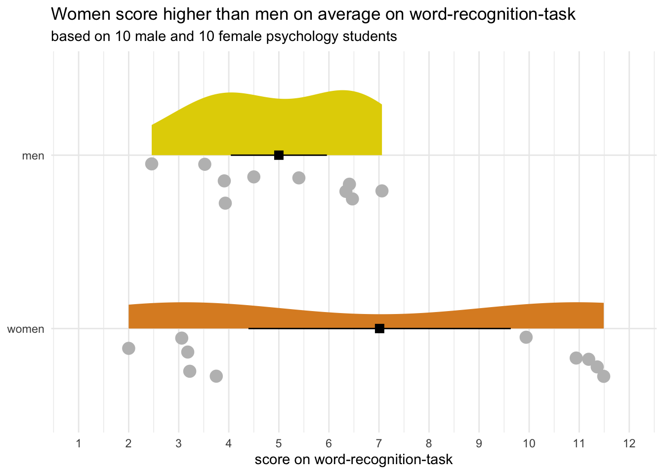
3.6.6 Changing theme elements
You can change many thematic elements in ggplot (see section on theme). Let’s see some at work.
ggplot(data, aes(x = sex, y = score)) +
  geom_half_violin(aes(fill = sex), side = "r", colour = NA) +
  geom_half_point(side = "l", colour = "grey", size = 4,
                  transformation = position_jitter(height = 0)) +
  geom_point(stat ="summary", fun = "mean", shape = 15,
             colour = "black", size = 3) +
  geom_errorbar(stat = "summary", fun.data = "mean_se",
                fun.args = list(mult = 1.96),
                width = 0, colour = "black") +
  guides(fill = "none") +
  coord_flip() +
  theme_minimal() +
  scale_fill_manual(values = wes_palette("FantasticFox1")) +
  labs(x = NULL, y = "score on word-recognition-task",
       title = "Women score higher than men on average on word-recognition-task",
       subtitle = "based on 10 male and 10 female psychology students") +
  scale_x_discrete(labels = c("male" = "men", "female" = "women")) +
  scale_y_continuous(limits = c(1, 12), breaks = seq(0, 12, 1)) +
  theme(
    panel.grid.minor = element_blank(),
    panel.grid.major.y = element_blank(),
    axis.title = element_text(face = "bold", size = 14),
    axis.text.y = element_text(face = "bold", size = 14),
    plot.title = element_text(size = 14),
    plot.subtitle = element_text(size = 12, colour = "grey")
  )