Chapter 5 Improving visualisation III
We’ll now work on a dataset that contains data on whether women feel the pressure to have children from their parents/caretakers, and whether this differs for people with and without children (see Stulp, G & Barrett, L. Do data from large personal networks support cultural evolutionary ideas about kin and fertility? Social Sciences 10(5):177 for several visualisations on this dataset)
data <- structure(list(
  has_child = structure(c(1L, 1L, 1L, 1L, 1L, 1L, 1L, 2L, 2L, 2L, 2L, 2L, 2L, 2L),
                          .Label = c("No children", "Has children"),
                          label = "Do you have children",
                          class = "factor"),
  agreement = structure(c(1L, 2L, 3L, 4L, 5L, 6L, 7L, 1L, 2L, 3L, 4L, 5L, 6L, 7L),
                        .Label = c("Completely disagree",
                                   "Disagree",
                                   "Slightly disagree",
                                   "Neither agree nor disagree",
                                   "Slightly agree",
                                   "Agree",
                                   "Completely agree",
                                   "I don't know",
                                   "Not applicable"),
                        class = "factor"),
  n = c(30L, 35L, 6L, 53L, 66L, 107L, 80L, 86L, 32L, 11L, 20L, 12L, 24L, 14L)),
  row.names = c(NA, -14L), class = "data.frame")
Let’s plot a graph between two categorical variables, whether an individual has children, and whether an individual feel pressure to have children from parents/caretakers (measured on a 7-point scale).
ggplot(data, aes(x = "", y = n, fill = agreement)) +
  geom_bar(stat = "identity", position = "fill") +
  coord_polar("y", start = 0) +
  facet_wrap(~ has_child) +
  labs(fill = "Feels pressure from\nparents to reproduce") +
  theme_void()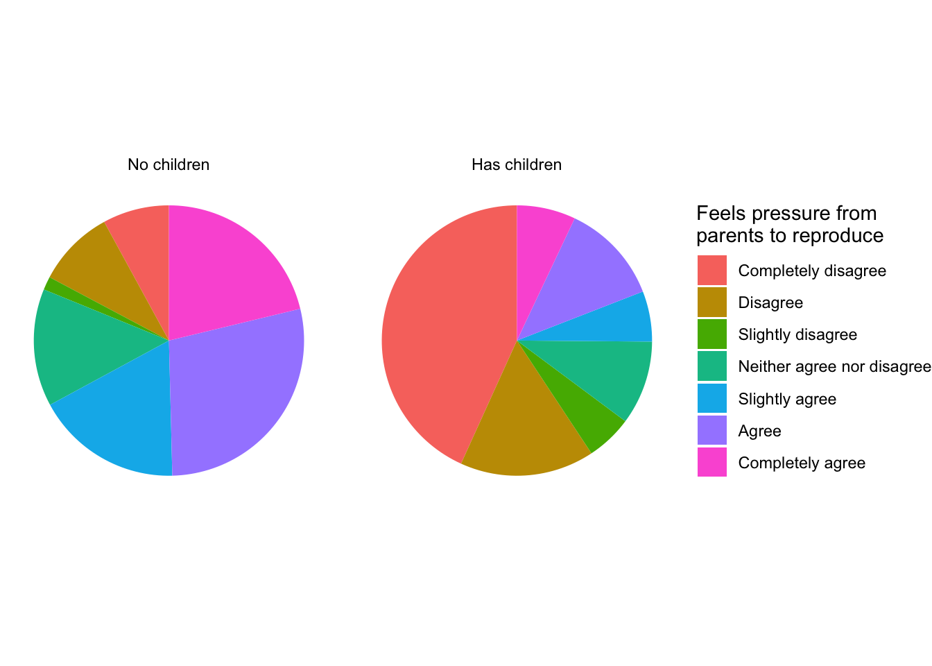
5.1 Angles versus lines
The reason why people love to hate pie charts (in the same way people love to hate comic sans), is because “the information” in pie charts come from the angles in the pie, but people are not so good on judging angles and their relative sizes. People are better at judging lines in either the horizontal and vertical direction. So let’s try to recreate the chart with lines (bars) rather than angles (circles).
ggplot(data, aes(x = has_child, y = n, fill = agreement)) +
  geom_bar(stat = "identity", position = "fill") +
labs(fill = "Feels pressure from\nparents to reproduce") 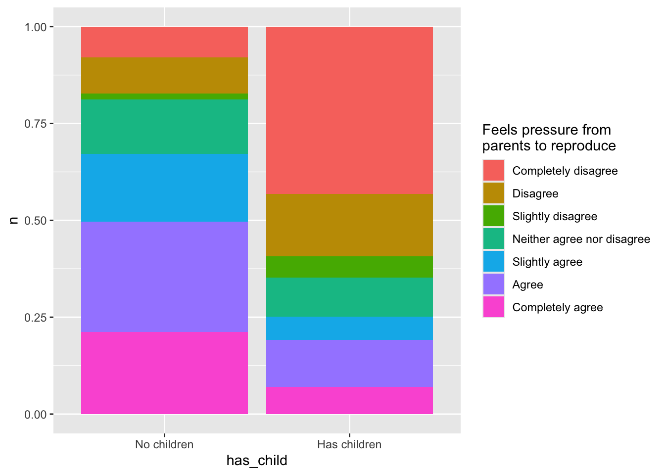
5.2 Above all else …
We almost have all data in the graph … except for sample size! We can fix this in two ways: 1) doing bar charts with counts, 2) doing stacked bar charts with proportions. Let’s have a look:
5.2.1 Bar charts with counts
ggplot(data, aes(x = has_child, y = n, fill = agreement)) +
  geom_bar(stat = "identity", position = "dodge") +
labs(fill = "Feels pressure from\nparents to reproduce") 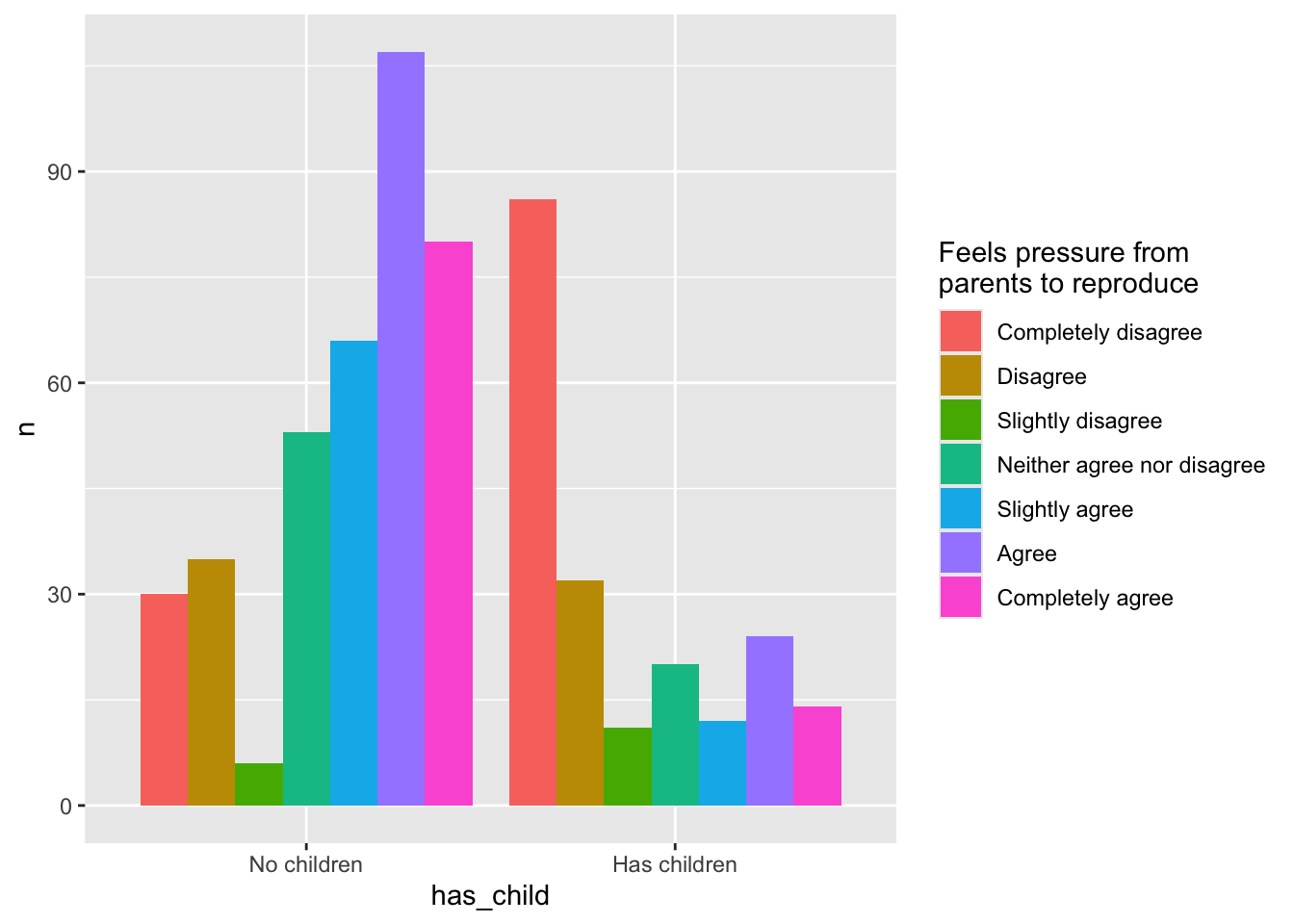
5.2.2 Stacked bar charts with counts
# The below code creates new variable with total counts for mothers and
# women without children
data <- data %>%
  group_by(has_child) %>%
  mutate(n_group = sum(n, na.rm = TRUE))

# Creates dataset with only relevant information on sample size
sample_sizes <- data %>%
  select(has_child, n_group) %>%
  unique() # unique rows information only once

ggplot(data, aes(x = has_child, y = n, fill = agreement)) +
  geom_bar(stat = "identity", position = "fill") +
  labs(fill = "Feels pressure from\nparents to reproduce") +
  geom_text(
    data = sample_sizes, # use different dataset
    aes(y = 0, label = n_group, fill = NULL),
    vjust = 0, colour = "white", size = 8
  )
5.3 Flip the script
People are better at assessing left-to-right different than up-down differences, so let’s flip over x and y.
ggplot(data, aes(x = has_child, y = n, fill = agreement)) +
  geom_bar(stat = "identity", position = "fill") +
  labs(fill = "Feels pressure from\nparents to reproduce") +
  geom_text(
    data = sample_sizes, # use different dataset
    aes(y = 0, label = n_group, fill = NULL),
    hjust = 0, colour = "white", size = 8
  ) +
  coord_flip()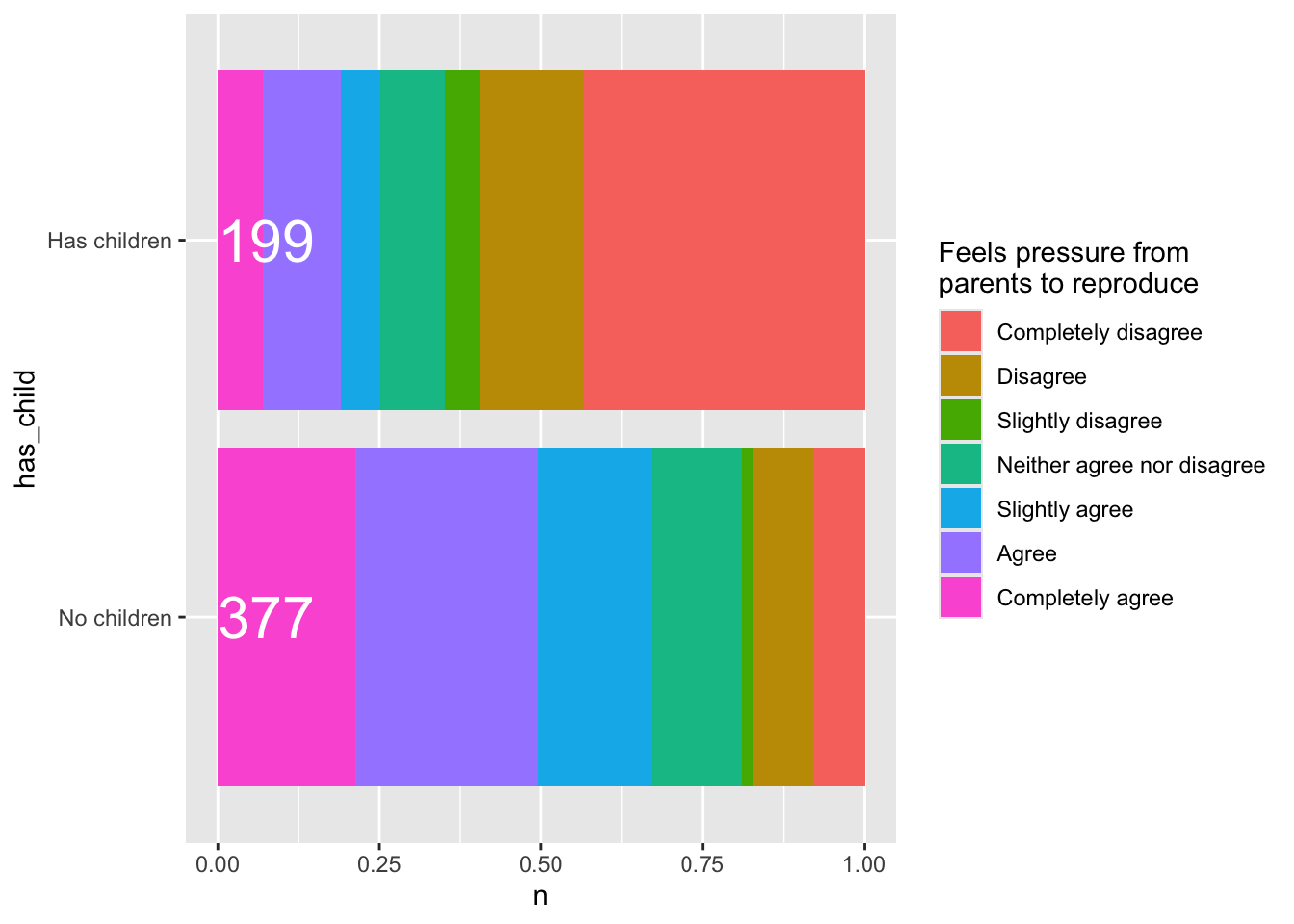
5.4 Customising your graph
5.4.1 A grey background!?
Again, maybe not the grey.
ggplot(data, aes(x = has_child, y = n, fill = agreement)) +
  geom_bar(stat = "identity", position = "fill") +
  labs(fill = "Feels pressure from\nparents to reproduce") +
  geom_text(
    data = sample_sizes, # use different dataset
    aes(y = 0, label = n_group, fill = NULL),
    hjust = 0, colour = "white", size = 8
  ) +
  coord_flip() +
  theme_linedraw()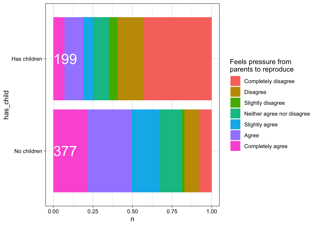
5.4.2 Give it some colour
# install.packages("viridis")
library(viridis)

ggplot(data, aes(x = has_child, y = n, fill = agreement)) +
  geom_bar(stat = "identity", position = "fill") +
  labs(fill = "Feels pressure from\nparents to reproduce") +
  geom_text(
    data = sample_sizes, # use different dataset
    aes(y = 0, label = n_group, fill = NULL),
    hjust = 0, colour = "white", size = 8
  ) +
  coord_flip() +
  theme_linedraw() +
  scale_fill_viridis_d()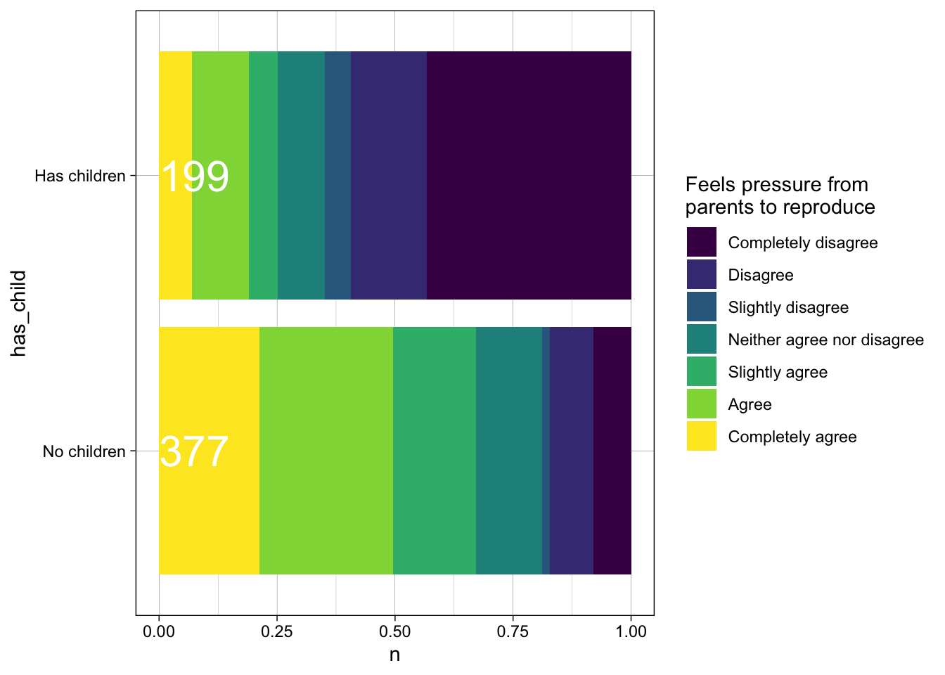
5.4.3 Adding appropriate labels
ggplot(data, aes(x = has_child, y = n, fill = agreement)) +
  geom_bar(stat = "identity", position = "fill") +
  geom_text(
    data = sample_sizes, # use different dataset
    aes(y = 0, label = n_group, fill = NULL),
    hjust = 0, colour = "white", size = 8
  ) +
  coord_flip() +
  theme_linedraw() +
  scale_fill_viridis_d() +
  labs(x = NULL, y = "Proportion",
fill = "Feels pressure from\nparents to reproduce") 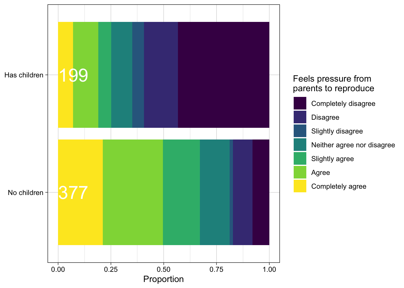
5.4.4 Titles are useful
ggplot(data, aes(x = has_child, y = n, fill = agreement)) +
  geom_bar(stat = "identity", position = "fill") +
  geom_text(
    data = sample_sizes, # use different dataset
    aes(y = 0, label = n_group, fill = NULL),
    hjust = 0, colour = "white", size = 8
  ) +
  coord_flip() +
  theme_linedraw() +
  scale_fill_viridis_d() +
  labs(x = NULL, y = "Proportion",
       fill = "Feels pressure from\nparents to reproduce",
       title = "Only women without children feel pressure to reproduce",
subtitle = "based on responses from 576 Dutch women") 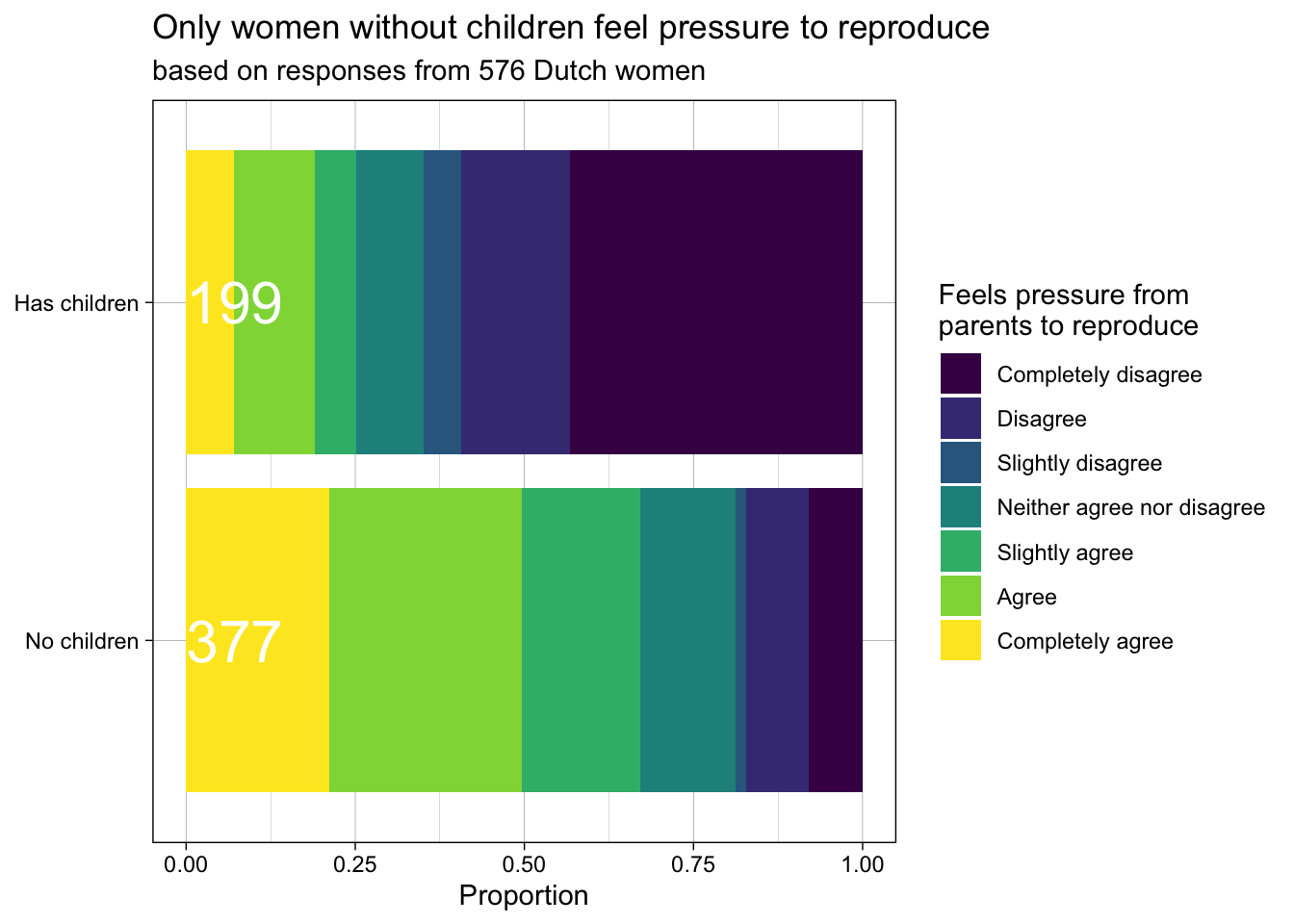
5.4.5 Changing the axes
# install.packages("scales")
library(scales)

ggplot(data, aes(x = has_child, y = n, fill = agreement)) +
  geom_bar(stat = "identity", position = "fill") +
  geom_text(
    data = sample_sizes, # use different dataset
    aes(y = 0, label = n_group, fill = NULL),
    hjust = 0, colour = "white", size = 8
  ) +
  coord_flip() +
  theme_linedraw() +
  scale_fill_viridis_d() +
  labs(x = NULL, y = NULL,
       fill = "Feels pressure from\nparents to reproduce",
       title = "Only women without children feel pressure to reproduce",
       subtitle = "based on responses from 576 Dutch women") +
  scale_y_continuous(breaks = seq(0, 1, 0.25),
                     labels = scales::percent)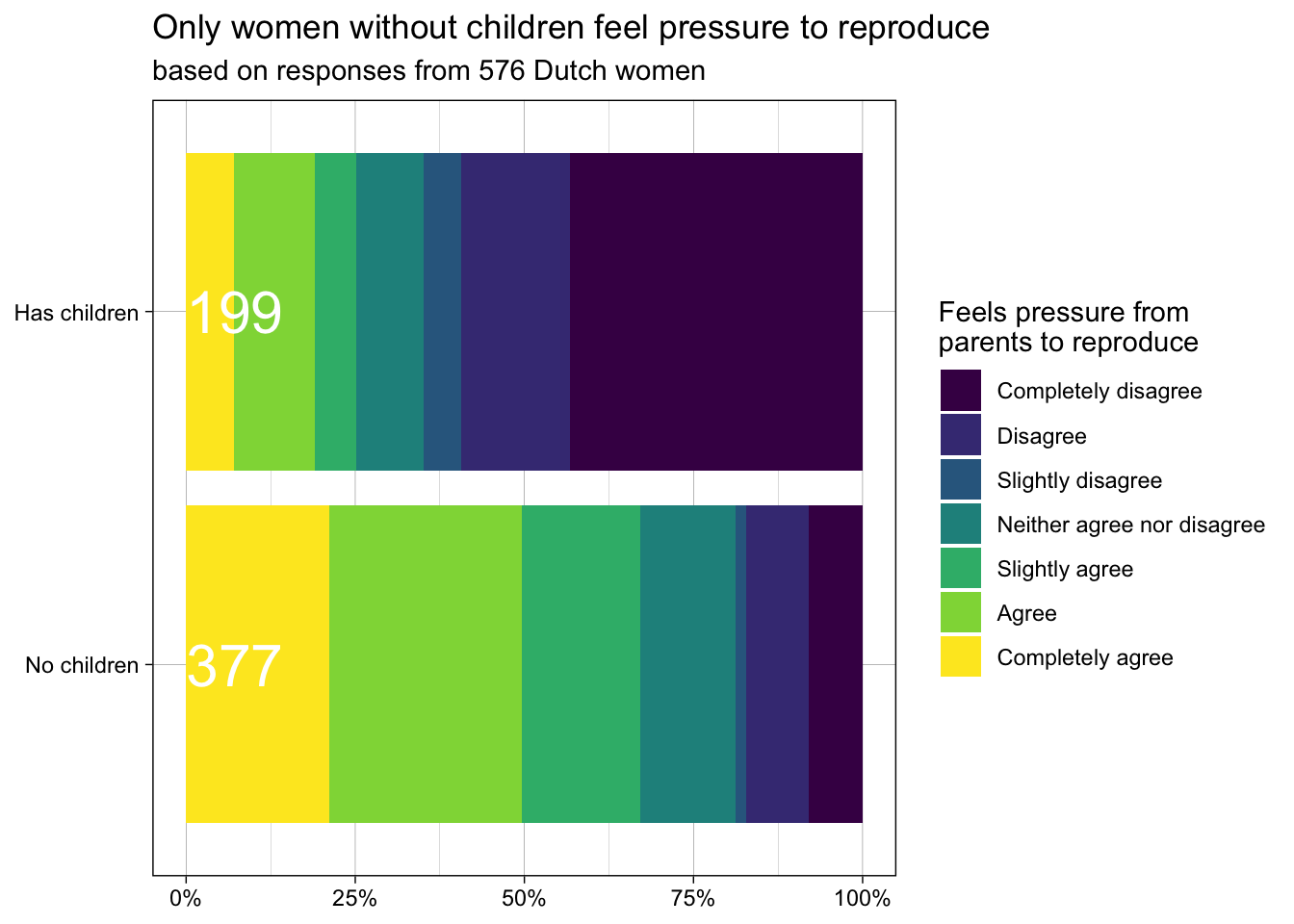
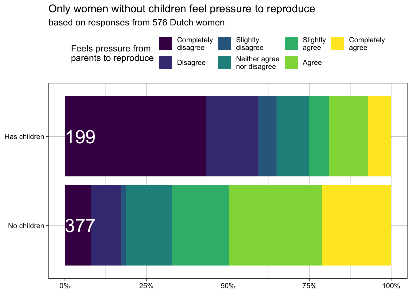
5.4.6 Changing the legend
# install.packages("forcats")
library(forcats)

ggplot(data, aes(x = has_child, y = n, fill = fct_rev(agreement))) +
  geom_bar(stat = "identity", position = "fill") +
  geom_text(
    data = sample_sizes, # use different dataset
    aes(y = 0, label = n_group, fill = NULL),
    hjust = 0, colour = "white", size = 8
  ) +
  coord_flip() +
  theme_linedraw() +
  scale_fill_viridis_d(
    direction = -1,
    breaks = levels(data$agreement),
    labels = c("Completely\ndisagree", "Disagree", "Slightly\ndisagree",
               "Neither agree\nnor disagree", "Slightly\nagree", "Agree",
               "Completely\nagree", "I don't\nknow", "Not\napplicable")
  ) +
  labs(x = NULL, y = NULL,
       fill = "Feels pressure from\nparents to reproduce",
       title = "Only women without children feel pressure to reproduce",
       subtitle = "based on responses from 576 Dutch women") +
  scale_y_continuous(breaks = seq(0, 1, 0.25),
                     labels = scales::percent) +
  theme(
    legend.position = "top"
  )
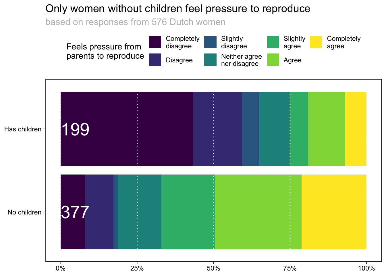
5.4.7 Changing theme elements
ggplot(data, aes(x = has_child, y = n, fill = fct_rev(agreement))) +
  geom_bar(stat = "identity", position = "fill") +
  geom_text(
    data = sample_sizes, # use different dataset
    aes(y = 0, label = n_group, fill = NULL),
    hjust = 0, colour = "white", size = 8
  ) +
  coord_flip() +
  theme_linedraw() +
  scale_fill_viridis_d(
    direction = -1,
    breaks = levels(data$agreement),
    labels = c("Completely\ndisagree", "Disagree", "Slightly\ndisagree",
               "Neither agree\nnor disagree", "Slightly\nagree", "Agree",
               "Completely\nagree", "I don't\nknow", "Not\napplicable")
  ) +
  labs(x = NULL, y = NULL,
       fill = "Feels pressure from\nparents to reproduce",
       title = "Only women without children feel pressure to reproduce",
       subtitle = "based on responses from 576 Dutch women") +
  scale_y_continuous(breaks = seq(0, 1, 0.25), labels = scales::percent) +
  theme(
    legend.position = "top",
    panel.grid.minor = element_blank(),
    panel.grid.major.y = element_blank(),
    panel.grid.major.x = element_line(colour = "white", linetype = "dotted", size = 0.5),
    panel.background = element_rect(fill = NA),
    panel.ontop = TRUE,
    plot.title = element_text(size = 14),
    plot.subtitle = element_text(size = 12, colour = "grey")
) 
5.5 Going wild
data <- structure(list(
  Heeft_Kind = structure(c(1L, 1L, 1L, 1L, 1L, 1L, 1L, 2L, 2L, 2L, 2L, 2L, 2L, 2L),
                         .Label = c("Nee", "Ja"), label = "Hebt u kinderen?", class = "factor"),
  start_y_adj = c(-0.258620689655172, -0.179045092838196, -0.0862068965517241,
                    -0.0702917771883289, 0.0702917771883289, 0.245358090185676,
                    0.529177718832891, -0.698492462311558, -0.266331658291457,
                    -0.105527638190955, -0.050251256281407, 0.050251256281407,
                    0.110552763819095, 0.231155778894472),
  end_y_adj = c(-0.179045092838196, -0.0862068965517241, -0.0702917771883289,
                0.0702917771883289,  0.245358090185676, 0.529177718832891,
                0.741379310344828,  -0.266331658291457, -0.105527638190955,
                -0.050251256281407,  0.050251256281407, 0.110552763819095,
                0.231155778894472,  0.301507537688442),
  outcome_F = structure(c(1L, 2L, 3L, 4L,
    5L, 6L, 7L, 1L, 2L, 3L, 4L, 5L, 6L, 7L),
    .Label = c("Helemaal niet mee eens",  "Niet mee eens", "Een beetje niet mee eens",
               "Niet mee eens/niet mee oneens",  "Een beetje mee eens", "Mee eens",
               "Helemaal mee eens", "Weet ik niet", "Niet van toepassing"),
    class = "factor")),
  row.names = c(NA, -14L), class = "data.frame")

# install.packages("ggtext")
library(ggtext)

ggplot(data, aes(xmin = as.numeric(Heeft_Kind) - 0.45,
                 xmax = as.numeric(Heeft_Kind) + 0.45,
                 ymin = start_y_adj, ymax = end_y_adj,
                 fill = fct_rev(outcome_F))) +
  geom_rect() +
  scale_x_continuous(
    breaks = c(1, 2),
    labels = c("Women without children<br> <i style='color:grey'>N = 377</i>",
              "Women with children<br> <i style='color:grey'>N = 199</i>")
  ) +
  scale_y_continuous(limits = c(-1, 1),
                     breaks = c(-1, -0.5, 0, 0.5, 1),
                     labels = c("100%", "50%", "0%", "50%", "100%")) +
  theme(panel.grid.major = element_blank(),
        legend.position = "top") +
  scale_fill_manual(#values = rev(c('#b2182b','#ef8a62','#fddbc7',
                    #             '#f7f7f7','#d1e5f0','#67a9cf','#2166ac')),
                    values = c("Helemaal niet mee eens" = '#b2182b',
                               "Niet mee eens" = '#ef8a62',
                               "Een beetje niet mee eens" = '#fddbc7',
                               "Niet mee eens/niet mee oneens" = '#f7f7f7',
                               "Een beetje mee eens" = '#d1e5f0',
                               "Mee eens" = '#67a9cf',
                               "Helemaal mee eens" = '#2166ac'),
                    breaks = c("Helemaal niet mee eens",
                                "Niet mee eens/niet mee oneens",
                                "Helemaal mee eens"),
                    labels = c("Completely disagree",
                               "Neither agree/disagree",
                               "Completely agree"),
                    guide = guide_legend(title.position = "top")) +
  coord_flip(clip = "off")  +
  labs(fill = "I feel pressure from my parents to have children") +
  theme(
    axis.text = element_text(lineheight = unit(0.7, "lines")),
    axis.title = element_text(hjust = 1),
    axis.text.x = element_markdown(lineheight = 1.2, size = 14),
    axis.text.y = element_markdown(lineheight = 1.2, size = 14),
    axis.ticks.y = element_blank(),
    legend.title = element_text(size = 14, face = "bold"),
    legend.text = element_text(lineheight = unit(0.7, "lines"), size = 11),
    panel.grid.minor = element_blank(),
    panel.grid.major.y = element_blank(),
    panel.grid.major.x = element_line(colour = "white", linetype = "dotted"),
    panel.background = element_rect(fill = NA),
    panel.ontop = TRUE,
    legend.margin = margin(r = 0, l = 0),
    legend.key.width = unit(0.5, 'lines'),
    legend.key.height  = unit(1.2, 'lines')
  )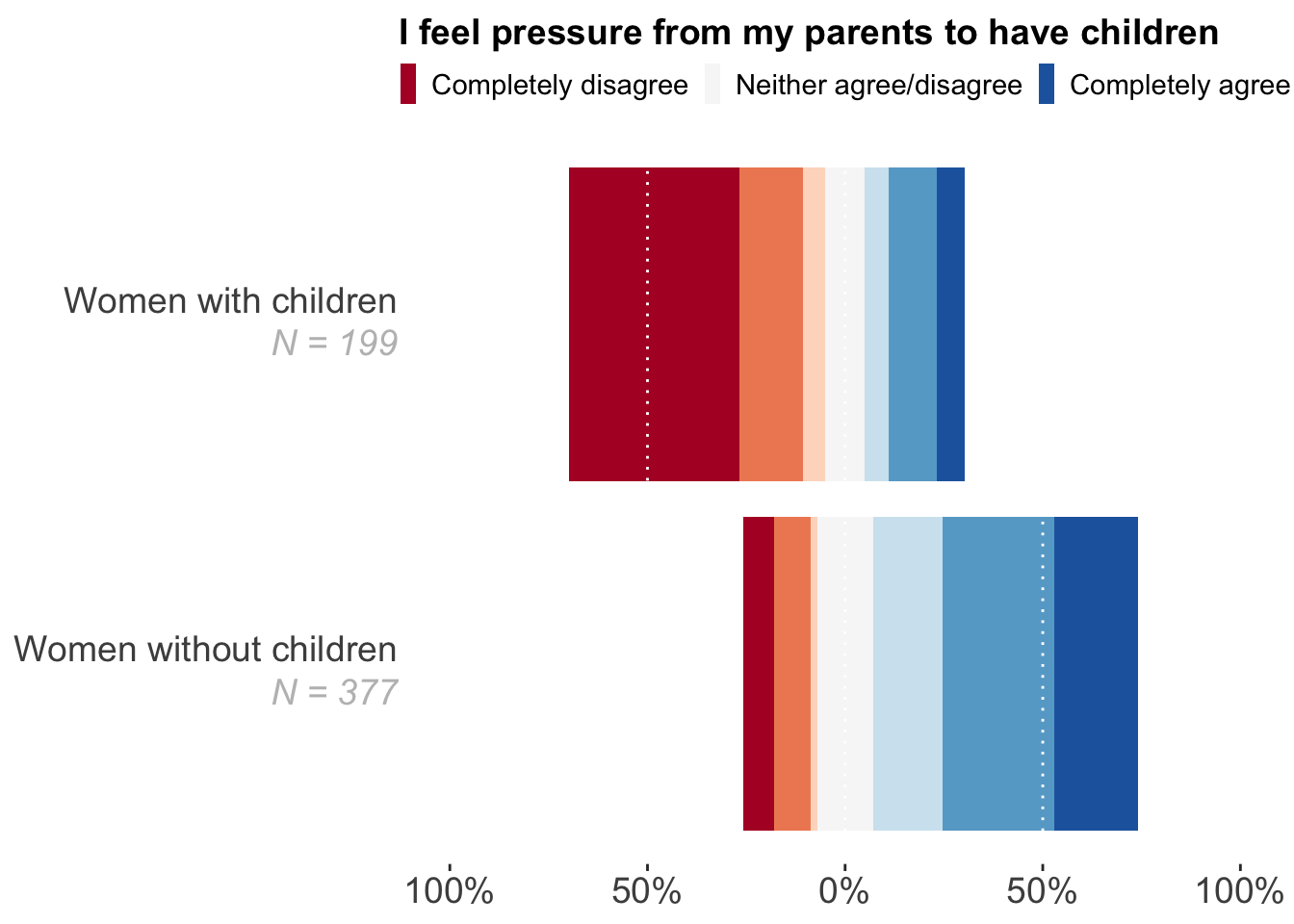
Please see Stulp, G & Barrett, L. Do data from large personal networks support cultural evolutionary ideas about kin and fertility? Social Sciences 10(5):177 for a version of this paper. The code to produce the plots in the paper can be found here: https://doi.org/10.34894/DTCZWA.