Chapter 6 Work on your own data
6.1 Esther Carlitz
I’ve got a dataset on hormones measured in hair of some monkeys. The hair is cut into 2 segments and samples are derived from two different years. I’d like to visualize hormonal difference between sex groups (w, m, mk, mv) regarding
hormone value of segment 1 and segment 2 between years
hormone difference between segment 2 minus segment 1 between years
cortisol would be enough right now but I would be interested in testo and prog later.
I have experience in R/ggplot2 but would be interesting to learn about other packages, too if you feel it is useful.
6.1.2 Repeatability in measurement
ggplot(esther, aes(x = Segment, y = `cortisol \r\n(pg/mg)`)) +
  geom_line(aes(group = `externe ID`), colour = "grey") + # indicate that points come from same individuals (= group)
  geom_point() +
  theme_minimal() +
  facet_wrap(~ Year) +
  labs(y = "Cortisol (pg/mg)")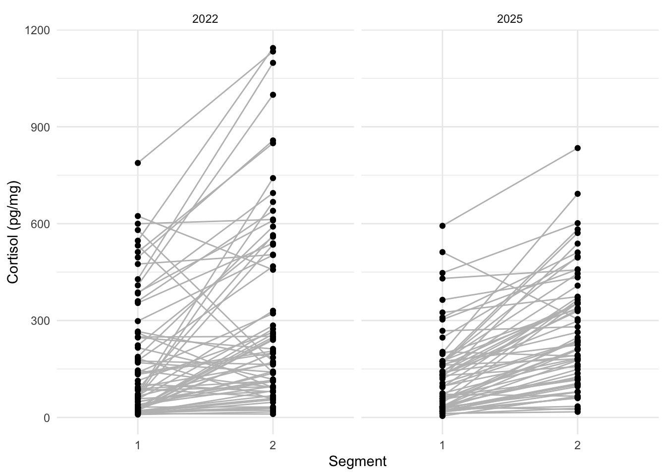
6.1.3 Difference in segment values per year
esther_wide <- esther |>
# reorder data such that segments next to one another as columns
pivot_wider(id_cols = c("Year", "externe ID", "Sex"), names_from = "Segment", values_from = "cortisol \r\n(pg/mg)") %>%
mutate(difference = `2` - `1`)
ggplot(esther_wide, aes(x = difference)) +
geom_histogram() +
facet_grid(Sex~Year) +
theme_linedraw() +
labs(x = "difference cortisol (segment 2 - segment 1)")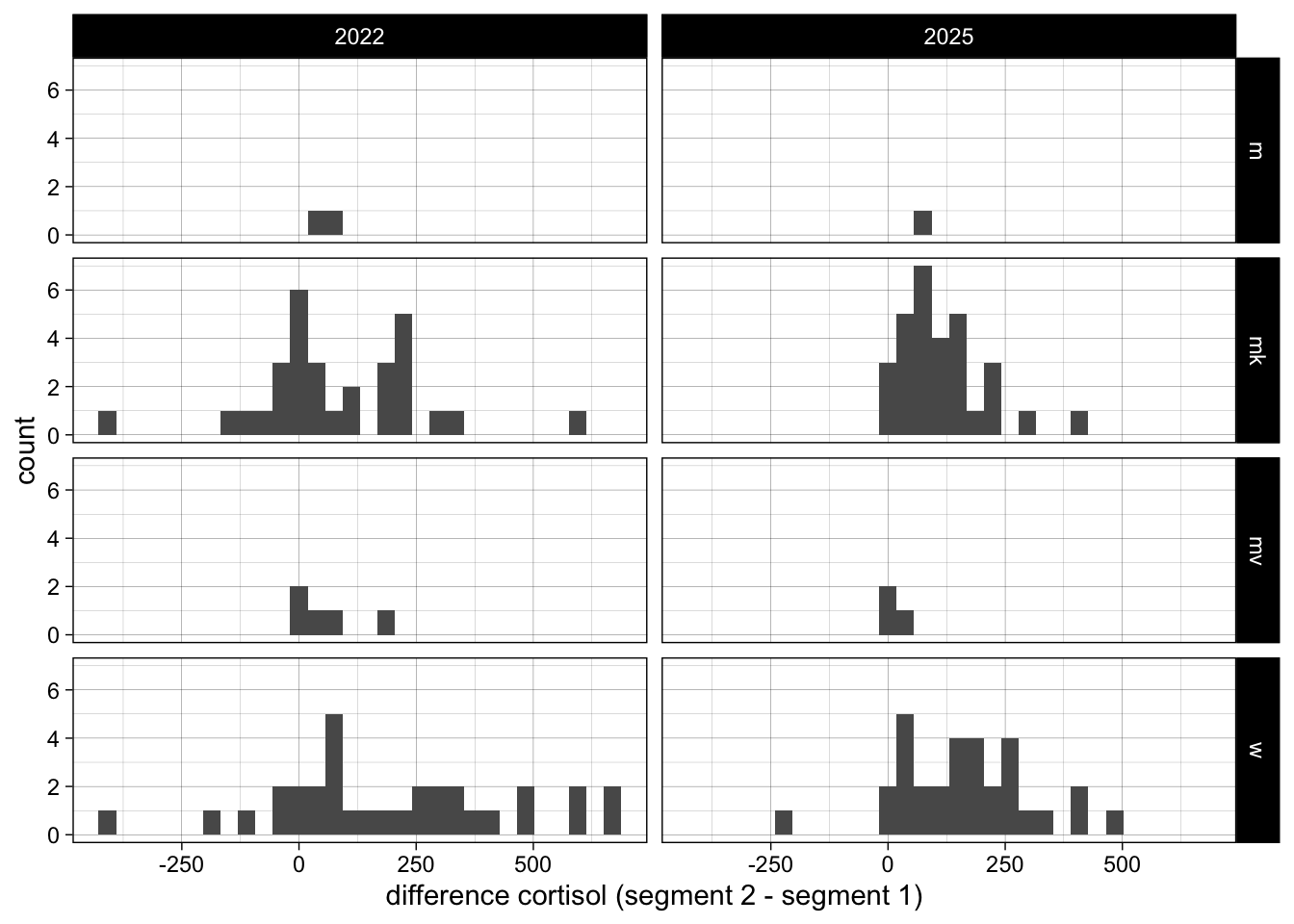 ### Differences across sex
ggplot(esther, aes(x = Sex, y = `cortisol \r\n(pg/mg)`)) +
  geom_point(aes(colour = Segment), position = position_nudge(x = 0.1)) +
  geom_boxplot(position = position_nudge(x = -0.1), width = 0.25) +
  facet_wrap(~Year) +
  theme_classic() +
  scale_colour_brewer(palette = "Set1") +
  labs(y = "Cortisol (pg/mg)")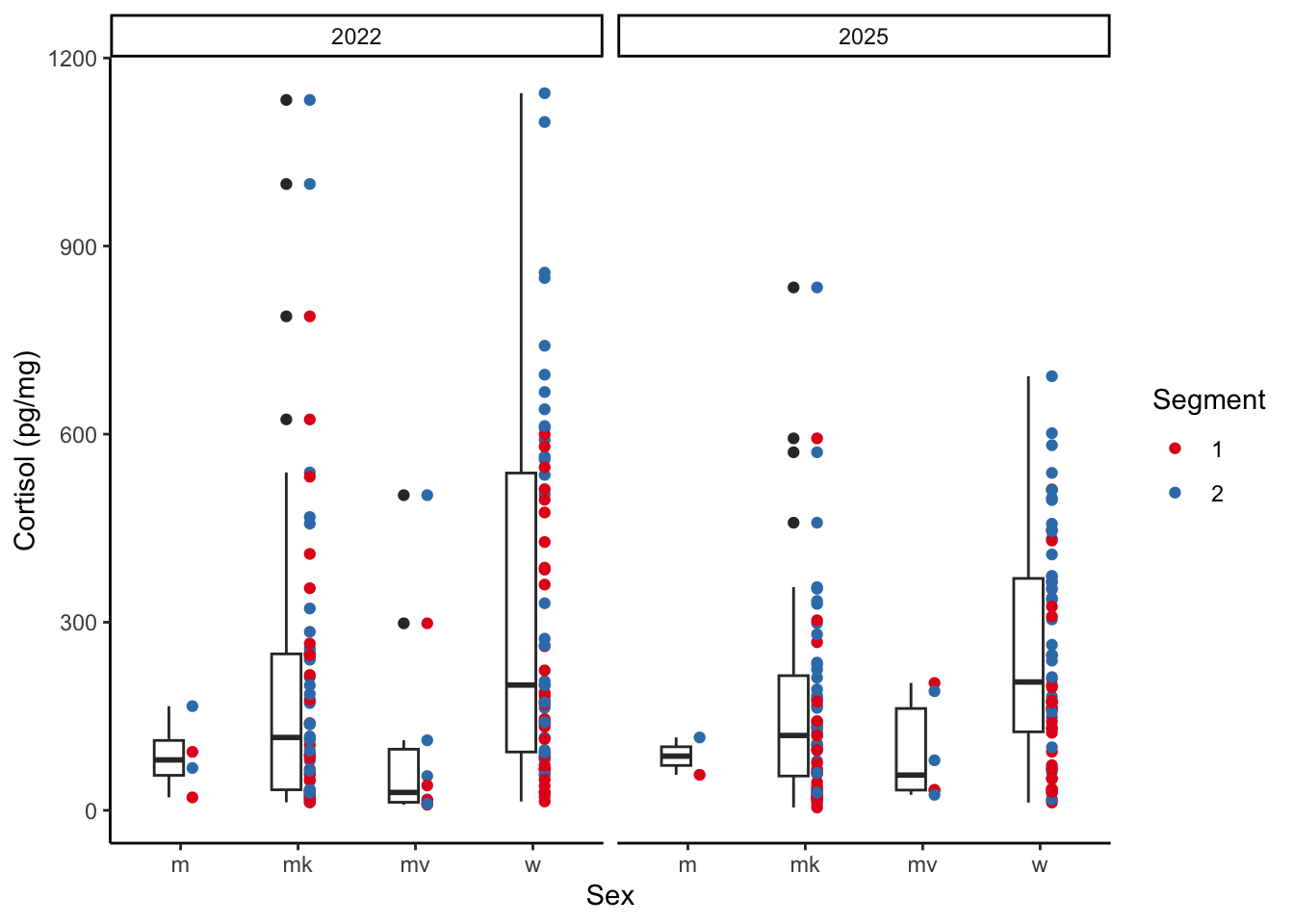
6.2 Yuheng Sun
6.2.2 Visualisation I: variation in fitness
library(dplyr)
library(ggplot2)

fit_per_ind <- sun |> # "|>" means "then do this"
  # for each bird
  group_by(BirdID) |>
  # summarise total number of recruits
  summarise(total_recruits = sum(NumberOfAnnualRecruit, na.rm = TRUE))

ggplot(fit_per_ind, aes(x = total_recruits)) +
  geom_histogram(binwidth = 1, fill = "lightblue") +
  labs(x = "Total number of recruits", y = "Frequency") +
theme_minimal() 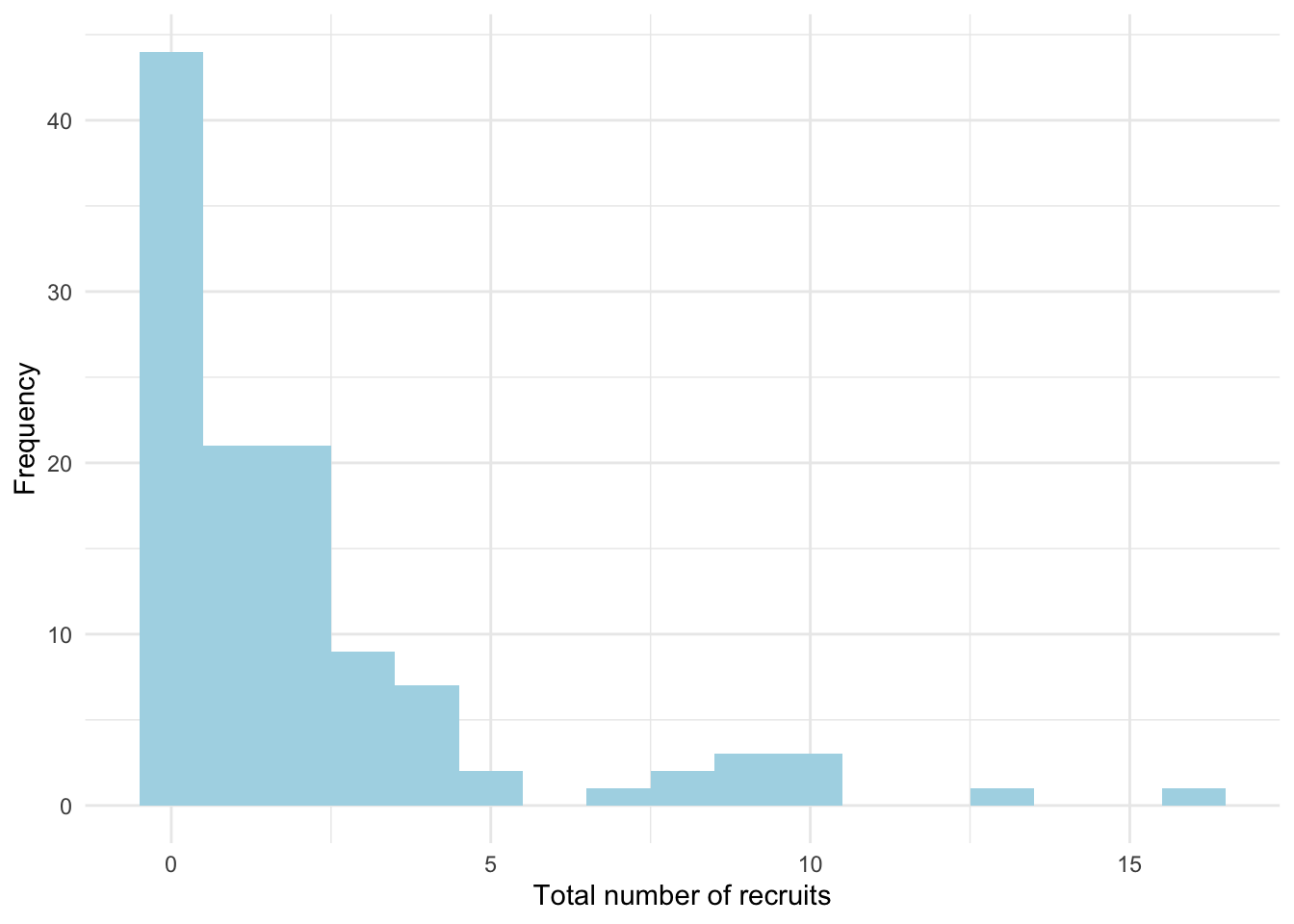
6.2.3 Visualisation II: age and recruitment
library(ggplot2)

ggplot(sun, aes(x = Age, y = NumberOfAnnualRecruit, colour = RearingEnv, fill = RearingEnv)) +
  geom_jitter(alpha = 0.8) +
  geom_smooth(method = "lm") +
  labs(x = "Age", y = "Number of recruits",
       colour = "rearing\nenvironment", fill = "rearing\nenvironment") +
  scale_x_continuous(breaks = c(0:9)) +
  scale_colour_brewer(palette = "Set2", labels = c("N" = "Noisy", "Q" = "Quiet"),
                      aesthetics = c("colour", "fill")) +
  theme_classic() +
  theme(legend.position = c(0.9, 0.9))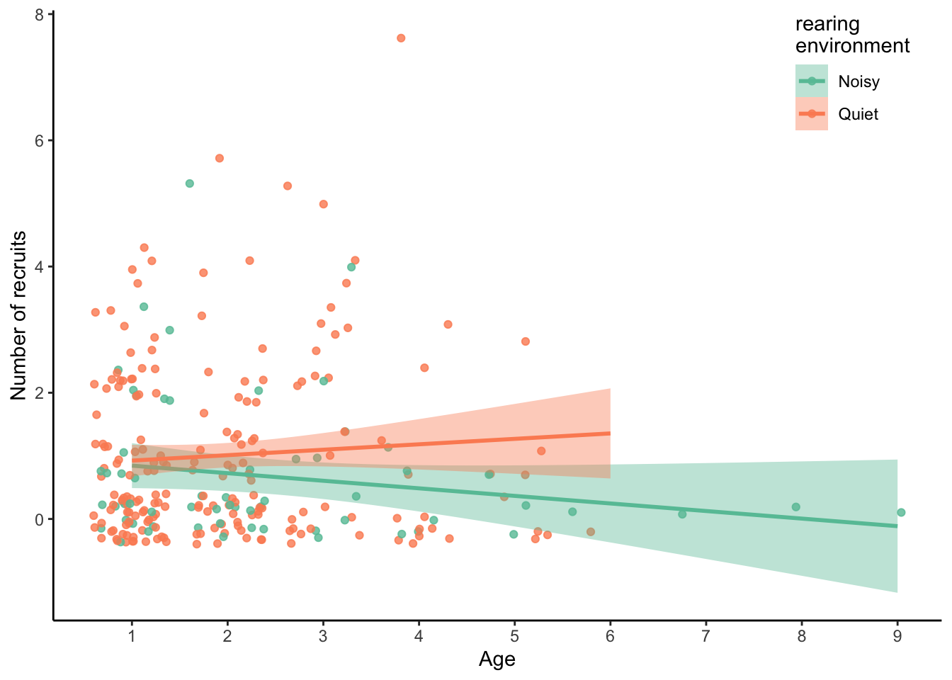
6.2.4 Visualisation III: senescence trajectories
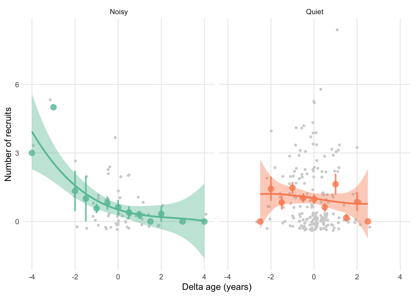
“What I would like to visualise: Reproductive senescence trajectories of the birds reared in different early-life environments More specifically, the y-axis would be ARO, the x-axis would be DeltaAge, and the groups would be RearingEnv = Q and RearingEnv = N.(in other word, a curve for Q and a curve for N, respectively)”
ggplot(sun, aes(x = DeltaAge, y = NumberOfAnnualRecruit,
                colour = RearingEnv, fill = RearingEnv)) +
  geom_jitter(size = 1, colour = "lightgrey") +
  # Add points for averages
  geom_point(stat = "summary", fun = "mean", size = 3, alpha = 0.8) +
  # Add errorbars
  geom_errorbar(stat = "summary", fun.data = "mean_se",
                size = 1, alpha = 0.8, width = 0) +
  # Add cubic function
  geom_smooth(method = "lm", formula = "y ~ x + I(x^2) + I(x^3)") +
  facet_wrap(~factor(RearingEnv, levels = c("N", "Q"), labels = c("Noisy", "Quiet"))) +
  labs(x = "Delta age (years)", y = "Number of recruits",
       colour = "rearing\nenvironment", fill = "rearing\nenvironment") +
  #scale_x_continuous(breaks = c(0:9)) +
  scale_colour_brewer(palette = "Set2", labels = c("N" = "Noisy", "Q" = "Quiet"),
                      aesthetics = c("colour" , "fill")) +
  theme_minimal() +
  theme(
    legend.position = "none",
    panel.grid.minor = element_blank()
  )
6.2.5 Visualisation IV: model estimates
You’d like to control for this: Year: the year when the bird bred NatalEnv: the environment where the bird was born (not necessarily the same as the rearing environment), also with two levels (Q/N) BroodSizeHatchling: size of the brood where the bird was born MeanAge: mean of the age that the bird presented in the dataset. This is to control for the between-individual effect NatalBroodRef: reference of the natal brood FosterBrood: reference of the rearing brood BirdID: bird ID
Below model leaves out NatalBroodRef and FosterBrood are not included because that requires more sophisticated models.
This is a simple intercept only model:
# install.packages("lme4")
library(lme4)

mod <- lmer(NumberOfAnnualRecruit ~ DeltaAge + Year + NatalEnv + BroodSizeHatchling +
              MeanAge + (1|BirdID), data = sun)
summary(mod)
## Linear mixed model fit by REML ['lmerMod']
## Formula:
## NumberOfAnnualRecruit ~ DeltaAge + Year + NatalEnv + BroodSizeHatchling +
## MeanAge + (1 | BirdID)
## Data: sun
##
## REML criterion at convergence: 851.3
##
## Scaled residuals:
## Min 1Q Median 3Q Max
## -2.1309 -0.6277 -0.2805 0.3611 5.2639
##
## Random effects:
## Groups Name Variance Std.Dev.
## BirdID (Intercept) 0.1871 0.4325
## Residual 1.3813 1.1753
## Number of obs: 256, groups: BirdID, 115
##
## Fixed effects:
## Estimate Std. Error t value
## (Intercept) 78.53942 45.27273 1.735
## DeltaAge -0.19072 0.07713 -2.473
## Year -0.03959 0.02259 -1.752
## NatalEnvQ 0.48756 0.23413 2.082
## BroodSizeHatchling 0.19558 0.09210 2.123
## MeanAge 0.32972 0.11037 2.987
##
## Correlation of Fixed Effects:
## (Intr) DeltAg Year NtlEnQ BrdSzH
## DeltaAge 0.293
## Year -1.000 -0.293
## NatalEnvQ -0.125 -0.035 0.120
## BrdSzHtchln 0.040 0.014 -0.049 0.130
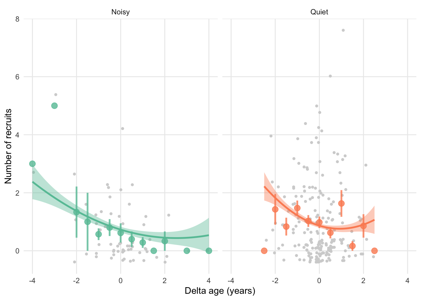
## MeanAge 0.316 0.094 -0.320 -0.067 0.029Below graph has “raw” datapoints (so not controlled for any variables), whereas the fitted lines go through the prediction of mixed model (model above).
ggplot(sun, aes(x = DeltaAge, y = NumberOfAnnualRecruit,
                colour = RearingEnv, fill = RearingEnv)) +
  geom_jitter(size = 1, colour = "lightgrey") +
  # Add points for averages
  geom_point(stat = "summary", fun = "mean", size = 3, alpha = 0.8) +
  # Add errorbars
  geom_errorbar(stat = "summary", fun.data = "mean_se",
                size = 1, alpha = 0.8, width = 0) +
  # Add cubic function
  # THIS IS DIFFERENT NOW
  geom_smooth(
    aes(y = predictions),
    method = "lm", formula = "y ~ x + I(x^2) + I(x^3)"
  ) +
  facet_wrap(~factor(RearingEnv, levels = c("N", "Q"), labels = c("Noisy", "Quiet"))) +
  labs(x = "Delta age (years)", y = "Number of recruits",
       colour = "rearing\nenvironment", fill = "rearing\nenvironment") +
  #scale_x_continuous(breaks = c(0:9)) +
  scale_colour_brewer(palette = "Set2", labels = c("N" = "Noisy", "Q" = "Quiet"),
                      aesthetics = c("colour" , "fill")) +
  theme_minimal() +
  theme(
    legend.position = "none",
    panel.grid.minor = element_blank()
  )
6.3 Life history theory data
These data come from this beautiful resource: https://esajournals.onlinelibrary.wiley.com/doi/10.1890/15-0846R.1
See here for explanation variables.
library(readr)
library(dplyr)
library(ggplot2)
lht <- read_csv("https://stulp.gmw.rug.nl/schier/data/Amniote_Database_Aug_2015.csv",
na = c("", "NA", -999))6.3.2 Visualisation
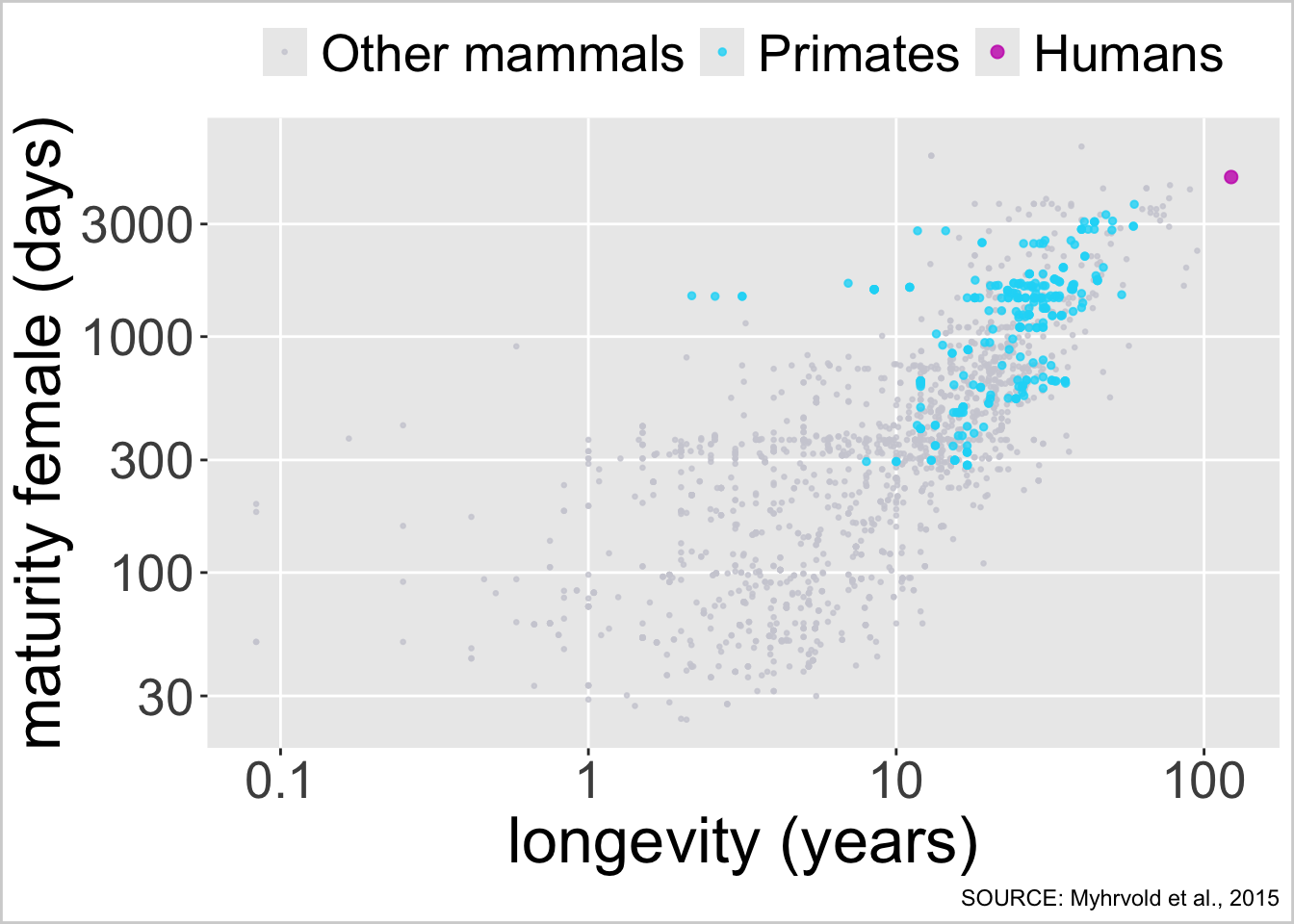
ggplot(lht, aes(x = longevity_y, y = female_maturity_d)) +
  # first draw other mammals
  geom_point(data = filter(lht, colour == "Other mammals"),
             aes(colour = "Other mammals"), size = 0.5, alpha = 0.8) +
  # then draw primates
  geom_point(data = filter(lht, colour == "Primates"),
             aes(colour = "Primates"), size = 1, alpha = 0.8) +
  # then draw humans
  geom_point(data = filter(lht, colour == "Humans"),
             aes(colour = "Humans"), size = 2, alpha = 0.8) +
  # log scale for x axis
  scale_x_continuous(trans = "log10", breaks = c(0.1, 1, 10, 100),
                     labels = c(0.1, 1, 10, 100)) +
  # log scale for y axis
  scale_y_continuous(trans = "log10") +
  scale_color_manual(
    values = c("Other mammals" = "#CECED6",
               "Primates" = "#16D9F7",
               "Humans" = "#C71EB9"),
    breaks = c("Other mammals", "Primates", "Humans")) +
  labs(x = "longevity (years)", y = "maturity female (days)", colour = NULL,
       caption = "SOURCE: Myhrvold et al., 2015") +
   theme(
     legend.position = "top",
     panel.grid.minor = element_blank(),
     axis.text = element_text(size = 20),
     axis.title = element_text(size = 25),
     strip.background = element_rect(),
     strip.text = element_text(size = 20),
     plot.title = element_text(size = 22, hjust = 0),
     legend.text = element_text(size = 20),
     plot.background = element_rect(colour = "lightgrey", fill = "white", linewidth = 1)
    )