Chapter 4 Improving visualisation II
Below is a graph from the paper: Chan, E. Y. (2015). Physically-attractive males increase men’s financial risk-taking. Evolution and Human Behavior, 36(5), 407–413. https://doi.org/10.1016/j.evolhumbehav.2015.03.005
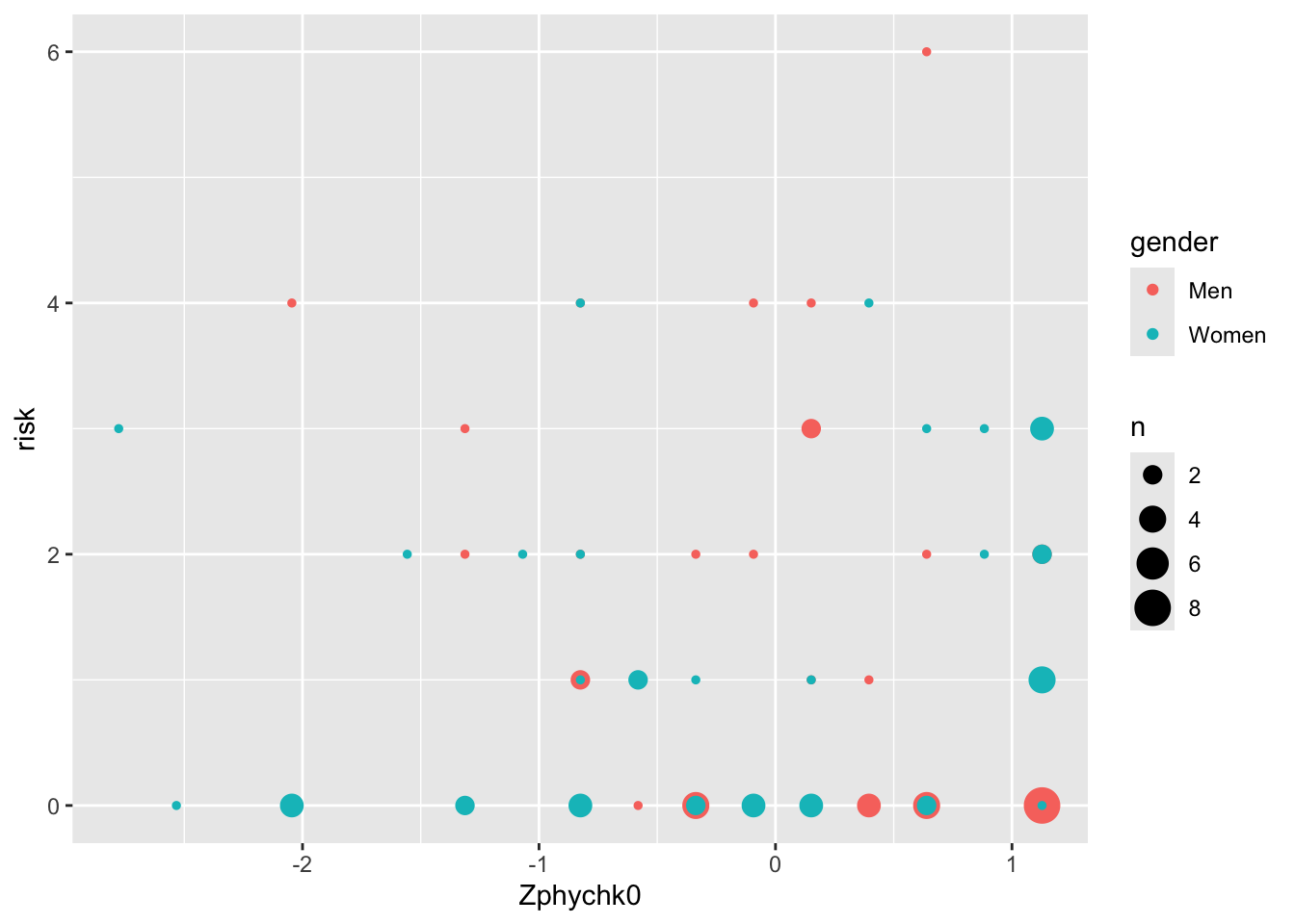
The author writes: “Fig. 2 presents the interaction at ± 1 S.D. on participants’ perceived physical attractiveness of themselves.” It’s based on 84 participants.
Convincing indeed!
The author is to be commended as he uploaded the underlying data. Let’s load that data.
# install.packages("haven")
library(haven)
# install.packages("tidyverse")
library(tidyverse)
data <- read_sav("https://stulp.gmw.rug.nl/schier/data/ens05986-mmc1.sav") %>%
  select(gender, Zphychk0, risk) %>% as_factor()
4.1 Recreating results
# Regression model
mod <- lm(risk ~ gender * Zphychk0, data = data)
test_data <- data.frame(gender = c("Men", "Men", "Women", "Women"),
                        Zphychk0 = c(-1, 1, -1, 1))
# Predictions / simple slopes
test_data$prediction <- predict(mod, test_data)

ggplot(test_data, aes(x = Zphychk0, y = prediction, colour = gender)) +
  geom_line() +
  scale_colour_manual(values = c("black", "grey")) +
  scale_x_continuous(
    limits = c(-1.5, 1.5),
    breaks = c(-1, 1),
    labels = c("Less physically attractive", "More physically attractive")
  ) +
  labs(x = NULL, y = "Financial Risk-Taking", colour = NULL) +
  theme_classic() +
  scale_y_continuous(limits = c(0, 3), breaks = seq(0, 3, 0.5), expand = c(0, 0)) +
  theme(panel.grid.major.y = element_line(colour = "darkgrey"))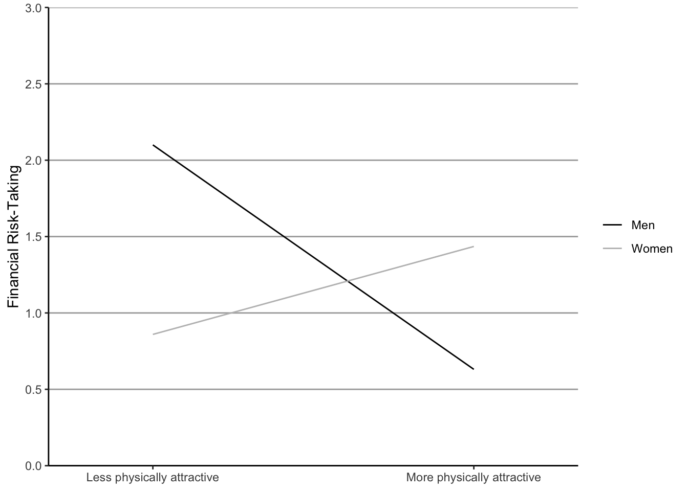
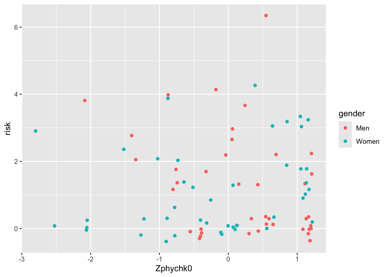
Hhhmm not quite the same, but close enough. The real question is: why show regression estimates if you also have the underlying data?!
4.2 Above all else …
4.3 I still want regression lines
4.4 Customising your graph
4.4.1 A grey background!?
Again, maybe not the grey.
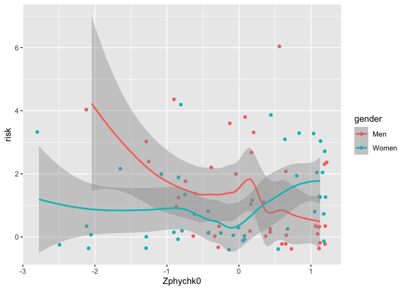
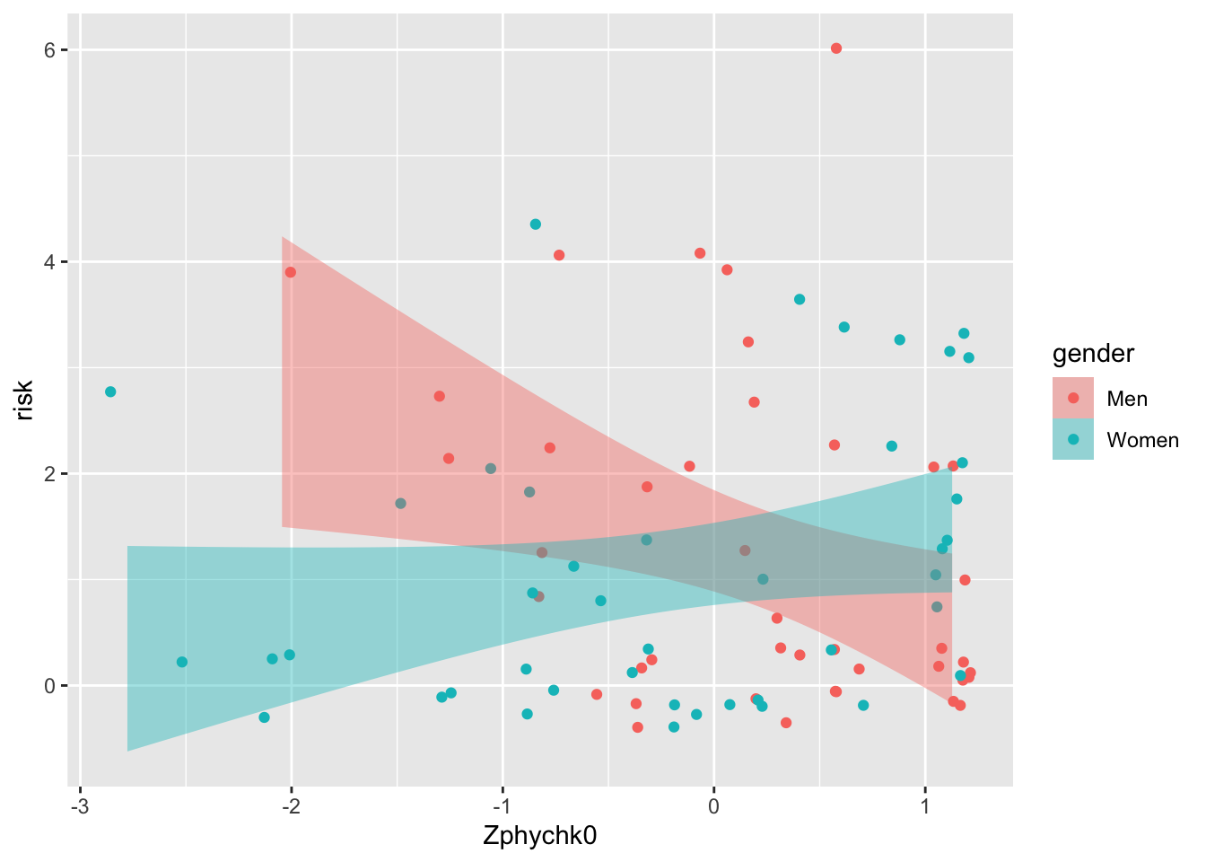
ggplot(data, aes(x = Zphychk0, y = risk, colour = gender)) +
geom_jitter() +
geom_smooth(aes(fill = gender), colour = NA, method = "lm") +
theme_classic()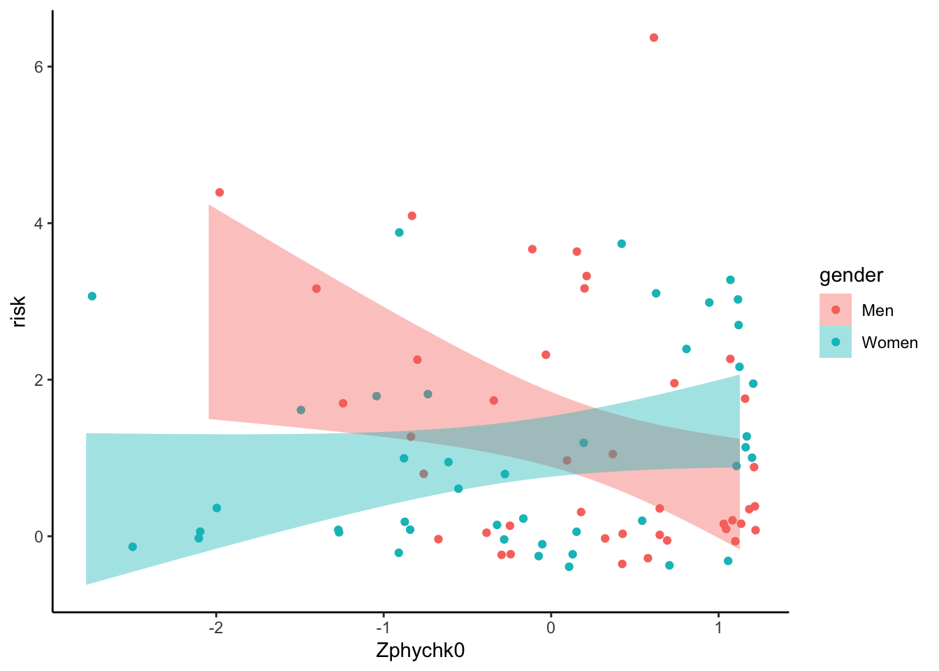
4.4.2 Give it some colour
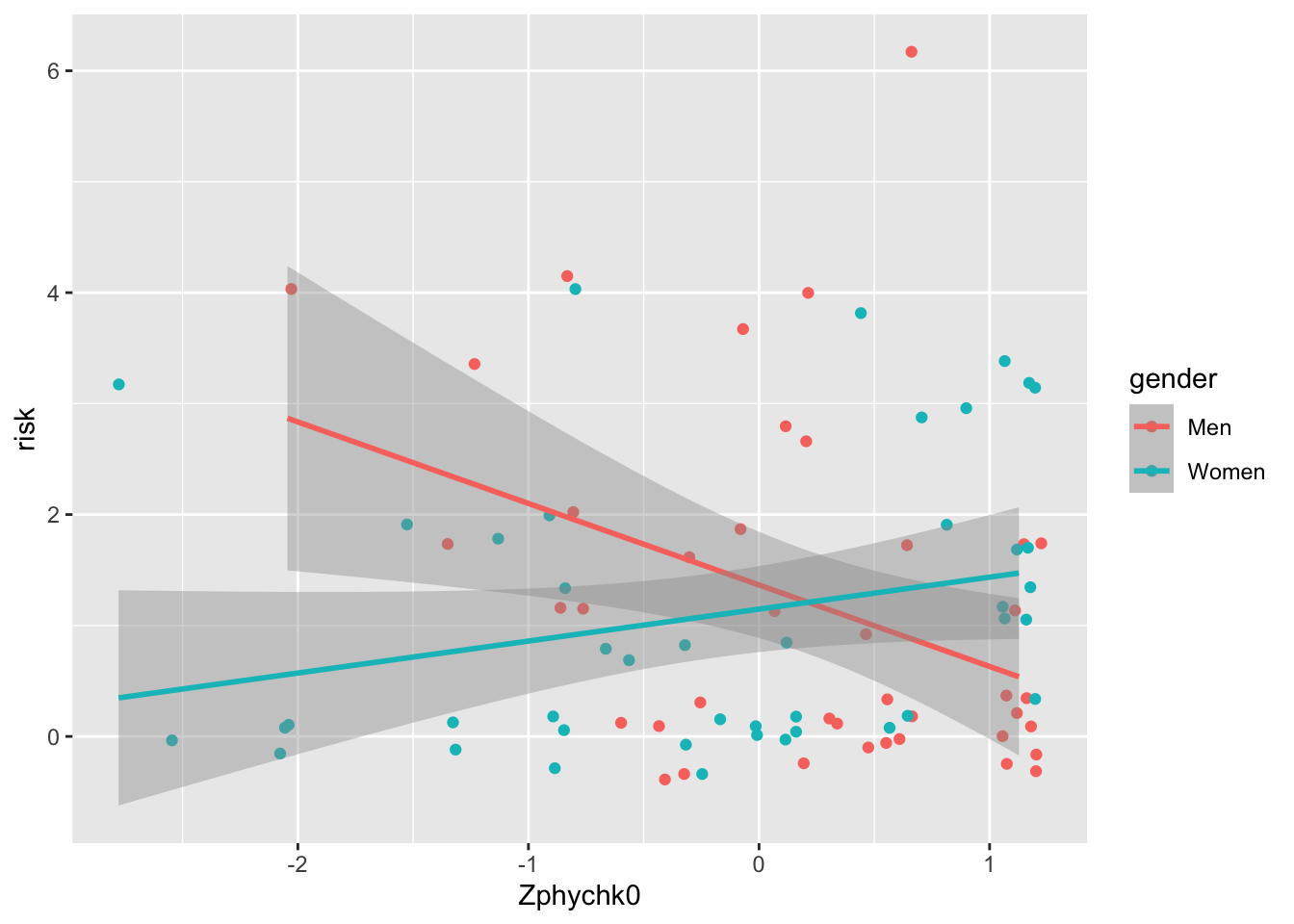
ggplot(data, aes(x = Zphychk0, y = risk, colour = gender)) +
  geom_jitter(size = 2) +
  geom_smooth(aes(fill = gender), colour = NA, method = "lm") +
  theme_classic() +
  scale_fill_brewer(palette = "Set1") +
  scale_colour_brewer(palette = "Set1")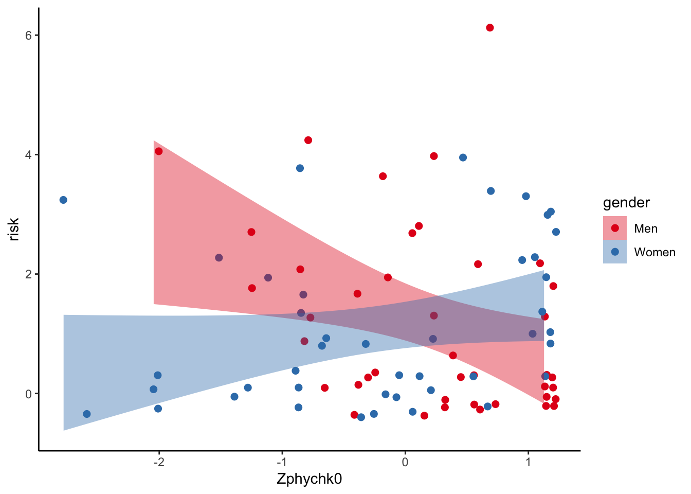
4.4.3 Adding appropriate labels
ggplot(data, aes(x = Zphychk0, y = risk, colour = gender)) +
  geom_jitter(size = 2) +
  geom_smooth(aes(fill = gender), colour = NA, method = "lm") +
  theme_classic() +
  scale_fill_brewer(palette = "Set1") +
  scale_colour_brewer(palette = "Set1") +
  labs(x = "Self-rated physical attractiveness (z-score)",
y = "Risk-taking score", fill = NULL, colour = NULL) 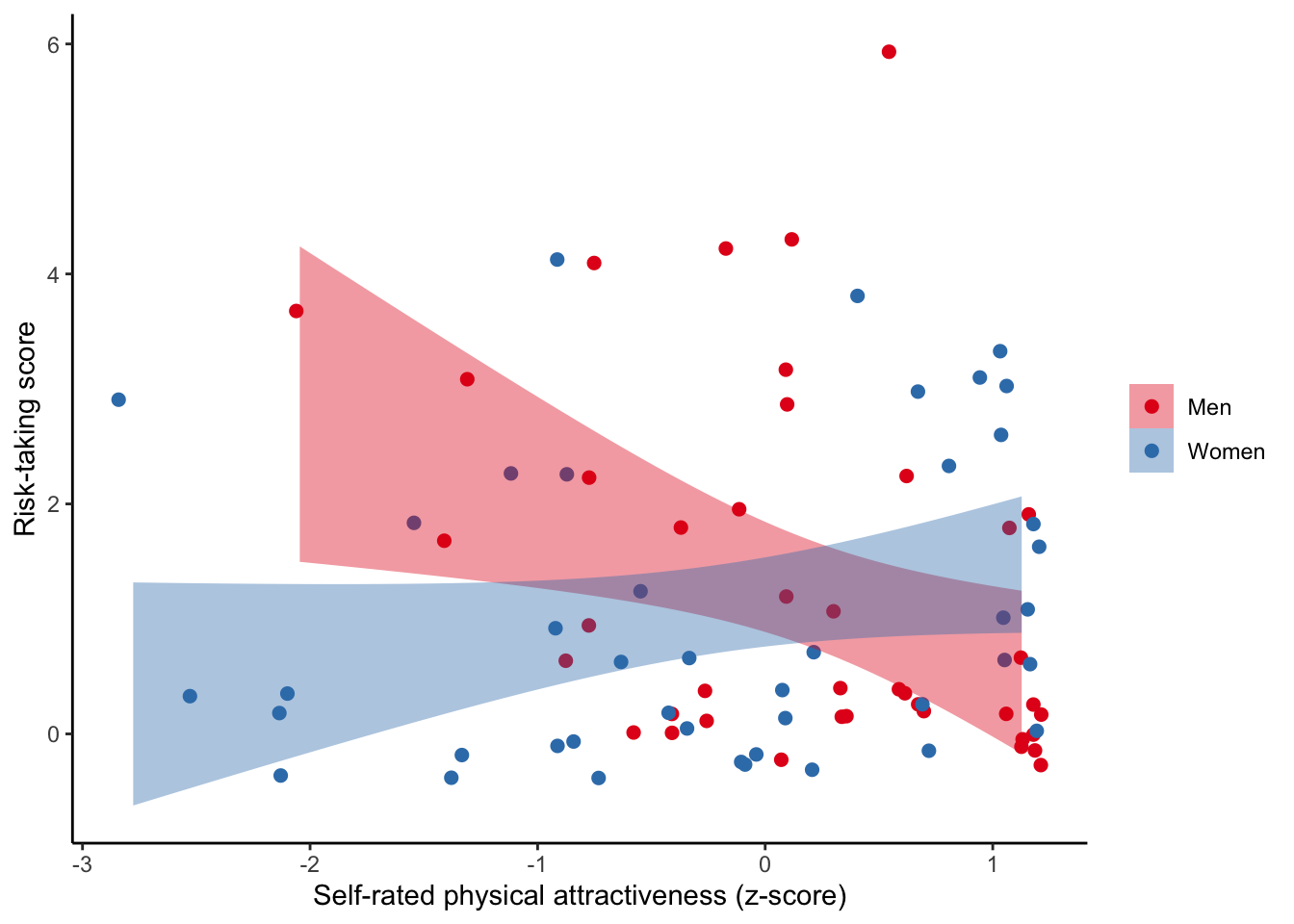
4.4.4 Titles are useful
ggplot(data, aes(x = Zphychk0, y = risk, colour = gender)) +
  geom_jitter(size = 2) +
  geom_smooth(aes(fill = gender), colour = NA, method = "lm") +
  theme_classic() +
  scale_fill_brewer(palette = "Set1") +
  scale_colour_brewer(palette = "Set1") +
  labs(x = "Self-rated physical attractiveness (z-score)",
       y = "Risk-taking score", fill = NULL, colour = NULL,
       title = "Men who think they are attractive say they take less financial risk",
subtitle = "based on 41 men and 43 women") 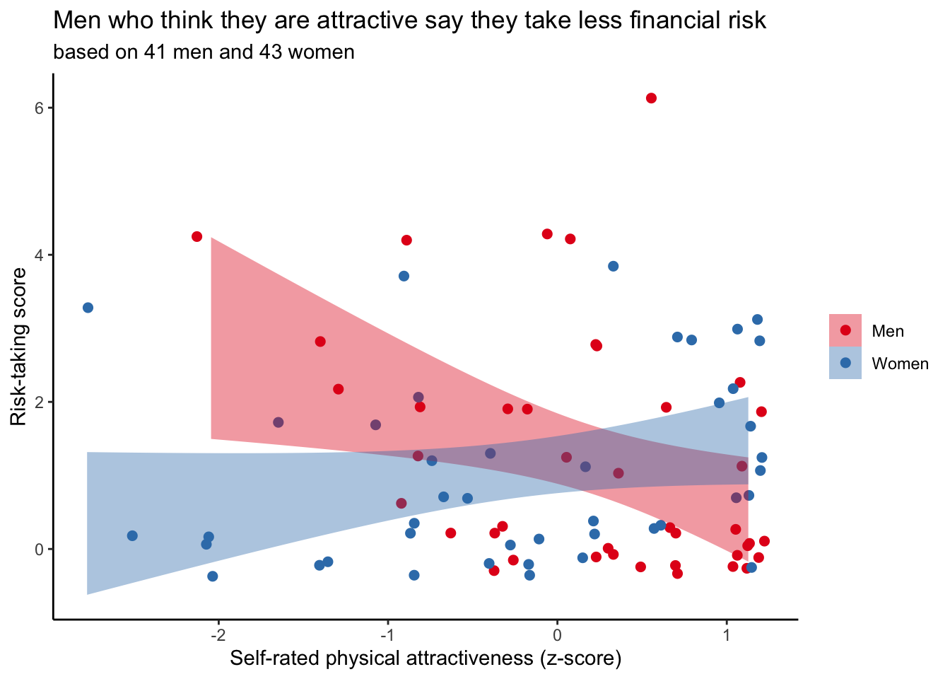
4.4.5 Changing the axes
The risk-taking score is the sum of six hypothetical financial situations in which the respondents could indicate whether they would take the financially risky (score of 1) or the non-risky (score of 0) option. The minium is thus 0, the maximum 6. Z-score for physical attractiveness implies (assumes) normal distribution ranging from ~-3 to 3. Let’s try to have that information reflected in the graph.
ggplot(data, aes(x = Zphychk0, y = risk, colour = gender)) +
  geom_jitter(size = 2) +
  geom_smooth(aes(fill = gender), colour = NA, method = "lm") +
  theme_classic() +
  scale_fill_brewer(palette = "Set1") +
  scale_colour_brewer(palette = "Set1") +
  labs(x = "Self-rated physical attractiveness (z-score)",
       y = "Risk-taking score", fill = NULL, colour = NULL,
       title = "Men who think they are attractive say they take less financial risk",
       subtitle = "based on 41 men and 43 women") +
  scale_x_continuous(limits = c(-3, 3), breaks = seq(-3, 3, 1)) +
  scale_y_continuous(limits = c(-1, 7), breaks = seq(0, 6, 1))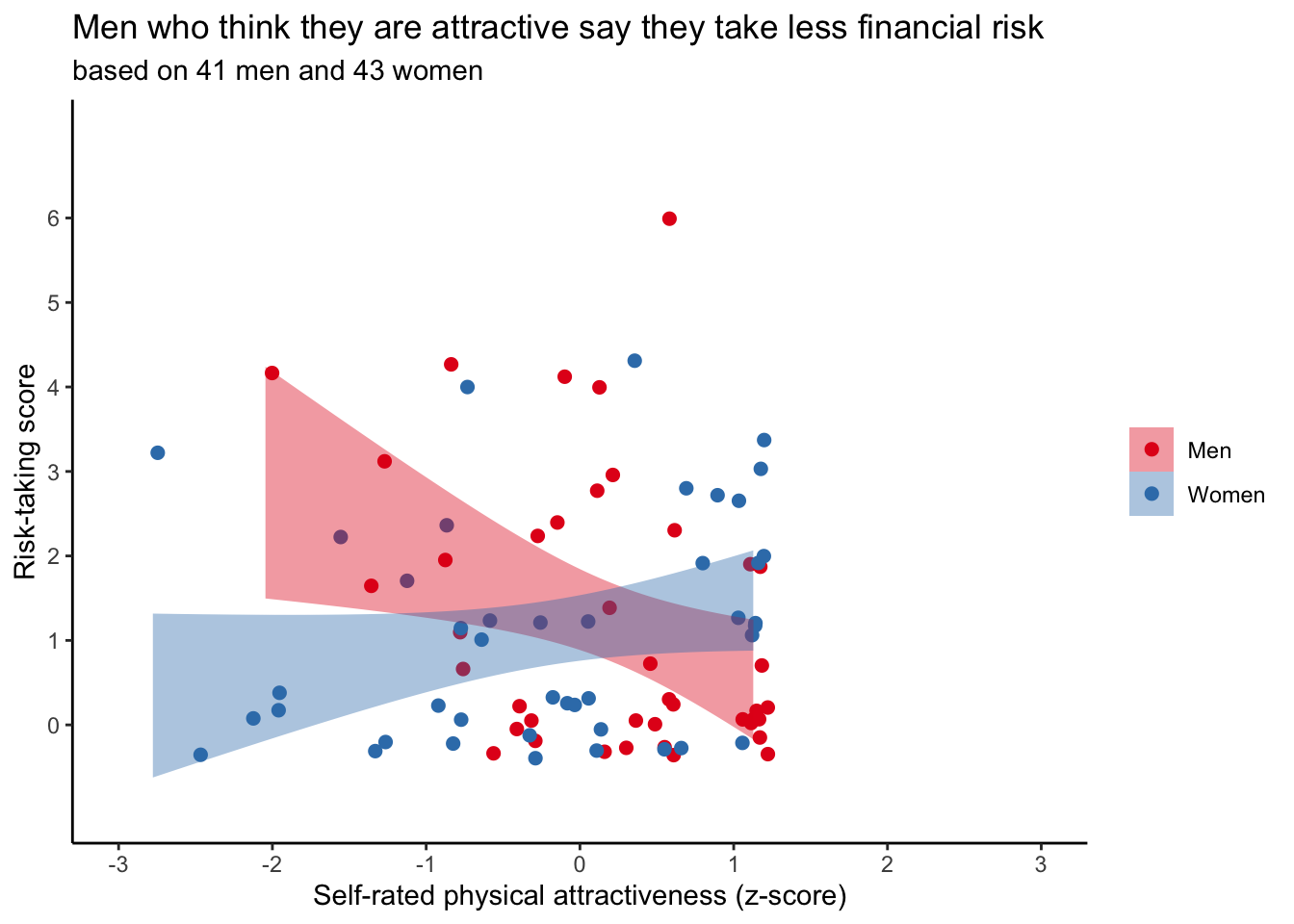
4.4.6 The legend takes up space
ggplot(data, aes(x = Zphychk0, y = risk, colour = gender)) +
  geom_jitter(size = 2) +
  geom_smooth(aes(fill = gender), colour = NA, method = "lm") +
  theme_classic() +
  scale_fill_brewer(palette = "Set1") +
  scale_colour_brewer(palette = "Set1") +
  labs(x = "Self-rated physical attractiveness (z-score)",
       y = "Risk-taking score", fill = NULL, colour = NULL,
       title = "Men who think they are attractive say they take less financial risk",
       subtitle = "based on 41 men and 43 women") +
  scale_x_continuous(limits = c(-3, 3), breaks = seq(-3, 3, 1)) +
  scale_y_continuous(limits = c(-1, 7), breaks = seq(0, 6, 1)) +
  theme(legend.position = c(0.9, 0.9))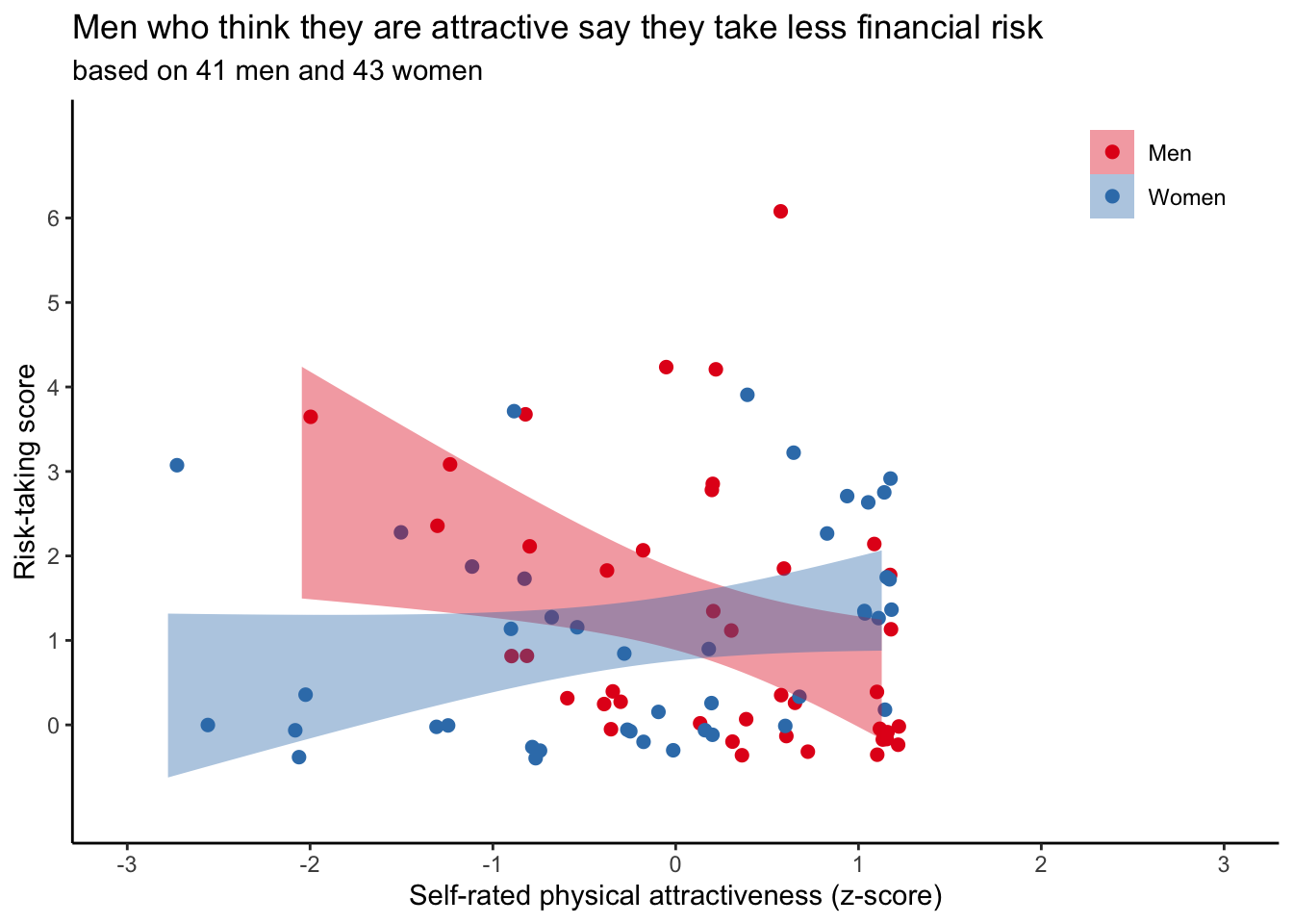
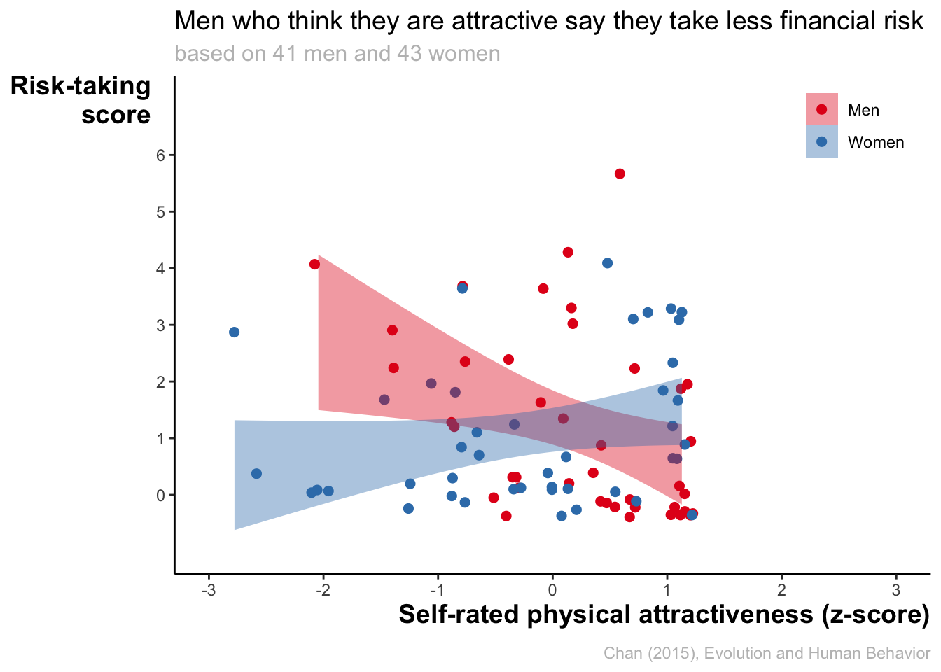
4.4.7 Changing theme elements
Let’s change some plot elements.
ggplot(data, aes(x = Zphychk0, y = risk, colour = gender)) +
geom_jitter(size = 2) +
geom_smooth(aes(fill = gender), colour = NA, method = "lm") +
theme_classic() +
scale_fill_brewer(palette = "Set1") +
scale_colour_brewer(palette = "Set1") +
labs(x = "Self-rated physical attractiveness (z-score)",
y = "Risk-taking\nscore", fill = NULL, colour = NULL,
title = "Men who think they are attractive say they take less financial risk",
subtitle = "based on 41 men and 43 women",
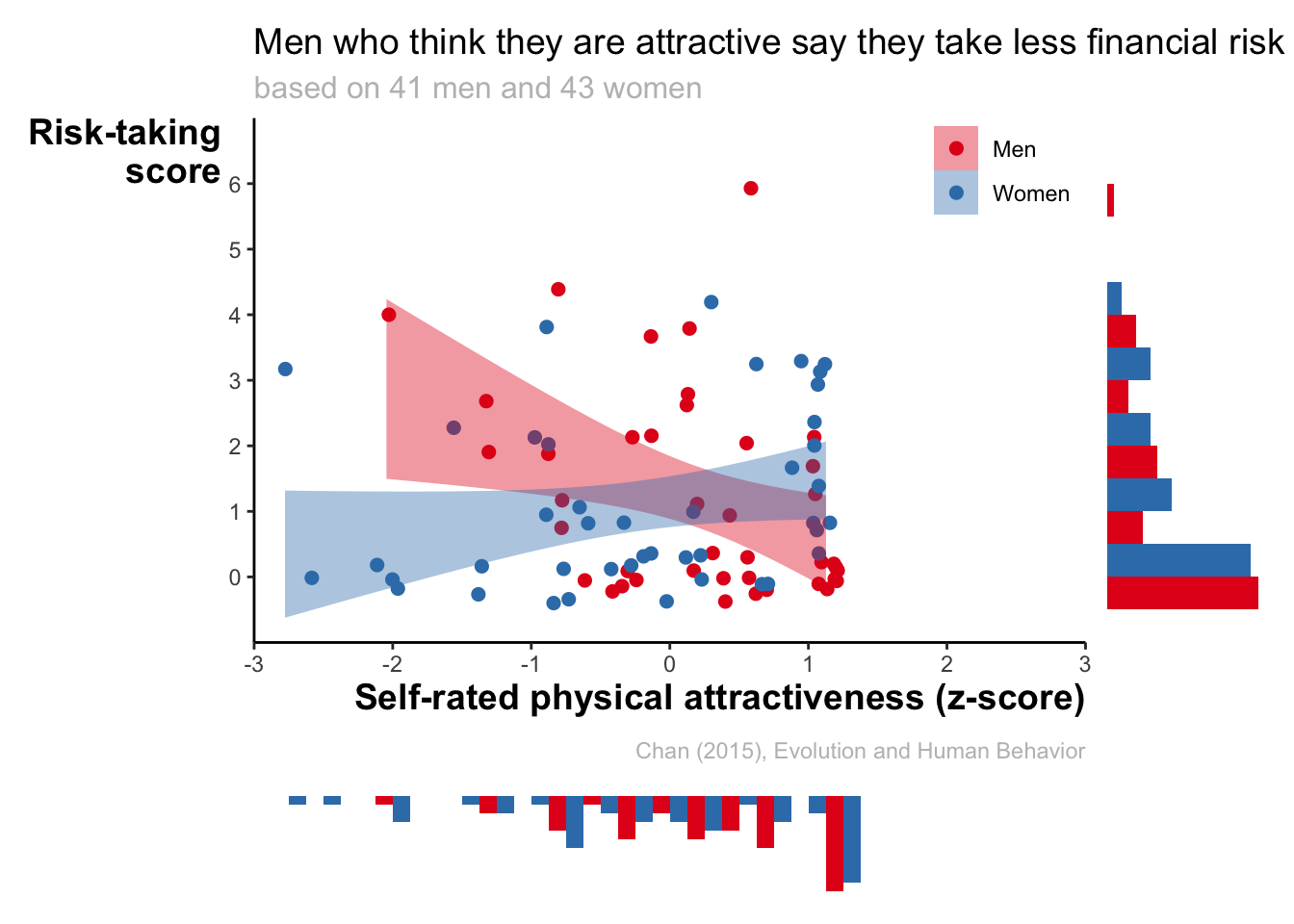
caption = "Chan (2015), Evolution and Human Behavior") +
scale_x_continuous(limits = c(-3, 3), breaks = seq(-3, 3, 1)) +
scale_y_continuous(limits = c(-1, 7), breaks = seq(0, 6, 1)) +
theme(
legend.position = c(0.9, 0.9),
axis.title = element_text(face = "bold", size = 14),
axis.title.x = element_text(hjust = 1),
axis.title.y = element_text(hjust = 1, angle = 0),
plot.title = element_text(size = 14),
plot.subtitle = element_text(size = 12, colour = "grey"),
plot.caption = element_text(colour = "grey", margin = margin(t = 10))
)
4.5 Going wild
4.5.1 Showing the distributions
We see all datapoints, but the overall distributions are still difficult to assess. Let’s try something extroardinary.
Let’s make the histogram for financial risk-taking.
hist_risk <- ggplot(data, aes(x = risk, fill = gender)) +
  geom_histogram(binwidth = 1, position = "dodge") +
  theme_classic() +
  scale_fill_brewer(palette = "Set1") +
  labs(x = "Risk-taking score")
hist_risk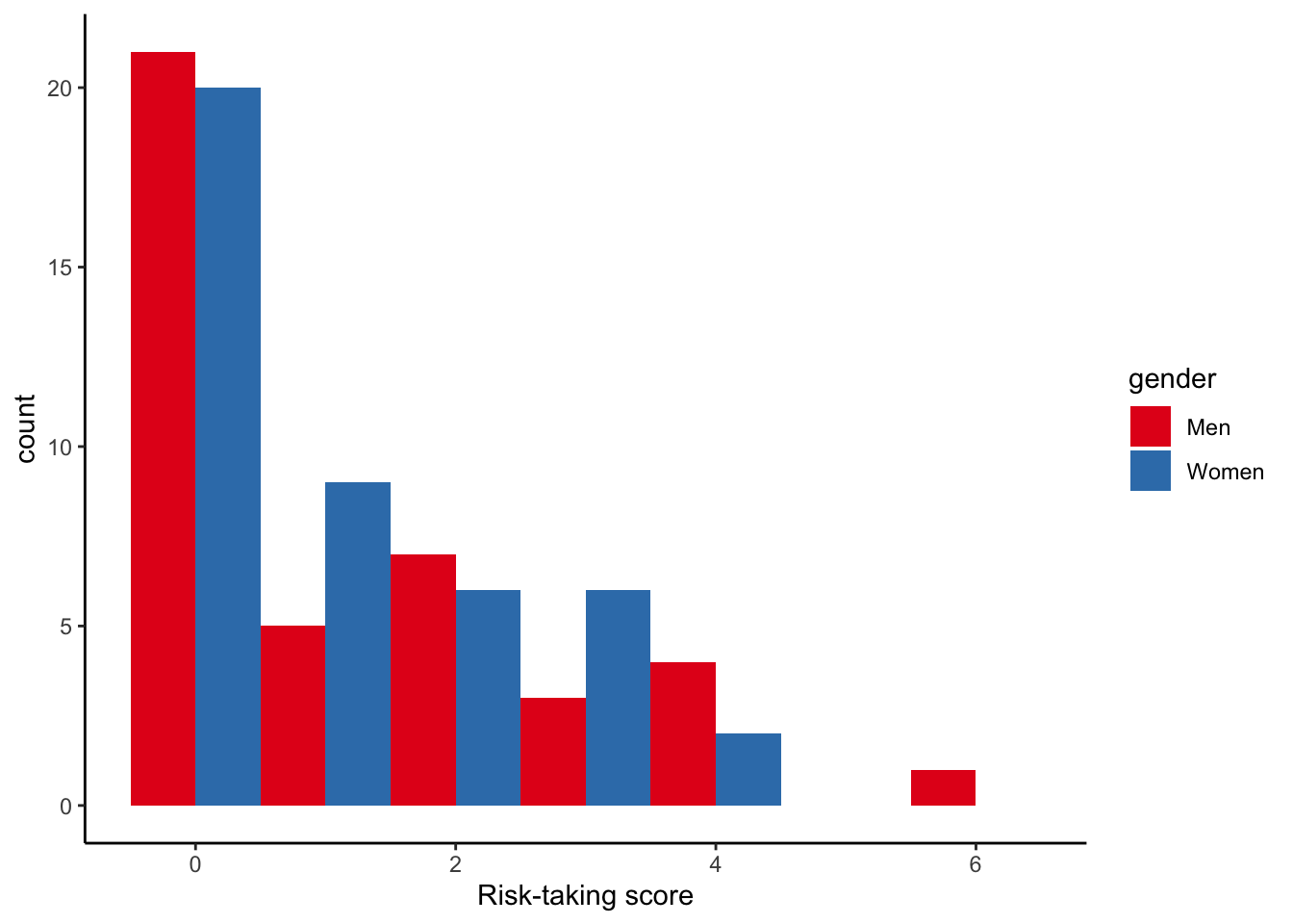
HHHmmmm, linear regression dubious, innit?
Let’s make the histogram for financial risk-taking
hist_ph <- ggplot(data, aes(x = Zphychk0, fill = gender)) +
geom_histogram(binwidth = 0.25, position = "dodge") +
theme_classic() +
scale_fill_brewer(palette = "Set1") +
labs(x = "Self-rated physical attractiveness (z-score)")
hist_ph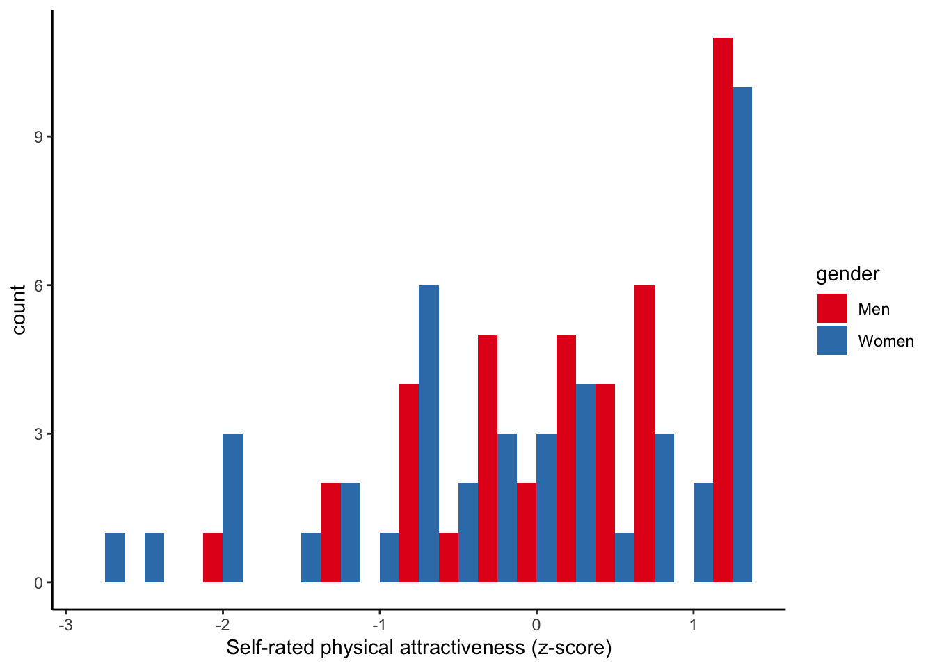 We are going to add these plots to our original scatter plot. Before doing that, we have to force the histograms to have identical x/y-axis as original graph. We also do not need the legend. Nor any of the remaining graph stuff.
hist_risk_clean <- hist_risk +
  theme_void() +
  scale_x_continuous(limits = c(-1, 7), breaks = seq(0, 6, 1), expand = c(0, 0)) +
  guides(fill = "none") +
  coord_flip()
hist_risk_clean 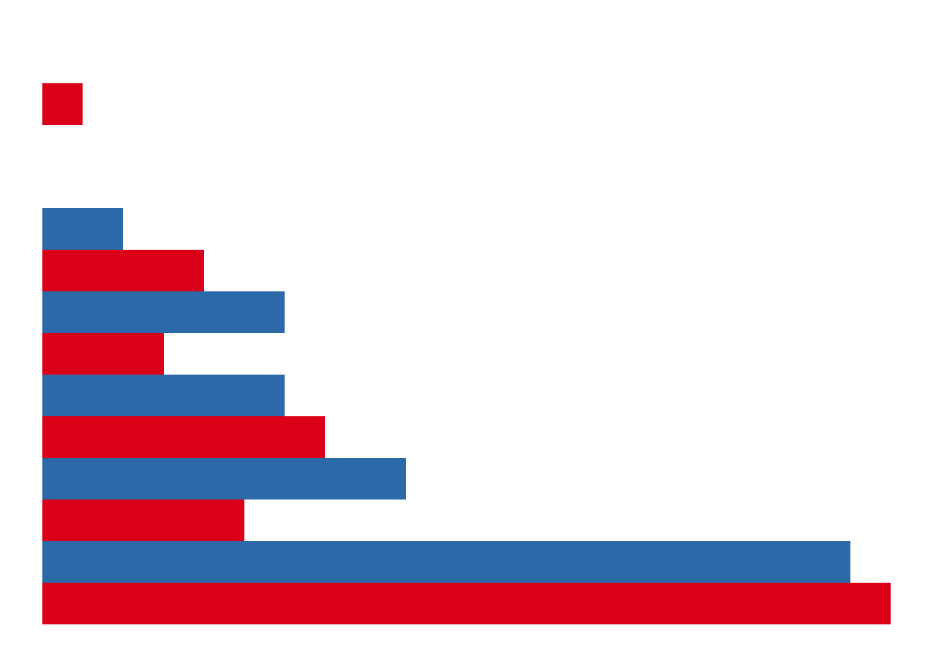
hist_ph_clean <- hist_ph +
  theme_void() +
  scale_x_continuous(limits = c(-3, 3), breaks = seq(-3, 3, 1), expand = c(0, 0)) +
  guides(fill = "none") +
  scale_y_reverse()
hist_ph_clean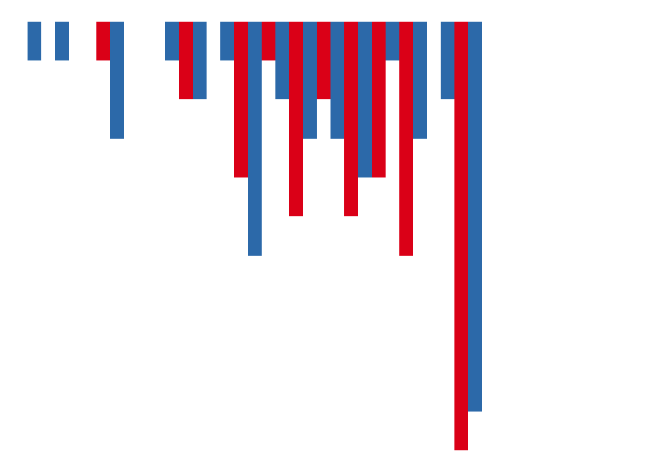
# install.packages("patchwork")
library(patchwork)

( ggplot(data, aes(x = Zphychk0, y = risk, colour = gender)) +
  geom_jitter(size = 2) +
  geom_smooth(aes(fill = gender), colour = NA, method = "lm") +
  theme_classic() +
  scale_fill_brewer(palette = "Set1") +
  scale_colour_brewer(palette = "Set1") +
  labs(x = "Self-rated physical attractiveness (z-score)",
       y = "Risk-taking\nscore", fill = NULL, colour = NULL,
       title = "Men who think they are attractive say they take less financial risk",
       subtitle = "based on 41 men and 43 women",
       caption = "Chan (2015), Evolution and Human Behavior") +
  scale_x_continuous(limits = c(-3, 3), breaks = seq(-3, 3, 1), expand = c(0, 0)) + # this is updated
  scale_y_continuous(limits = c(-1, 7), breaks = seq(0, 6, 1), expand = c(0, 0)) + # this is updated
  theme(
    legend.position = c(0.9, 0.9),
    axis.title = element_text(face = "bold", size = 14),
    axis.title.x = element_text(hjust = 1),
    axis.title.y = element_text(hjust = 1, angle = 0),
    plot.title = element_text(size = 14),
    plot.subtitle = element_text(size = 12, colour = "grey"),
    plot.caption = element_text(colour = "grey", margin = margin(t = 10))
  ) + # put plots next to one another
    hist_risk_clean + plot_layout(widths = c(5, 1)) ) / # put plots under one another
  ( hist_ph_clean + plot_spacer() + plot_layout(widths = c(5, 1))) + # empty plot
  plot_layout(heights = c(5, 1))