Chapter 23 Assignments part II
Try and create any type of graph you want on the basis of your data! I have also given some examples.
23.1 Hagoort
library(tidyverse)
# install.packages("openxlsx")
library(openxlsx)

df_Ha <- read.xlsx("https://stulp.gmw.rug.nl/21-03-2019/ggplotworkshop/data/Hagoort.xlsx",
                   sheet = "Gait parameters ", startRow = 2)
# Note; typically I would use the readxl-package, but this package
# Does not allow you to read in online-excel files

# It is wise not to have your variables be named identically! Let's fix this
df_Ha <- as_tibble(df_Ha, .name_repair = "unique")ggplot(df_Ha, aes(x = X3, y = `V..6`)) +
geom_smooth(colour = "white", fill = "orange", alpha = 0.5) +
geom_point(size = 4, colour = "orange") +
theme_classic() +
labs(x = "gait speed m/s", y = "RMS acc m/sec2 V")## `geom_smooth()` using method = 'loess' and formula 'y ~ x'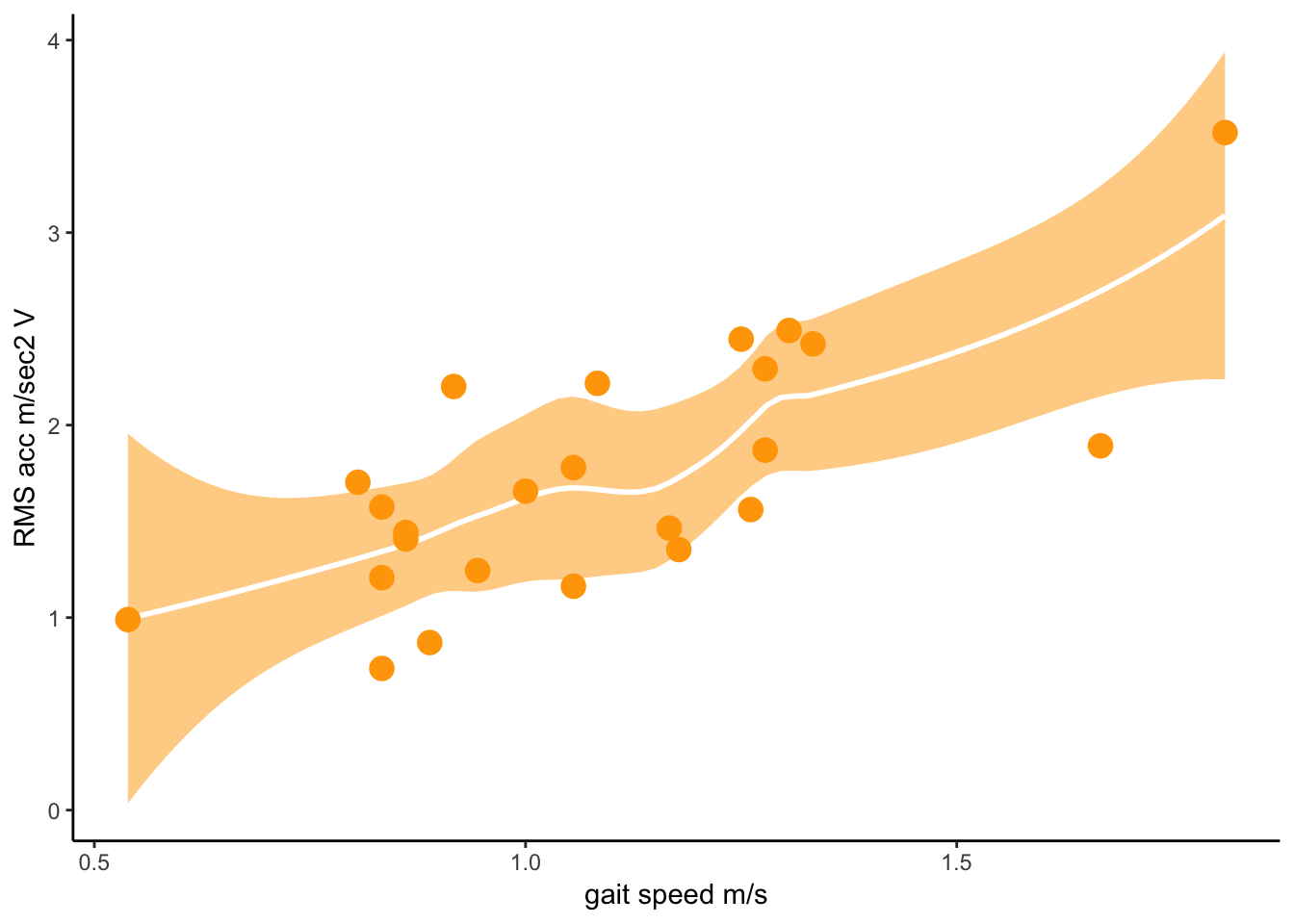
23.2 Hogelin
library(tidyverse)
# install.packages("openxlsx")
library(openxlsx)

df_Ho <- read.xlsx("https://stulp.gmw.rug.nl/21-03-2019/ggplotworkshop/data/Hogeling.xlsx")
# Note; typically I would use the readxl-package, but this package
# Does not allow you to read in online-excel files

df_Ho_red <- df_Ho %>% select(1:50) %>% slice(1:50) %>% # select 50 vars & cases
mutate_at(2:50, as.numeric) # turn to numeric variablesggplot(df_Ho_red, aes(x = Hugo_Symbol, y = `TCGA-AB-2802-03A-01R-0757-21`)) +
geom_point() +
coord_flip()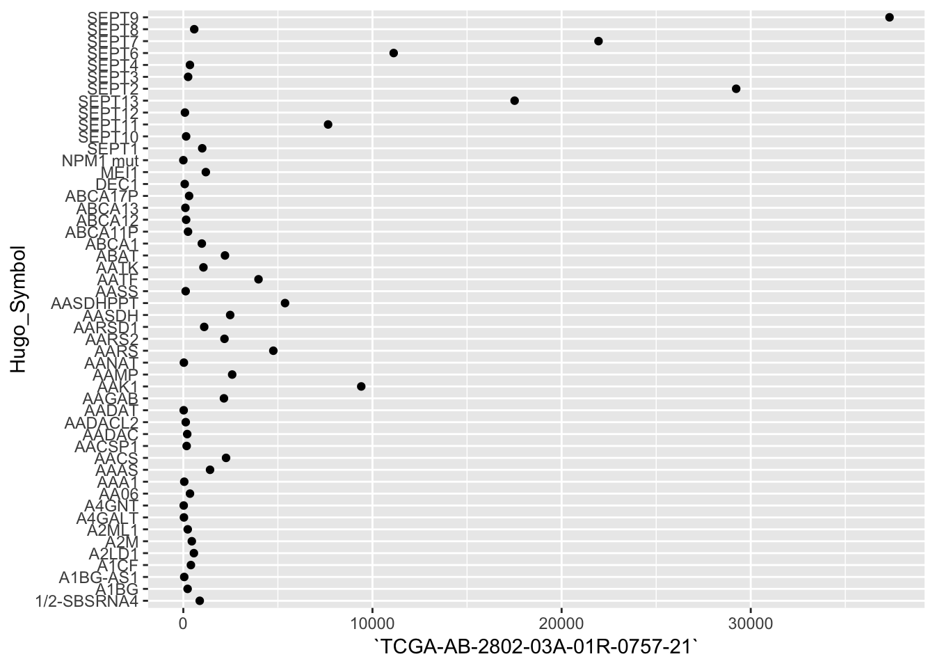
df_Ho_red2 <- df_Ho_red %>% gather(2:50, key = "Gene", value = "Score")

ggplot(df_Ho_red2, aes(x = Hugo_Symbol, y = Gene, fill = Score)) +
geom_raster() 
23.3 Maat
library(tidyverse)

# The "bed"-file; has no column names!
df_Ma1 <- read_delim("https://stulp.gmw.rug.nl/21-03-2019/ggplotworkshop/data/mobPBSC_H3K4me3_D2_peaks.bed",
                     delim = "\t", col_names = FALSE)

# wig is a funky format that I don't understand!
# rtracklayer seems like a package neededggplot(df_Ma1, aes(x = X5)) +
geom_histogram(fill = "grey", colour = "white", binwidth = 5) +
theme_minimal() +
labs(x ="Expression")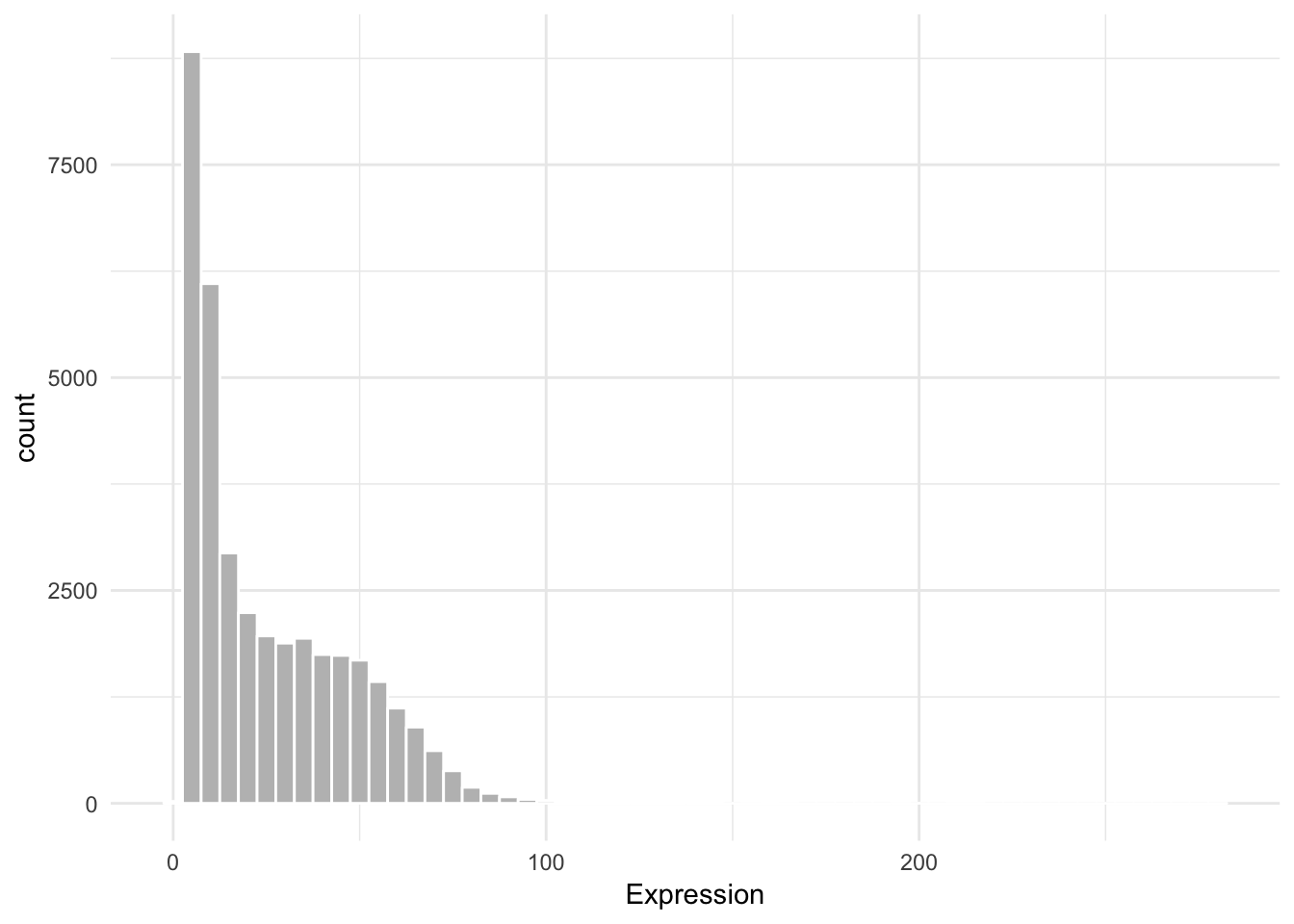
23.4 Van Rooij
library(tidyverse)
# install.packages("openxlsx")
library(openxlsx)

df_Ro <- read.xlsx("https://stulp.gmw.rug.nl/21-03-2019/ggplotworkshop/data/Van%20Rooij.xlsx",
                   startRow = 3)
# Note; typically I would use the readxl-package, but this package
# Does not allow you to read in online-excel filesggplot(df_Ro, aes(x = reorder(factor(Country), Country, length))) +
geom_bar(fill = "lightblue", colour = "black") +
labs(y = "frequency", x = "country") +
coord_flip() +
theme_minimal() +
theme(panel.grid.minor = element_blank(),
panel.grid.major.y = element_blank())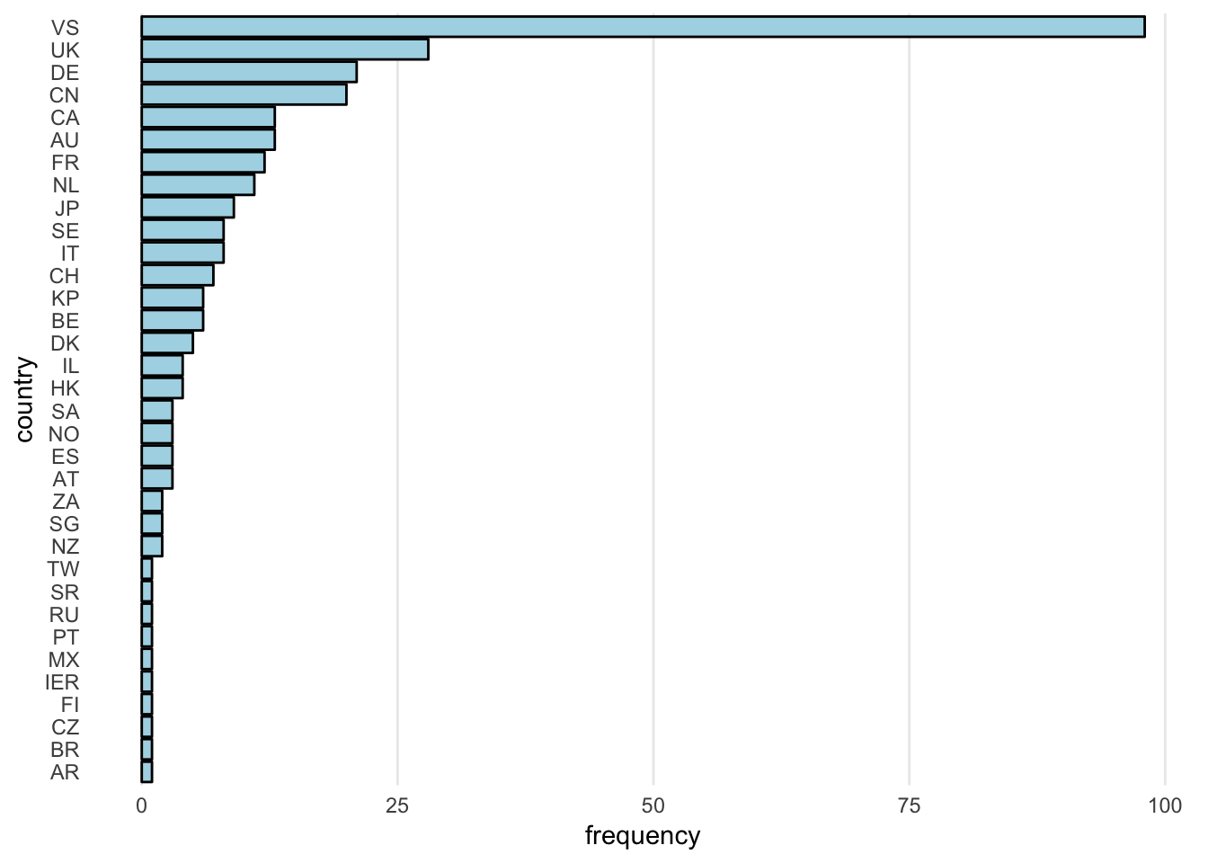
df_Ro_sel <- df_Ro %>%
  gather(c("Pub16", "Pub15", "Pub14", "Pub13", "Pub12", "Pub11"),
         key = "Year", value = "Pubs") %>%
  mutate(Year_num = case_when(Year == "Pub11" ~ 2011,
                              Year == "Pub12" ~ 2012,
                              Year == "Pub13" ~ 2013,
                              Year == "Pub14" ~ 2014,
                              Year == "Pub15" ~ 2015,
                              Year == "Pub16" ~ 2016))

data = filter(df_Ro_sel, UnivAll == "RUG")

ggplot(df_Ro_sel, aes(x = Year_num, y = Pubs)) +
  geom_line(aes(group = UnivAll), colour = "grey", alpha = 0.7) +
  geom_line(data = filter(df_Ro_sel, UnivAll == "RUG"),
            colour = "#CC0000", size = 2) +
  theme_minimal() +
  labs(x = "Year", y = "Publication score") +
  theme(panel.grid = element_blank())
## Warning: Removed 19 rows containing missing values (geom_path).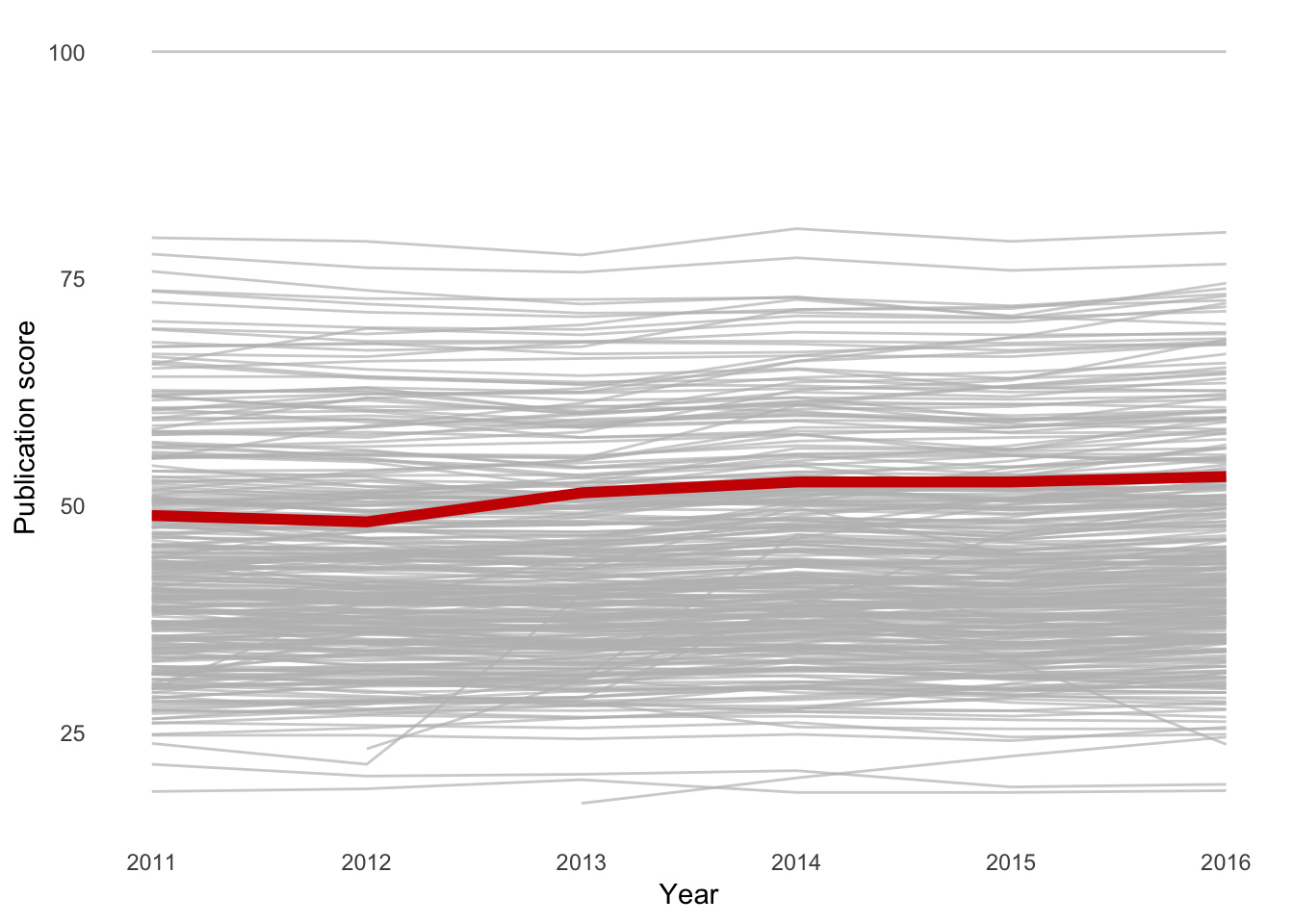
23.5 Santhakumar
library(tidyverse)
# install.packages("openxlsx")
library(openxlsx)

# I've turned your xls file into xlsx
df_Sa1 <- read.xlsx("https://stulp.gmw.rug.nl/21-03-2019/ggplotworkshop/data/Santhakumar1.xlsx",
                    sheet = "Data", startRow = 4)
# Note; typically I would use the readxl-package, but this package
# Does not allow you to read in online-excel files

df_Sa2 <- read_csv("https://stulp.gmw.rug.nl/21-03-2019/ggplotworkshop/data/Santhakumar2.csv")
df_Sa1_lg <- df_Sa1 %>% gather(`1960`:`2018`, key = "Year", value = "C02")
ggplot(filter(df_Sa1_lg, Country.Name %in% c("Australia", "Netherlands", "United States")),
aes(x = as.numeric(Year), y = C02)) +
geom_line(aes(colour = Country.Name), size = 2) +
labs(x = "Year", colour = NULL) +
theme_minimal() ## Warning: Removed 12 rows containing missing values (geom_path).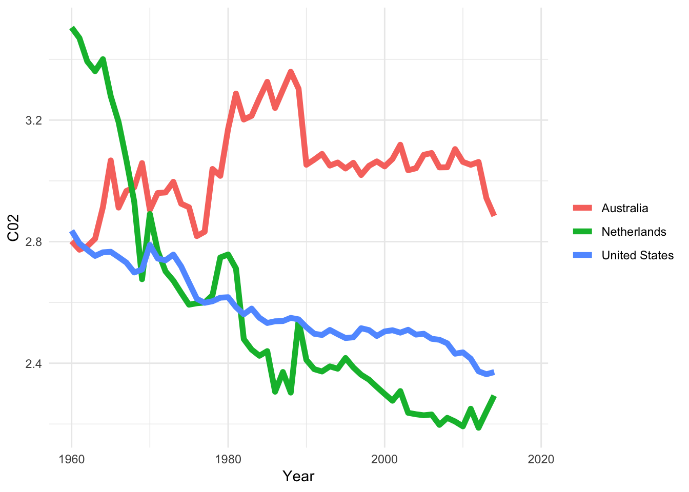
23.6 Seibel
library(tidyverse)
# install.packages("haven")
library(haven)

df_Se <- read_sav("https://stulp.gmw.rug.nl/21-03-2019/ggplotworkshop/data/Seibel.sav")

# SPSS handles labels of categorical variables a bit differently than R.
# It’s better to convert all labelled variables into factors,
# that R can more easily deal with (you don’t have to do this though!).
# You can do this simply by:

df_Se <- as_factor(df_Se)ggplot(filter(df_Se, !is.na(ident_a) & sex %in% c("man", "woman")),
aes(x = sex, fill = ident_a)) +
geom_bar(position = "fill") +
scale_fill_brewer(palette = "Set1") +
theme_minimal() 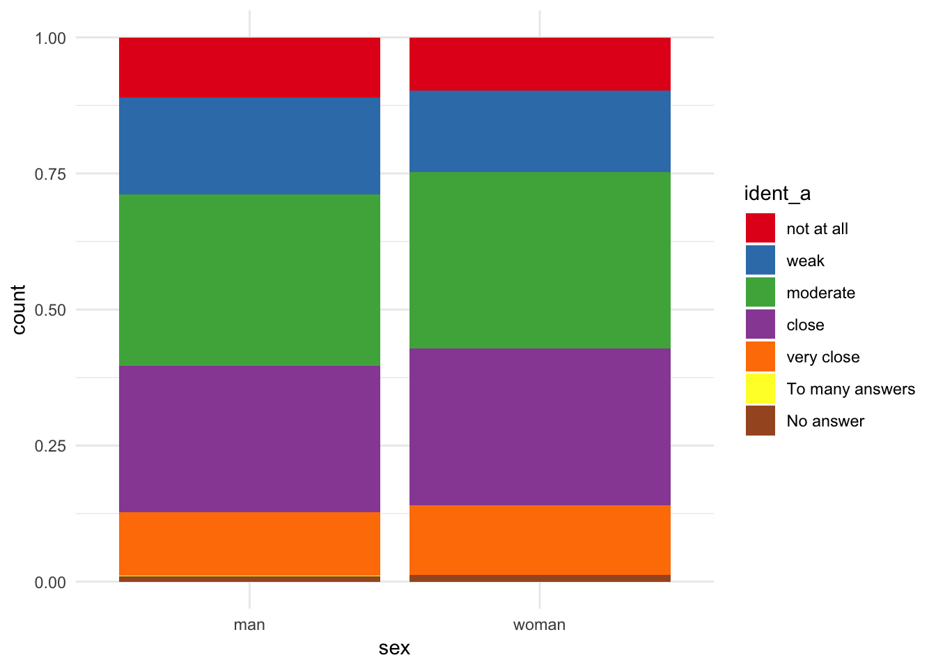
23.7 Zhang
library(tidyverse)
# install.packages("openxlsx")
library(openxlsx)


df_Za1 <- read.xlsx("https://stulp.gmw.rug.nl/21-03-2019/ggplotworkshop/data/Zhang.xlsx")
# I had to make the below excel file compatible with R by copying data to new sheet
df_Za2 <- read.xlsx("https://stulp.gmw.rug.nl/21-03-2019/ggplotworkshop/data/Zhang2.xlsx",
                    sheet = "Sheet1")

# Note; typically I would use the readxl-package, but this package
# Does not allow you to read in online-excel files
df_Za1_lg <- df_Za1 %>% gather(c("A":"F"), key = "Letter", value = "Score")
ggplot(df_Za1_lg, aes(x = `Time/minutes`, y = Score)) +
geom_line(aes(colour = Letter), size = 2) +
scale_colour_brewer(palette = "Set1") +
theme_classic() +
labs(colour = NULL)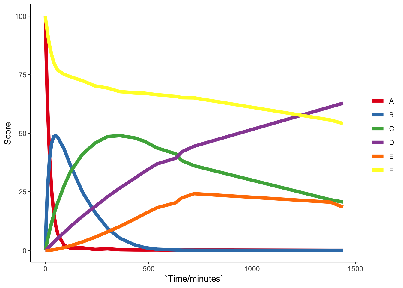
23.8 Other assignments
23.8.1 Assignment 1
In Chapter 10, we used ggplot(mpg, aes(x=cty, colour=drv, fill=drv)) + geom_histogram(binwidth=1) to compare distributions. As we’ve seen for bar charts in 14, default settings can be informative. In this case, it might be good to realise that the default settings within geom_histogram, includes position=stack. Alternatives for ‘position’ are “identity” and “dodge”. Try them both and explain what’s going on. Also compare them to ggplot(mpg, aes(x=cty, colour=drv, fill=drv)) + geom_freqpoly(binwidth=1)
23.8.2 Assignment 2
We’re interested in whether car-models from 2007 are more fuel efficient than those from 1999. Create a boxplot of the variable “cty” (fuel efficiency within the city) on the y-axis and year on the x-axis. Add the raw data by adding jitter. Make the jitter points blue and seethrough!
23.8.3 Assignment 3
Show the association between “displ” and “drv” for the different years using facets.