Chapter 14 Visualizing two discrete variables
Plotting two discrete variables is a bit harder, in the sense that graphs of two discrete variables do not always give much deeper insight than a table with percentages. Let’s try to make some graphs nonetheless. While doing so, we’ll also learn some more ggplot-tricks.
Let’s see what the relationship is between the class of car (e.g., suv, minivan, pickup, et cetera) and whether it is a front-, rear, or 4-wheeldrive.
table(mpg$class, mpg$drv)##
## 4 f r
## 2seater 0 0 5
## compact 12 35 0
## midsize 3 38 0
## minivan 0 11 0
## pickup 33 0 0
## subcompact 4 22 9
## suv 51 0 11Apparently all pickup-trucks make use 4-wheel drive, whereas 2seaters are only rear-wheel drive. Fascinating stuff.
14.1 Bar charts
We could make a bar chart! Not a simple bar chart, but a stacked bar! We saw previously that when we specify an x and a y to geom_bar, that we need to make use of stat="identity". So let’s try:
ggplot(mpg, aes(x=class, y=drv)) + geom_bar(stat="identity") 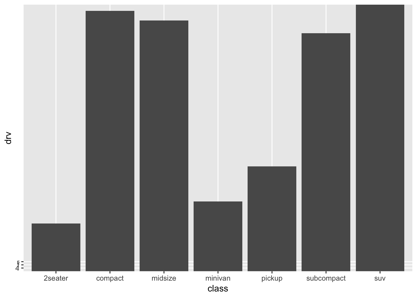
Hhmm, this is certainly not what we want. Also ggplot can’t quite handle this (look at the weird left-bottom-corner, and the lack of values on the y-axis!). Remember, that the stat=identity refers to the fact that we want the bar to have the height of the values we give through a variable (the bar has the identity specified by a variable), namely y=drv. But this is nonsense; “drv” is not a numerical variable that is useful to take as an “identity” of the bar. If we compare the table to the graph, then there is a sensible pattern in the graph, namely, the number of cases of each category (“2seater” is the category with the fewest cases, while “suv” is the category with the most cases). The scaling seems a bit off though. Let’s explore a bit. Let’s make a table with the counts of each category.
mpg_count_class <- mpg %>%
  group_by(class) %>%
  summarise(number_cases = n())
mpg_count_class
## # A tibble: 7 x 2
## class number_cases
## <chr> <int>
## 1 2seater 5
## 2 compact 47
## 3 midsize 41
## 4 minivan 11
## 5 pickup 33
## 6 subcompact 35
## 7 suv 62Now we can use this newly created variable as our “identity”! The “identity” of the bar will be a count (reflecting the number of cases of that group):
ggplot(mpg_count_class, aes(x=class, y=number_cases)) + geom_bar(stat="identity") 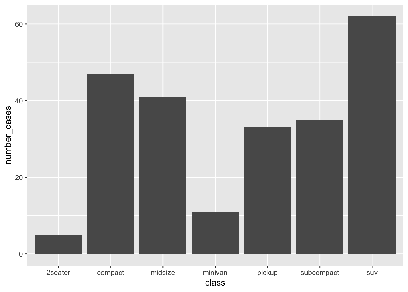
Looks very similar to the earlier graph, but not quite the same. At least now, we know exactly what the graph is showing. Incidentally, this is exactly what geom_bar does when you don’t specify anything. This is because the default setting for geom_bar() is to include stat=count:
ggplot(mpg, aes(x=class)) + geom_bar()
So without any further specification within geom_bar(), ggplot itself creates the table we made, and plots the counts in each group. We have learned something, but of course, we have entirely neglected our variable of interest “drv” so far. So let’s try different things. Let’s try something else:
ggplot(mpg, aes(x=class, colour=drv)) + geom_bar() 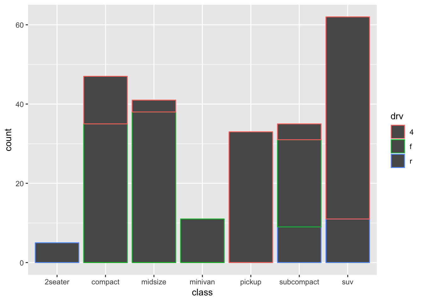
This is more like it! Now we see the counts of each class, with a colour-coding for “drv”.
This very much resembles one of our earlier histograms; is this surprising?
As was the case for histograms, this works a bit better with “fill”.
ggplot(mpg, aes(x=class, fill=drv)) + geom_bar() 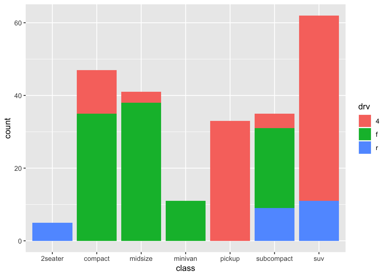
A stacked bar chart!
Again something is happening under the hood that is informative: the default settings also includes position="stack", so the above code is identical to:
ggplot(mpg, aes(x=class, fill=drv)) + geom_bar(position="stack") 
So apparently, we can also choose other options, including “dodge” and “fill”. Let’s try both:
ggplot(mpg, aes(x=class, fill=drv)) + geom_bar(position="dodge") 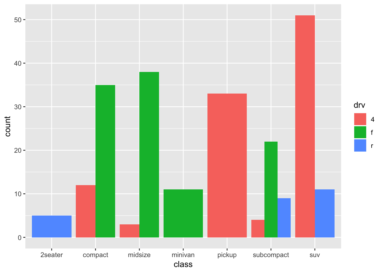
Certainly not an improved graph, but it is clear what is happening!
How about “fill”:
ggplot(mpg, aes(x=class, fill=drv)) + geom_bar(position="fill") 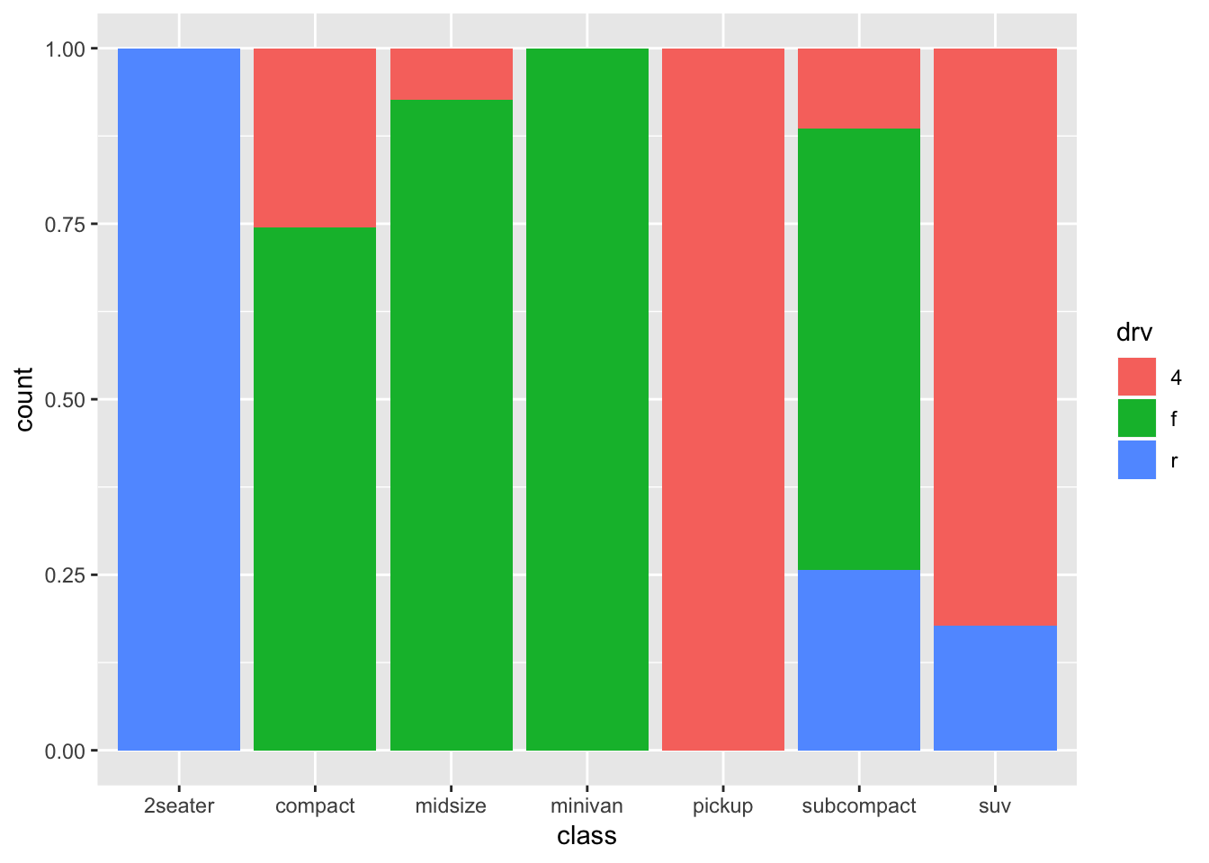
This is more like it! A stacker bar chart that is scaled for height/counts! A big advantage of this form, is that the comparisons between the different classes become a bit more obvious. A downside is that we lose information on sample sizes. I quite like stacked bar charts, but in such cases I would always like to include the sample sizes for each group. Luckily, we already made a table with this information! So we can include it in the graph:
ggplot(mpg, aes(x=class, fill=drv)) +
  geom_bar(position="fill") +
  geom_text(data=mpg_count_class,
            aes(x=class, y=0.05, label=number_cases),
            size=5, colour="white", inherit.aes=FALSE)
Not bad at all! Note that the label “count” on the y-axis is not accurate anymore!
Try and interpret what is going on with the geom_text()-code.
14.1.1 Recreating the graph with more manual labour
To increase our understanding of ggplot and data manipulation, we will now try to recreate this graph, but this time we will calculate everything ourselves. So we need the percentages of each class for each drv-category.
mpg_stacked_bar <- mpg %>%
  group_by(class, drv) %>% # First we'll create counts for each group
  summarise(number_cases = n()) %>%
  group_by(class) %>% # Group new datafram by class
  mutate(total_cases = sum(number_cases),
         proportion = number_cases/total_cases) # Create total counts
mpg_stacked_bar
## # A tibble: 12 x 5
## # Groups: class [7]
## class drv number_cases total_cases proportion
## <chr> <chr> <int> <int> <dbl>
## 1 2seater r 5 5 1
## 2 compact 4 12 47 0.255
## 3 compact f 35 47 0.745
## 4 midsize 4 3 41 0.0732
## 5 midsize f 38 41 0.927
## 6 minivan f 11 11 1
## 7 pickup 4 33 33 1
## 8 subcompact 4 4 35 0.114
## 9 subcompact f 22 35 0.629
## 10 subcompact r 9 35 0.257
## 11 suv 4 51 62 0.823
## 12 suv r 11 62 0.177Now let’s recreate the graph:
ggplot(mpg_stacked_bar, aes(x=class, y=proportion, fill=drv)) +
  geom_bar(stat="identity", position="stack") +
  geom_text(aes(x=class, y=0.05, label=total_cases),
            size=5, colour="white", inherit.aes=FALSE)
The same graph, but a rather different code.
14.2 Bubbleplot
An alternative way of visualizing two discrete variables is by using a bubbpleplot. We’ve seen bubbleplots and you wouldn’t immediately think of two discrete variables, but here goes:
ggplot(mpg, aes(x=class, y=drv)) +
  geom_count()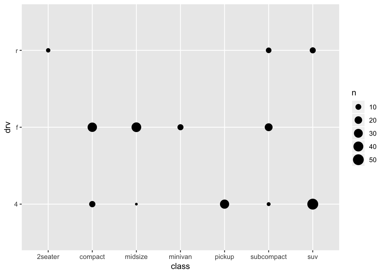
This gives some impression of the data, but it’s not very clear. But first let us get a better understanding of what is plotted and what geom_count does, by recreating it (again with more manual labour). Remember that we already made a table with for each class a count (which is the size of the dots above):
ggplot(mpg_stacked_bar, aes(x=class, y=drv)) +
  geom_point(aes(size=number_cases))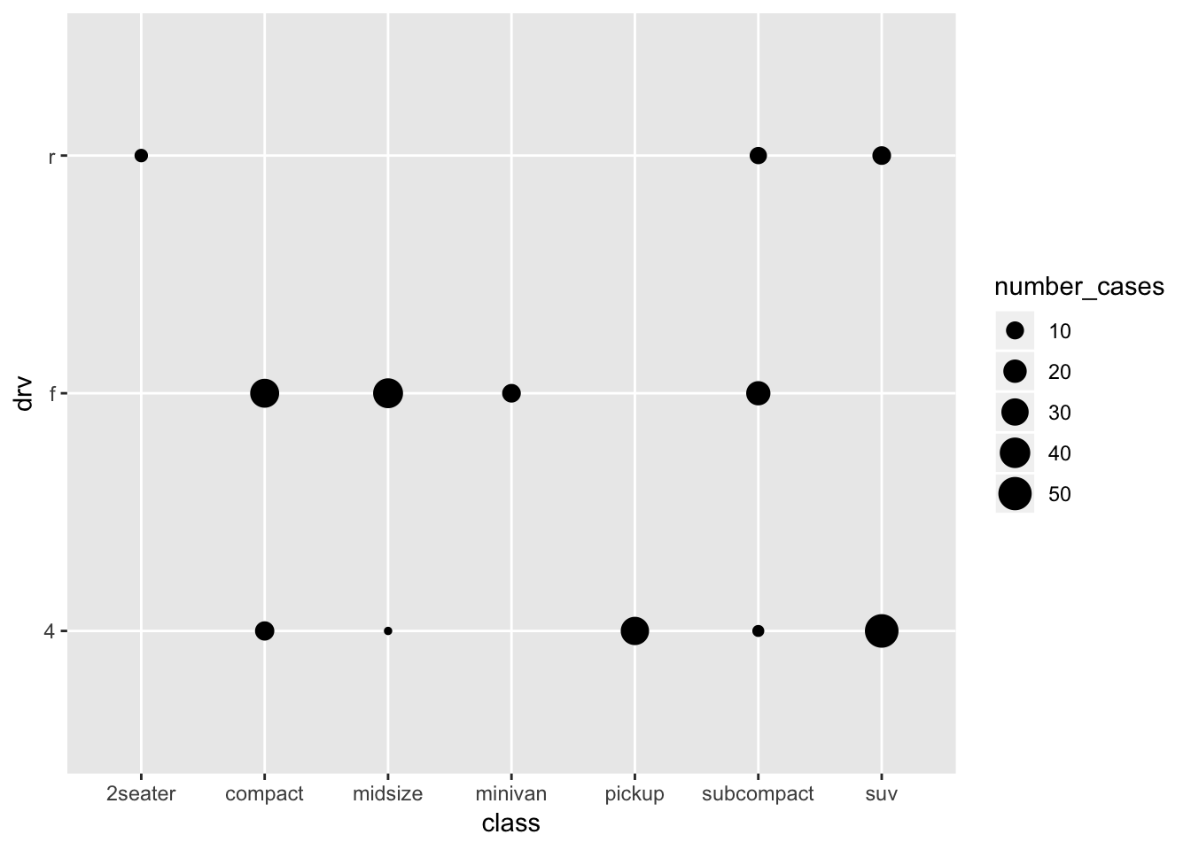
Of course, the different sample sizes in the different classes obscure some of the patterns. So let’s try and scale it to the proportion within each class:
ggplot(mpg_stacked_bar, aes(x=class, y=drv)) +
  geom_point(aes(size=proportion))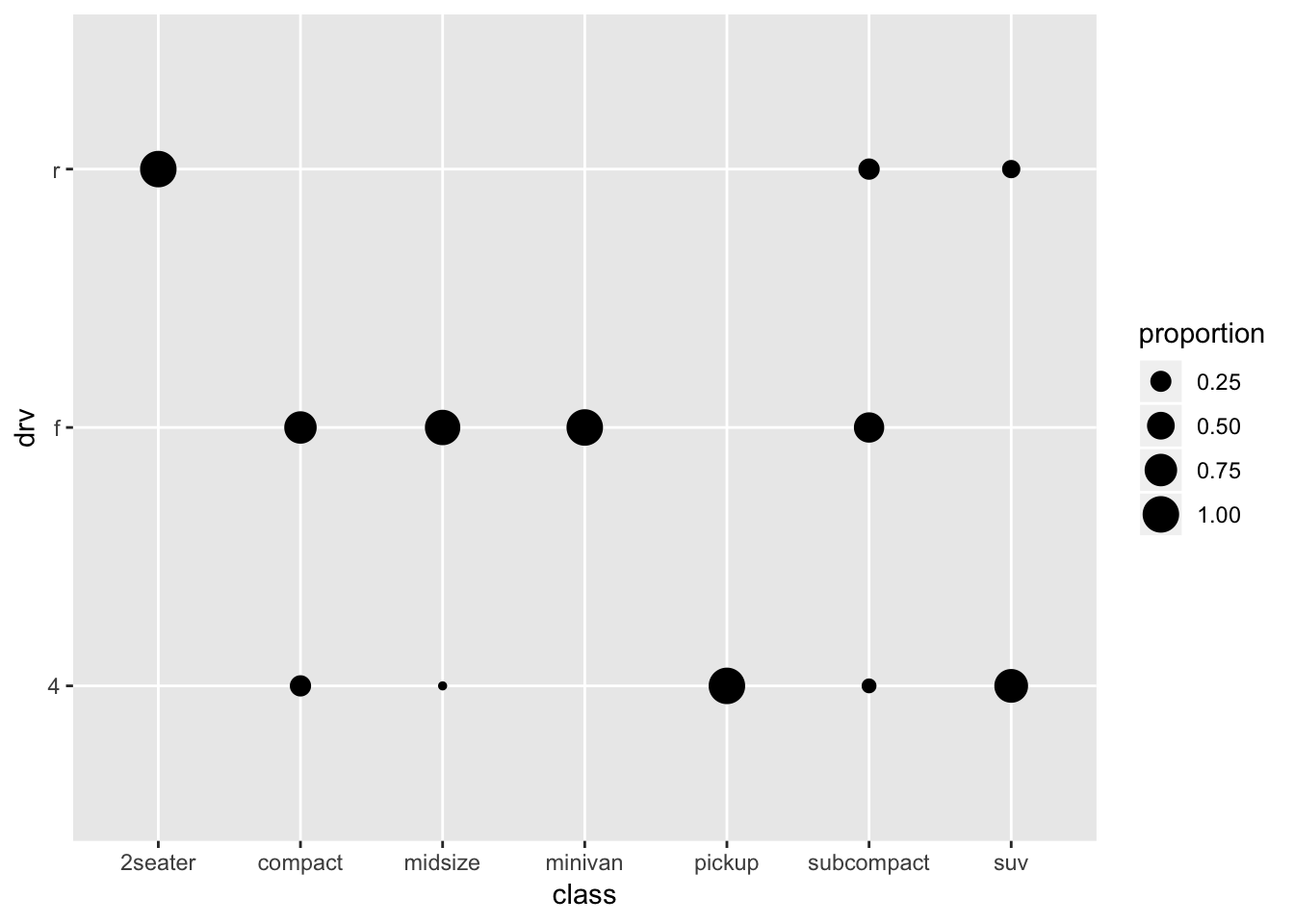
A bit better perhaps.
Although this graph certainly is not an improvement over the stacked bar, we’ll recreate it via geom_count, so that we learn a new trick:
ggplot(mpg, aes(x=class, y=drv)) +
geom_count(aes(size=..prop.., group=class)) 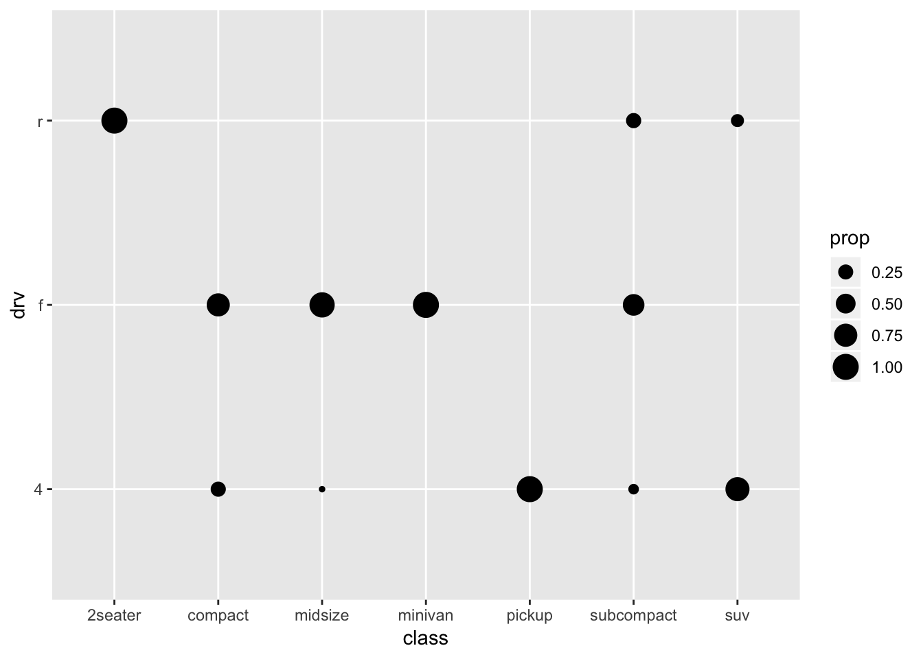

There’s supposed to be a surprised hamster here
What’s going on here!? It’s importantly to realize here that geom_count creates a new dataframe on the basis of the dataframe mpg. More specifically, it creates new variables (the counts, and the proportions) of the variables and the groups that we specify. A way of using the variables that geom_count has created, is by referring to them with the “..” before, and after. By default, the counts will be used (..count..), but we can also refer to the proportions in the created dataframe by using: size=..prop... (we specify group=class to signal to geom_count that we want the proportions within class) Below you can see the dataframe that was created through geom_count
a <- ggplot(mpg, aes(x=class, y=drv)) +
  geom_count(aes(size=..prop.., group=class))
ggplot_build(a)$data
## [[1]]
## size PANEL x y group n prop shape colour fill alpha stroke
## 1 6.000000 1 1 3 1 5 1.00000000 19 black NA NA 0.5
## 2 3.216577 1 2 1 2 12 0.25531915 19 black NA NA 0.5
## 3 5.255949 1 2 2 2 35 0.74468085 19 black NA NA 0.5
## 4 1.000000 1 3 1 3 3 0.07317073 19 black NA NA 0.5
## 5 5.798574 1 3 2 3 38 0.92682927 19 black NA NA 0.5
## 6 6.000000 1 4 2 4 11 1.00000000 19 black NA NA 0.5
## 7 6.000000 1 5 1 5 33 1.00000000 19 black NA NA 0.5
## 8 2.053101 1 6 1 6 4 0.11428571 19 black NA NA 0.5
## 9 4.870556 1 6 2 6 22 0.62857143 19 black NA NA 0.5
## 10 3.227646 1 6 3 6 9 0.25714286 19 black NA NA 0.5
## 11 5.496037 1 7 1 7 51 0.82258065 19 black NA NA 0.5
## 12 2.676893 1 7 3 7 11 0.17741935 19 black NA NA 0.5Try
ggplot(mpg, aes(x=class, y=drv)) + geom_count(aes(size=..prop.., group=drv)); what happens?
This is pretty high-level ggplot-stuff, so don’t worry about it if this seems like magic. This took me years to understand. See Chapter 24 for another example that might be a bit more intuitive. Type ?geom_count in R for further help, or of course: http://ggplot2.tidyverse.org/reference/geom_count.html
Maybe we should try and see if we can make a graph that is a bit more appealing and informative:
ggplot(mpg, aes(x=class, y=drv)) +
  geom_count(aes(size=..prop..), colour="lightgrey") +
  geom_count(aes(size=..prop.., group=class), colour="cornflowerblue")  +
  scale_size(range = c(0,10), breaks=seq(0,1,by=0.2)) +
  coord_fixed() +
  theme_minimal()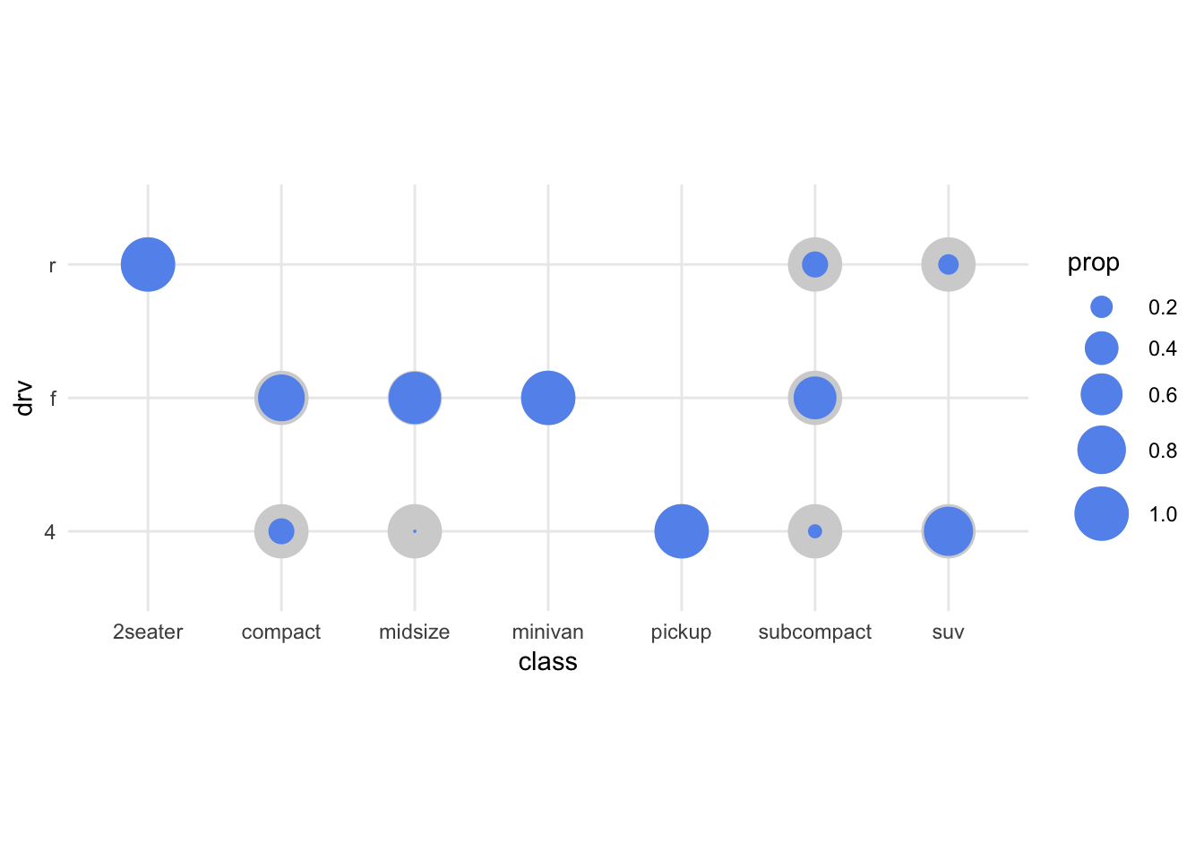
Let’s leave at this, and let the ggplot-wizardry sink in.
14.3 geom_tile / geom_raster
Let’s try something like we did earlier, but then with tiles/squares
ggplot(mpg_stacked_bar, aes(x=class, y=drv, fill=proportion)) +
geom_raster() 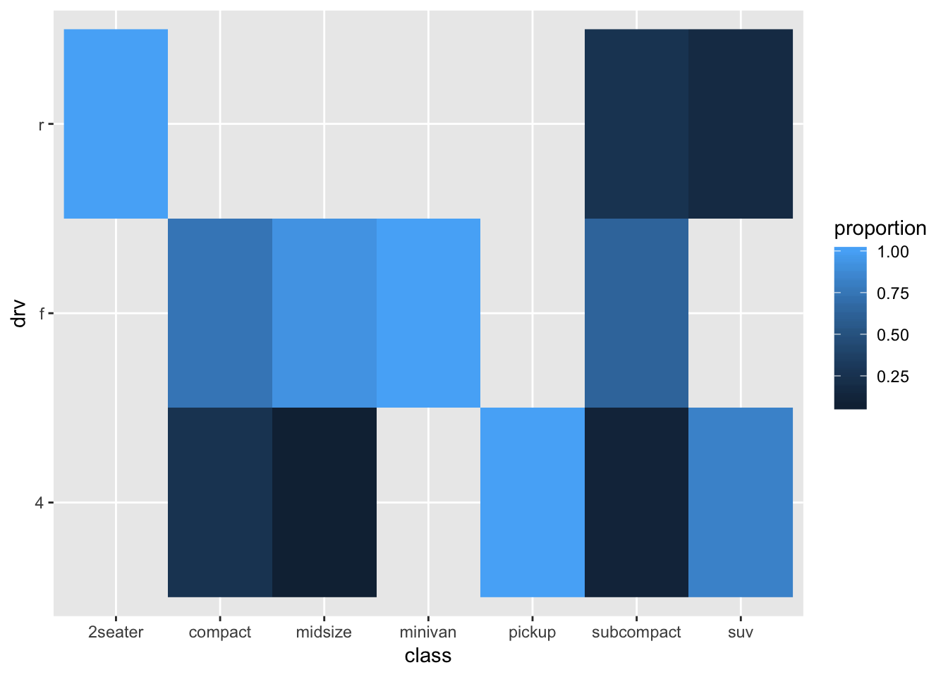
Maybe this works slightly better than the bubbleplot, but it isn’t great. Maybe a bit nicer to have the “tiles” to be squares:
ggplot(mpg_stacked_bar, aes(x=class, y=drv, fill=proportion)) +
  geom_raster() +
  coord_fixed()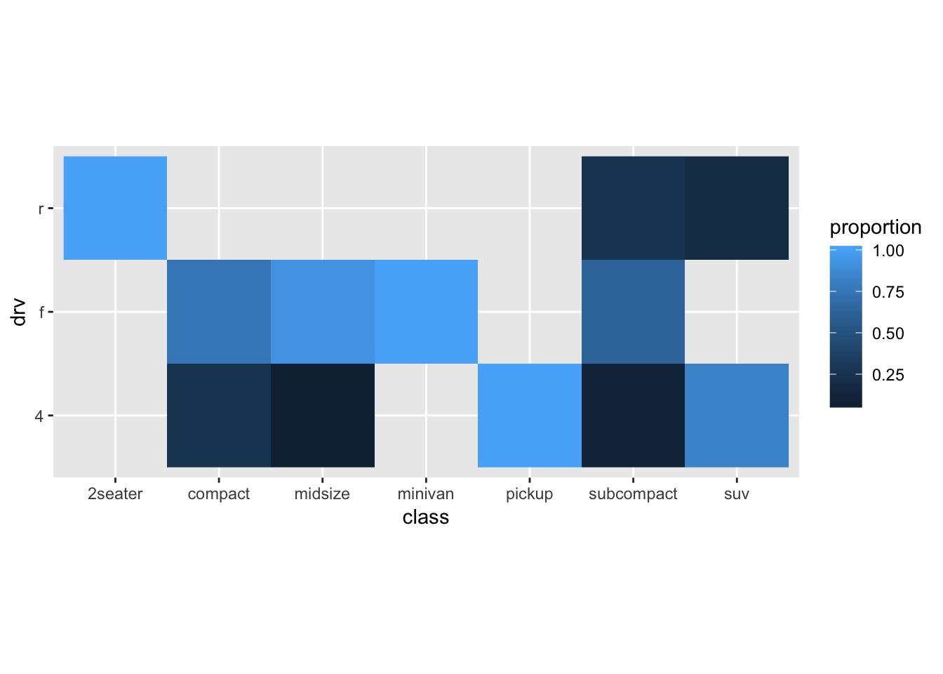
As you can see, visualizing associations between discrete variables is not easy.