Chapter 18 Axes
We can also use ggplot’s built-in functions to change the axes.
18.1 Zooming in and out
For instance, often we want to zoom in or out. Let’s zoom in on the y-axis and zoom out on the x-axis.
ggplot(mpg, aes(x=hwy, y=cty)) + geom_point() +
  scale_x_continuous(limits = c(0,75)) +
  scale_y_continuous(limits = c(20, 30))
## Warning: Removed 180 rows containing missing values (geom_point).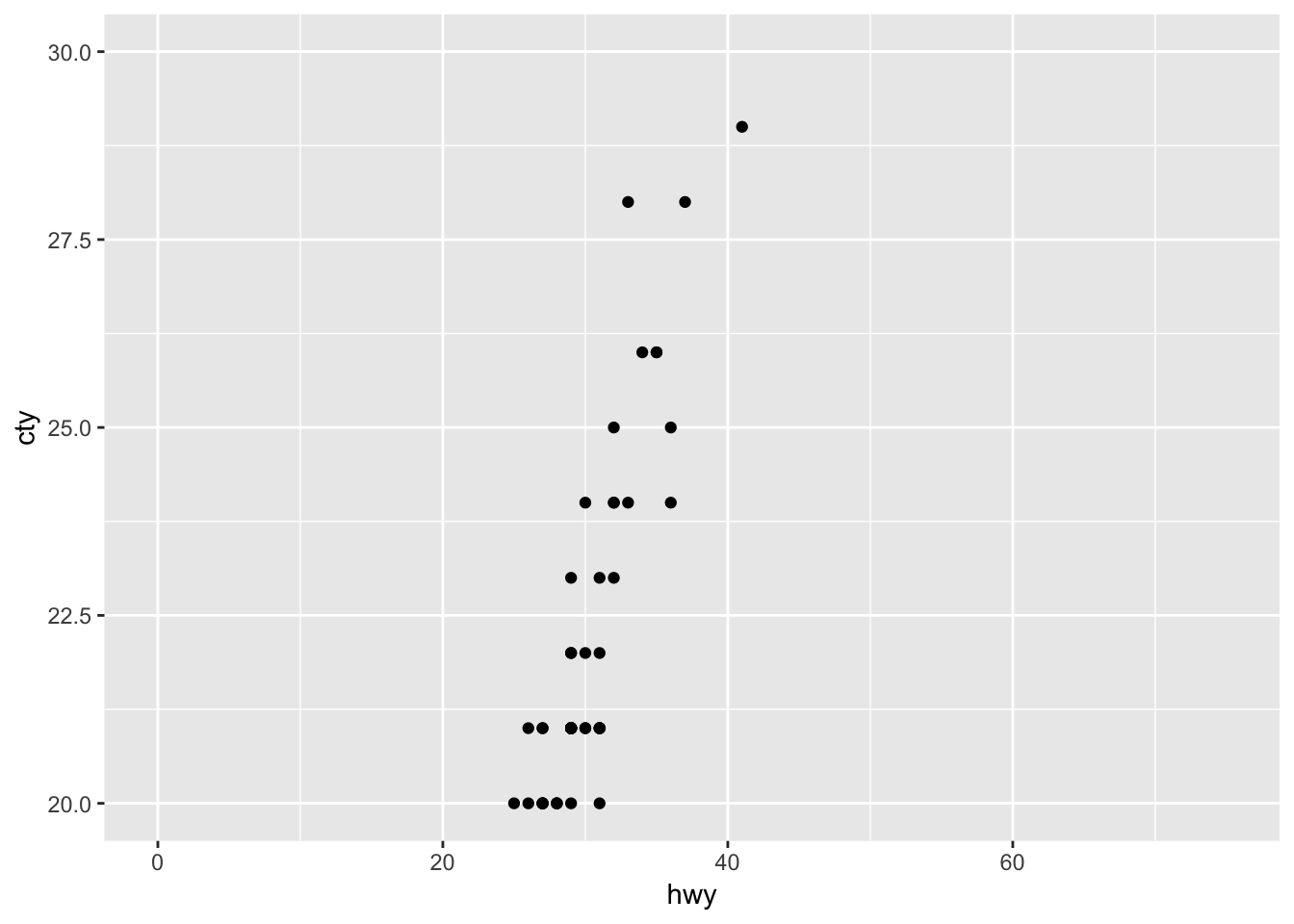
It works! Importantly, though, we must realise that there are many datapoints not visualized currently, as the warning message in R already suggests.
Using the limits in this way can be a bit dangerous. Let’s see why in an example with mean + error plots:
ggplot(mpg, aes(x=manufacturer, y=cty)) + geom_bar(stat="summary", fun.y="mean") +
  geom_errorbar(stat="summary", fun.data="mean_se") +
  geom_point(colour="lightblue")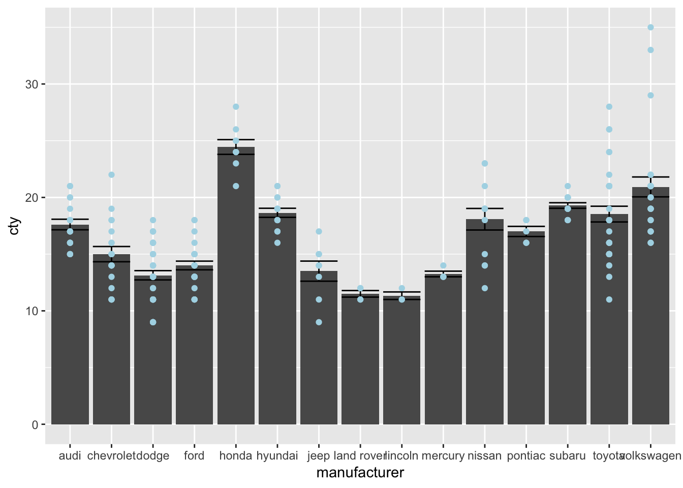
Now let’s see what happens if we give limits that exclude some points
ggplot(mpg, aes(x=manufacturer, y=cty)) + geom_bar(stat="summary", fun.y="mean") +
  geom_errorbar(stat="summary", fun.data="mean_se") +
  geom_point(colour="lightblue") +
  scale_y_continuous(limits=c(0,25))
## Warning: Removed 8 rows containing non-finite values (stat_summary).
## Warning: Removed 8 rows containing non-finite values (stat_summary).## Warning: Removed 8 rows containing missing values (geom_point).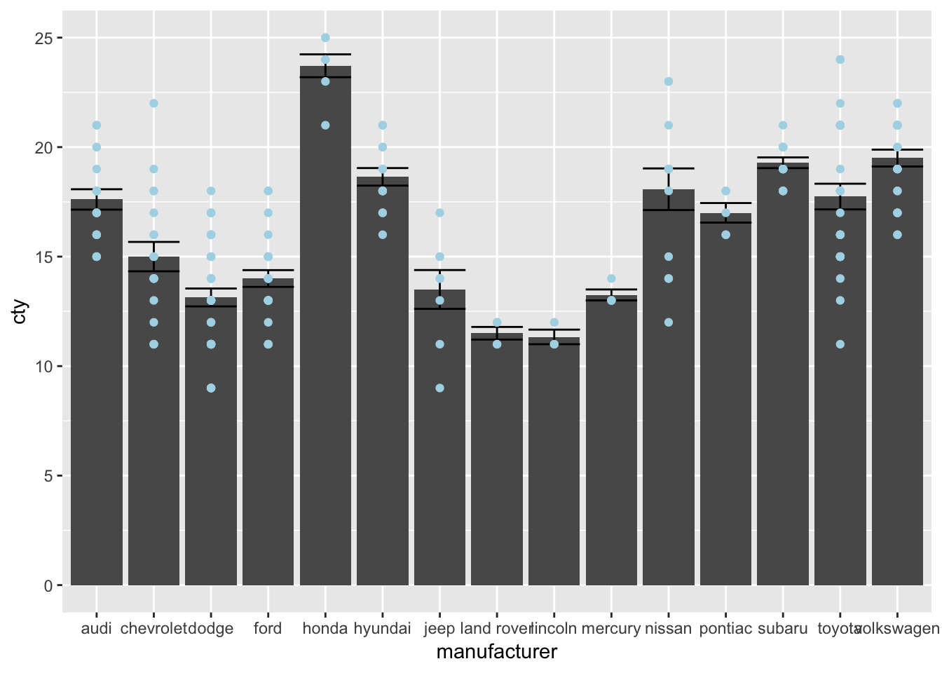
This is certainly not what we had in mind! We have changed our underlying data; all 8 datapoints that were larger than 25 were removed and then the data were plotted. Compare the bar and error for Honda and Volkswagen in the two graphs.
An alternative and preferred way of doing this, is doing it in the following way:
ggplot(mpg, aes(x=manufacturer, y=cty)) + geom_bar(stat="summary", fun.y="mean") +
  geom_errorbar(stat="summary", fun.data="mean_se") +
  geom_point(colour="lightblue") +
coord_cartesian(ylim=c(0,25)) 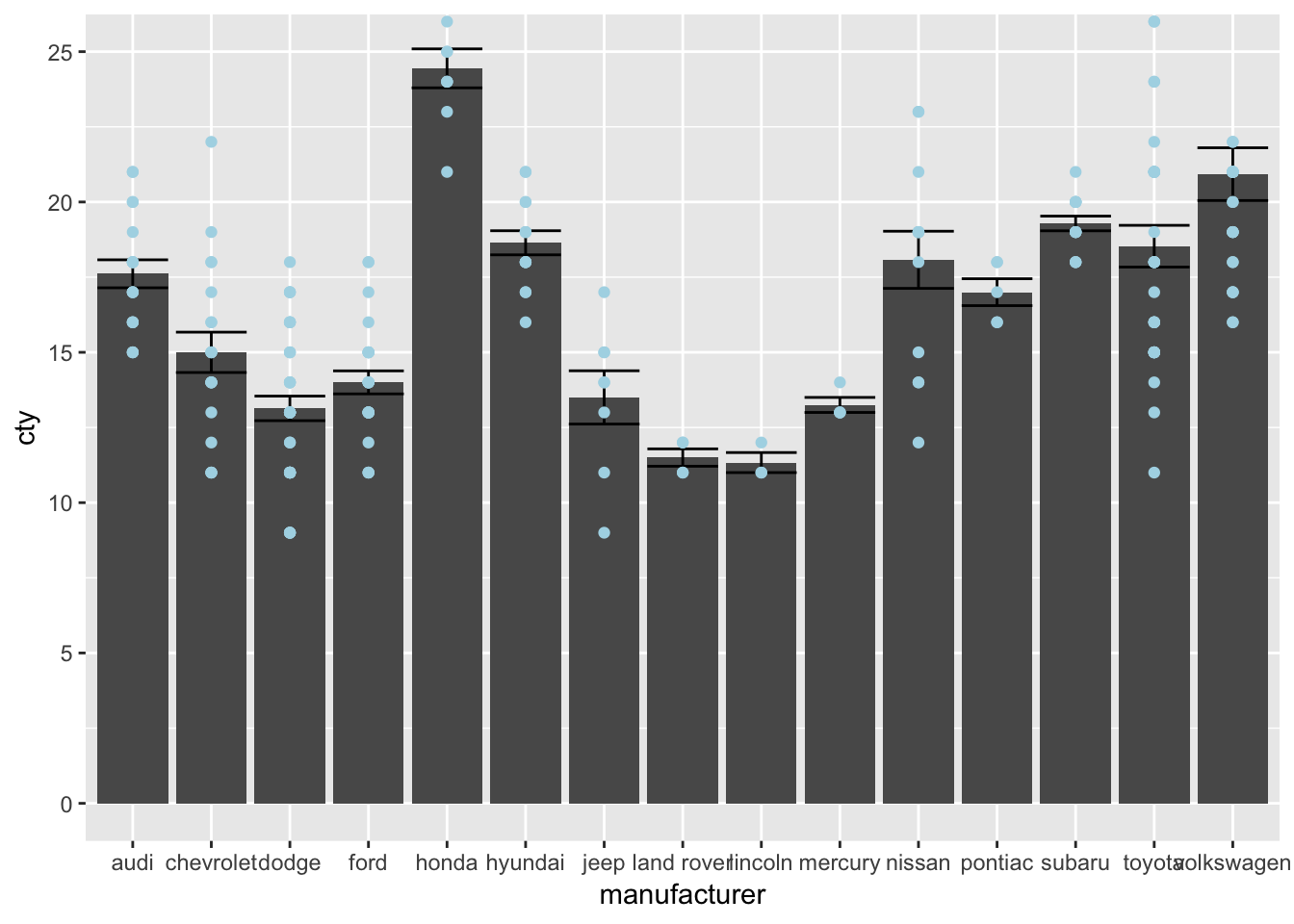
18.1.1 expand
ggplot adds some space to the bottom and the side of your axes. If you do not want this, use the expand() function. Compare the following two graphs:
ggplot(mpg, aes(x=displ, y=cty)) +
  geom_point() +
  scale_x_continuous(limits=c(0,8)) +
scale_y_continuous(limits=c(0,36)) 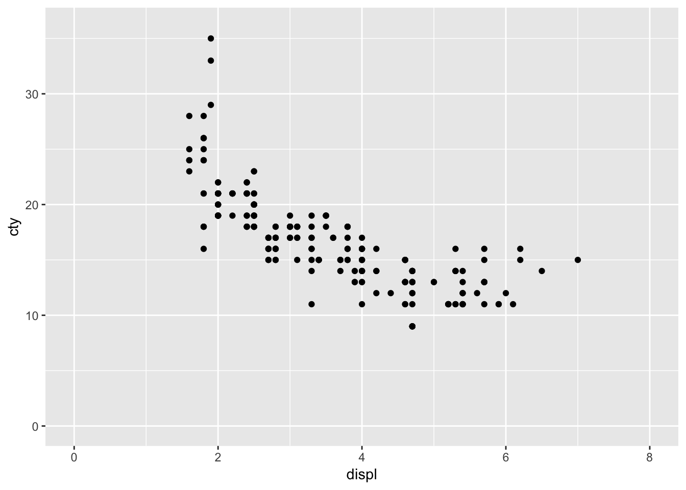
ggplot(mpg, aes(x=displ, y=cty)) +
  geom_point() +
  scale_x_continuous(limits=c(0,8), expand=c(0,0)) +
scale_y_continuous(limits=c(0,36), expand=c(0,0)) 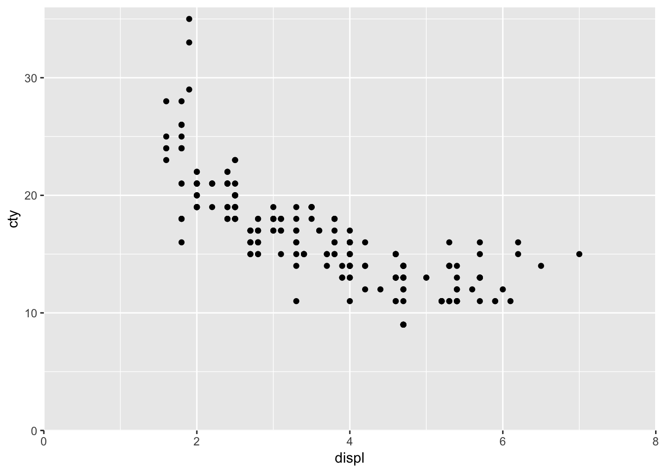
But do note that you are risking throwing away datapoints again if you specify limits that exlude particular datapoints.
18.2 Breaks
Sometimes we want to specify which values can be seen on the axes. Par exemple:
ggplot(mpg, aes(x=displ, y=cty)) +
  geom_point() +
  scale_x_continuous(breaks=c(1.4, 2.4, 4, 6.9)) +
  scale_y_continuous(breaks=seq(8, 35, by=2))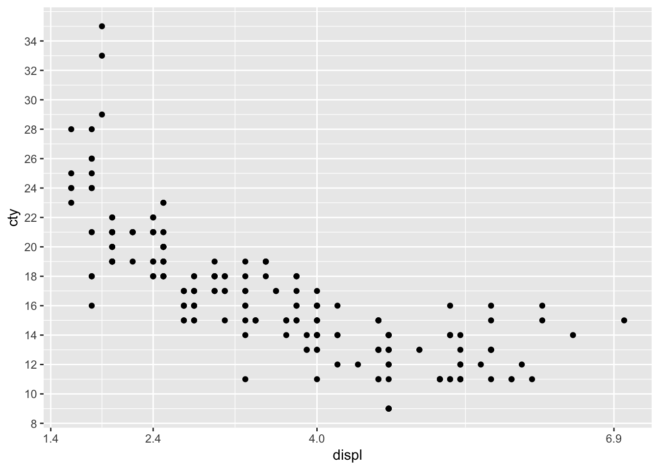
seq(8,35, by=2)is a neat litle trick we can do. Run that code (seq(8,35, by=2)); what does it mean?
18.3 Transformations
There are also functions that allow you to transform the scales of the axes. For instance, you can think of having a logarithmic scale, or a square-root-transformed scale.
ggplot(mpg, aes(x=displ, y=cty)) +
  geom_point() +
scale_x_continuous(trans="sqrt") 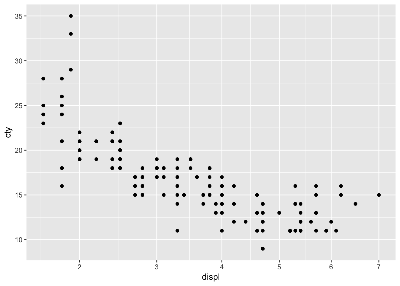
Look closely at the x-axis. We have transformed the x-axis. This works much better for variables that have more skewed distributions.
Another example:
ggplot(mpg, aes(x=displ, y=cty)) +
  geom_point() +
scale_y_continuous(trans="reverse") 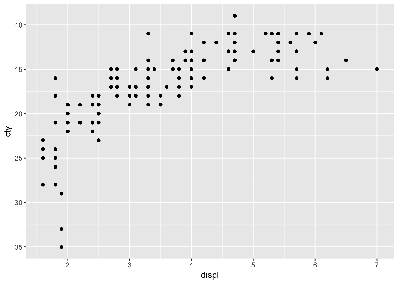
What happened?
18.4 labels
ggplot can also do something nifty with the labels of the axes. Let’s look at four examples to get some impressions (after we install a necessary package):
library(scales)ggplot(mpg, aes(x=displ, y=cty)) +
geom_point() +
scale_x_continuous(labels=scales::percent)  Cool that we can do this but obviously doesn’t make much sense.
ggplot(mpg, aes(x=displ, y=cty)) +
  geom_point() +
scale_x_continuous(labels=scales::dollar) 
Also nice that we can do this, but obviously not appropriate.
ggplot(mpg, aes(x=displ, y=cty)) +
  geom_point() +
scale_y_continuous(labels=scientific) 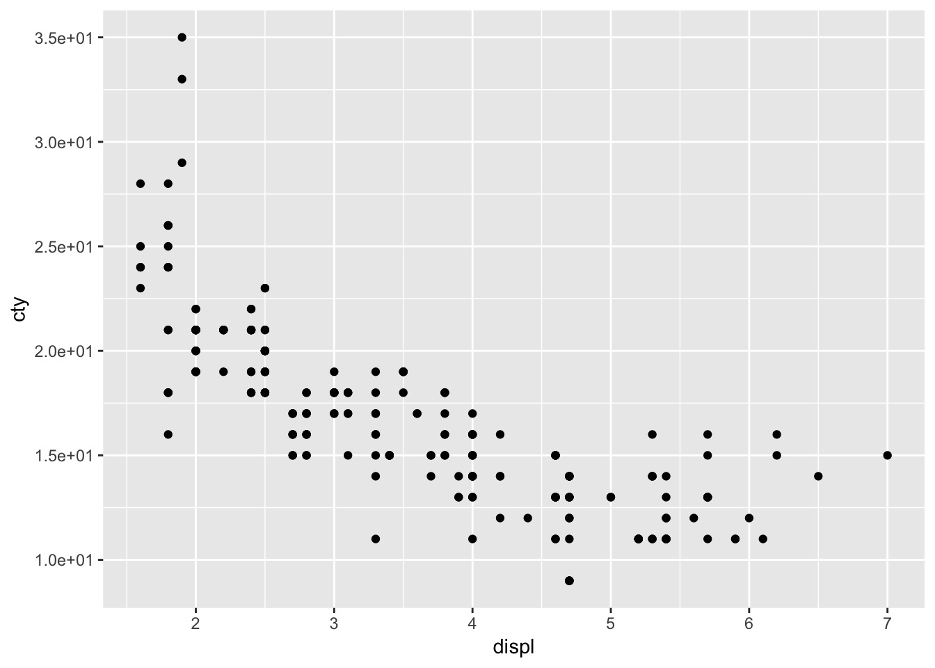
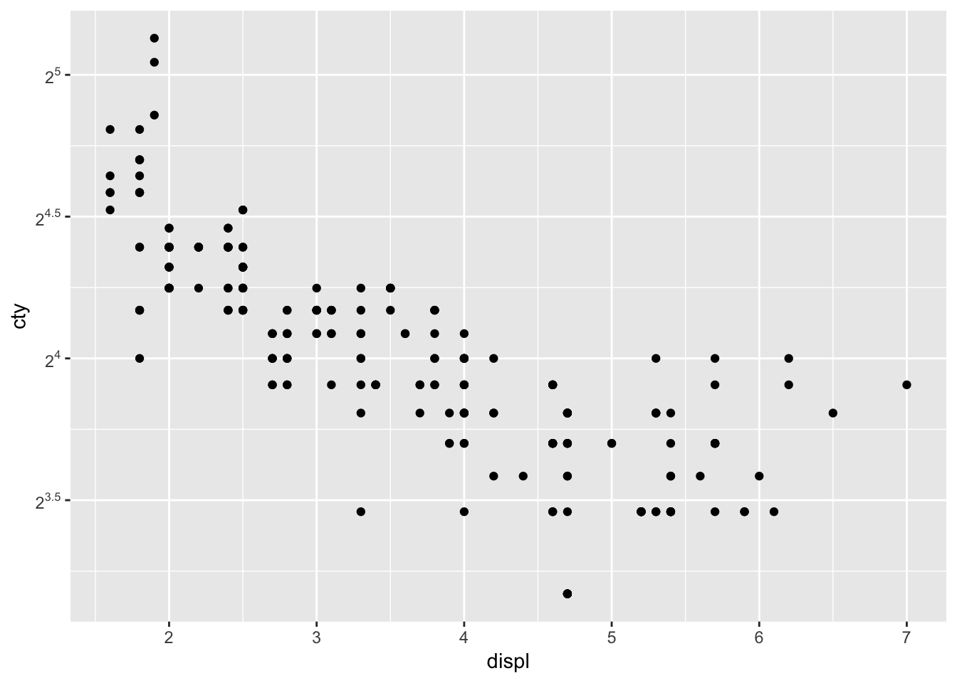
ggplot(mpg, aes(x=displ, y=cty)) +
  geom_point() +
  scale_y_continuous(trans = log2_trans(),
                     breaks = trans_breaks("log2", function(x) 2^x),
                     labels = trans_format("log2", math_format(2^.x)))