Chapter 5 ggplot - a quick overview
Now the R-basics are covered, we’ll move on to what we came for: visualizing data using ggplot! We’ll first get a quick glimpse of what ggplot can do, before we delve a bit into the theory behind ggplot. Later, we’ll start creating high-quality, publication-worthy graphs (or so I hope), and we’ll have a quick look at the different types of visualizations that are possible in R.
We must of course tell R that we will be using the ggplot2-package:
library(ggplot2)ggplot is not difficult to use. It is particularly straightforward when you want to make a quick graph as part of exploring your data. [remember, your data needs to be “tidy” 4]
ggplot(your_data, aes(x = x_variable, y = y_variable)) + geom_point()You can interpret this code as follows: create a ggplot-object (a graph) on the basis of the data(frame) “your_data” that you supply, and more specifically, use as data for the x-axis the variable named “x_variable” and as data for the y-axis the variable named “y_variable” (which both must exist in “your_data”). “aes” refers to “aesthetics”, and it essentially refers to how the data are structured. We’re almost there, but ggplot does not know yet what it has to do with the x_variable and y_variable in terms of visualizing. As you might have guessed “geom_point()” does this exactly: it specifies that we are interested in points (or dots). These commands together will create a scatter-plot. “geom” refers to “geometrics” and this specifies what type of graph you are interested in.
Try and run the above code; why doesn’t it work?
In many cases, you also want to include some grouping variable (maybe you want to show the pattern seperately for men and women). This is also easy in ggplot; in the aesthetics you can specify either a colour or a fill or a group depending on the function:
ggplot(your_data, aes(x=x_variable, y=y_variable, colour=group_variable)) + geom_point()You see that the code makes some sense, although it is still rather abstract, so let us create an actual visualization!
To see ggplot in action, we will use the mpg-data that comes with the ggplot-package. We’ll get a quick glimpse of what the data looks like when we call the dataset “mpg”.
data(mpg, package = "ggplot2")
mpg # An example dataset on cars.
## # A tibble: 234 x 11
## manufacturer model displ year cyl trans drv cty hwy fl class
## <chr> <chr> <dbl> <int> <int> <chr> <chr> <int> <int> <chr> <chr>
## 1 audi a4 1.8 1999 4 auto… f 18 29 p comp…
## 2 audi a4 1.8 1999 4 manu… f 21 29 p comp…
## 3 audi a4 2 2008 4 manu… f 20 31 p comp…
## 4 audi a4 2 2008 4 auto… f 21 30 p comp…
## 5 audi a4 2.8 1999 6 auto… f 16 26 p comp…
## 6 audi a4 2.8 1999 6 manu… f 18 26 p comp…
## 7 audi a4 3.1 2008 6 auto… f 18 27 p comp…
## 8 audi a4 q… 1.8 1999 4 manu… 4 18 26 p comp…
## 9 audi a4 q… 1.8 1999 4 auto… 4 16 25 p comp…
## 10 audi a4 q… 2 2008 4 manu… 4 20 28 p comp…
## # … with 224 more rows“mpg” is the name of the dataframe and includes data on types of cars and their use of fuel. “cty” refers to a variable in the data (in mpg), namely how many miles the car can drive per gallon of fuel in a city. “hwy” also refers to a variable in the data (in mpg), namely the miles per gallon on a highway.
Note that within RStudio, there is now a symbol representing “mpg” in the “environment”-tab in the upper right corner!
Figure 5.1: mpg in RStudio
5.1 Our first scatterplot
We will now try to create a scatter-plot using the code above.
ggplot(mpg, aes(x=cty, y=hwy)) + geom_point() 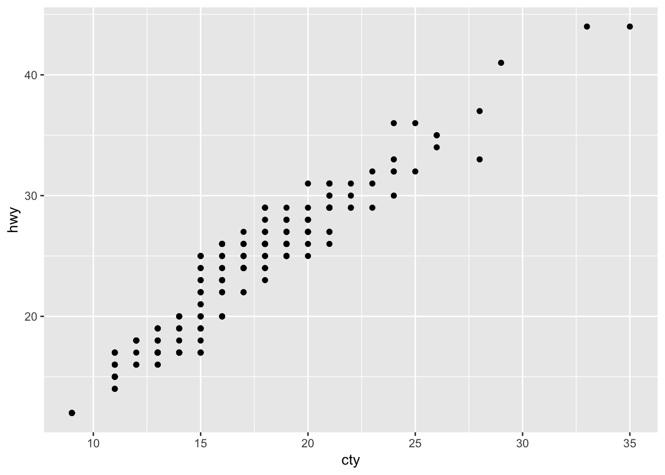
Our first ggplot-graph! Looks pretty good already! What does it mean? Cars that can drive more mile per gallon in the city (i.e. are less fuel consuming) can also drive more mile per gallon on the highway. Not a very remarkable conclusion.
It’s very easy to include a grouping variable; ggplot assigns nice colours! Let’s include the grouping variable “drv”; which refers to three different groups of cars: those that have front-, rear-, and 4-wheeldrive.
ggplot(mpg, aes(x=cty, y=hwy, colour=drv)) + geom_point() 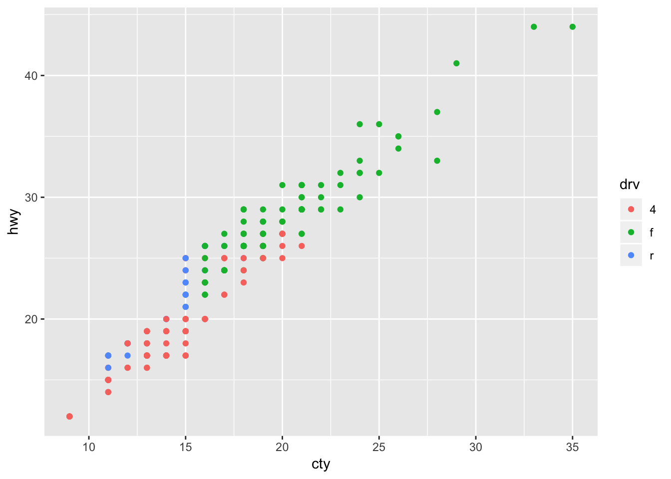
The beauty of ggplot is that using different a different “geom”-function will create a different graph:
ggplot(mpg, aes(x=cty, y=hwy)) + geom_count() 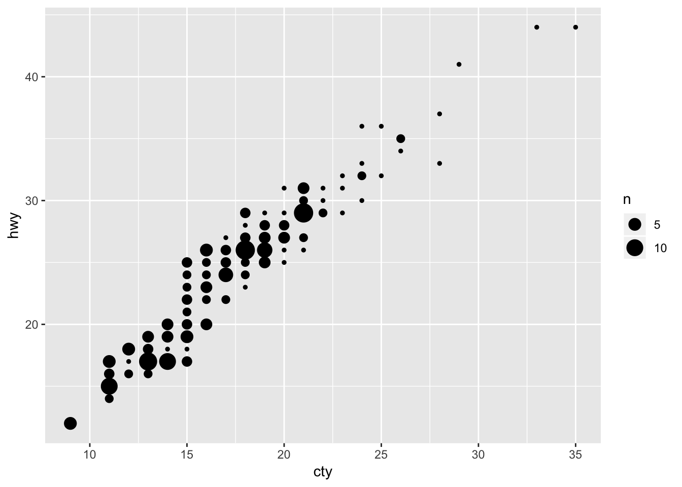
A bubbleplot! There was some overlap in points in the previous graph; in this graph, this overlap is represented by the size of the points.
Let’s try another scatterplot:
ggplot(mpg, aes(x=cty, y=hwy)) + geom_point() + geom_smooth() ## `geom_smooth()` using method = 'loess' and formula 'y ~ x'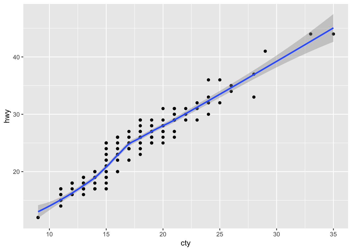
We have added a prediction line between the variables “cty” and “hwy” and a confidence band around the predictions! The message tells us that we have used the “loess” method to estimate the line. Other options are possible, which we will learn about later.
Such simple code already gives us very useful and pretty-good quality graphs! The beauty of ggplot is that you can easily combine multiple “geom”-functions, and that you can tweak any detail that you’d like.
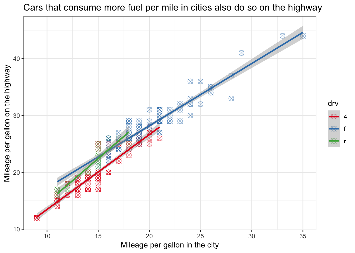
Adapting and modifying the graph by tweaking the details might take some more effort, but even here the “language” of ggplot is rather clear. Below is an example of the same data, plus some additional features that give you an idea of what you can do and how you can do it:
ggplot(mpg, aes(x=cty, y=hwy, colour=drv)) +
  geom_point(size=3, shape=13, alpha=0.5) + # Change the size and shape of the points and make them see-through
  geom_smooth(method="lm") + # Add linear regression lines
  scale_colour_brewer(palette = "Set1") + # Change the colours
  labs(x="Mileage per gallon in the city", y="Mileage per gallon on the highway",
       title="Cars that consume more fuel per mile in cities also do so on the highway") +  # Change labels of axes and add title
  theme_bw() # Remove the gray background