Chapter 12 Comparing group statistics
Because we are not always able to assess differences between groups “by eye” in particular cases (particularly when there are many datapoints), we often rely on a comparisons of group statistics (for example, the mean, or the median). Such group statistics are also important when statistically comparing groups, through, for instance, ANOVAs, t-tests, and non-parametric alternatives. In fact, the comparison of means may be the most popular statistical test out there, and the visualization of group means the most popular form of graph (regrettably). Here we’ll focus on boxplots and mean-errorbar-plots.
12.1 Boxplots
We’ve already seen boxplots in the previous chapter, so let’s have another look at boxplots. Let’s visualize the fuel efficiency for the different car-manufacturers (measured by “manufacturer”). Perhaps we can first get a glimpse of the different manufacurers:
table(mpg$manufacturer)##
## audi chevrolet dodge ford honda hyundai
## 18 19 37 25 9 14
## jeep land rover lincoln mercury nissan pontiac
## 8 4 3 4 13 5
## subaru toyota volkswagen
## 14 34 27And visualize:
ggplot(mpg, aes(x=manufacturer, y=cty)) + geom_boxplot() 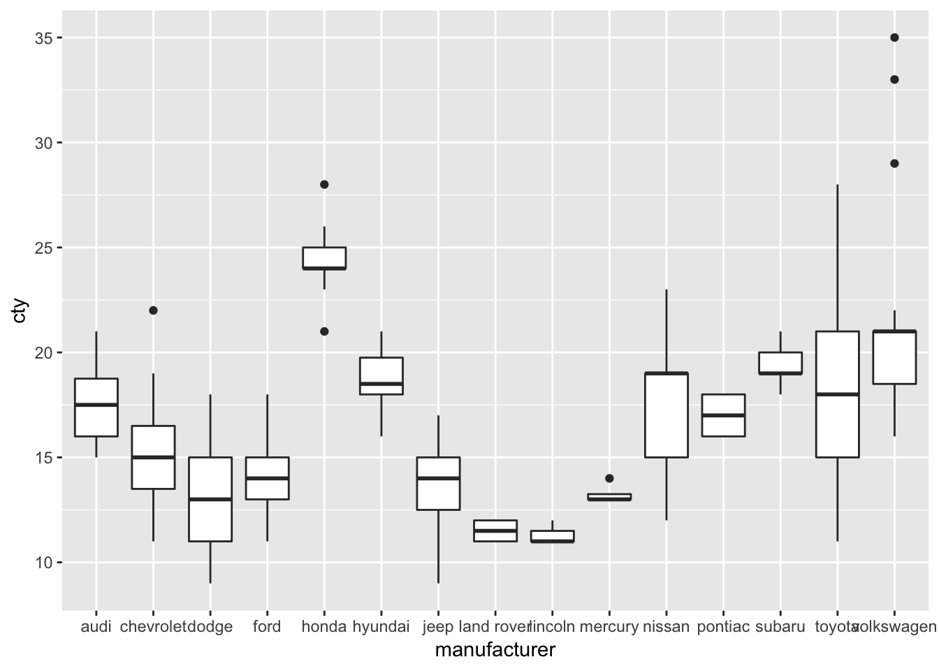
Honda, apparently, makes fuel-efficient cars, but rover and lincoln do not. Volkswagen has produced the most fuel-efficient cars.
12.1.1 Tweaking boxplots
Perhaps the boxplot would look better when we would order the manufacturers on their median fuel efficiency (this may seem a bit daunting):
ggplot(mpg, aes(x=reorder(manufacturer, cty, FUN=median), y=cty)) + geom_boxplot() 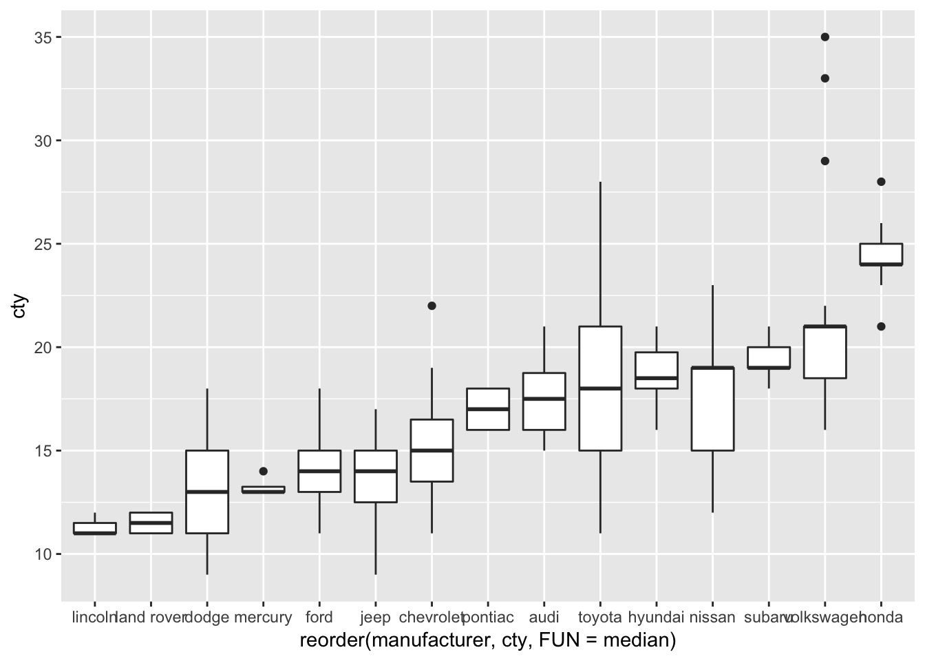
This looks better (except perhaps the weird x-axis label).
Let’s try to change some other features:
ggplot(mpg, aes(x=reorder(manufacturer, cty, FUN=median), y=cty)) +
  geom_boxplot(notch=TRUE, # Make a notched boxplot
               outlier.colour="red", # Change colour of outliers
               outlier.shape = 3 # Change shape of outliers
               ) +
  labs(x="Manufacturer")
## notch went outside hinges. Try setting notch=FALSE.
## notch went outside hinges. Try setting notch=FALSE.
## notch went outside hinges. Try setting notch=FALSE.
## notch went outside hinges. Try setting notch=FALSE.
## notch went outside hinges. Try setting notch=FALSE.
## notch went outside hinges. Try setting notch=FALSE.
## notch went outside hinges. Try setting notch=FALSE.
## notch went outside hinges. Try setting notch=FALSE.
## notch went outside hinges. Try setting notch=FALSE.
## notch went outside hinges. Try setting notch=FALSE.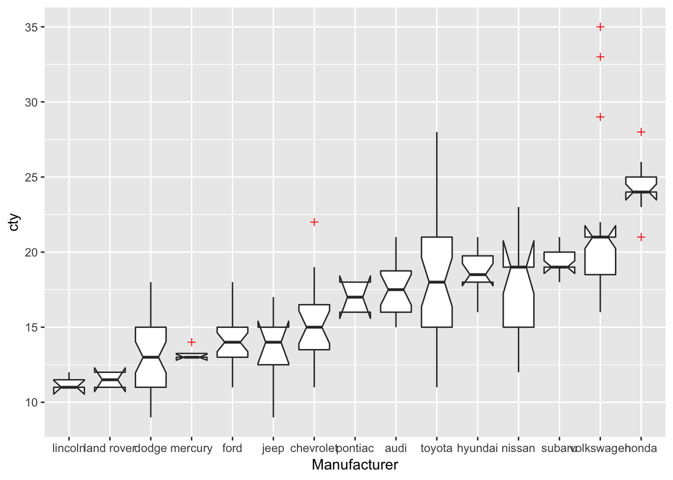
There are some warnings about notches that go outside hinges, but let’s not worry about them.
For more information on boxplots, see http://ggplot2.tidyverse.org/reference/geom_boxplot.html
12.2 Mean-errorbar-plots
12.2.1 Creating barplots of means
Often, people want to show the different means of their groups. This is often done through either bar-plots or dot/point-plots. Because a mean is a statistical summary that needs to be calculated, we must somehow let ggplot know that the bar or dot should reflect a mean.
We can do this by using ggplot’s built-in “stat”-functions. Again, the cheatsheet is helpful: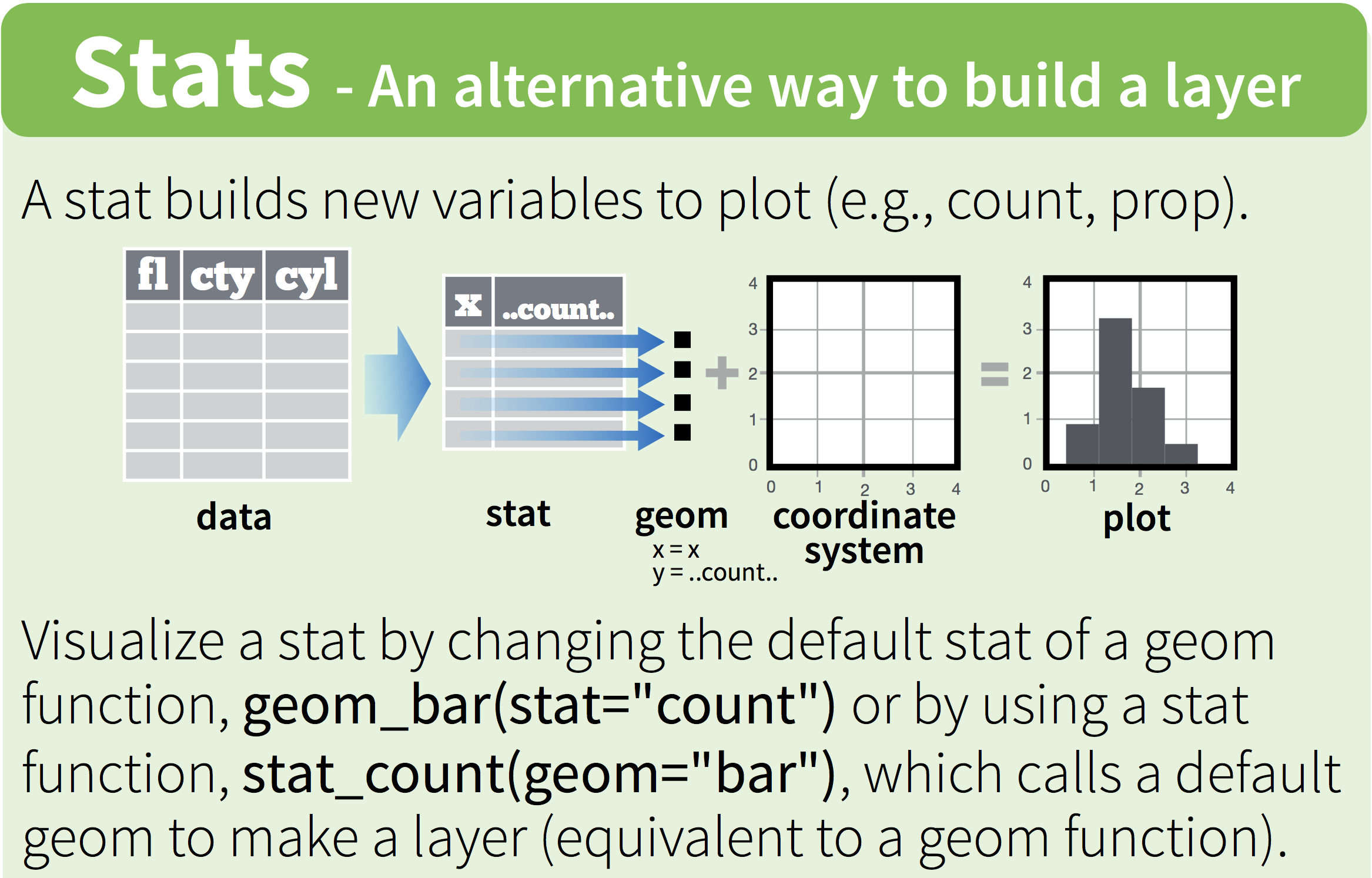
Figure 12.1: The stat-function
Let’s try and create a bar-plot of the means. Rather than using the `stat=“count”’), we are going to tell to stat that we want a summary measure, namely the mean:
ggplot(mpg, aes(x=manufacturer, y=cty)) + geom_bar(stat="summary", fun.y="mean") 
It is important to understand, what happens “under the hood”; as the cheatsheet already suggests, the stat-function creates a new dataset (with the means for all the groups), and uses this dataset for the visualization. But we don’t have to let ggplot do all the work for us; we can also calculate the dataset with the means ourselves and pass this new dataset along through ggplot. So let’s create the data ourselves.
Let’s install a package that can help us with this process:
install.packages("dplyr")library(dplyr)
# Create new dataframe mpg_means
mpg_means <- mpg %>%
group_by(manufacturer) %>% # Group the data by manufacturer
summarize(mean_cty=mean(cty)) # Create new variable which is the mean of cty
mpg_means## # A tibble: 15 x 2
## manufacturer mean_cty
## <chr> <dbl>
## 1 audi 17.6
## 2 chevrolet 15
## 3 dodge 13.1
## 4 ford 14
## 5 honda 24.4
## 6 hyundai 18.6
## 7 jeep 13.5
## 8 land rover 11.5
## 9 lincoln 11.3
## 10 mercury 13.2
## 11 nissan 18.1
## 12 pontiac 17
## 13 subaru 19.3
## 14 toyota 18.5
## 15 volkswagen 20.9Now that we have done the work ourselves, we can plot the means! Importantly, we are not going to specify that we will create a “summary” with stat="summary" and neither will we specify a function fun.y="mean". Of course, we need to tell ggplot that we’ll make use of our new dataset, and also that we’ll be using the “mean_cty” variable from this new dataset.
ggplot(mpg_means, aes(x=manufacturer, y=mean_cty)) + geom_bar() Error: stat_count() must not be used with a y aesthetic.Hhmm, an error message. This is because geom_bar() apparently expects some ‘stat’, and we can’t specify our own y aesthetic. The trick here is to specify as the “stat” being “identity”; this means that the numbers that are explicitely specified should be used (they define the “identity” of the bars).
ggplot(mpg_means, aes(x=manufacturer, y=mean_cty)) + geom_bar(stat="identity") 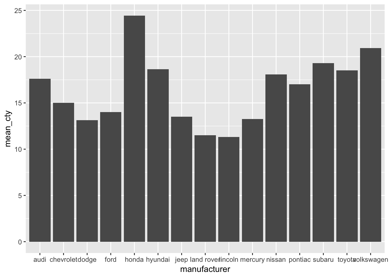
Now we have reproduced our earlier plot! So we’ve found two ways of doing the same thing. In this case, the first specification seems much easier to understand than the second, and also less work because we don’t have to create a new dataset. The second option does give us a bit more flexibility though, particularly if we want to do something more complex to our dataset than just calculating means.
12.2.2 Creating point-plots of means
Let’s do the same for point-plots of the means. This is very similar, yet a bit different, because geom_point() works slightly different from geom_bar().
ggplot(mpg, aes(x=manufacturer, y=cty)) + geom_point(stat="summary", fun.y="mean") 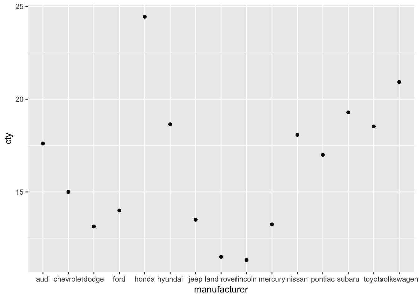
That was easy! Now let us recreate the graph with our own dataset “mpg_means” that we created above:
ggplot(mpg_means, aes(x=manufacturer, y=mean_cty)) + geom_point() 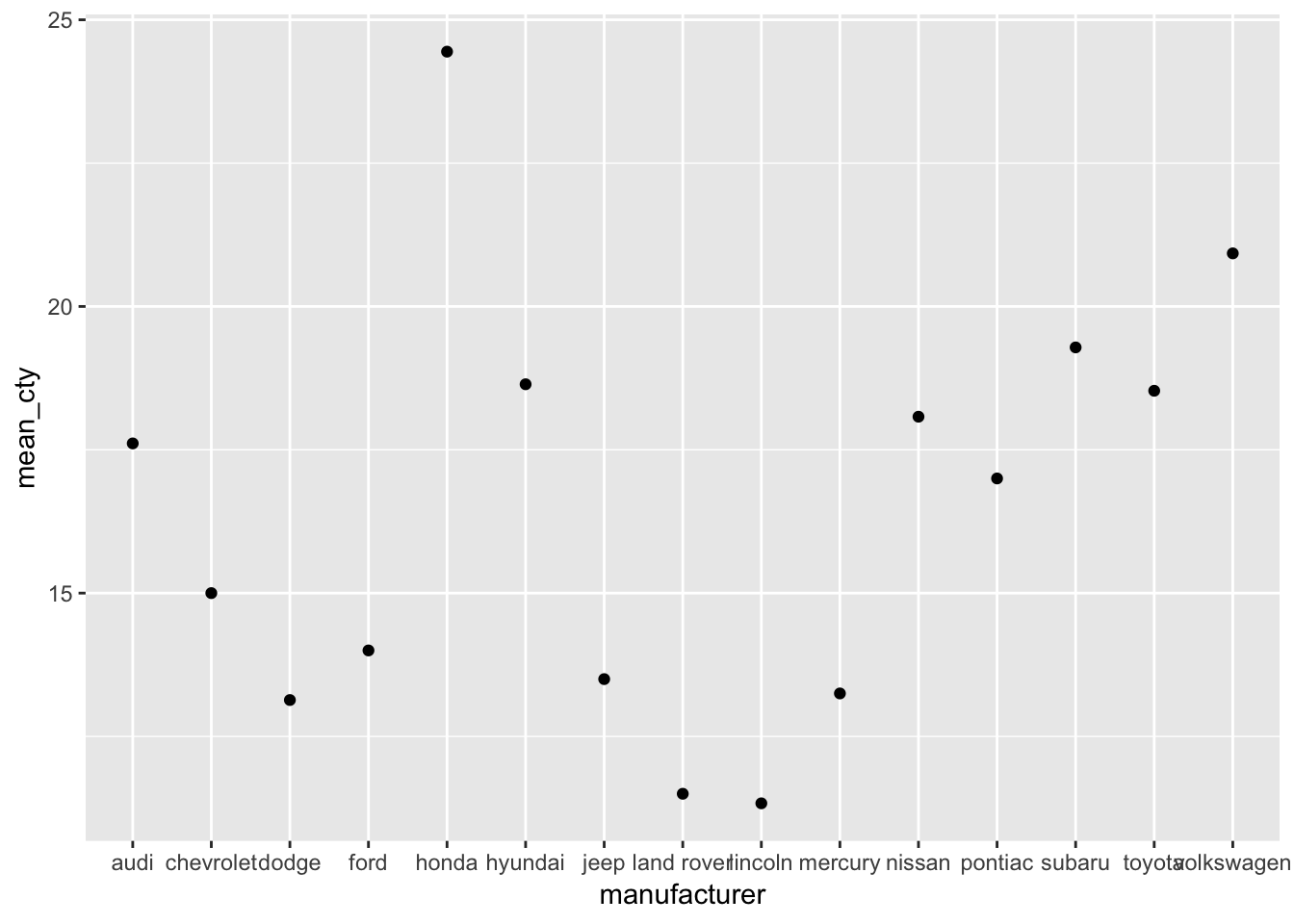
Why do we need a
stat="something"when we usegeom_bar()but not when we usegeom_point()?
12.3 Adding error bars
Often, mean plots are associated with errorbars (e.g., 1 standard error around the mean, or 95% confidence intervals). We’ll use no less than three ways of getting the errorbars in the graph. This is not to annoy you, but to give you some further insight into how ggplot works. They all depend on the geom_errorbar() function.
12.3.1 By creating a new dataframe
Let’s start with the most laborious way of achieving errorbars around the means; creating a new dataset. This time, in addition to calculating the mean, we will also calculate the standard error (which equates to the standard deviation divided by the square root of N).
library(dplyr)
# Create new dataframe mpg_means_se
mpg_means_se <- mpg %>%
  group_by(manufacturer) %>% # Group the data by manufacturer
  summarize(mean_cty=mean(cty), # Create variable with mean of cty per group
            sd_cty=sd(cty), # Create variable with sd of cty per group
            N_cty=n(), # Create new variable N of cty per group
            se=sd_cty/sqrt(N_cty), # Create variable with se of cty per group
            upper_limit=mean_cty+se, # Upper limit
            lower_limit=mean_cty-se # Lower limit
            )
mpg_means_se
## # A tibble: 15 x 7
## manufacturer mean_cty sd_cty N_cty se upper_limit lower_limit
## <chr> <dbl> <dbl> <int> <dbl> <dbl> <dbl>
## 1 audi 17.6 1.97 18 0.465 18.1 17.1
## 2 chevrolet 15 2.92 19 0.671 15.7 14.3
## 3 dodge 13.1 2.49 37 0.409 13.5 12.7
## 4 ford 14 1.91 25 0.383 14.4 13.6
## 5 honda 24.4 1.94 9 0.648 25.1 23.8
## 6 hyundai 18.6 1.50 14 0.401 19.0 18.2
## 7 jeep 13.5 2.51 8 0.886 14.4 12.6
## 8 land rover 11.5 0.577 4 0.289 11.8 11.2
## 9 lincoln 11.3 0.577 3 0.333 11.7 11
## 10 mercury 13.2 0.5 4 0.25 13.5 13
## 11 nissan 18.1 3.43 13 0.950 19.0 17.1
## 12 pontiac 17 1 5 0.447 17.4 16.6
## 13 subaru 19.3 0.914 14 0.244 19.5 19.0
## 14 toyota 18.5 4.05 34 0.694 19.2 17.8
## 15 volkswagen 20.9 4.56 27 0.877 21.8 20.0Now let’s use this information to add an errorbar with the help of geom_errorbar, which requires as input a minimim boundary ymin and a maximum boundary ymax.
ggplot(mpg_means_se, aes(x=manufacturer, y=mean_cty)) + geom_bar(stat="identity") +
  geom_errorbar(aes(ymin=lower_limit, ymax=upper_limit))
12.3.2 Creating your own “se” function within geom_errorbar()
ggplot(mpg, aes(x=manufacturer, y=cty)) + geom_bar(stat="summary", fun.y="mean") +
  geom_errorbar(stat="summary",
                fun.ymin=function(x) {mean(x)-sd(x)/sqrt(length(x))},
                fun.ymax=function(x) {mean(x)+sd(x)/sqrt(length(x))})
What’s going on here?
12.3.3 Using the built-in mean_se() function
ggplot(mpg, aes(x=manufacturer, y=cty)) + geom_bar(stat="summary", fun.y="mean") +
  geom_errorbar(stat="summary", fun.data="mean_se")
This last option is clearly the fastest way, but perhaps not the most intuitive one. Indeed, one requirement is that you know about the existence of the mean_se function. Particularly in the early stages, I would use the more labour intensive first method, in which you create a new dataframe that you pass on to ggplot. Comparing the dataframe to the graphs allows for better checking whether everything was done right.
Incidentally, this function can be used easily to get a 95%-confidence interval (a 95% CI is ± 1.96 * standard error). The mean_se() can also be give a multiplier (of the se, which by default is 1). Let’s change the multiplier to 1.96:
ggplot(mpg, aes(x=manufacturer, y=cty)) + geom_bar(stat="summary", fun.y="mean") +
  geom_errorbar(stat="summary", fun.data="mean_se", fun.args = list(mult = 1.96))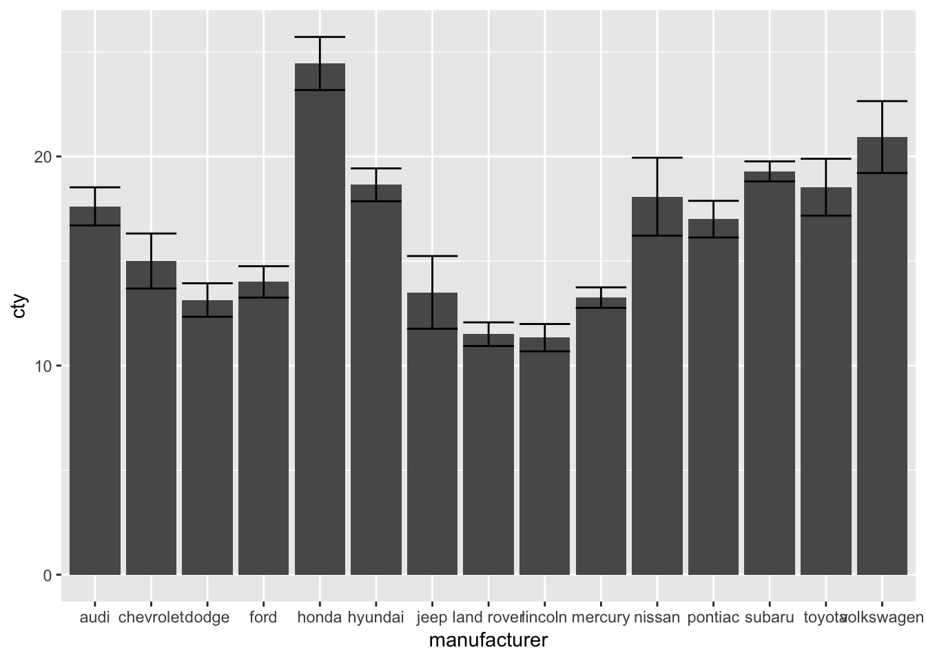
To find more information on the mean_se() function, see: http://ggplot2.tidyverse.org/reference/mean_se.html
12.3.4 Point-error plots
All these methods can also be used for the (common) point-error plot:
ggplot(mpg, aes(x=manufacturer, y=cty)) + geom_point(stat="summary", fun.y="mean") +
  geom_errorbar(stat="summary", fun.data="mean_se", fun.args = list(mult = 1.96))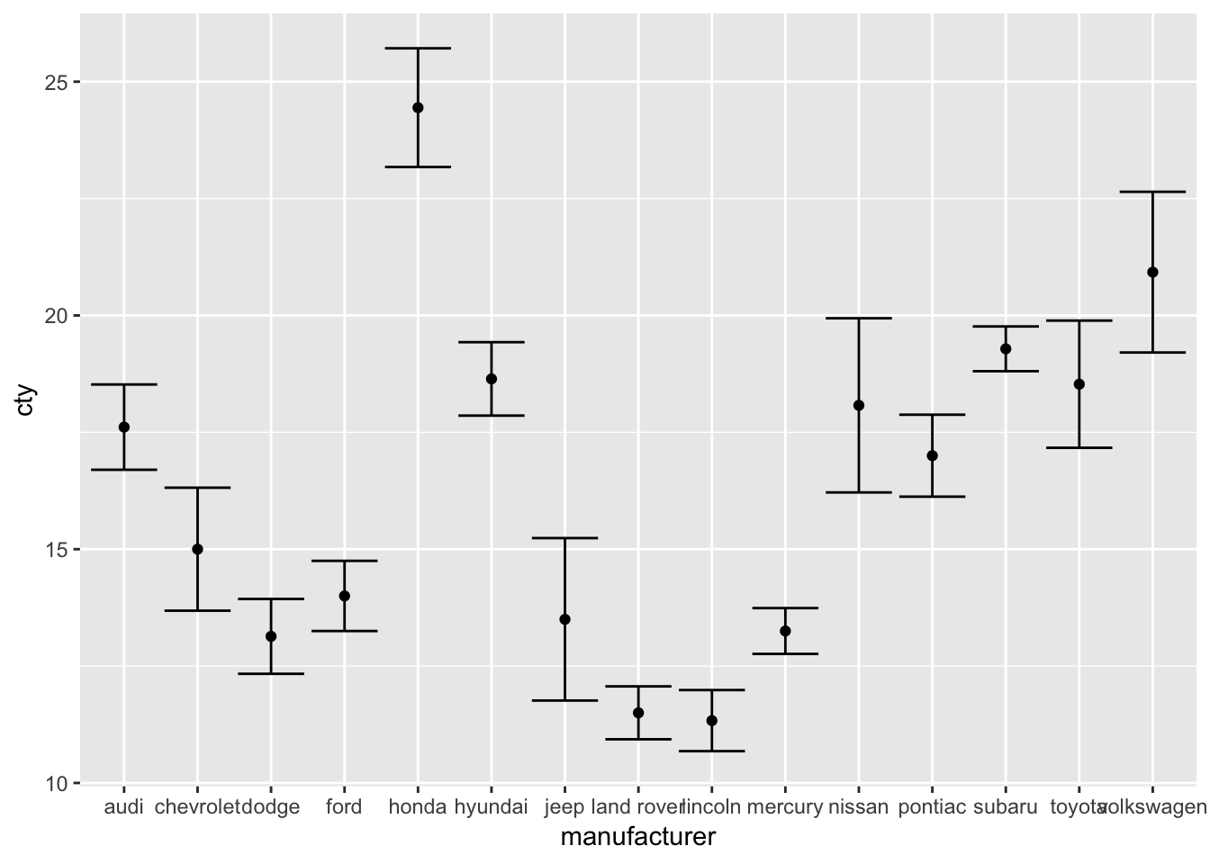
Also this plot might benefit from reordering the x-axis on the basis of the mean. I’ll also change the width of the errorbar:
ggplot(mpg, aes(x=reorder(manufacturer, cty, FUN=mean), y=cty)) +
  geom_point(stat="summary", fun.y="mean") +
  geom_errorbar(stat="summary", fun.data="mean_se", fun.args = list(mult = 1.96), width=0)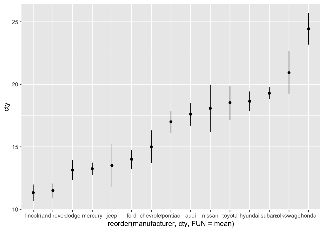
Create a bar-error-plot in which we compare the fuel efficiency (cty) across front-, rear-, and 4-wheel drives (measured in variable ‘drv’). Make the colours of the bars and the errorbars different (and you can pick any colours you’d like).
12.4 An important note on mean-error-plots
There are very good reasons to avoid mean-error plots (which is why it’s so sad they are so common), which have to do with the fact that the mean is not always a good summary measure of a distribution, and that the standard error is not always a good measure of the variation. The below figures show this very clearly:
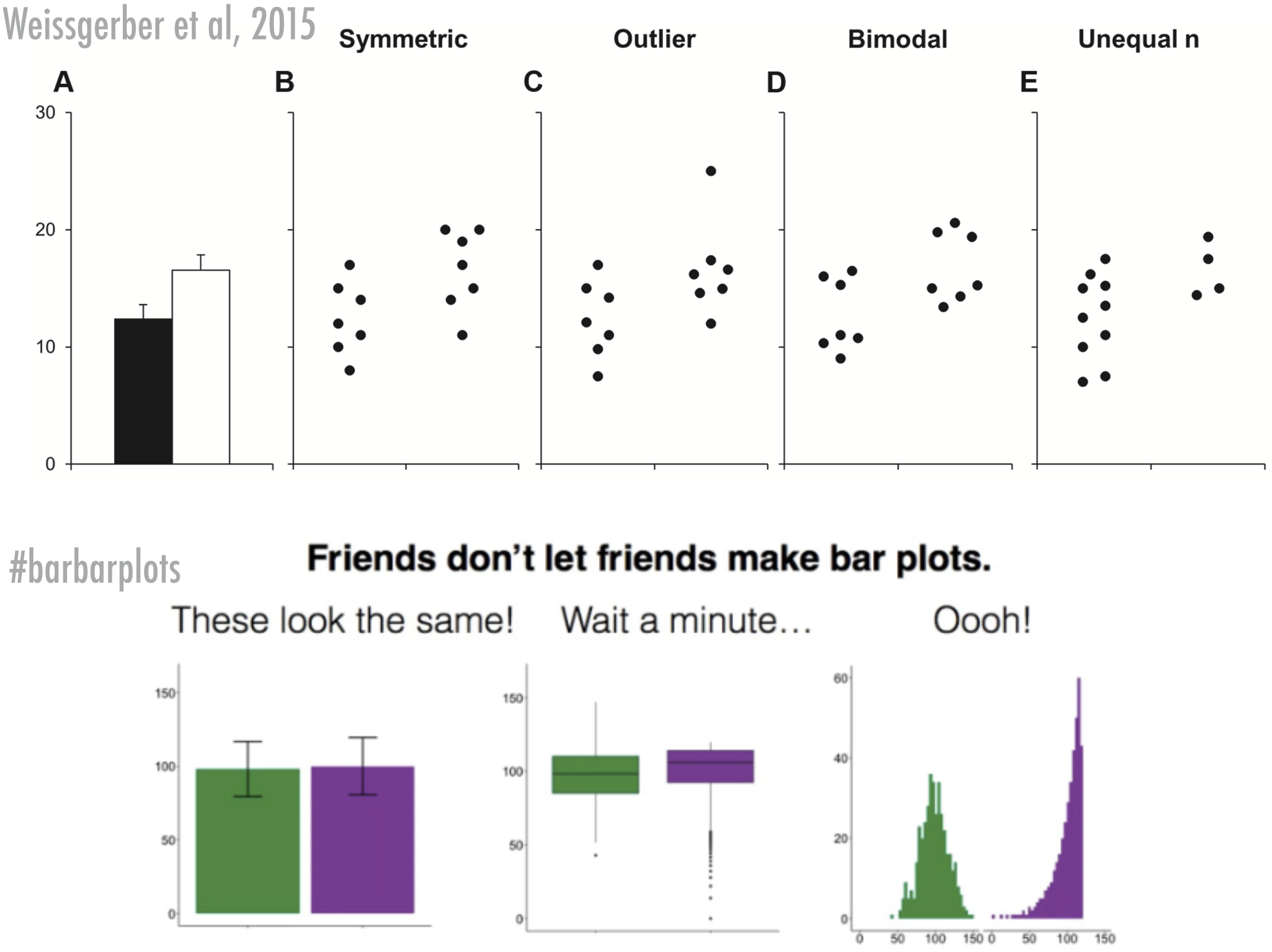
Figure 12.2: Bar bar plots
Of course, mean-error-plots have their value too, so if you feel you must create one, then I’d suggest you always include the raw data or some distributional information in the graph as well. Two examples that I think improve the mean-error-plots tremendously (remember, the purpose of graphs is to help the reader get a better grasp on your data, not to only help the reader understand basic summary measures of the data):
12.4.1 Mean-error-plots + raw data
Let’s add the raw data by adding points. I’ve also changed some of the features of the graphs:
ggplot(mpg, aes(x=reorder(manufacturer, cty, FUN=mean), y=cty)) +
  geom_jitter(colour="lightblue", alpha=0.5, width=0.1) +
  geom_point(stat="summary", fun.y="mean") +
  geom_errorbar(stat="summary", fun.data="mean_se", fun.args = list(mult = 1.96), width=0) +
  labs(x="Manufacturer", y="Mileage per gallon of fuel (mean + 95%CI)") +
  theme_bw() +
theme(axis.text.x=element_text(angle=45, hjust=1)) 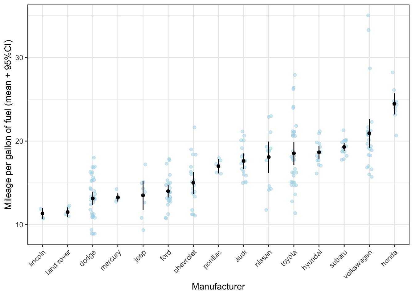
What can be seen much more clearly in this graph, is, for instance, that, while toyota on average makes rather fuel-efficient cars, there is quite some variation. However, the confidence interval is rather small, giving the impression that there is little variation within the cars produced by toyota. The reason is that the standard error is calculated by dividing the standard deviation by the square root of the sample size; given the sample size is rather large, the resulting standard error will be rather small (despite the variation as measured by the standard deviation is large). Let’s check the numbers:
mpg_means_se %>% arrange(-sd_cty) # Let's sort the data on the standard deviation## # A tibble: 15 x 7
## manufacturer mean_cty sd_cty N_cty se upper_limit lower_limit
## <chr> <dbl> <dbl> <int> <dbl> <dbl> <dbl>
## 1 volkswagen 20.9 4.56 27 0.877 21.8 20.0
## 2 toyota 18.5 4.05 34 0.694 19.2 17.8
## 3 nissan 18.1 3.43 13 0.950 19.0 17.1
## 4 chevrolet 15 2.92 19 0.671 15.7 14.3
## 5 jeep 13.5 2.51 8 0.886 14.4 12.6
## 6 dodge 13.1 2.49 37 0.409 13.5 12.7
## 7 audi 17.6 1.97 18 0.465 18.1 17.1
## 8 honda 24.4 1.94 9 0.648 25.1 23.8
## 9 ford 14 1.91 25 0.383 14.4 13.6
## 10 hyundai 18.6 1.50 14 0.401 19.0 18.2
## 11 pontiac 17 1 5 0.447 17.4 16.6
## 12 subaru 19.3 0.914 14 0.244 19.5 19.0
## 13 land rover 11.5 0.577 4 0.289 11.8 11.2
## 14 lincoln 11.3 0.577 3 0.333 11.7 11
## 15 mercury 13.2 0.5 4 0.25 13.5 13Indeed, Toyota has the the second largest standard deviation and the second largest sample size. It’s important to note that the mean and standard error do not seem to be a bad reflection of the distribution of toyota cars; what might be misleading is that without information on the raw data, you assume that the width of the confidence intervals is a reflection of the variation.
Do you think the mean and standard error are good statistical summaries for Volkswagen?
12.4.2 Mean-error-plots + violin plot
ggplot(mpg, aes(x=reorder(manufacturer, cty, FUN=mean), y=cty)) +
  geom_violin(colour="lightblue", alpha=0.5) +
  geom_point(stat="summary", fun.y="mean") +
  geom_errorbar(stat="summary", fun.data="mean_se", fun.args = list(mult = 1.96), width=0) +
  labs(x="Manufacturer", y="Mileage per gallon of fuel (mean + 95%CI)") +
  theme_bw() +
theme(axis.text.x=element_text(angle=45, hjust=1)) 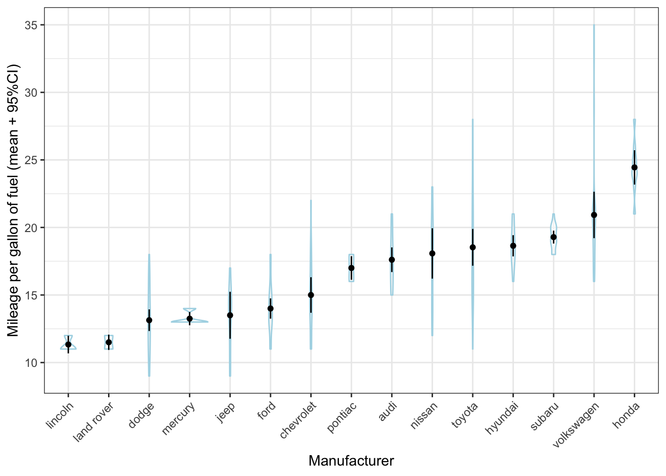
Hhmmm that doesn’t quite work, because there are so many different manufacturers and because there are relatively few cars per manufacturer. It works much better here:
ggplot(mpg, aes(x=reorder(drv, cty, FUN=mean), y=cty)) +
  geom_violin(colour="lightblue") +
  geom_point(stat="summary", fun.y="mean") +
  geom_errorbar(stat="summary", fun.data="mean_se", fun.args = list(mult = 1.96), width=0) +
  labs(x="Type of vehicle", y="Mileage per gallon of fuel (mean + 95%CI)") +
theme_bw() 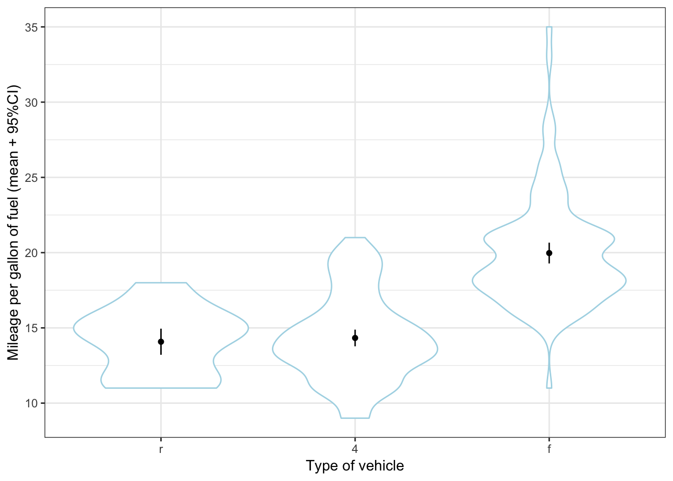
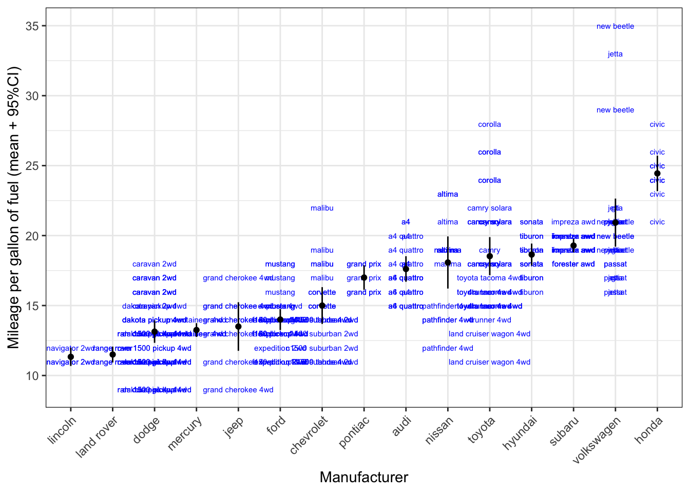
12.4.3 A quick preview of labels
Another way of showing the datapoints, is to show the actual car models with labels. It doesn’t quite work here because of the overlap, but it certainly provides us with more information (the toyota corolla are much mure fuel efficient than the toyota land cruiser wagon 4wd (who’d have thought)).
ggplot(mpg, aes(x=reorder(manufacturer, cty, FUN=mean), y=cty)) +
  geom_text(aes(label=model), size=2, colour="blue") +
  geom_point(stat="summary", fun.y="mean") +
  geom_errorbar(stat="summary", fun.data="mean_se", fun.args = list(mult = 1.96), width=0) +
  labs(x="Manufacturer", y="Mileage per gallon of fuel (mean + 95%CI)") +
  theme_bw() +
  theme(axis.text.x=element_text(angle=45, hjust=1))