R visualization workshop
Gert Stulp
21 March 2019
Chapter 1 Introduction
This workshop helps you in making graphs in R via ggplot2. “ggplot2” is a visualization package for R, written by Hadley Wickham (Wickham 2016), and it is simply fantastic. At lightning speed, we’ll first cover R, RStudio, and “tidy data”, before we go on to learning how to visualize our data (beautifully) in R. You can switch to different topics using the navigation bar on the left.
Just to give you a glimpse of the amazingness of ggplot, see what a few lines of code in R can produce:
ggplot(mpg, aes(x=cty, y=hwy, colour=drv)) + geom_point() + geom_smooth() + theme_minimal()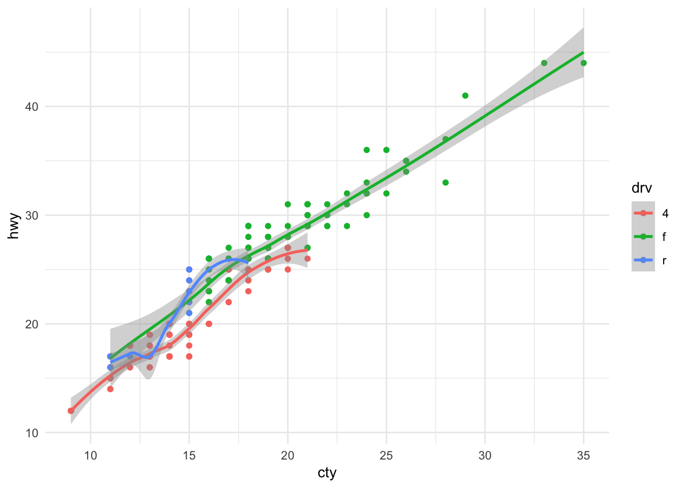
As to why graphs are important, I refer you to Anscombe’s quartet:
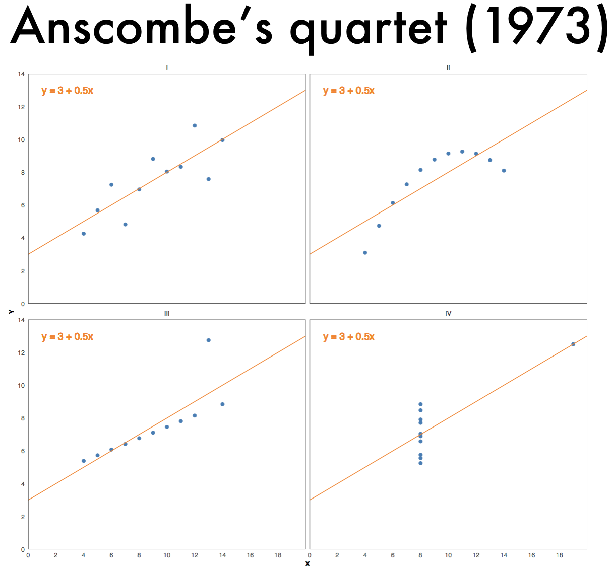
Figure 1.1: Anscombe’s quartet
References
Wickham, Hadley. 2016. Ggplot2: Elegant Graphics for Data Analysis. 2nd ed. Cham, Switzerland: Springer International Publishing. http://www.springer.com/br/book/9780387981413.