Chapter 2 ggplot - some theory
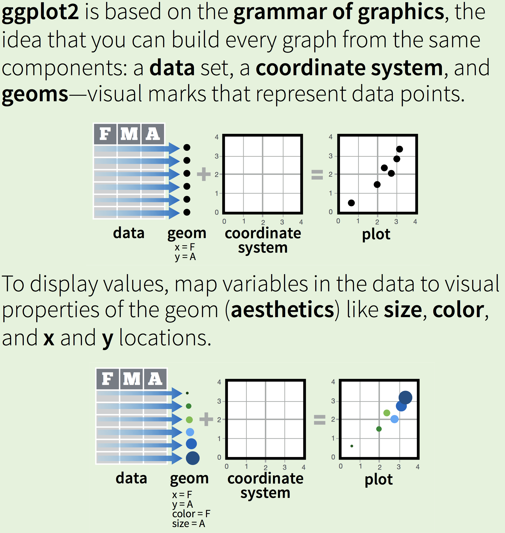
The “gg” in ggplot stands for the “grammar of graphics” developed by Leland Wilkinson (Wilkinson 2005), and describes the “deep features that underlie all statistical graphics” (Wickham 2016). In essence, it’s a way of thinking about how to create graphs. This all sounds a bit esoteric, so let’s try and be a bit more specific.
Wickham writes:
In brief, the grammar tells us that a statistical graphic is a mapping from data to aesthetic attributes (colour, shape, size) of geometric objects (points, lines, bars). The plot may also contain statistical transformations of the data and is drawn on a specific coordinate system.
Every graph consists of data within a coordinate system with the data being represented by geometric objects (or geoms), like points, lines, or bars. The data that you want to visualize are mapped to aesthetic attributes, like shape, colour, location.
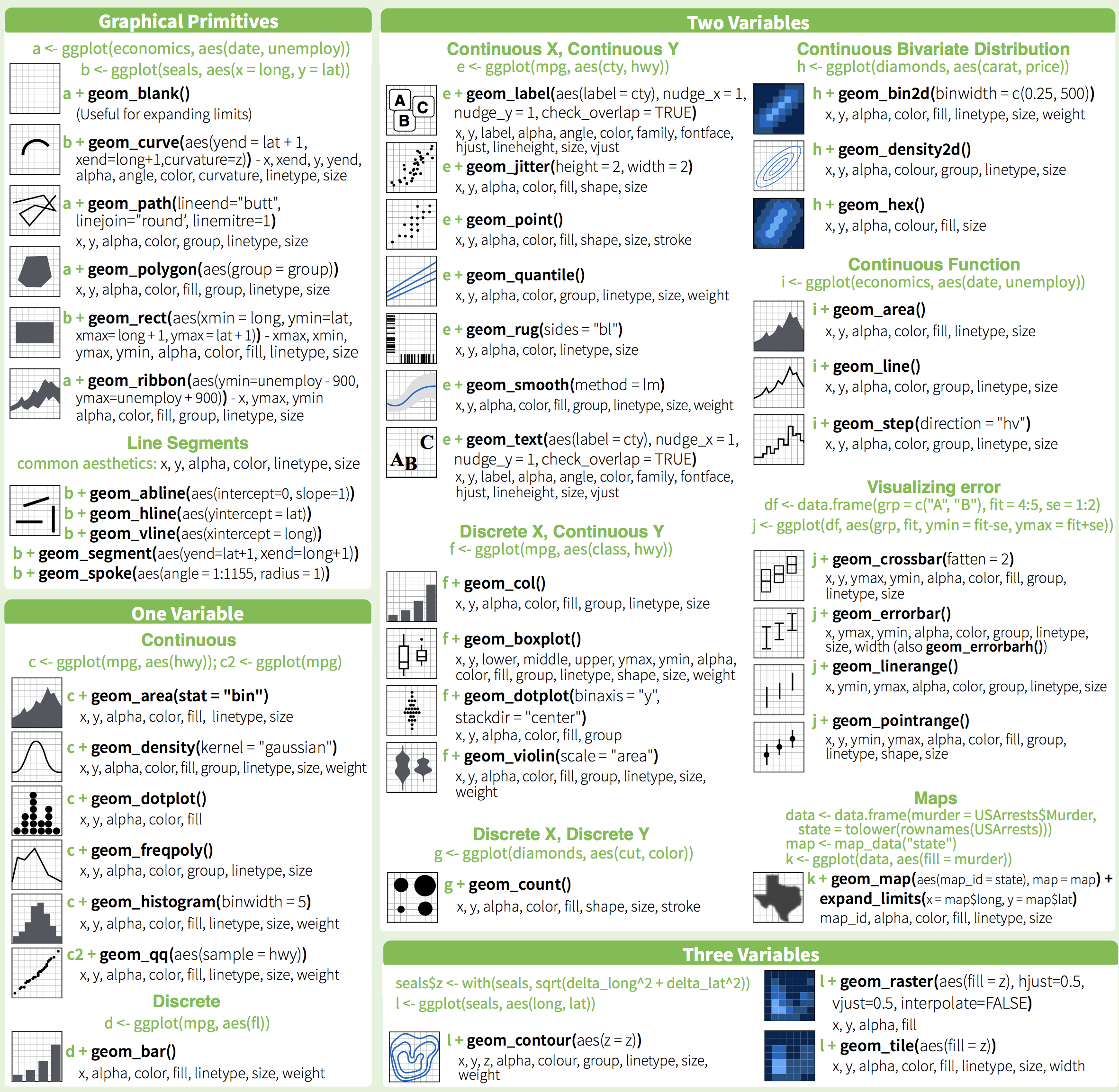
The ggplot-cheatsheet is tremendously helpful in representing this process:
 To see ggplot in action, we will first use the mpg-data that comes with the ggplot-package. We’ll get a quick glimpse of what the data looks like when we call the dataset
 mpg.
data(mpg, package = "ggplot2")
mpg # An example dataset on cars.
## # A tibble: 234 × 11
## manufacturer model displ year cyl trans drv cty hwy fl class
## <chr> <chr> <dbl> <int> <int> <chr> <chr> <int> <int> <chr> <chr>
## 1 audi a4 1.8 1999 4 auto… f 18 29 p comp…
## 2 audi a4 1.8 1999 4 manu… f 21 29 p comp…
## 3 audi a4 2 2008 4 manu… f 20 31 p comp…
## 4 audi a4 2 2008 4 auto… f 21 30 p comp…
## 5 audi a4 2.8 1999 6 auto… f 16 26 p comp…
## 6 audi a4 2.8 1999 6 manu… f 18 26 p comp…
## 7 audi a4 3.1 2008 6 auto… f 18 27 p comp…
## 8 audi a4 quattro 1.8 1999 4 manu… 4 18 26 p comp…
## 9 audi a4 quattro 1.8 1999 4 auto… 4 16 25 p comp…
## 10 audi a4 quattro 2 2008 4 manu… 4 20 28 p comp…
## # … with 224 more rowsmpg is the name of the dataframe and includes data on types of cars and their use of fuel. cty refers to a variable in the data (in mpg), namely how many miles the car can drive per gallon of fuel in a city. hwy also refers to a variable in the data (in mpg), namely the miles per gallon on a highway.
ggplot(mpg, aes(x = cty, y = hwy, colour = drv)) +
geom_point() 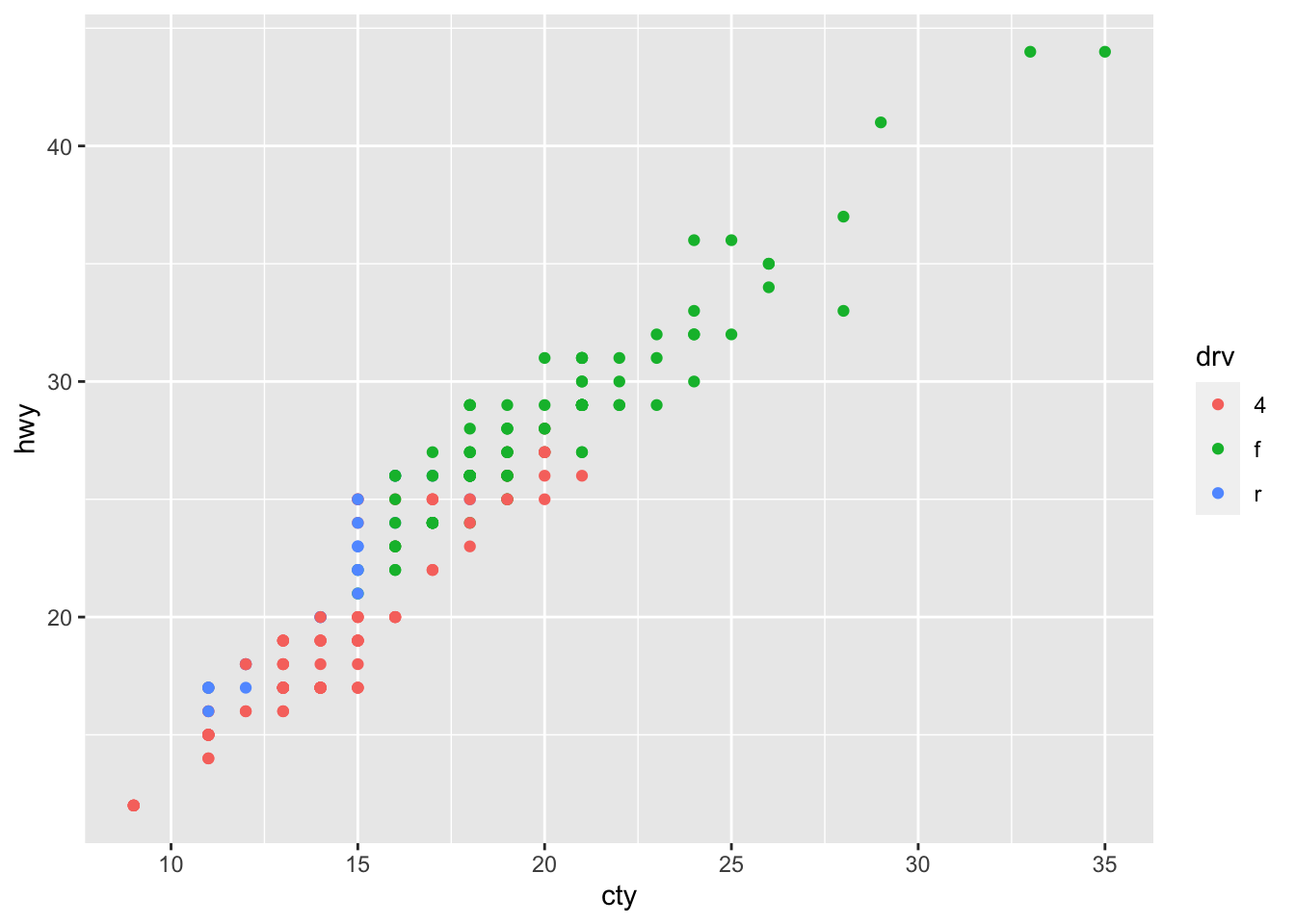
The data(set) here is ‘mpg’. The data will be represented by points (the geom). We have mapped the variables in the data to visual properties of the geom, the aesthetics; in this case the x- and y-location (based on variables cty and hwy that exist in mpg) and a colour (based on the variable drv). We haven’t specified a coordinate system, so ggplot takes the default Cartesian coordinate system (but other options are available!).
The beauty of ggplot is that using different a different geom-function will create a different graph:
ggplot(mpg, aes(x = cty, y = hwy)) +
  geom_count()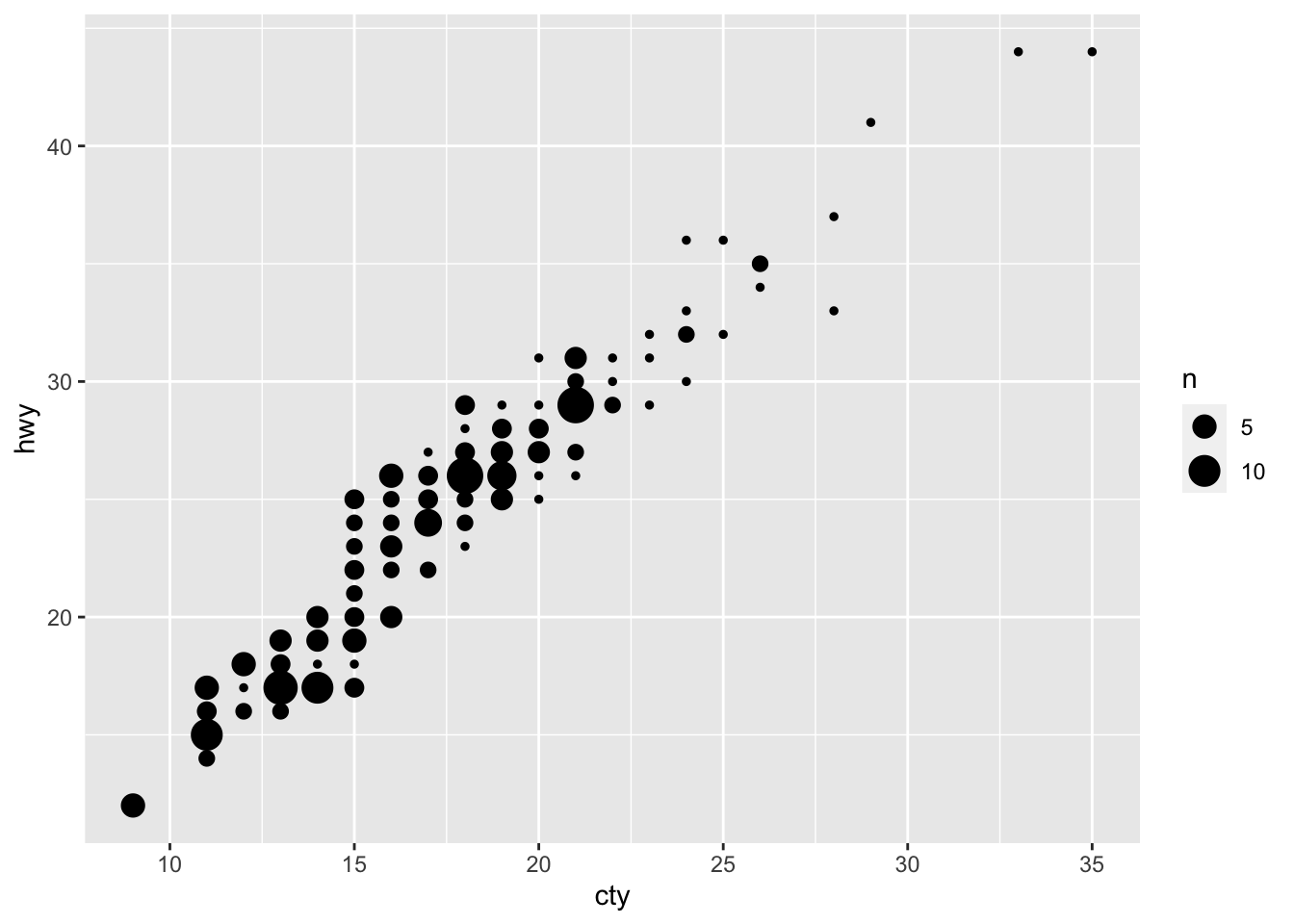
That you can add multiple layers:
ggplot(mpg, aes(x = cty, y = hwy)) +
  geom_point() +
  geom_smooth()
## `geom_smooth()` using method = 'loess' and formula 'y ~ x'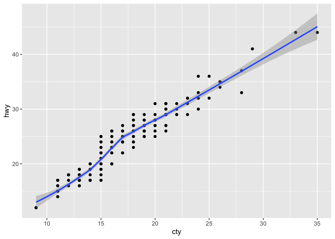
And that you can customise nearly everything (as we will see)
Kieran Healy’s recent (freely available) book “Data Visualization for Social Science” (Healy 2018) is a useful resource. For a quick overview of ggplot, the chapter on visualization in “R for data science” (Garrett Grolemund (2017)) is also excellent.
2.1 geoms
There are many different type of graphs you can make in ggplot. For a quick overview, see the ggplot2-cheatsheet:
For more information, see Wickham’s book (Wickham 2016) and the official ggplot documentation. ggplot is very extensive, but the beauty of using R is that others are also contributing to its development. When a particular type of graph does not exist in ggplot, chances are that others already have made a package that you can use. For some examples of excellent extensions, see https://exts.ggplot2.tidyverse.org/.
For further examples of different graph-types, see here and here