Scales, Axes & Coordinate systems
Scales
Within ggplot there are a bunch of scales that control how a plot maps data values to the visual values of an aesthetic. To change the mapping, add a custom scale. These scales look something like (the ggplot2-cheatsheet is helpful as well):
scale_x_continuous; change your x-axis when your x-variable is continuous (scale_y_continuousfor y-axis)scale_x_discrete; change your x-axis when your x-variable is categorical (scale_y_discretefor y-axis)scale_*_identity; use data values as visual values (e.g.,scale_colour_identitywhen your variable incolour = variablecontains the names of colours). * can befill,colour,shape,sizescale_*_manual(values = c()); map discrete values to manually chosen visual values (e.g.,scale_fill_manual(values = c("4" = "blue", "r" = "red", "f" = "black"))* can befill,colour,shape,size.
scale_x_continuous
Let’s see what scale_x_continuous and scale_y_continuous can do.
We’ll change features from this graph
ggplot(mpg, aes(x = hwy, y = cty)) +
  geom_point()
Breaks
ggplot(mpg, aes(x = hwy, y = cty)) +
  geom_point() +
  scale_x_continuous(breaks = c(15, 20, 25, 30, 35, 40, 45))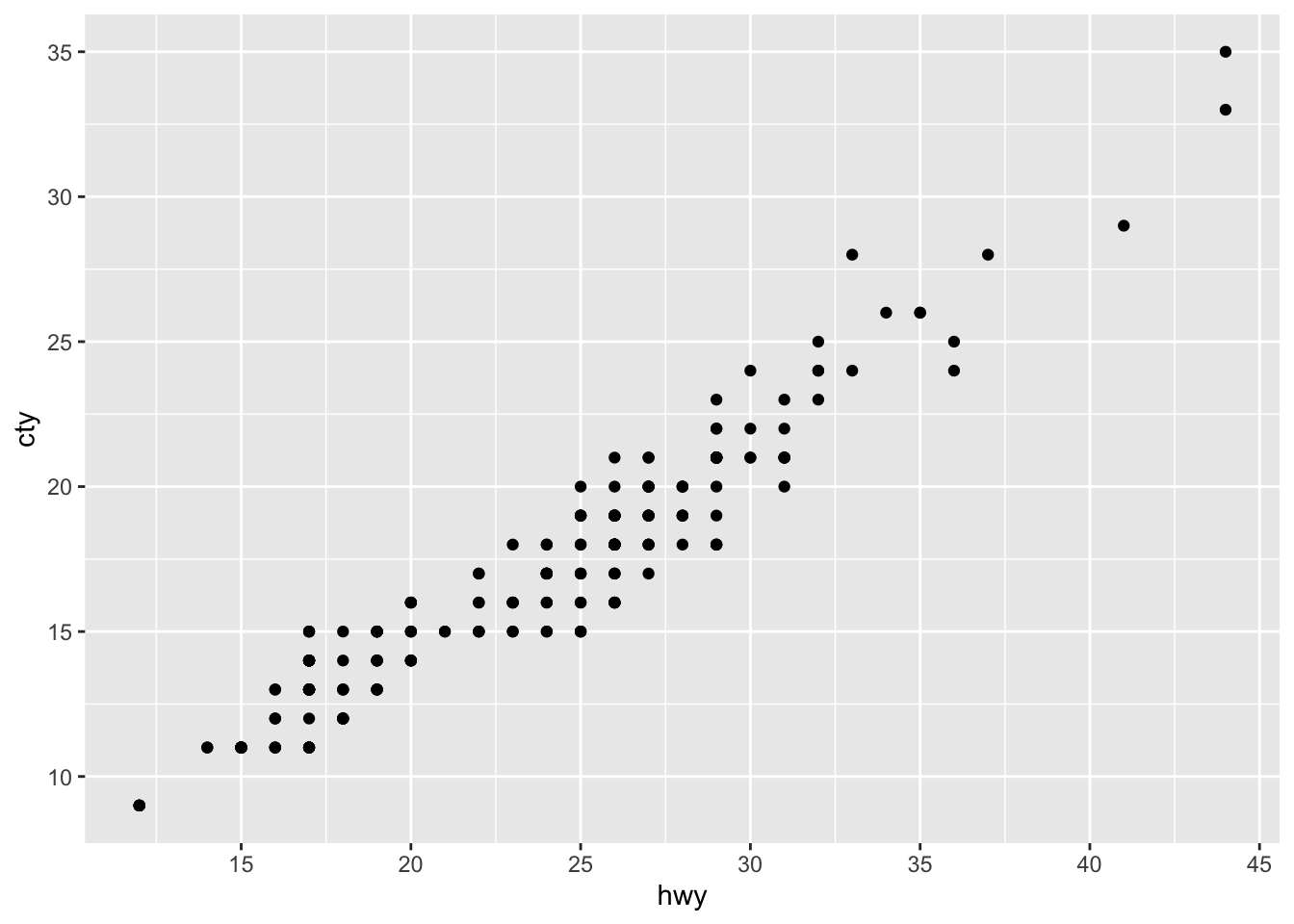
# this would do the same scale_x_continuous(breaks = seq(15, 45, by = 5))ggplot(mpg, aes(x = hwy, y = cty)) +
geom_point() +
scale_x_continuous(breaks = c(15, 20, 25, 30, 35, 40, 45)) +
scale_y_continuous(breaks = c(9, 26, 35.5))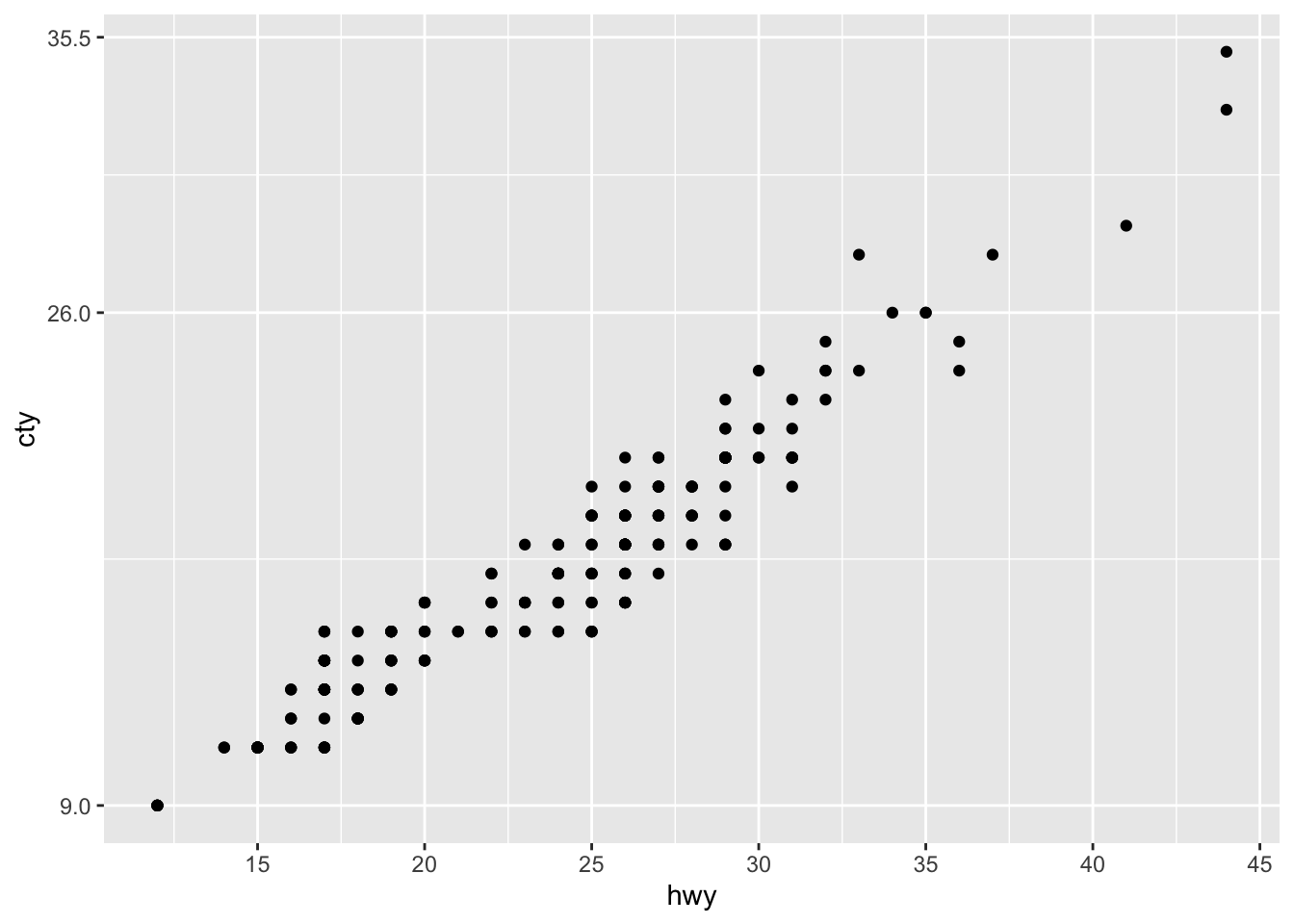
Zooming in and out with limits
For instance, often we want to zoom in or out. Let’s zoom in on the y-axis and zoom out on the x-axis.
ggplot(mpg, aes(x = hwy, y = cty)) +
  geom_point() +
  scale_x_continuous(limits = c(0, 75)) +
  scale_y_continuous(limits = c(20, 30))
## Warning: Removed 180 rows containing missing values (geom_point).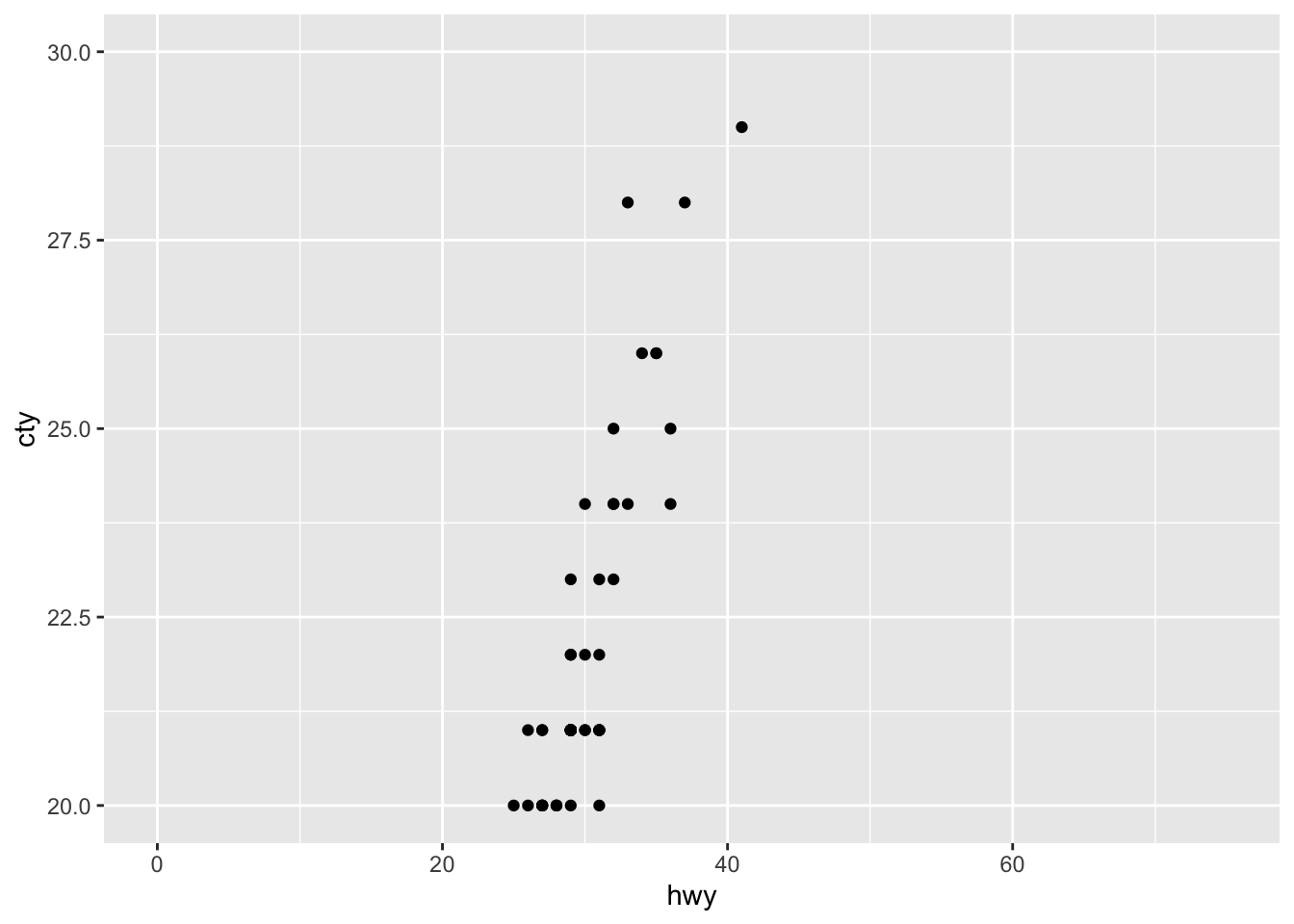
It works! Importantly, though, we must realise that there are many datapoints not visualized currently, as the warning message in R already suggests.
Using the limits in this way can be a bit dangerous. Let’s see why in an example with mean + error plots:
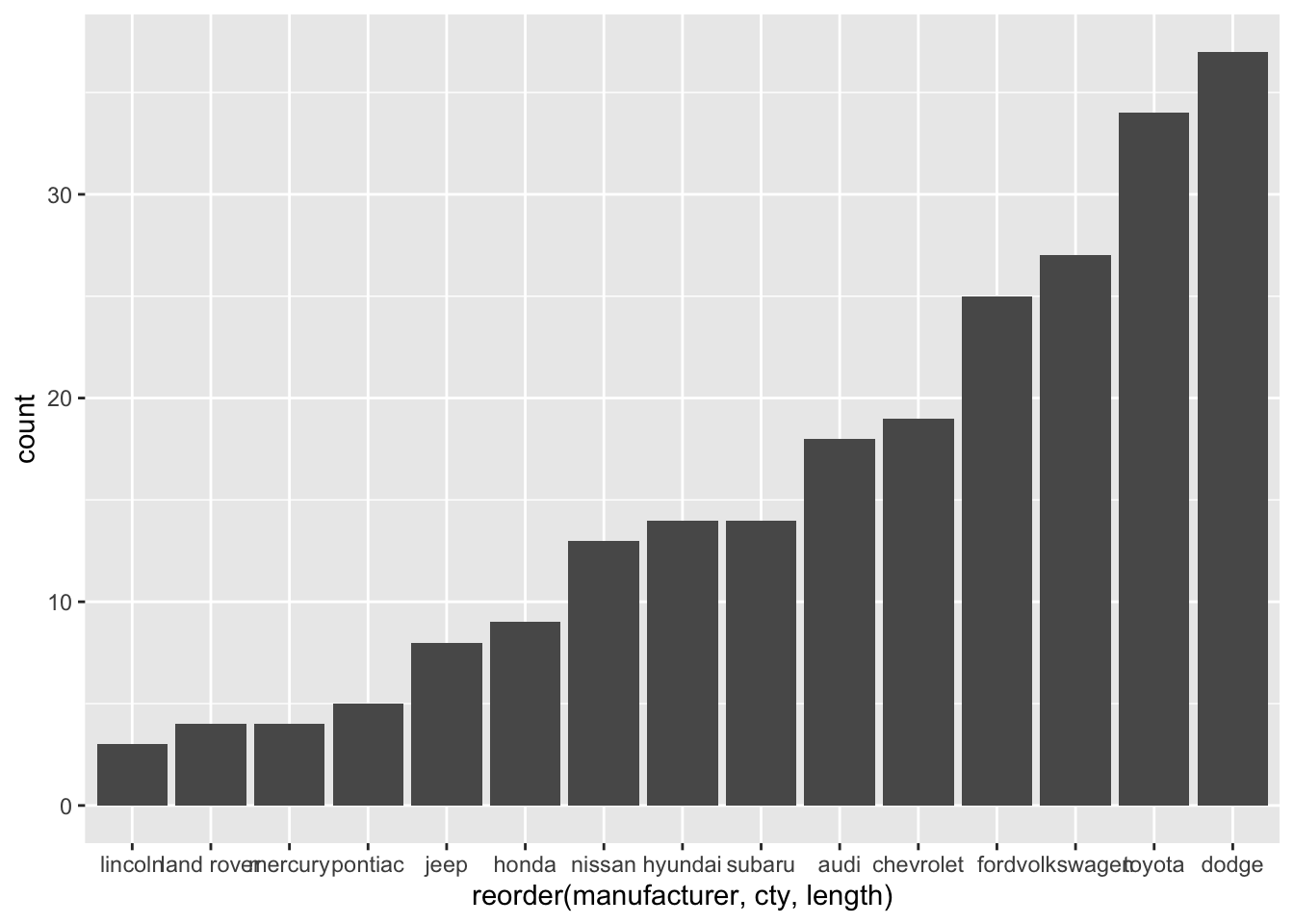
ggplot(mpg, aes(x = manufacturer, y = cty)) +
  geom_bar(stat = "summary", fun = "mean") +
  geom_errorbar(stat = "summary", fun.data = "mean_se") +
  geom_point(colour = "lightblue")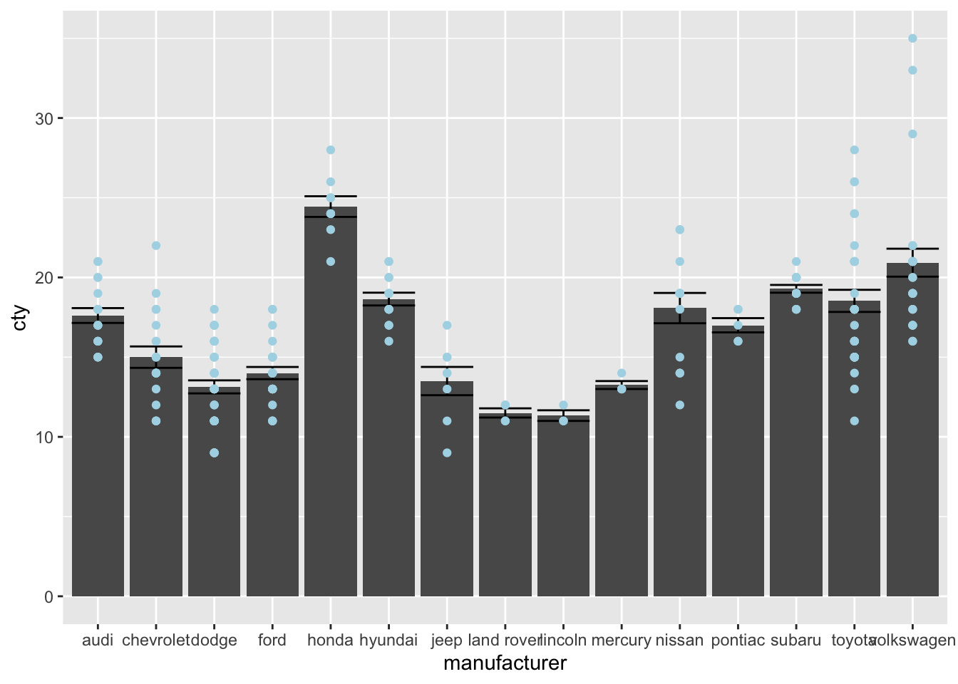
Now let’s see what happens if we give limits that exclude some points
ggplot(mpg, aes(x = manufacturer, y = cty)) +
  geom_bar(stat = "summary", fun = "mean") +
  geom_errorbar(stat = "summary", fun.data = "mean_se") +
  geom_point(colour = "lightblue") +
  scale_y_continuous(limits = c(0, 25))
## Warning: Removed 8 rows containing non-finite values (stat_summary).
## Removed 8 rows containing non-finite values (stat_summary).## Warning: Removed 8 rows containing missing values (geom_point).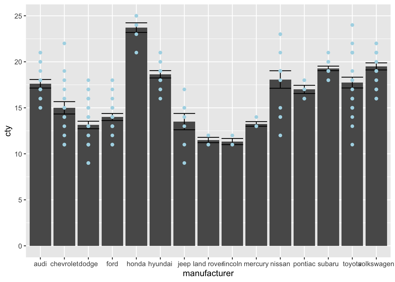
This is certainly not what we had in mind! We have changed our underlying data; all 8 datapoints that were larger than 25 were removed and then the data were plotted. Compare the bar and error for Honda and Volkswagen in the two graphs.
An alternative and preferred way of doing this, is doing it in the following way (also see coord_cartesian below):
ggplot(mpg, aes(x = manufacturer, y = cty)) +
  geom_bar(stat = "summary", fun = "mean") +
  geom_errorbar(stat = "summary", fun.data = "mean_se") +
  geom_point(colour = "lightblue") +
  coord_cartesian(ylim = c(0, 25))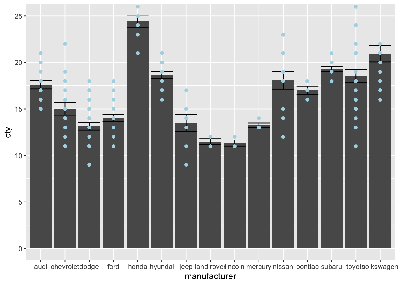
Expand
ggplot adds some space to the bottom and the side of your axes. If you do not want this, use the expand() function. Compare the following two graphs:
ggplot(mpg, aes(x = displ, y = cty)) +
  geom_point() +
  scale_x_continuous(limits = c(0, 8)) +
  scale_y_continuous(limits = c(0, 36))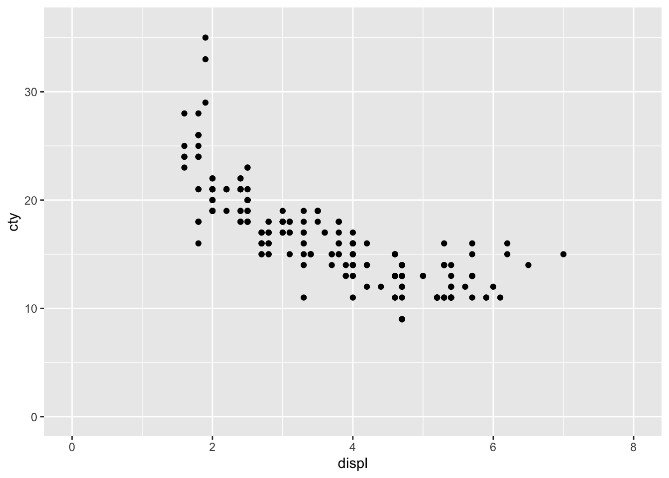
ggplot(mpg, aes(x = displ, y = cty)) +
  geom_point() +
  scale_x_continuous(limits = c(0, 8), expand = c(0, 0)) +
  scale_y_continuous(limits = c(0, 36), expand = c(0, 0))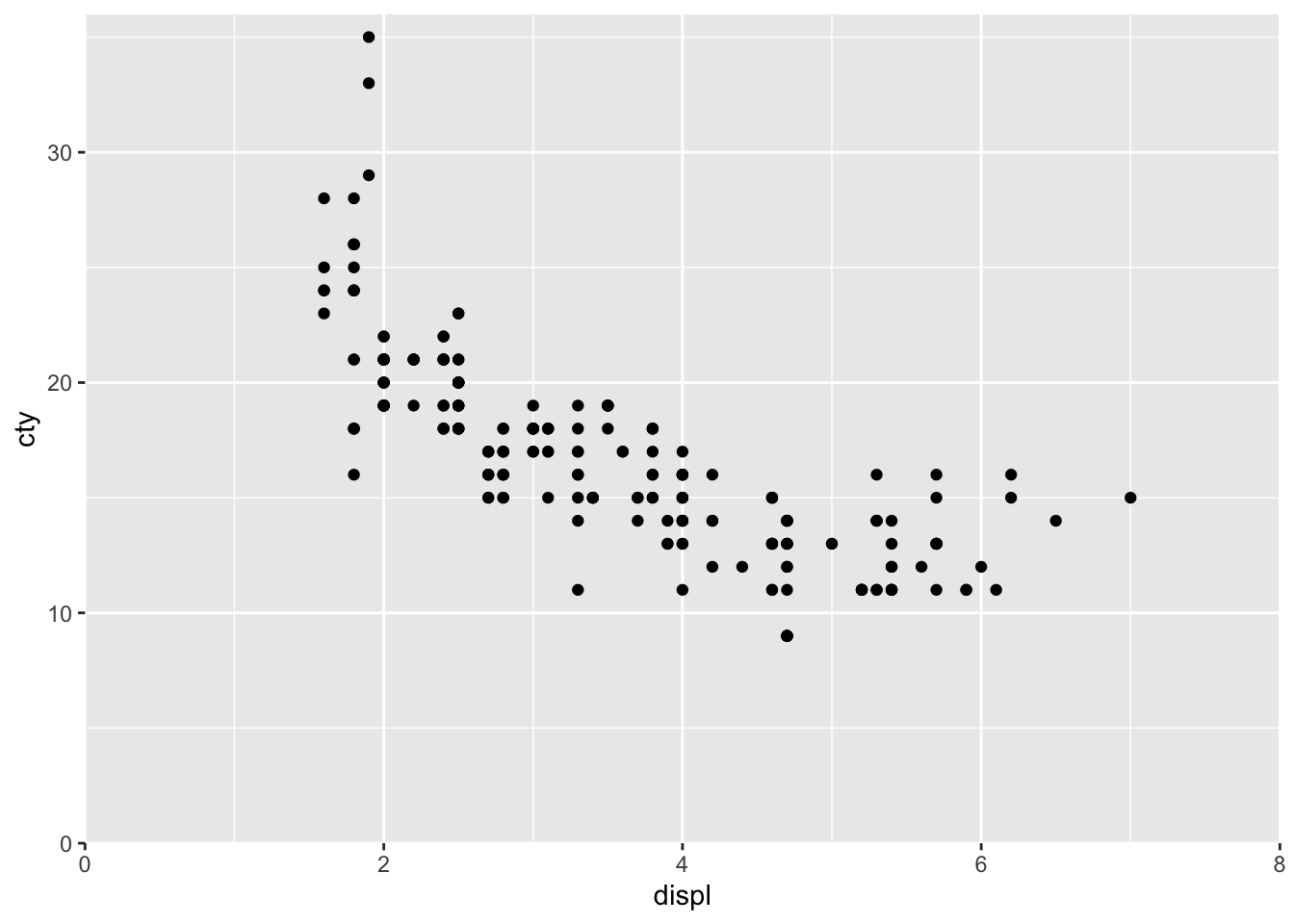
But do note that you are risking throwing away datapoints again if you specify limits that exlude particular datapoints.
Transformations
There are also functions that allow you to transform the scales of the axes. For instance, you can think of having a logarithmic scale, or a square-root-transformed scale.
ggplot(mpg, aes(x = displ, y = cty)) +
  geom_point() +
  scale_x_continuous(trans = "sqrt")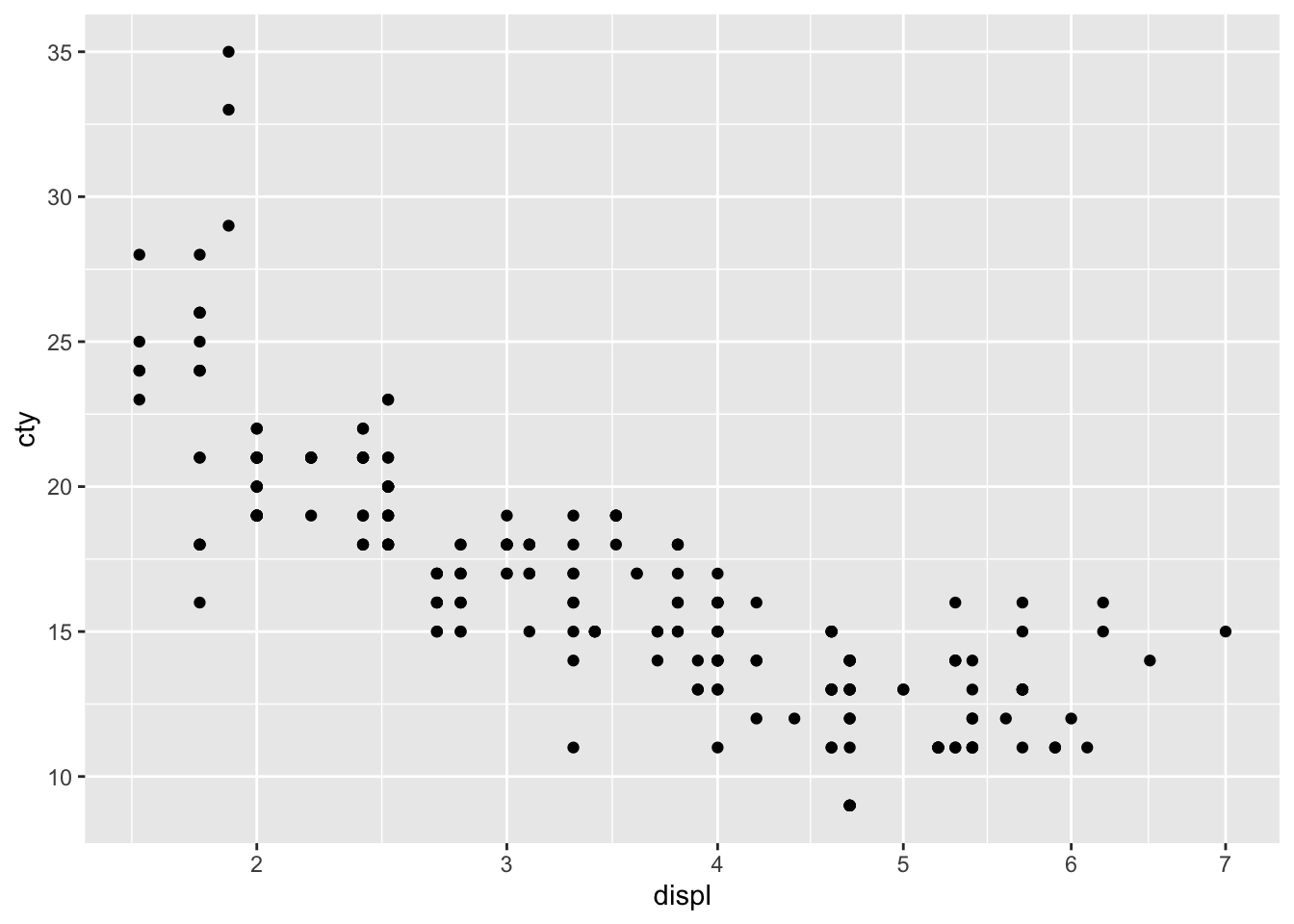
Look closely at the x-axis. We have transformed the x-axis. This works much better for variables that have more skewed distributions.
Another example:
ggplot(mpg, aes(x = displ, y = cty)) +
  geom_point() +
  scale_y_continuous(trans = "reverse")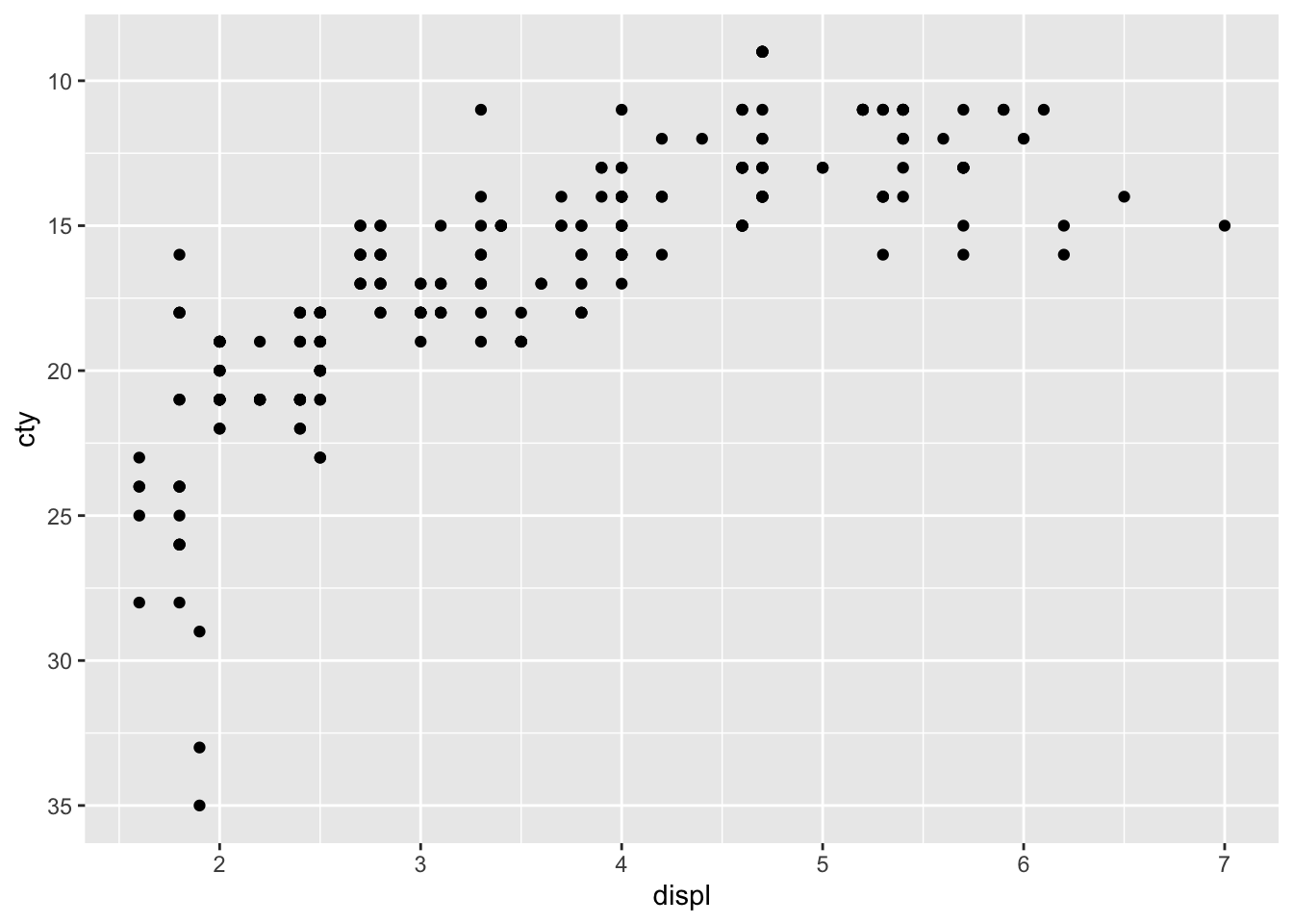
What happened?
Another example:
ggplot(mpg, aes(x = displ, y = cty)) +
  geom_point() +
  scale_y_continuous(trans = "log2")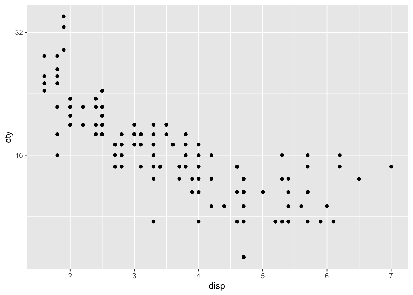
What happened?
Labels
ggplot can also do something nifty with the labels of the axes. Let’s look at four examples to get some impressions (after we install a necessary package):
install.packages("scales")library(scales)ggplot(mpg, aes(x = displ, y = cty)) +
geom_point() +
scale_x_continuous(labels = scales::percent)
Cool that we can do this but obviously doesn’t make much sense.
ggplot(mpg, aes(x = displ, y = cty)) +
  geom_point() +
  scale_x_continuous(labels = scales::dollar)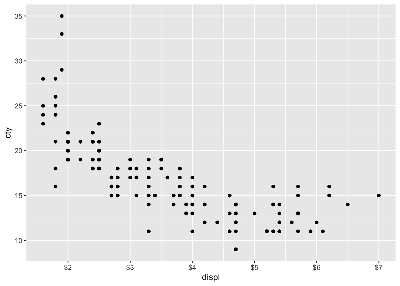
Also nice that we can do this, but obviously not appropriate.
ggplot(mpg, aes(x = displ, y = cty)) +
  geom_point() +
  scale_y_continuous(labels = scientific)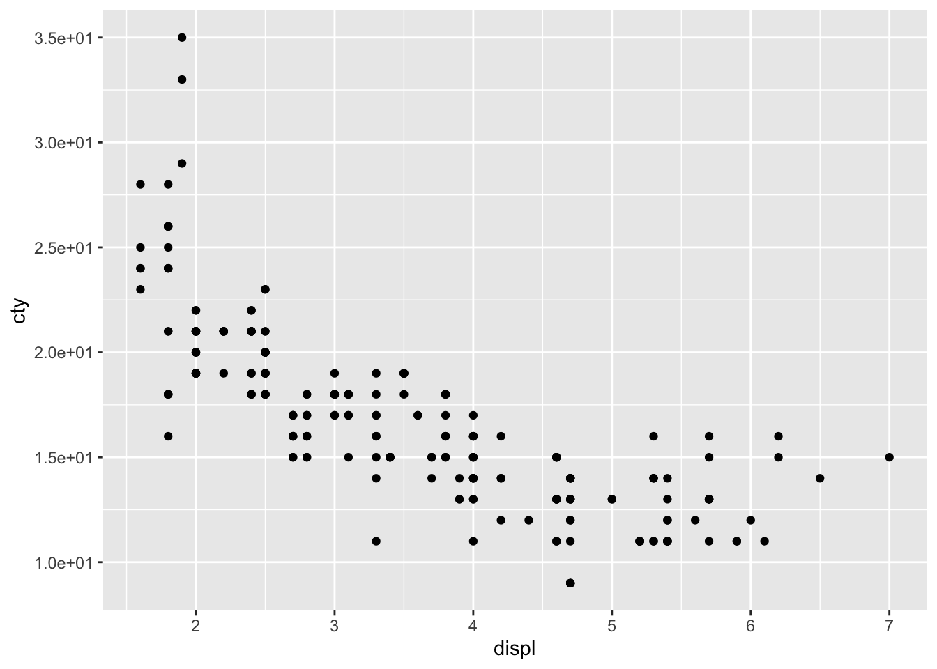
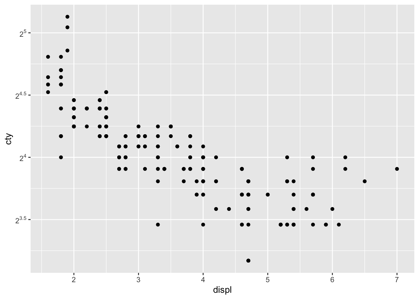
ggplot(mpg, aes(x = displ, y = cty)) +
  geom_point() +
  scale_y_continuous(
    trans = "log2",
    breaks = trans_breaks("log2", function(x) 2^x),
    labels = trans_format("log2", math_format(2^.x))
  )
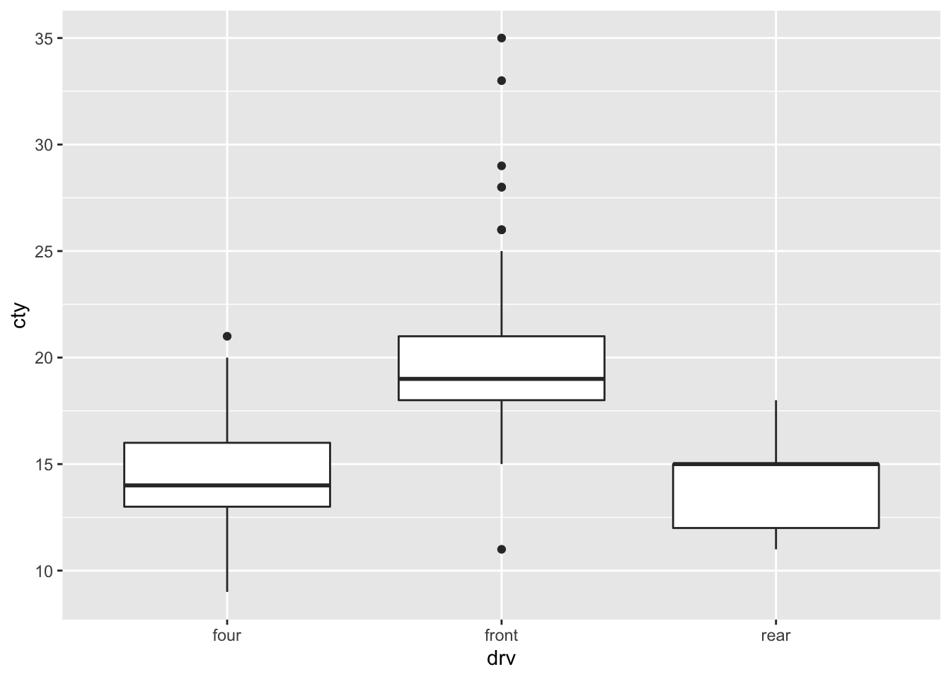
scale_x_discrete
When your x-axis is discrete (or categorical), you can use scale_x_discrete to change all sorts of relevant stuff. Let’s see how that works for the following graph:
ggplot(mpg, aes(x = drv, y = cty)) +
  geom_boxplot()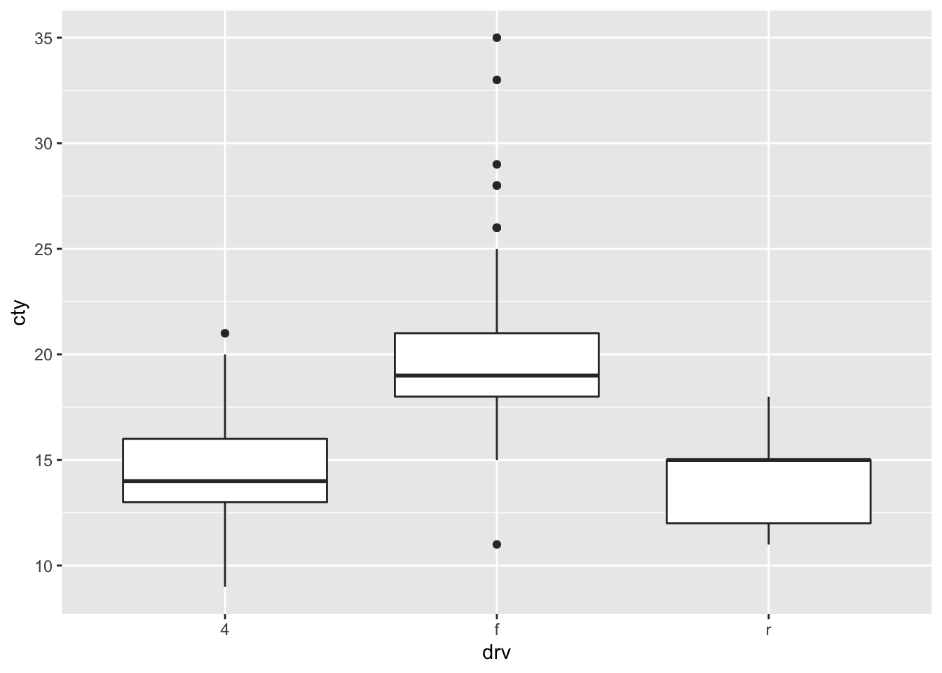

scale_colour_identity
Identity uses that values that are specified within a variable. Let’s create a column with colour names for the different types of drv.
library(tidyverse)
mpg <- mpg %>%
  mutate(colour = case_when(
    drv == "f" ~ "blue",
    drv == "r" ~ "orange",
    drv == "4" ~ "green"
  ))
We can now use this variable:
ggplot(mpg, aes(x = drv, y = cty, colour = colour)) +
  geom_boxplot() +
  scale_colour_identity()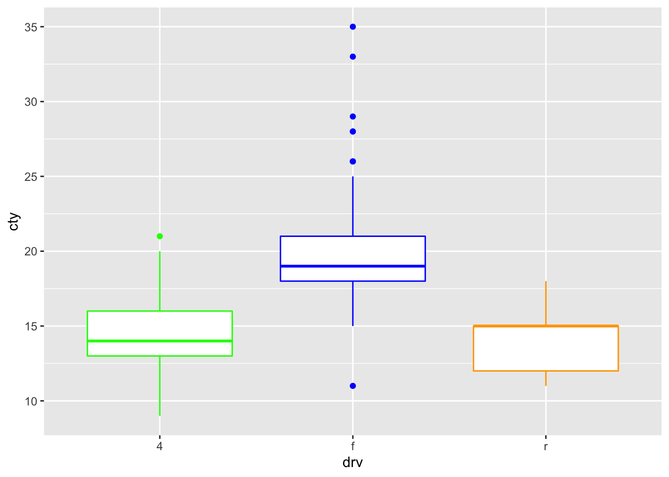
Fill works too:
ggplot(mpg, aes(x = drv, y = cty, fill = colour)) +
  geom_boxplot() +
  scale_fill_identity()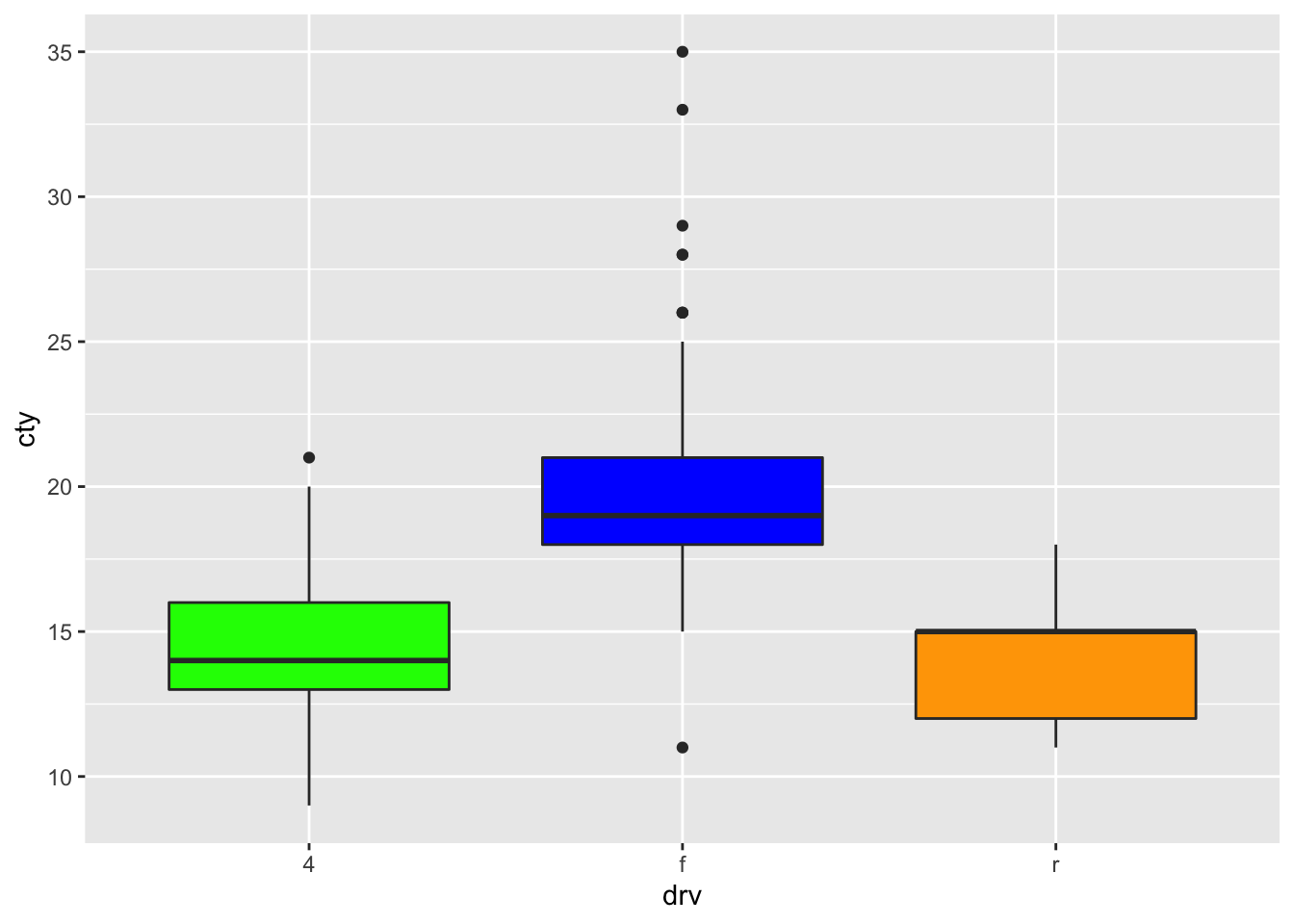
scale_fill_manual
We could have created the above graph also with scale_fill_manual:
ggplot(mpg, aes(x = drv, y = cty, fill = colour)) +
  geom_boxplot() +
  scale_fill_manual(values = c("blue", "green", "orange"))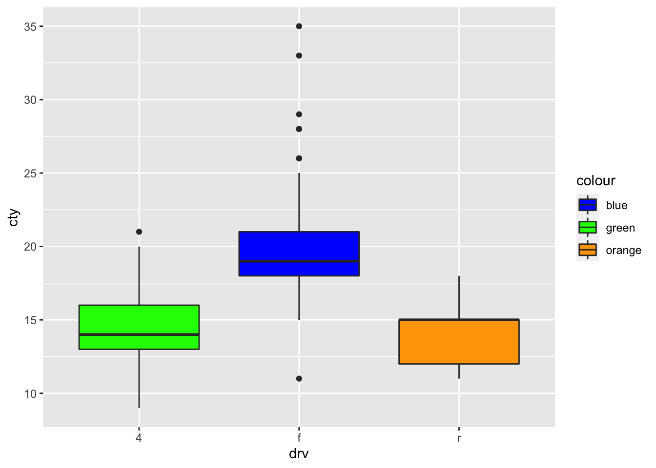
Again, better to be a bit specific, to be more sure that the colour is added to the right group:
ggplot(mpg, aes(x = drv, y = cty, fill = drv)) +
  geom_boxplot() +
  scale_fill_manual(values = c("f" = "blue", "4" = "green", "r" = "orange"))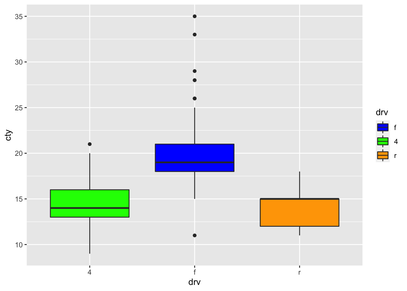
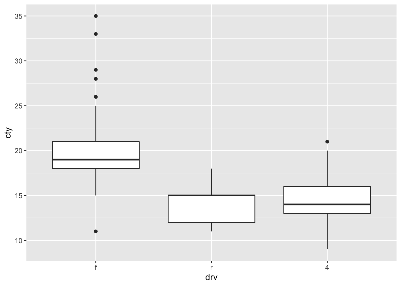
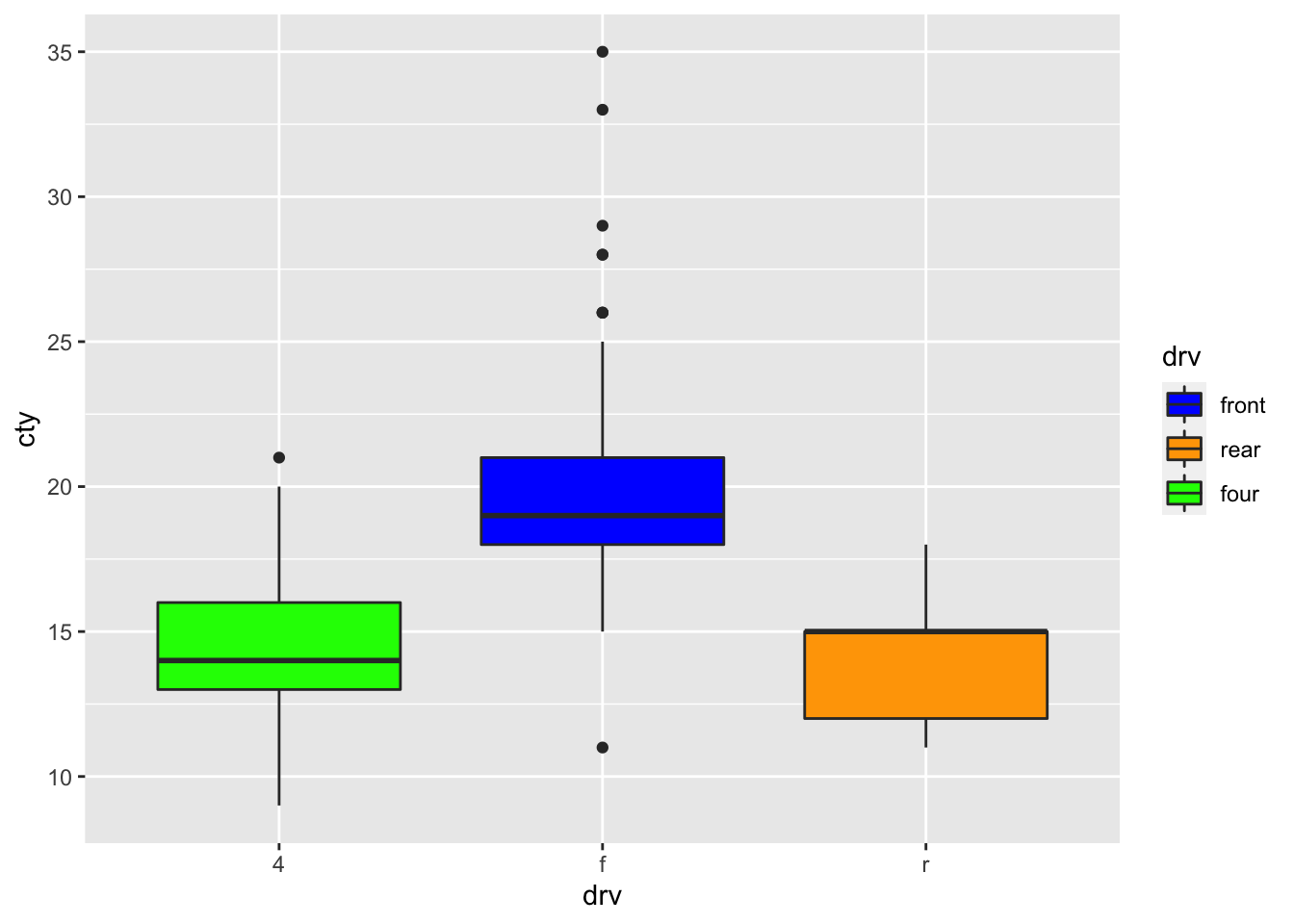
Let’s try to control the order and labels of the legend!
ggplot(mpg, aes(x = drv, y = cty, fill = drv)) +
  geom_boxplot() +
  scale_fill_manual(
    values = c("f" = "blue", "4" = "green", "r" = "orange"),
    breaks = c("f", "r", "4"),
    labels = c("4" = "four", "f" = "front", "r" = "rear")
  )
Coordinate systems
ggplot has several coordinate systems, you’ll mostly use the default coord_cartesian, but also coord_fixed and coord_flip might come in handy.
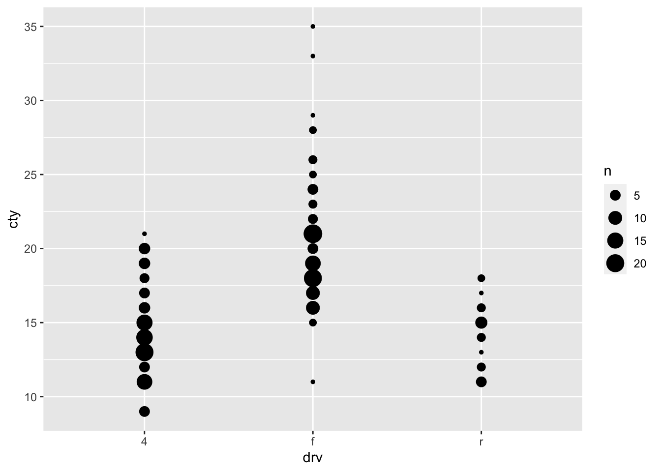
coord_cartesian
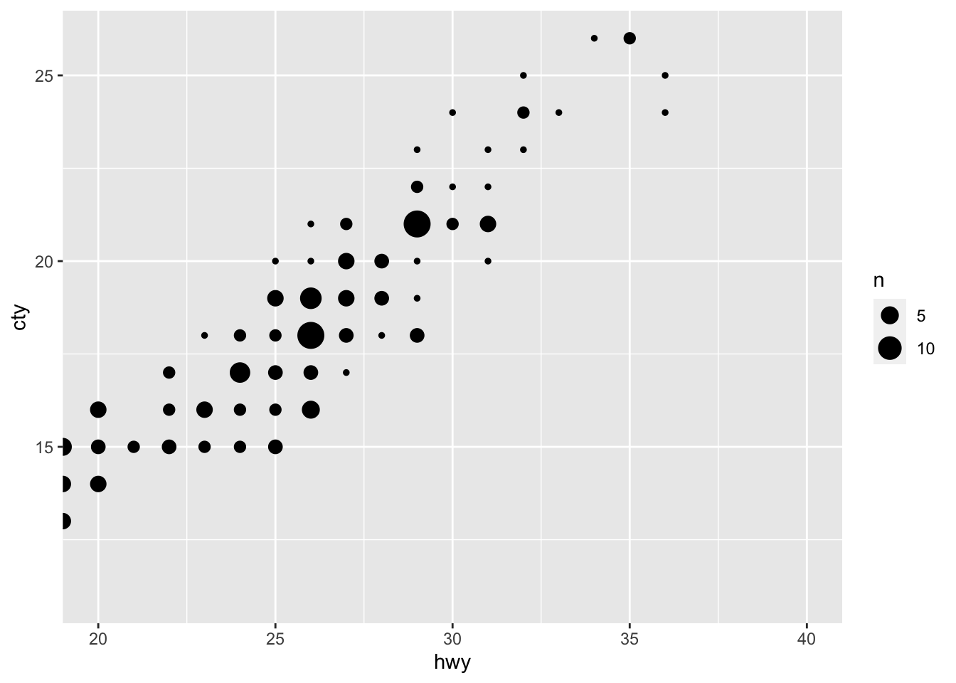
ggplot(mpg, aes(x = hwy, y = cty)) +
  geom_count()
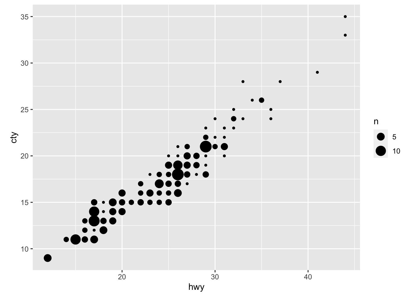
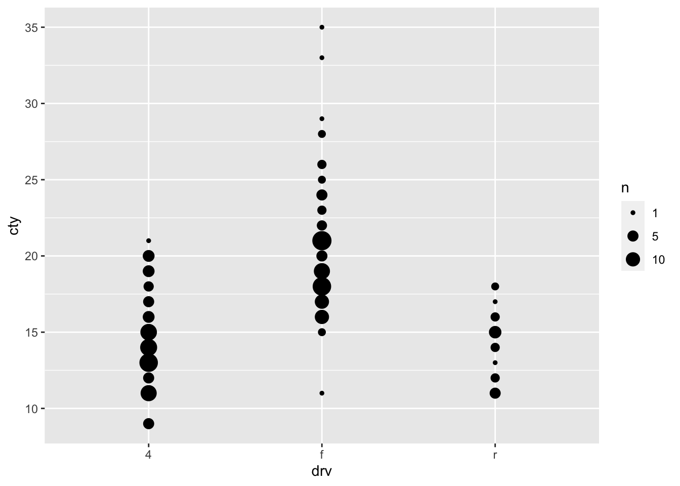
Through coord_caresian we can zoom:
ggplot(mpg, aes(x = hwy, y = cty)) +
  geom_count() +
  coord_cartesian(xlim = c(20, 40), ylim = c(11, 26))