Data Visualization
September - October 2025
Welcome
Welcome to Data Wise’s data visualization course. This course helps you in making graphs in R via ggplot2. ggplot2 is a visualization package for R, written by Hadley Wickham (Wickham 2016), and it is simply fantastic. At lightning speed, we’ll first cover R and RStudio, before we go on to learning how to visualize our data (beautifully) in R. You can switch to different topics using the navigation bar on the left.
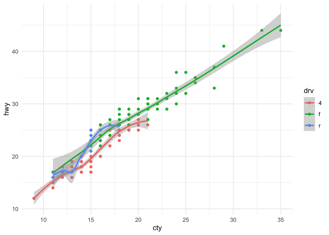
Just to give you a glimpse of the amazingness of ggplot, see what a few lines of code in R can produce:
Why R?
Some reasons to use R:

You can easily generate stuff:
# Flipping a coin ten times
sample(c("Head", "Tails"), size = 10, replace = TRUE, prob = c(0.5, 0.5))
## [1] "Tails" "Tails" "Head" "Head" "Tails" "Head" "Head" "Tails" "Tails"
## [10] "Head"You can do ‘standard’ analysis, like linear regression:
##
## Call:
## lm(formula = hwy ~ cty + drv, data = mpg)
##
## Residuals:
##     Min      1Q  Median      3Q     Max
## -4.7830 -0.9041 -0.3083  0.8973  5.0223
##
## Coefficients:
##             Estimate Std. Error t value Pr(>|t|)
## (Intercept)  1.99883    0.46622   4.287 2.66e-05 ***
## cty          1.19859    0.03087  38.826  < 2e-16 ***
## drvf         2.22365    0.27027   8.227 1.42e-14 ***
## drvr         2.12501    0.33314   6.379 9.70e-10 ***
## ---
## Signif. codes:  0 '***' 0.001 '**' 0.01 '*' 0.05 '.' 0.1 ' ' 1
##
## Residual standard error: 1.494 on 230 degrees of freedom
## Multiple R-squared:  0.9379, Adjusted R-squared:  0.9371
## F-statistic:  1157 on 3 and 230 DF,  p-value: < 2.2e-16
You can also do fancy “state-of-the-art” analysis stuff, for example:
- network analyses
- mixed models
- missing data imputation
- bayesian analyses
- making statistical webapplications
You’ll learn about the wonderful world of coding:
passed_the_test <- function(grade) {
    if(grade > 5.5){
        print("You passed the test")
    }
    else {
        print("You failed the test")
    }
}
passed_the_test(8)
## [1] "You passed the test"
 Source:
Why are visualizations important?
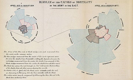
Graphs can change the world, as Florence Nightingale showed:
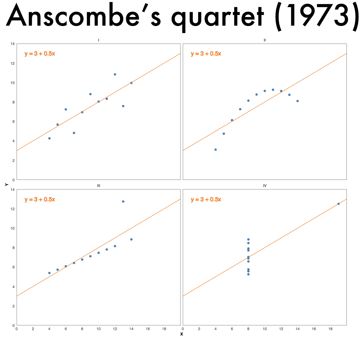
The importance of visualizations is further evident from Anscombe’s quartet:
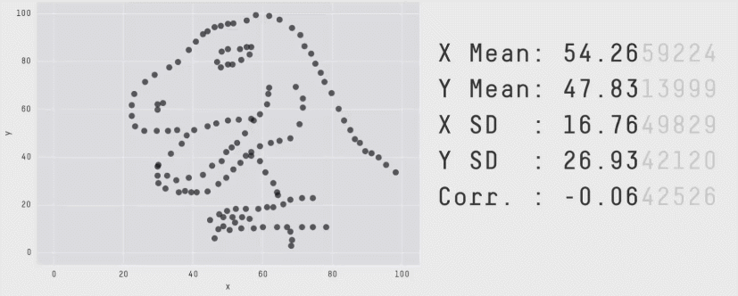
And from the datasaurus dozen:
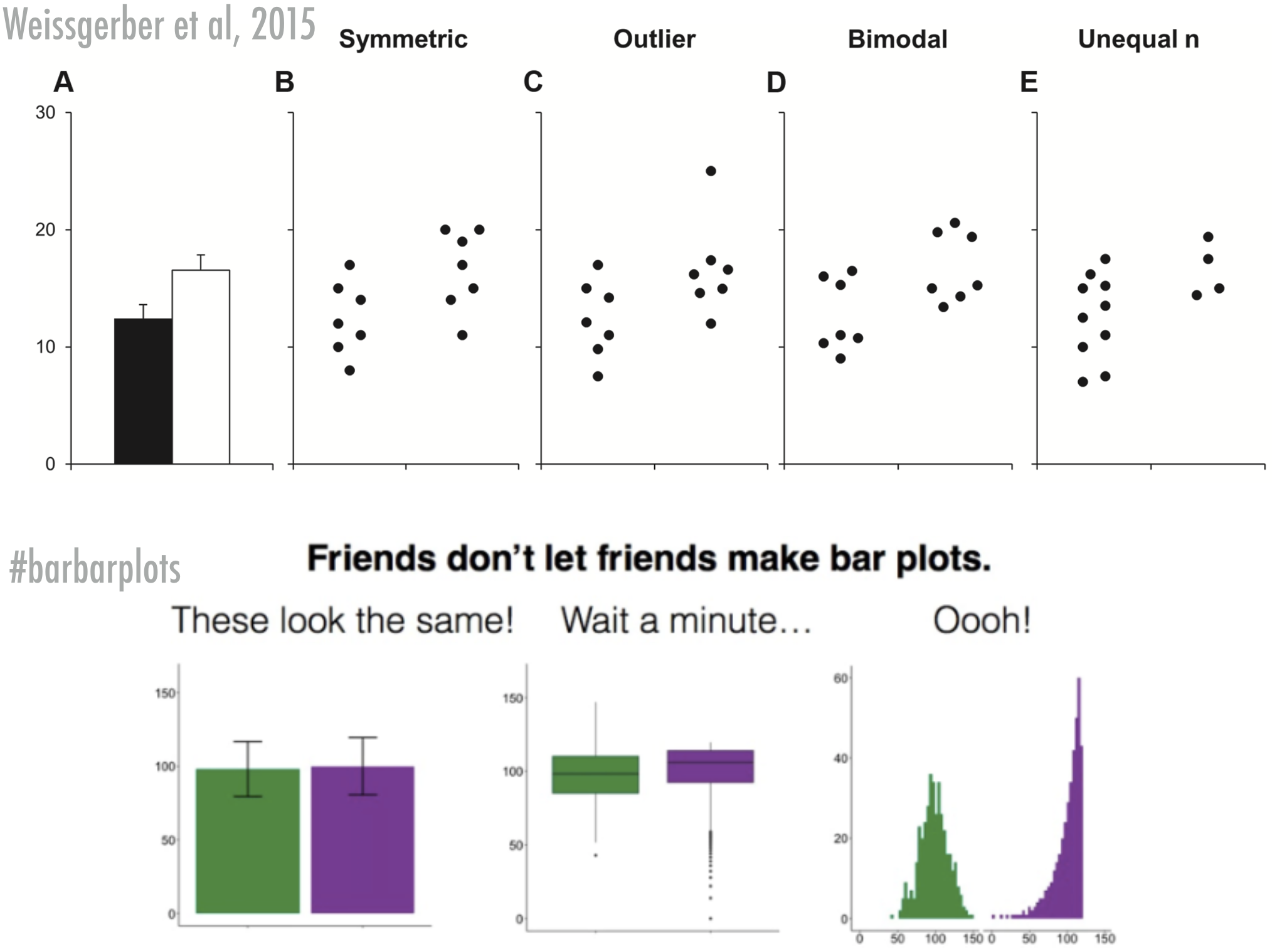
And from:
References
Wickham, Hadley. 2016. Ggplot2: Elegant Graphics for Data Analysis. 2nd ed. Cham, Switzerland: Springer International Publishing. http://www.springer.com/br/book/9780387981413.