Chapter 13 Revisiting earlier graphs
Now we’ve learned more about coding and transforming data(sets) we can recreate earlier graphs but through calculating the means ourselves, rather than have ggplot do it for us.
13.1 Recreating mean-plots
Remember this plot:
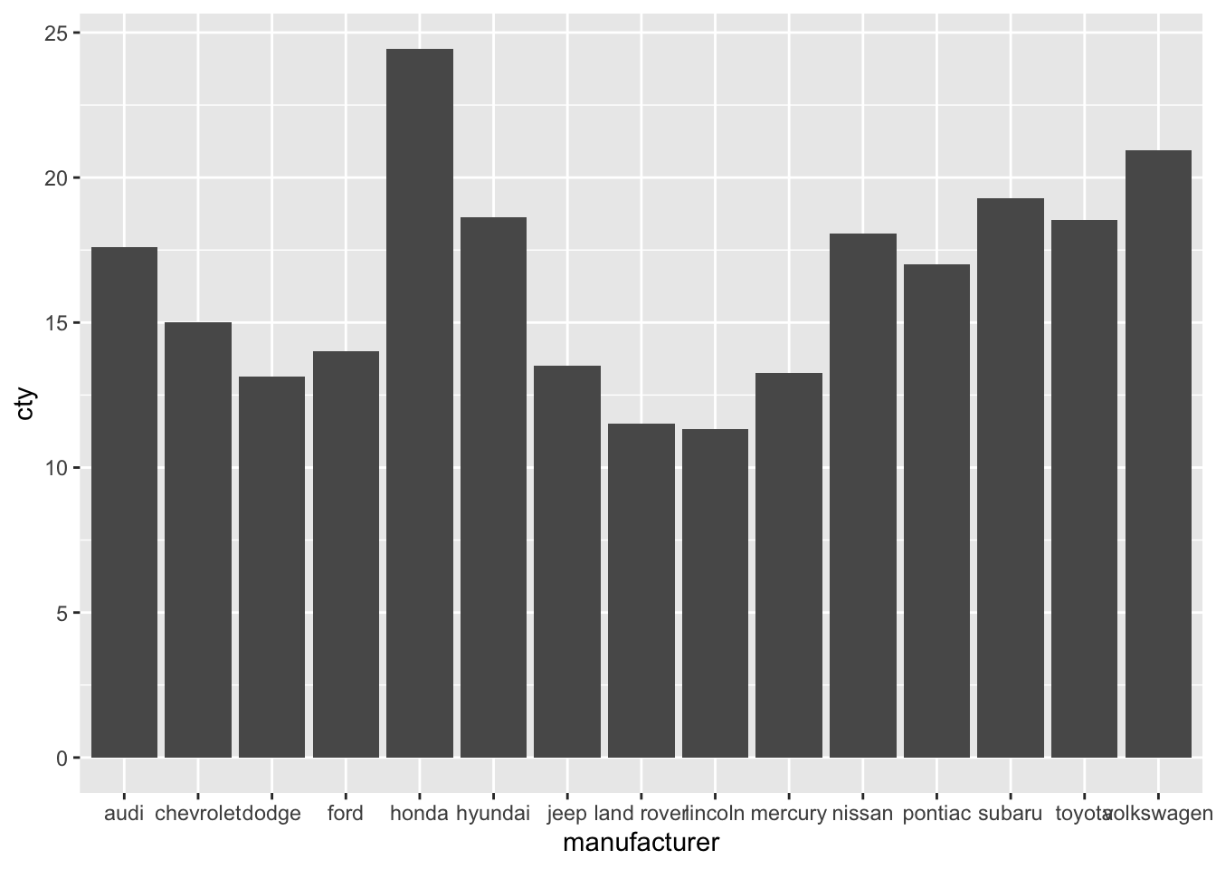
Let’s create the means ourselves:
# Create new dataframe mpg_means
mpg_means <- mpg %>%
group_by(manufacturer) %>% # Group the data by manufacturer
summarize(mean_cty = mean(cty)) # Create new variable which is the mean of cty
mpg_means## # A tibble: 15 × 2
## manufacturer mean_cty
## <chr> <dbl>
## 1 audi 17.6
## 2 chevrolet 15
## 3 dodge 13.1
## 4 ford 14
## 5 honda 24.4
## 6 hyundai 18.6
## 7 jeep 13.5
## 8 land rover 11.5
## 9 lincoln 11.3
## 10 mercury 13.2
## 11 nissan 18.1
## 12 pontiac 17
## 13 subaru 19.3
## 14 toyota 18.5
## 15 volkswagen 20.9Now that we have done the work ourselves, we can plot the means! Importantly, we are not going to specify that we will create a “summary” with stat="summary" and neither will we specify a function fun="mean". Of course, we need to tell ggplot that we’ll make use of our new dataset, and also that we’ll be using the mean_cty variable from this new dataset.
Hhmm, an error message. This is because geom_bar() apparently calculates some stat, so we can’t use our own y-variable. It’s further good to realise that geom_bar() as a default has stat = "count" (see ?geom_bar). The trick here is to specify the stat as being identity; this means that the numbers that are explicitely specified should be used (they define the “identity” of the bars).

Now we have reproduced our earlier plot! We’ve already seen two ways of creating this plot, but now we have a third way. This last option in which we calculate means ourselves is most laborious, but also gives us most flexibililty. Particularly if we want to do something more complex to our dataset than just calculating means.
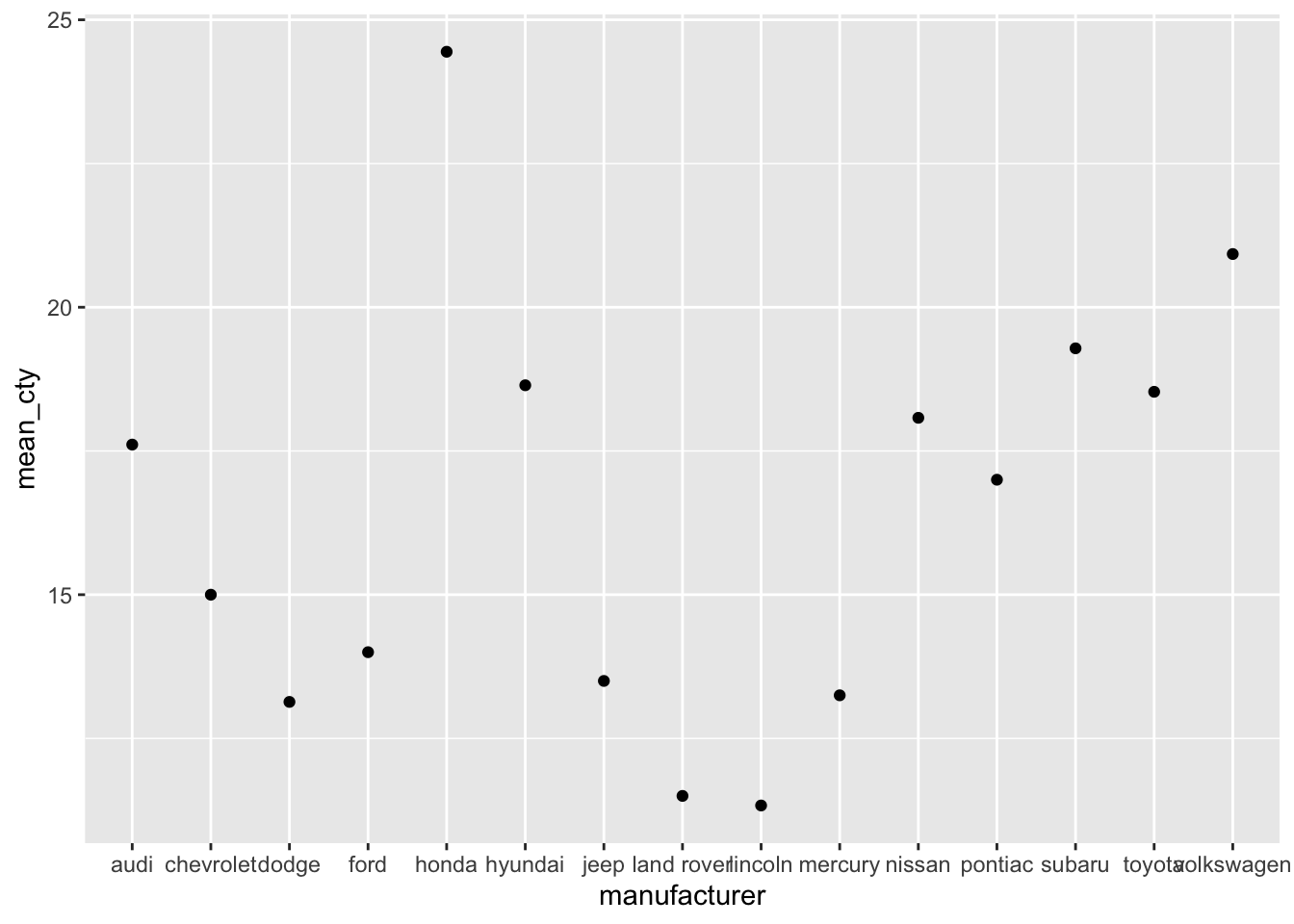
Let’s also try to recreate the following graph:
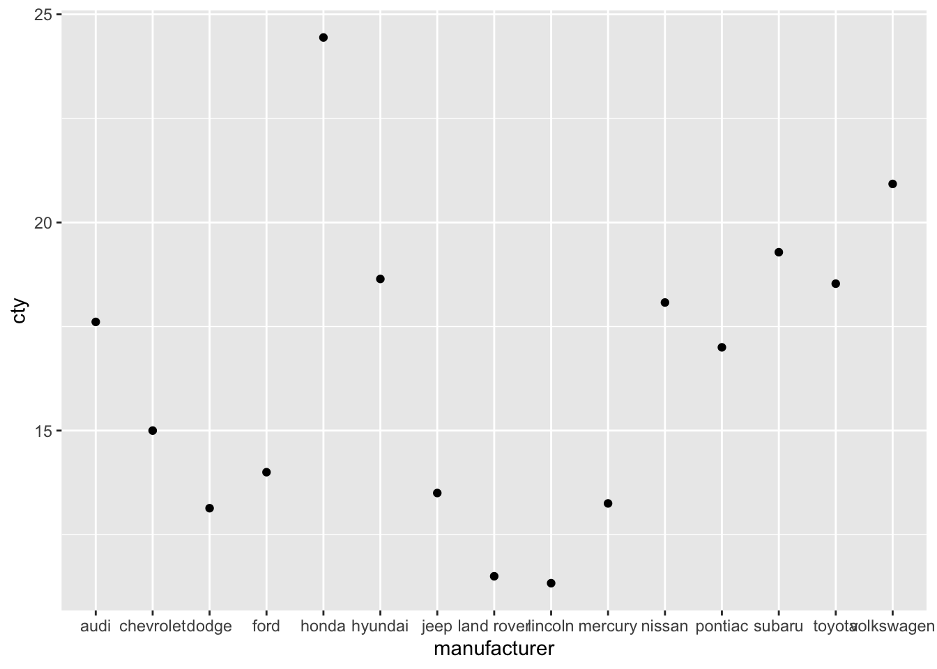
Et voila:
Why do we need a
stat="identity"when we usegeom_bar()but not when we usegeom_point()?
13.2 Adding error bars
ggplot(mpg, aes(x = manufacturer, y = cty)) +
geom_bar(stat = "summary", fun = "mean") +
geom_errorbar(stat = "summary", fun.data = "mean_se",
fun.args = list(mult = 1.96))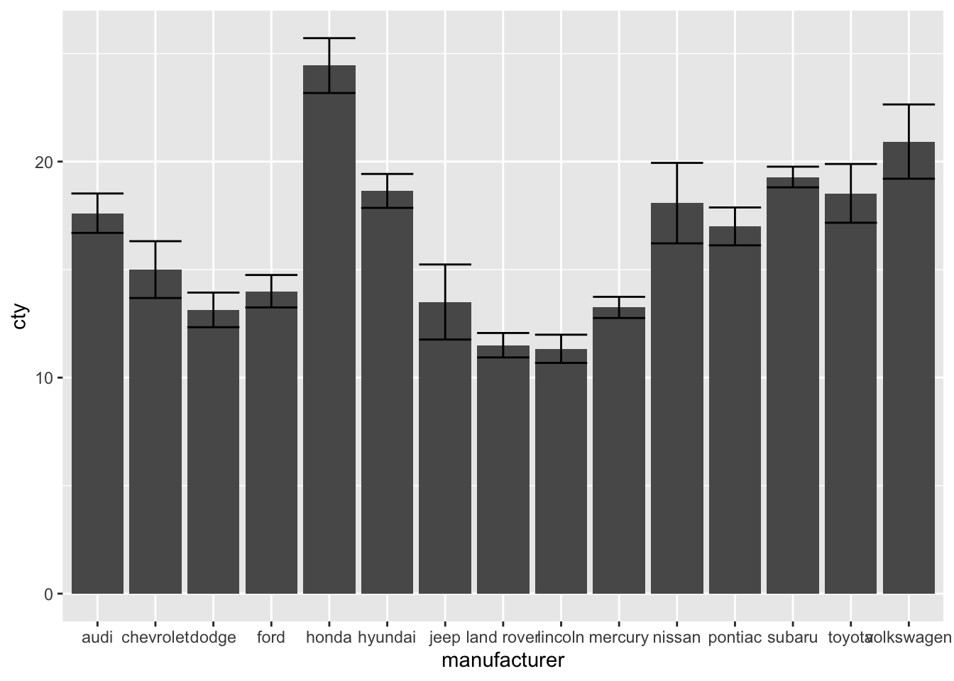
Let’s recreate errorbars by creating a new dataset. This time, in addition to calculating the mean, we will also calculate the standard error (which equates to the standard deviation divided by the square root of N).
# Create new dataframe mpg_means_se
mpg_means_se <- mpg %>%
  group_by(manufacturer) %>% # Group the data by manufacturer
  summarize(
    mean_cty = mean(cty), # Create variable with mean of cty per group
    sd_cty = sd(cty), # Create variable with sd of cty per group
    N_cty = n(), # Create new variable N of cty per group
    se = sd_cty / sqrt(N_cty), # Create variable with se of cty per group
    upper_limit = mean_cty + se, # Upper limit
    lower_limit = mean_cty - se # Lower limit
  )
mpg_means_se
## # A tibble: 15 × 7
## manufacturer mean_cty sd_cty N_cty se upper_limit lower_limit
## <chr> <dbl> <dbl> <int> <dbl> <dbl> <dbl>
## 1 audi 17.6 1.97 18 0.465 18.1 17.1
## 2 chevrolet 15 2.92 19 0.671 15.7 14.3
## 3 dodge 13.1 2.49 37 0.409 13.5 12.7
## 4 ford 14 1.91 25 0.383 14.4 13.6
## 5 honda 24.4 1.94 9 0.648 25.1 23.8
## 6 hyundai 18.6 1.50 14 0.401 19.0 18.2
## 7 jeep 13.5 2.51 8 0.886 14.4 12.6
## 8 land rover 11.5 0.577 4 0.289 11.8 11.2
## 9 lincoln 11.3 0.577 3 0.333 11.7 11
## 10 mercury 13.2 0.5 4 0.25 13.5 13
## 11 nissan 18.1 3.43 13 0.950 19.0 17.1
## 12 pontiac 17 1 5 0.447 17.4 16.6
## 13 subaru 19.3 0.914 14 0.244 19.5 19.0
## 14 toyota 18.5 4.05 34 0.694 19.2 17.8
## 15 volkswagen 20.9 4.56 27 0.877 21.8 20.0Now let’s use this information to add an errorbar with the help of geom_errorbar, which requires as input a minimim boundary ymin and a maximum boundary ymax.
ggplot(mpg_means_se, aes(x = manufacturer, y = mean_cty)) +
  geom_bar(stat = "identity") +
  geom_errorbar(aes(ymin = lower_limit, ymax = upper_limit))
13.3 Using multiple datasets in one graph
We’ve also seen (a version of) this graph:
ggplot(mpg, aes(x = manufacturer, y = cty)) +
  geom_jitter(colour = "lightblue", alpha = 0.5, width = 0.1) +
  geom_point(stat = "summary", fun = "mean") +
  geom_errorbar(stat = "summary", fun.data = "mean_se",
                fun.args = list(mult = 1.96), width = 0) +
  labs(x = "Manufacturer", y = "Mileage per gallon of fuel (mean + 95%CI)") +
  theme_bw() +
  theme(axis.text.x = element_text(angle = 45, hjust = 1))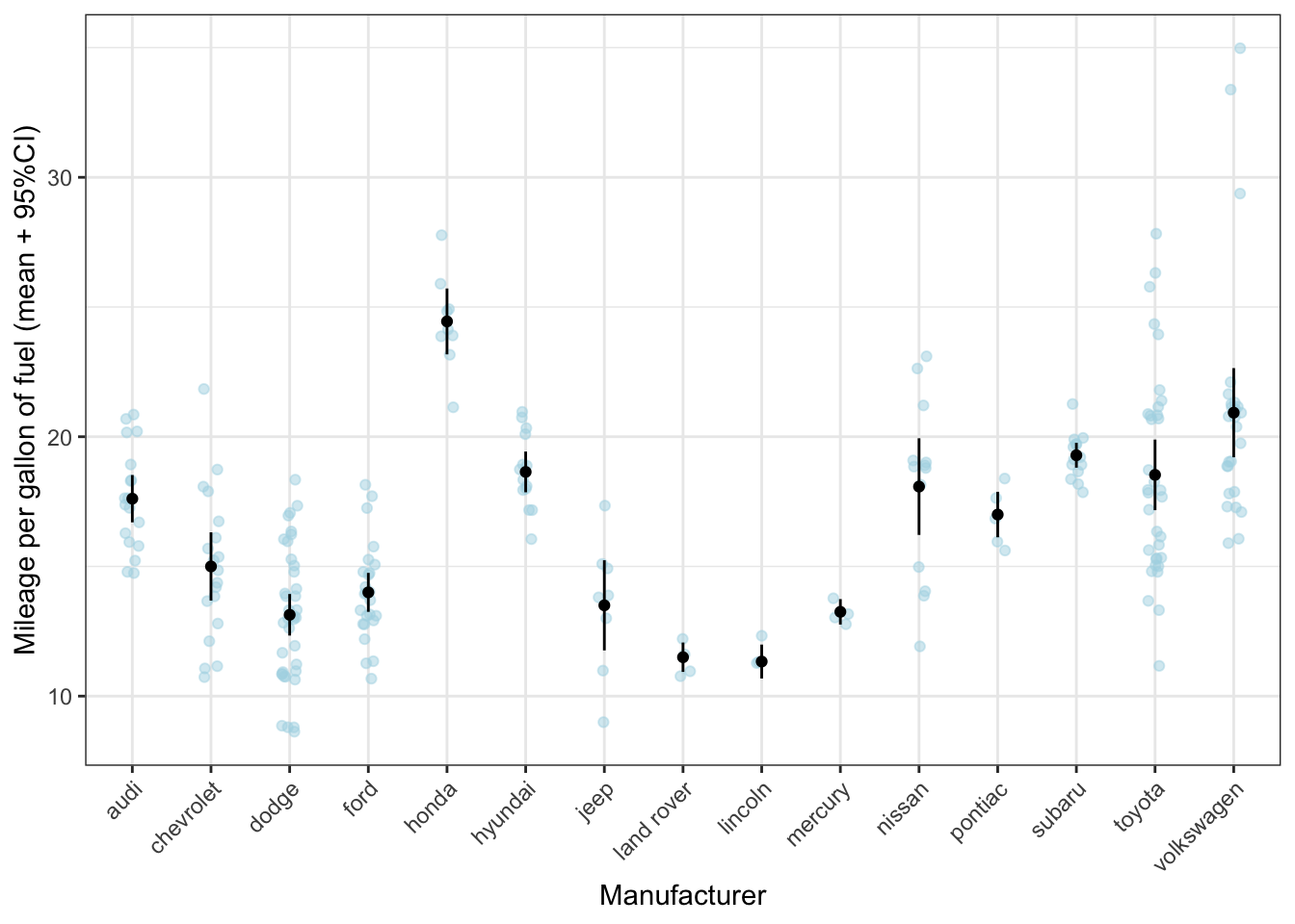
To recreate this graph with the ‘manual’ effort we put into calculating the averages, we have to use two datasets in one graph. In each layer in ggplot, we can add another dataset by specifying data = name_of_other_dataset/ Let’s first try to get the average in our graph that we’ve calculated ourselves in mpg_means_se:
ggplot(mpg, aes(x = manufacturer, y = cty)) +
  geom_jitter(colour = "lightblue", alpha = 0.5, width = 0.1) +
  geom_point(data = mpg_means_se) +
  labs(x = "Manufacturer", y = "Mileage per gallon of fuel (mean + 95%CI)") +
  theme_bw() +
  theme(axis.text.x = element_text(angle = 45, hjust = 1))
## Error in `geom_point()`:
## ! Problem while computing
## aesthetics.
## ℹ Error occurred in the 2nd layer.
## Caused by error:
## ! object 'cty' not foundThe reason why this doesn’t work is because cty does not exist in mpg_means_se! In mpg_means_se only the variable mean_cty exists.
ggplot(mpg, aes(x = manufacturer, y = cty)) +
  geom_jitter(colour = "lightblue", alpha = 0.5, width = 0.1) +
  geom_point(data = mpg_means_se, aes(y = mean_cty)) +
  labs(x = "Manufacturer", y = "Mileage per gallon of fuel (mean + 95%CI)") +
  theme_bw() +
  theme(axis.text.x = element_text(angle = 45, hjust = 1))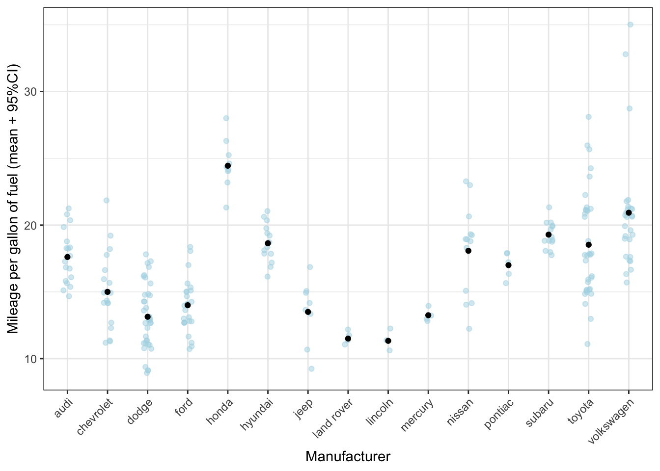
Why don’t we have to specify
x=manufacturerwithinaes()the second time?
Now let’s add the errorbar as well. Again, we have to realise that we should put y=cty only in the layer where it’s appropriate:
ggplot(mpg, aes(x = manufacturer)) +
  geom_jitter(aes(y = cty), colour = "lightblue", alpha = 0.5, width = 0.1) +
  geom_point(data = mpg_means_se, aes(y = mean_cty)) +
  geom_errorbar(data = mpg_means_se,
                aes(ymin = lower_limit, ymax = upper_limit)) +
  labs(x = "Manufacturer", y = "Mileage per gallon of fuel (mean + 95%CI)") +
  theme_bw() +
  theme(axis.text.x = element_text(angle = 45, hjust = 1))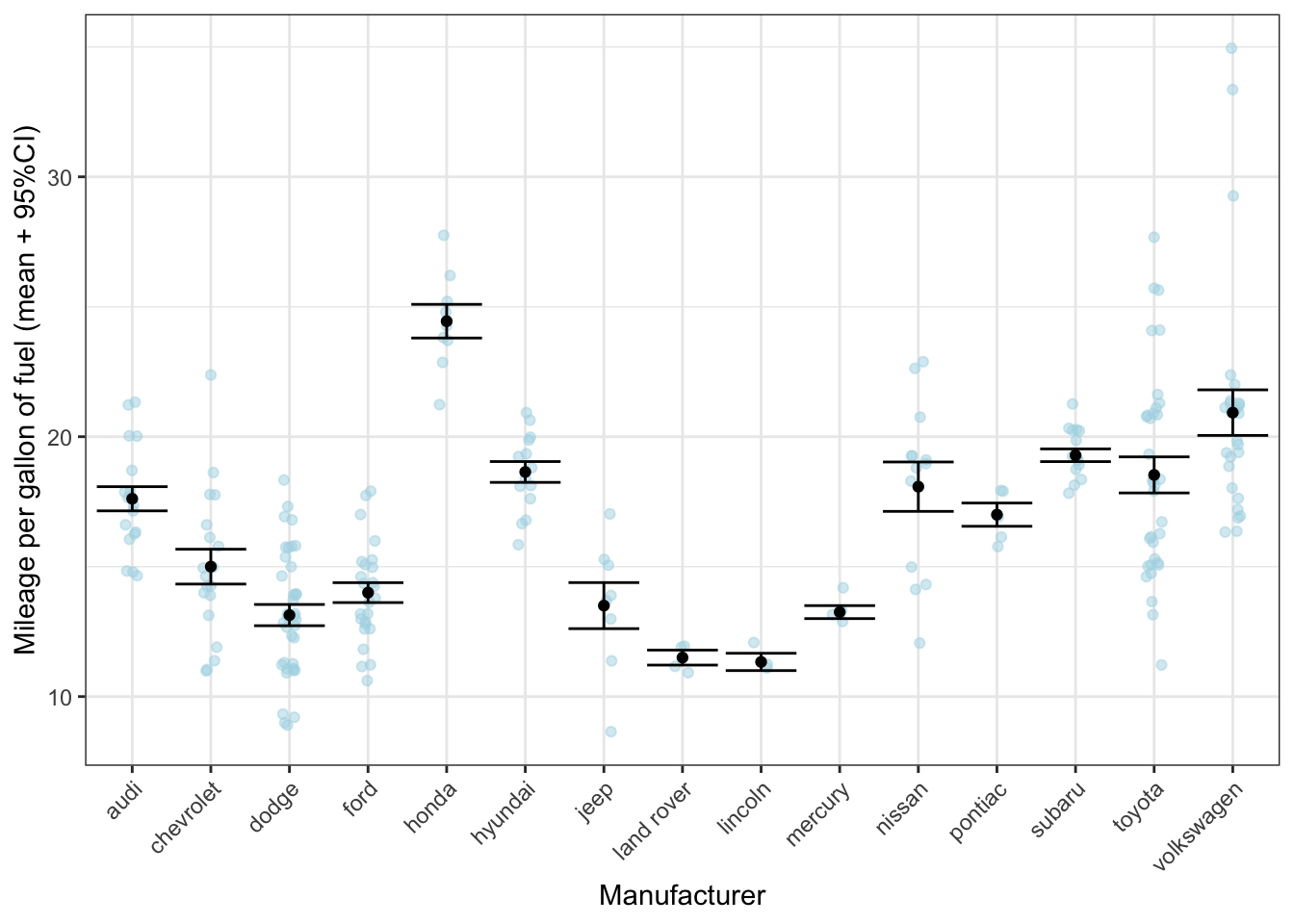
13.3.1 A quick preview of labels
Now that we know that we can use different datasets, we can use this to our advantage. Let’s add a label to most fuel efficient car:
mpg_max <- mpg %>% filter(cty == max(cty)) # dataframe with most fuel efficient car

ggplot(mpg, aes(x = reorder(manufacturer, cty, FUN = mean), y = cty)) +
  geom_jitter(colour = "lightblue", alpha = 0.5, width = 0.1) +
  geom_point(stat = "summary", fun = "mean") +
  geom_errorbar(stat = "summary", fun.data = "mean_se",
                fun.args = list(mult = 1.96), width = 0) +
  geom_text(data = mpg_max, aes(label = model), size = 5, colour = "blue") +
  labs(x = "Manufacturer", y = "Mileage per gallon of fuel (mean + 95%CI)") +
  theme_bw() +
  theme(axis.text.x = element_text(angle = 45, hjust = 1))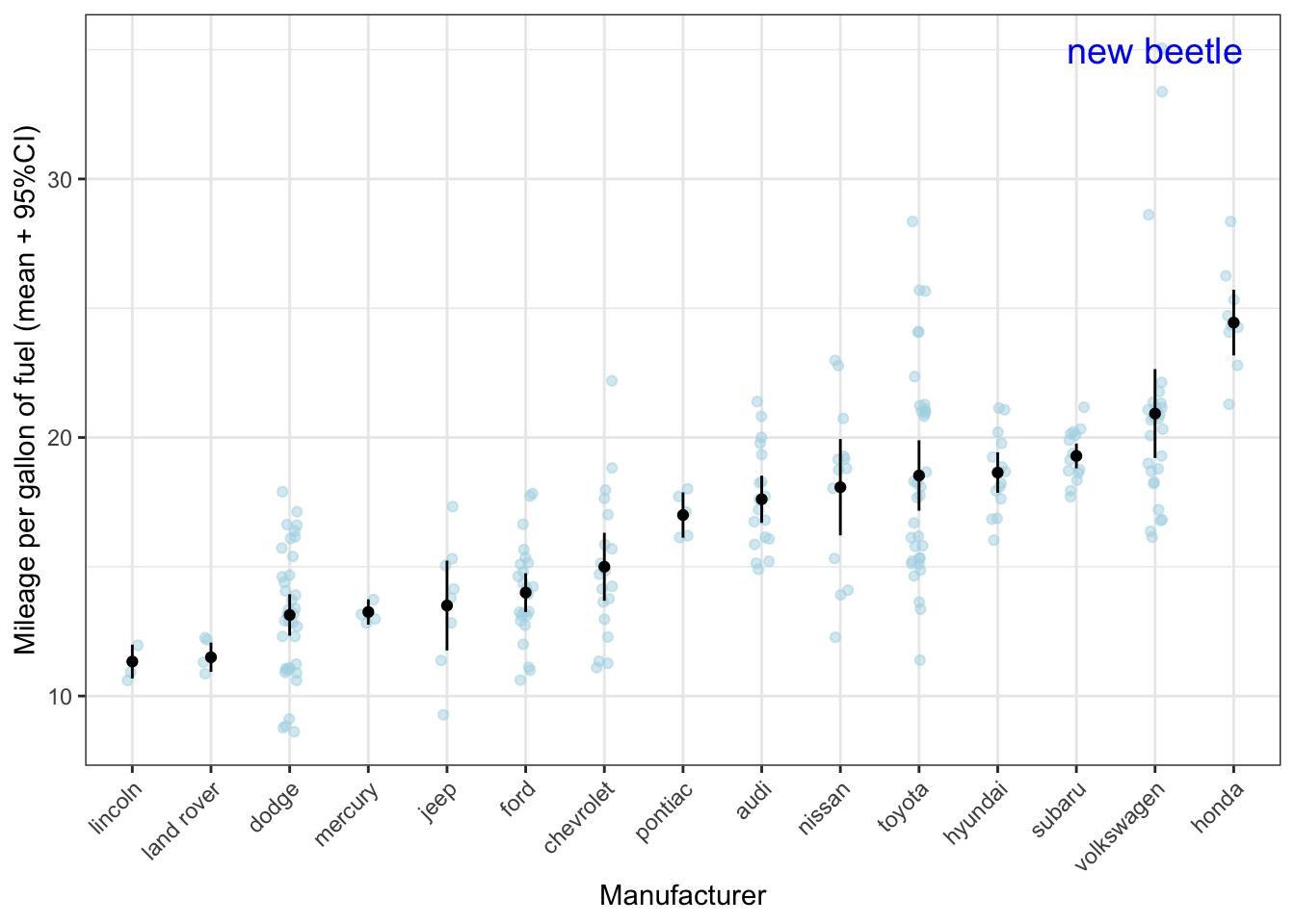
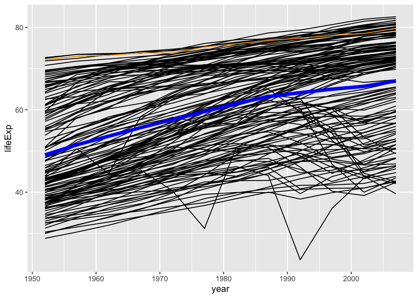
13.4 Line graphs
Let’s try the same trick, of using multiple datasets to create a graph. This time 3 datasets! We’ll make use of the gapminder dataset again.
Let’s first calculate the average lifespan across the world across time:
Let’s also create a dataset that focuses only on the Netherlands:
# This code does the same: NL <- gapminder[gapminder$country == "Netherlands", ]
NL <- gapminder %>% filter(country == "Netherlands")
Let’s now create a graph with a line for each country across time based on the original dataset gapminder, the average across time based on our dataset lifespan, and the line for the Netherlands based on our dataset NL.
ggplot(gapminder, aes(x = year, y = lifeExp)) +
  geom_line(aes(group = country)) +
  geom_line(data = lifespan, aes(y = mean_lifespan), colour = "blue", size = 2) +
  geom_line(data = NL, colour = "orange")