Chapter 11 Comparing group statistics
Because we are not always able to assess differences between groups “by eye” in particular cases (particularly when there are many datapoints), we often rely on a comparisons of group statistics (for example, the mean, or the median). Compare the visualizations below:
Such group statistics are also important when statistically comparing groups, through, for instance, ANOVAs, t-tests, and non-parametric alternatives. In fact, the comparison of means may be the most popular statistical test out there, and the visualization of group means the most popular form of graph (regrettably). Today we’ll focus on mean-errorbar-plots. The important thing that we’ll learn here is that sometimes you have to create these means (or other statistics) yourself on the basis of the data at hand. This means programming! Luckily, some of R’s language is fairly intuitive.
11.1 Mean-errorbar-plots
11.1.1 Creating barplots of means
Often, people want to show the different means of their groups. Bar-plots or dot/point-plots are popular choices. Because a mean is a statistical summary that needs to be calculated, we must somehow let ggplot know that the bar or dot should reflect a mean.
We can do this by using ggplot’s built-in stat-functions. Again, the cheatsheet is helpful:

Let’s try and create a bar-plot of the means. Rather than using the stat="count"), we are going to tell to stat that we want a summary measure, namely the mean:
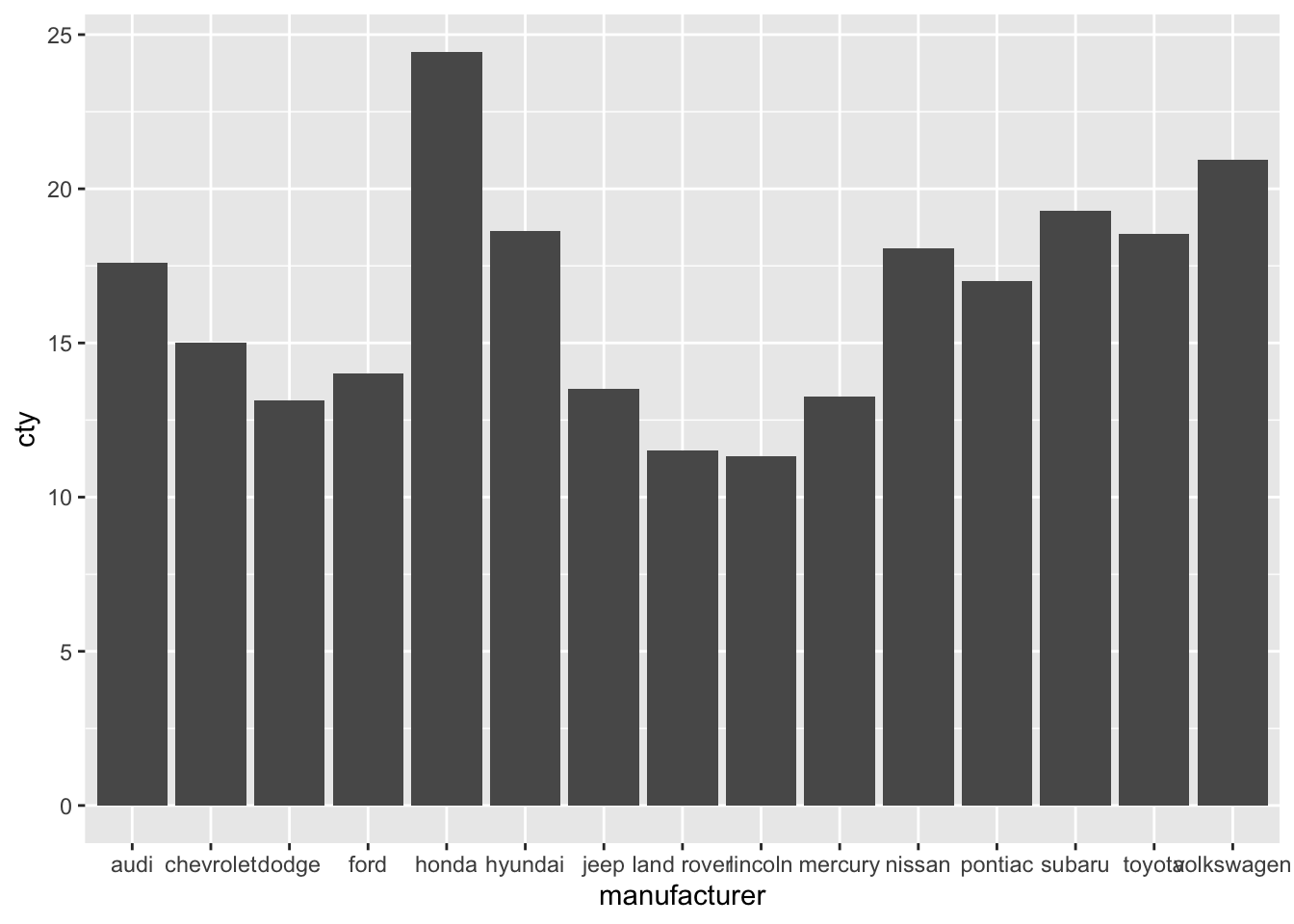
It is important to understand, what happens “under the hood”; as the cheatsheet already suggests, the stat-function creates a new dataset (with the means for all the groups), and uses this dataset for the visualization.
11.2 Adding error bars
Often, mean plots are associated with errorbars (e.g., 1 standard error around the mean, or a 95% confidence intervals). We’ll show two ways of getting the errorbars in the graph. This is not to annoy you, but to give you some further insight into how ggplot works. They all depend on the geom_errorbar() function.
11.2.1 Using the built-in mean_se() function
ggplot(mpg, aes(x = manufacturer, y = cty)) +
geom_bar(stat = "summary", fun = "mean") +
geom_errorbar(stat = "summary", fun.data = "mean_se")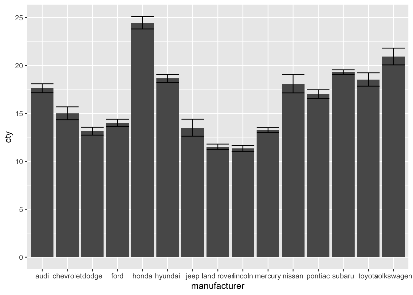
This is the fastest way, but perhaps not the most intuitive one. Indeed, one requirement is that you know about the existence of the mean_se function.
This function can be used easily to get a 95%-confidence interval (a 95% CI is ± 1.96 * standard error). The mean_se() can also be give a multiplier (of the se, which by default is 1). Let’s change the multiplier to 1.96:
ggplot(mpg, aes(x = manufacturer, y = cty)) +
geom_bar(stat = "summary", fun = "mean") +
geom_errorbar(stat = "summary", fun.data = "mean_se", fun.args = list(mult = 1.96))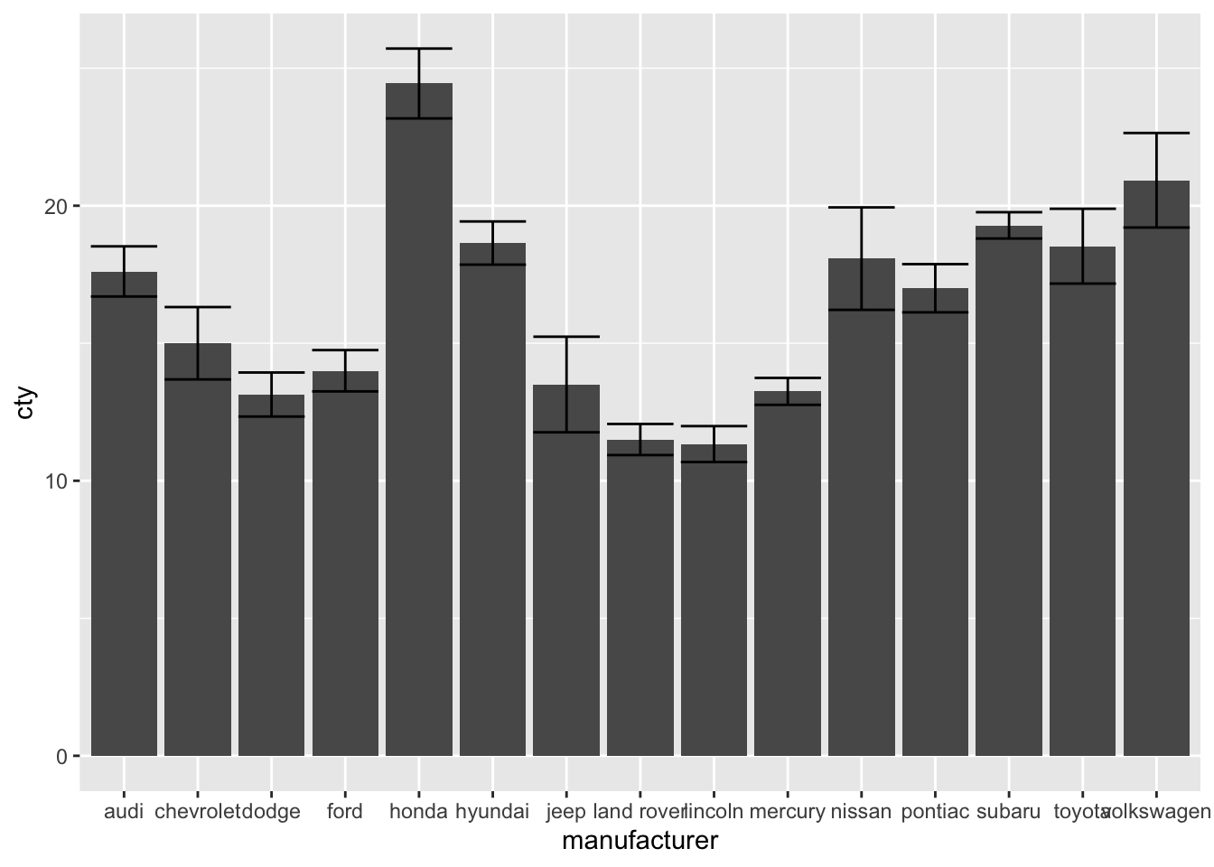
To find more information on the mean_se() function, see: http://ggplot2.tidyverse.org/reference/mean_se.html
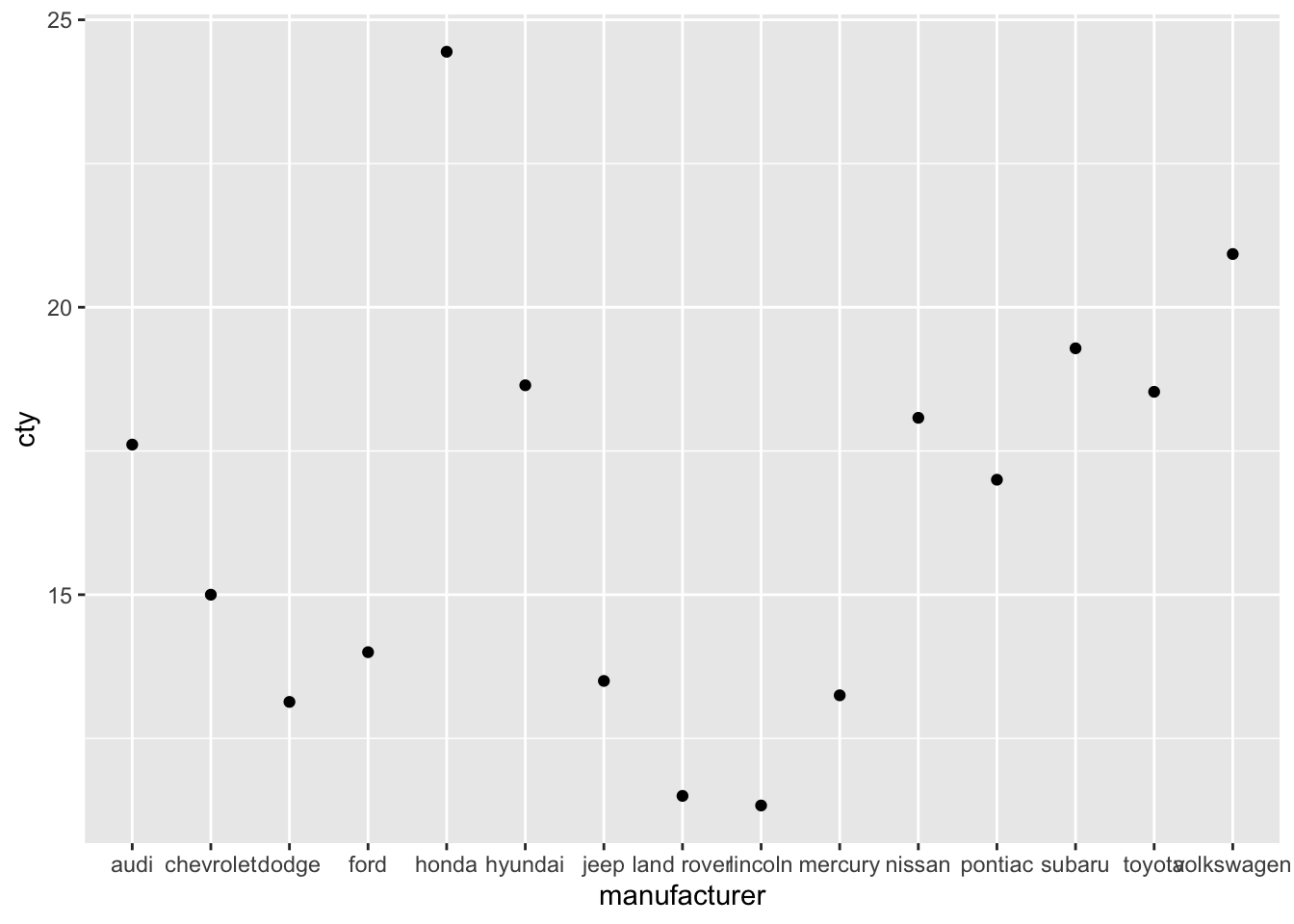
11.3 Point-error plots
All these methods can also be used for the (common) point-error plot:
ggplot(mpg, aes(x = manufacturer, y = cty)) +
geom_point(stat = "summary", fun = "mean") +
geom_errorbar(stat = "summary", fun.data = "mean_se",
fun.args = list(mult = 1.96))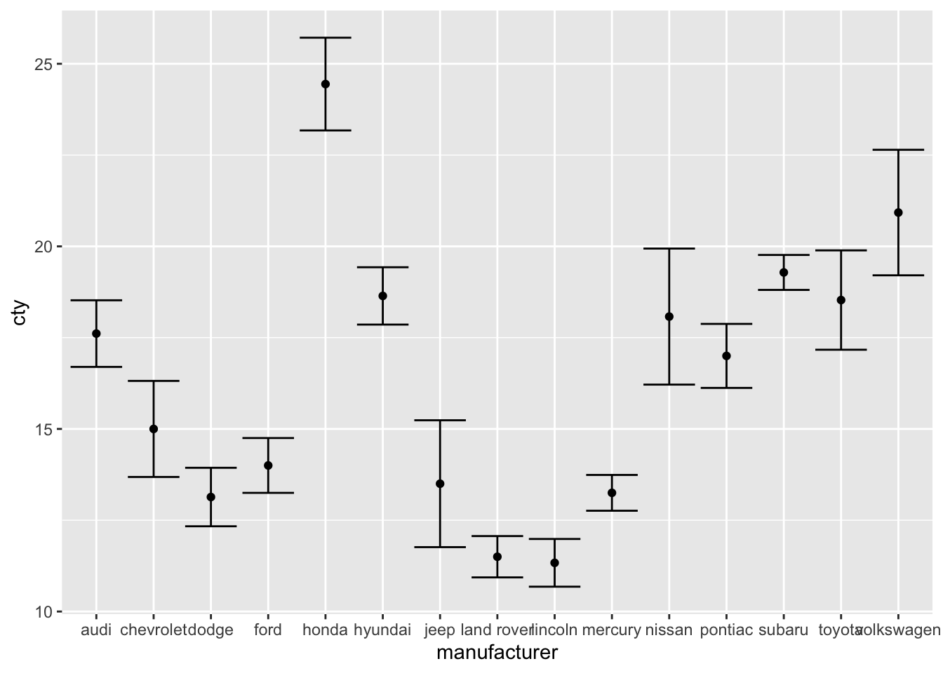
Also this plot might benefit from reordering the x-axis on the basis of the mean. I’ll also change the width of the errorbar:
ggplot(mpg, aes(x = reorder(manufacturer, cty, FUN = mean), y = cty)) +
  geom_point(stat = "summary", fun = "mean") +
  geom_errorbar(stat = "summary", fun.data = "mean_se",
                fun.args = list(mult = 1.96), width = 0)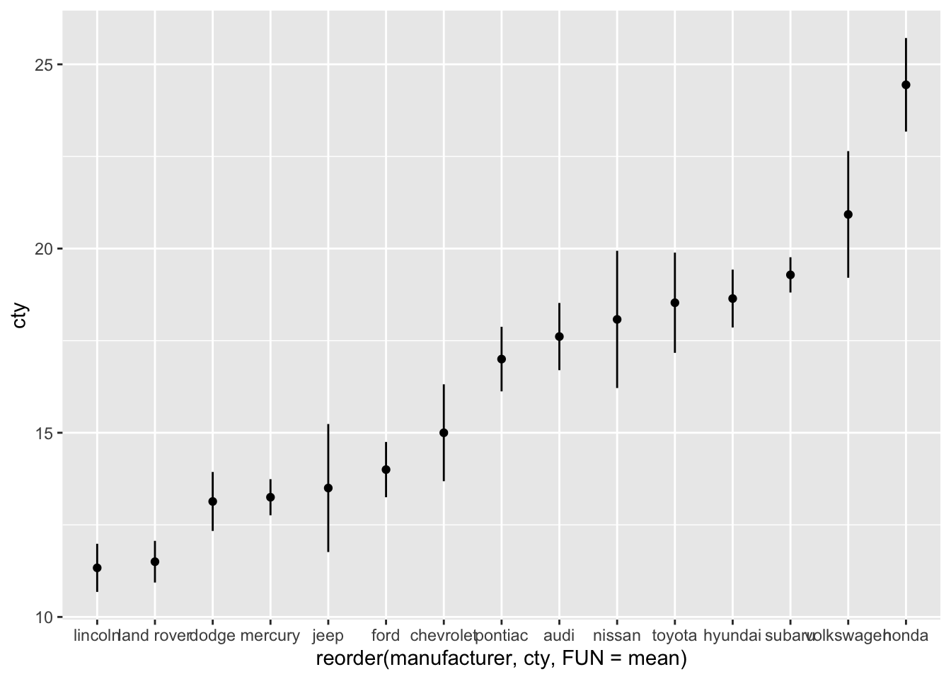
Create a bar-error-plot in which we compare the fuel efficiency (cty) across front-, rear-, and 4-wheel drives (measured in variable ‘drv’). Make the colours of the bars and the errorbars different (and you can pick any colours you’d like).
11.4 An important note on mean-error-plots
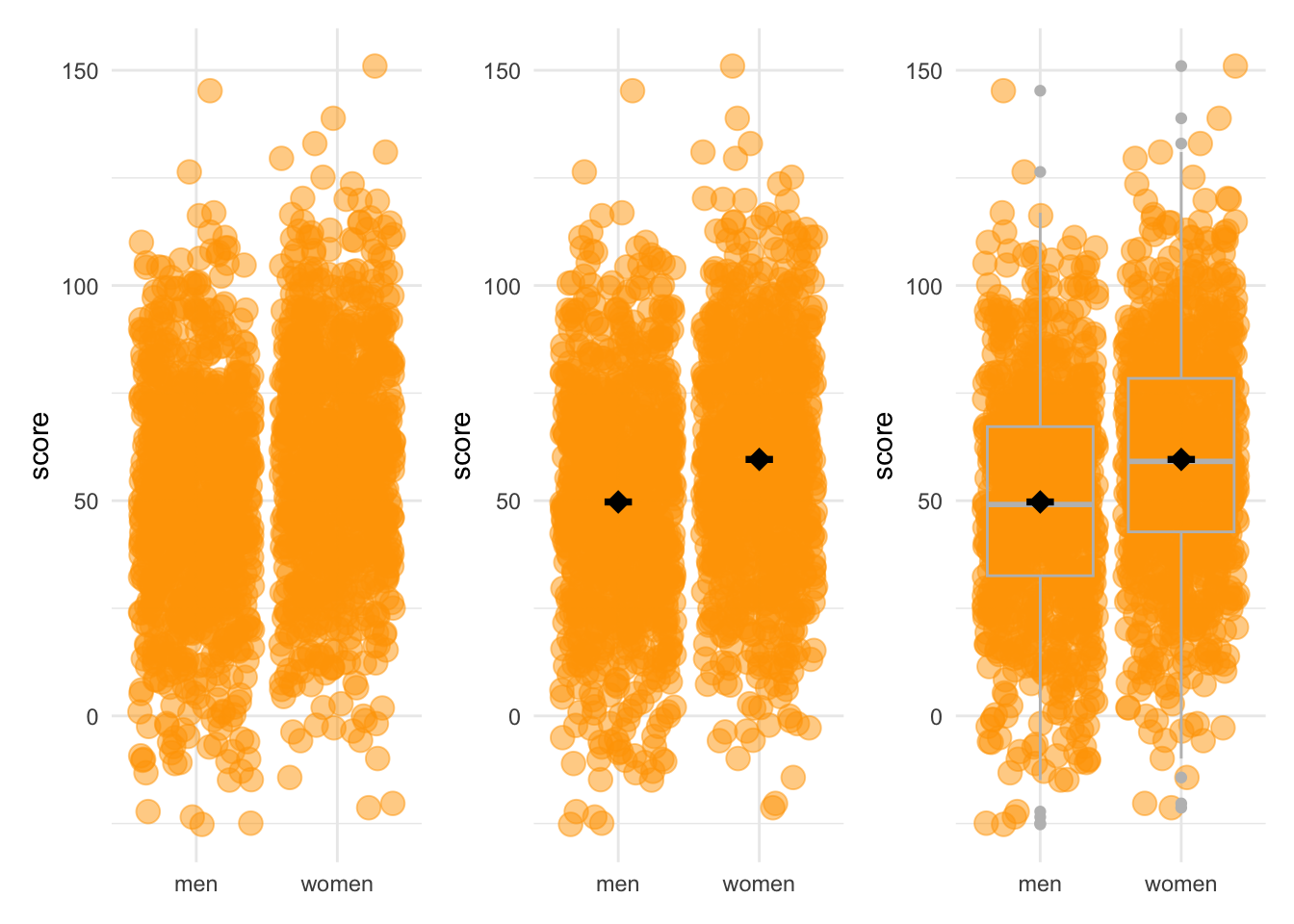
There are very good reasons to avoid mean-error plots (which is why it’s so sad they are so common), which have to do with the fact that the mean is not always a good summary measure of a distribution, and that the standard error is not always a good measure of the variation. The below figures show this very clearly:
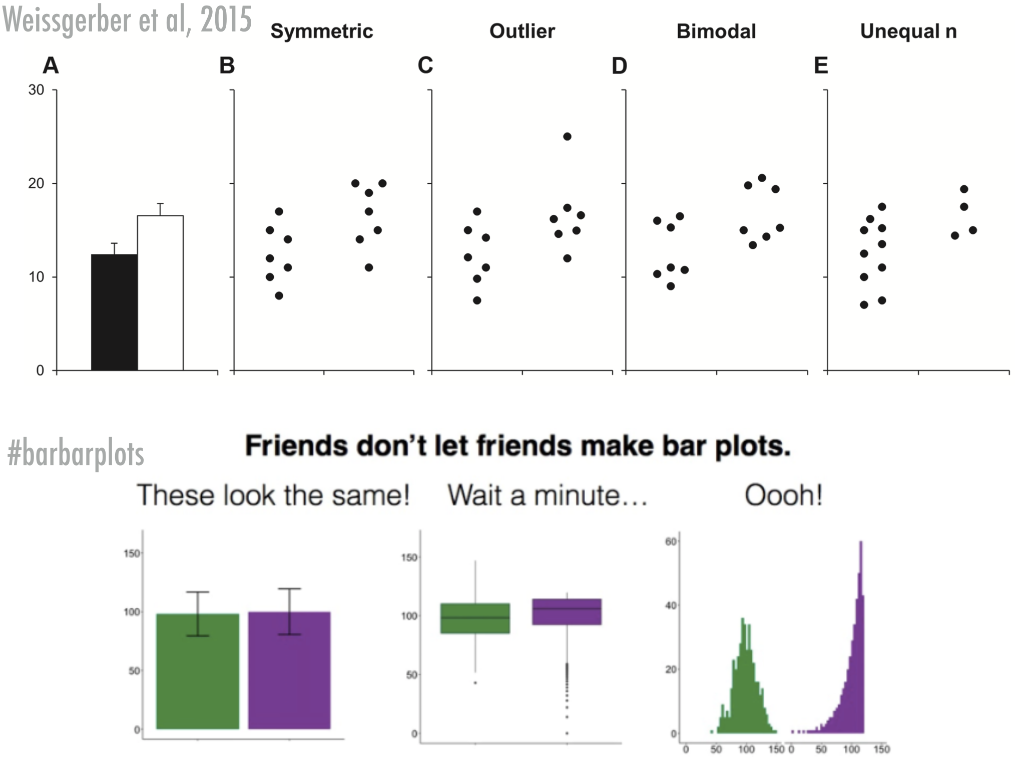
Of course, mean-error-plots have their value too, so if you feel you must create one, then I’d suggest you always include the raw data or some distributional information in the graph as well. Two examples that I think improve the mean-error-plots tremendously (remember, the purpose of graphs is to help the reader get a better grasp on your data, not to only help the reader understand basic summary measures of the data):
11.4.1 Mean-error-plots + raw data
Let’s add the raw data by adding points. I’ve also changed some of the features of the graphs:
ggplot(mpg, aes(x = reorder(manufacturer, cty, FUN = mean), y = cty)) +
  geom_jitter(colour = "lightblue", alpha = 0.5, width = 0.1) +
  geom_point(stat = "summary", fun = "mean") +
  geom_errorbar(stat = "summary", fun.data = "mean_se",
                fun.args = list(mult = 1.96), width = 0) +
  labs(x = "Manufacturer", y = "Mileage per gallon of fuel (mean + 95%CI)") +
  theme_bw() +
  theme(axis.text.x = element_text(angle = 45, hjust = 1))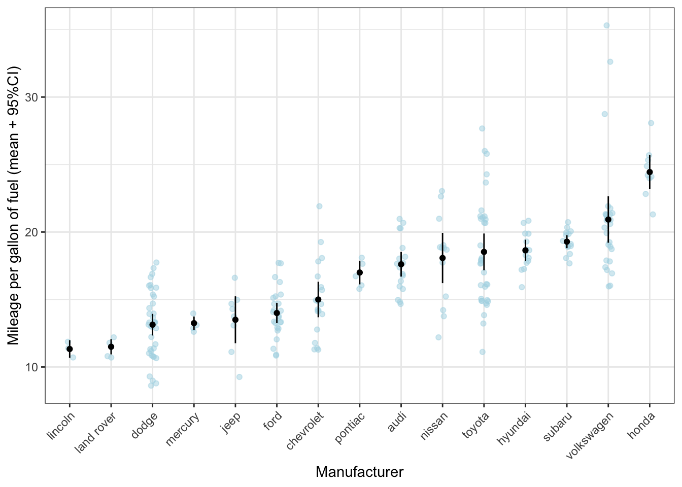
What can be seen much more clearly in this graph, is, for instance, that, while toyota on average makes rather fuel-efficient cars, there is quite some variation. However, the confidence interval is rather small, giving the impression that there is little variation within the cars produced by toyota. The reason is that the standard error is calculated by dividing the standard deviation by the square root of the sample size; given the sample size is rather large, the resulting standard error will be rather small (despite the variation as measured by the standard deviation is large).
Do you think the mean and standard error are good statistical summaries for Volkswagen?
11.4.2 Mean-error-plots + violin plot
ggplot(mpg, aes(x = reorder(manufacturer, cty, FUN = mean), y = cty)) +
  geom_violin(colour = "lightblue", alpha = 0.5) +
  geom_point(stat = "summary", fun = "mean") +
  geom_errorbar(stat = "summary", fun.data = "mean_se",
                fun.args = list(mult = 1.96), width = 0) +
  labs(x = "Manufacturer", y = "Mileage per gallon of fuel (mean + 95%CI)") +
  theme_bw() +
  theme(axis.text.x = element_text(angle = 45, hjust = 1))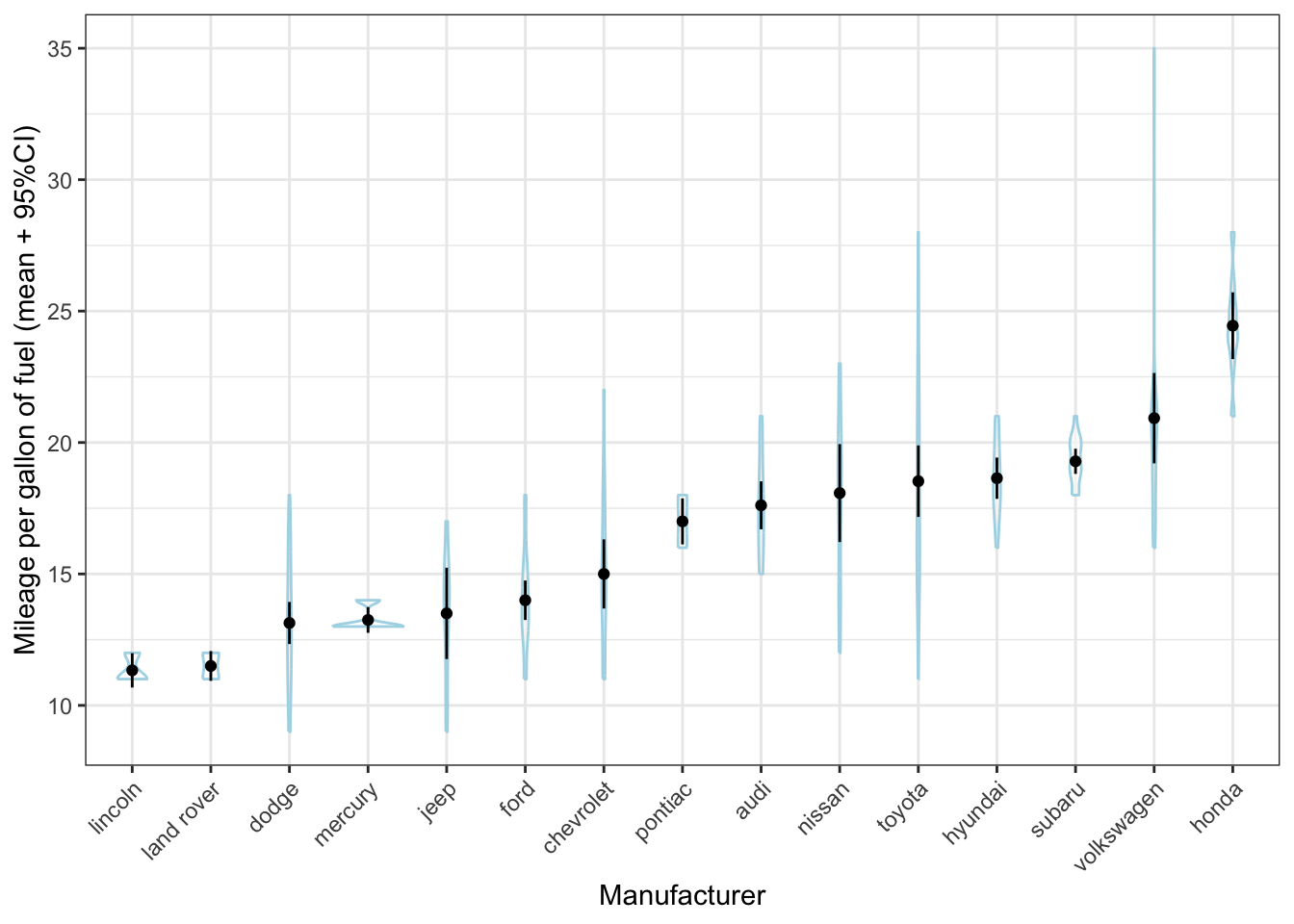
Hhmmm that doesn’t quite work, because there are so many different manufacturers and because there are relatively few cars per manufacturer. It works much better here:
ggplot(mpg, aes(x = reorder(drv, cty, FUN = mean), y = cty)) +
  geom_violin(colour = "lightblue") +
  geom_point(stat = "summary", fun = "mean") +
  geom_errorbar(stat = "summary", fun.data = "mean_se",
                fun.args = list(mult = 1.96), width = 0) +
  labs(x = "Type of vehicle", y = "Mileage per gallon of fuel (mean + 95%CI)") +
  theme_bw()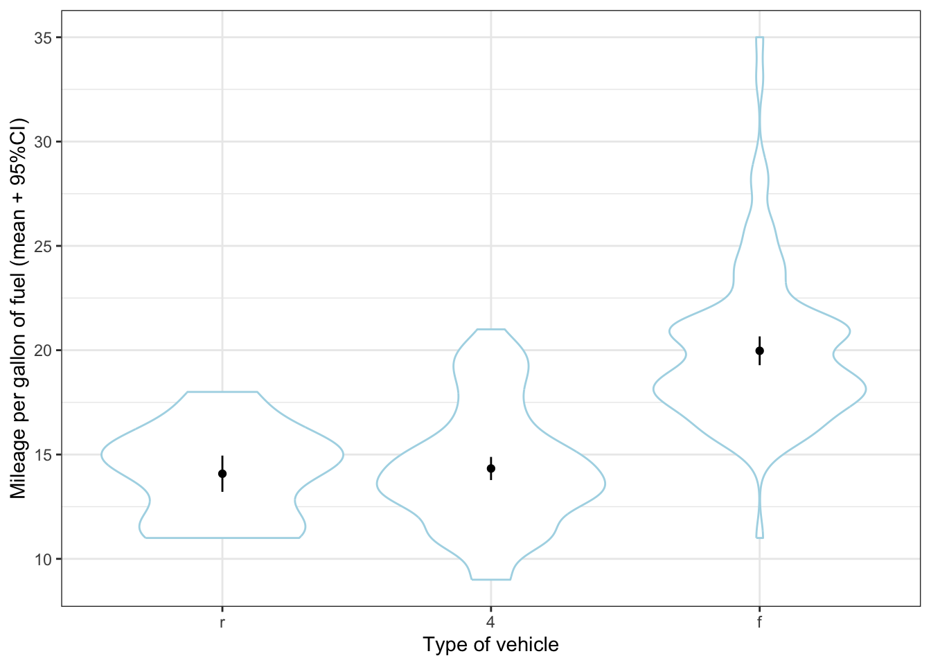
11.4.3 A quick preview of labels
Another way of showing the datapoints, is to show the actual car models with labels. It doesn’t quite work here because of the overlap, but it certainly provides us with more information (the toyota corolla are much mure fuel efficient than the toyota land cruiser wagon 4wd (who’d have thought)).
ggplot(mpg, aes(x = reorder(manufacturer, cty, FUN = mean), y = cty)) +
  geom_text(aes(label = model), size = 2, colour = "blue") +
  geom_point(stat = "summary", fun = "mean") +
  geom_errorbar(stat = "summary", fun.data = "mean_se",
                fun.args = list(mult = 1.96), width = 0) +
  labs(x = "Manufacturer", y = "Mileage per gallon of fuel (mean + 95%CI)") +
  theme_bw() +
  theme(axis.text.x = element_text(angle = 45, hjust = 1))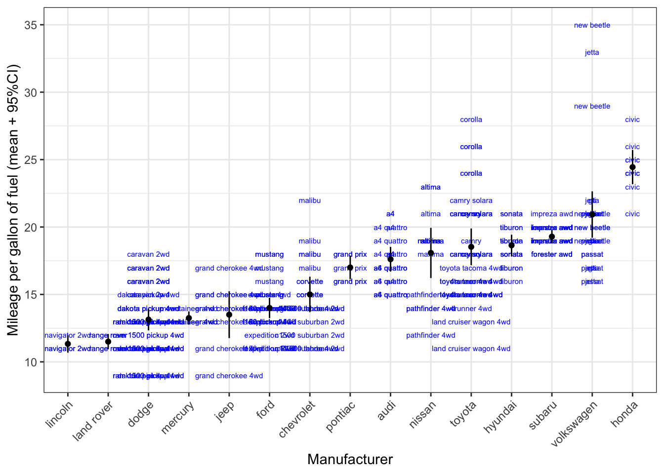
11.5 Line plots
Line plots also often represent an average of some variable over (for instance) time. Let’s revisit the gapminder-dataset.
## # A tibble: 1,704 × 6
##    country     continent  year lifeExp      pop gdpPercap
##    <fct>       <fct>     <int>   <dbl>    <int>     <dbl>
##  1 Afghanistan Asia       1952    28.8  8425333      779.
##  2 Afghanistan Asia       1957    30.3  9240934      821.
##  3 Afghanistan Asia       1962    32.0 10267083      853.
##  4 Afghanistan Asia       1967    34.0 11537966      836.
##  5 Afghanistan Asia       1972    36.1 13079460      740.
##  6 Afghanistan Asia       1977    38.4 14880372      786.
##  7 Afghanistan Asia       1982    39.9 12881816      978.
##  8 Afghanistan Asia       1987    40.8 13867957      852.
##  9 Afghanistan Asia       1992    41.7 16317921      649.
## 10 Afghanistan Asia       1997    41.8 22227415      635.
## # ℹ 1,694 more rows
Let’s see if we can visualise the life expectancy across time in the Netherlands. Let’s make a dataset of the Netherlands first:
ggplot(NL, aes(x = year, y = lifeExp)) +
  geom_line() +
  labs(title = "The average life expectancy in years across time in the Netherlands")
Note that the following code would produce the exact same graph:
ggplot(
  gapminder[gapminder$country == "Netherlands", ],
  aes(x = year, y = lifeExp)
) +
  geom_line() +
  labs(title = "The average life expectancy in years across time in the Netherlands")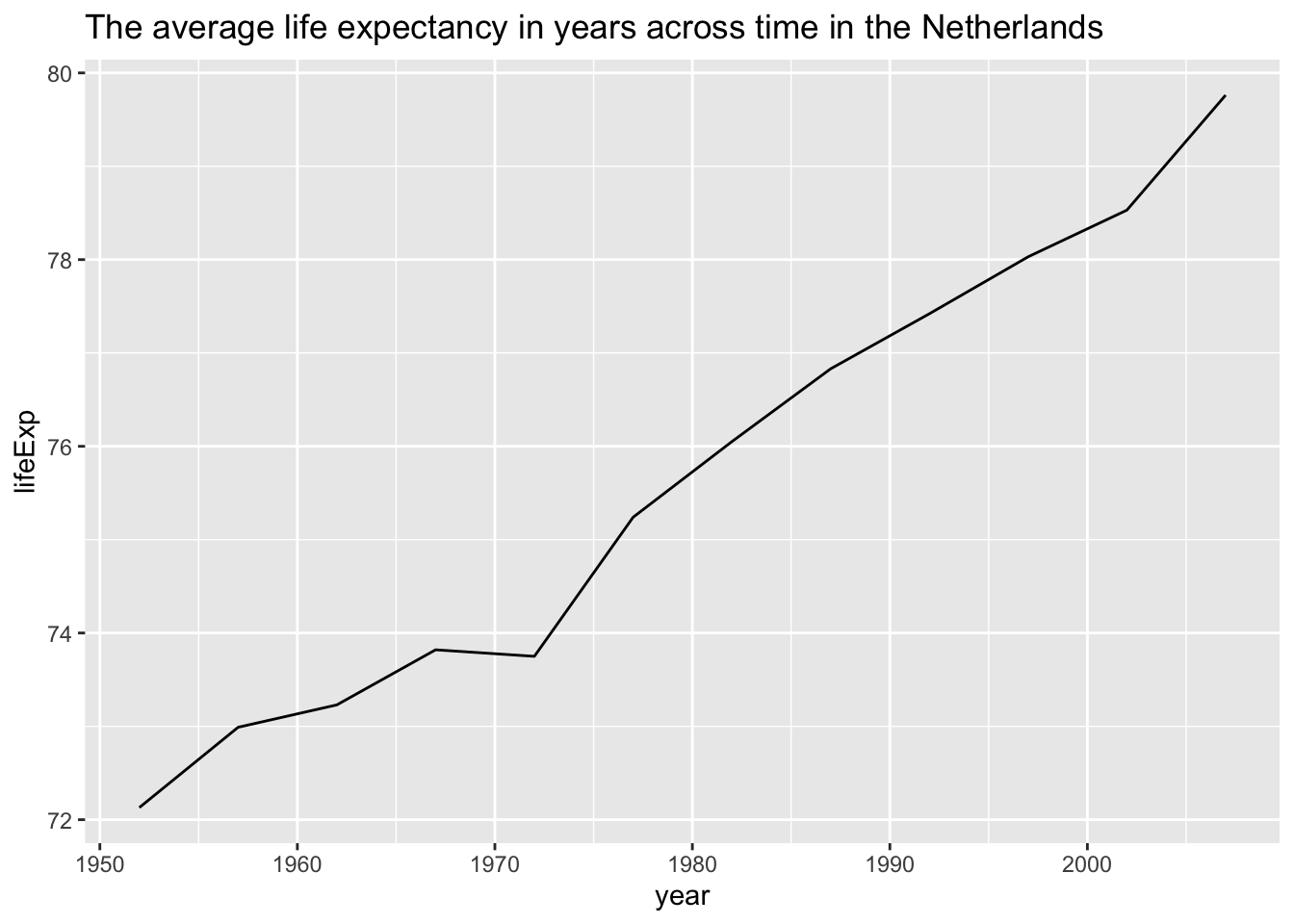
We could also add points to signify in which years measurements were taken:
ggplot(NL, aes(x = year, y = lifeExp)) +
  geom_line() +
  geom_point() +
  labs(title = "The average life expectancy in years across time in the Netherlands")
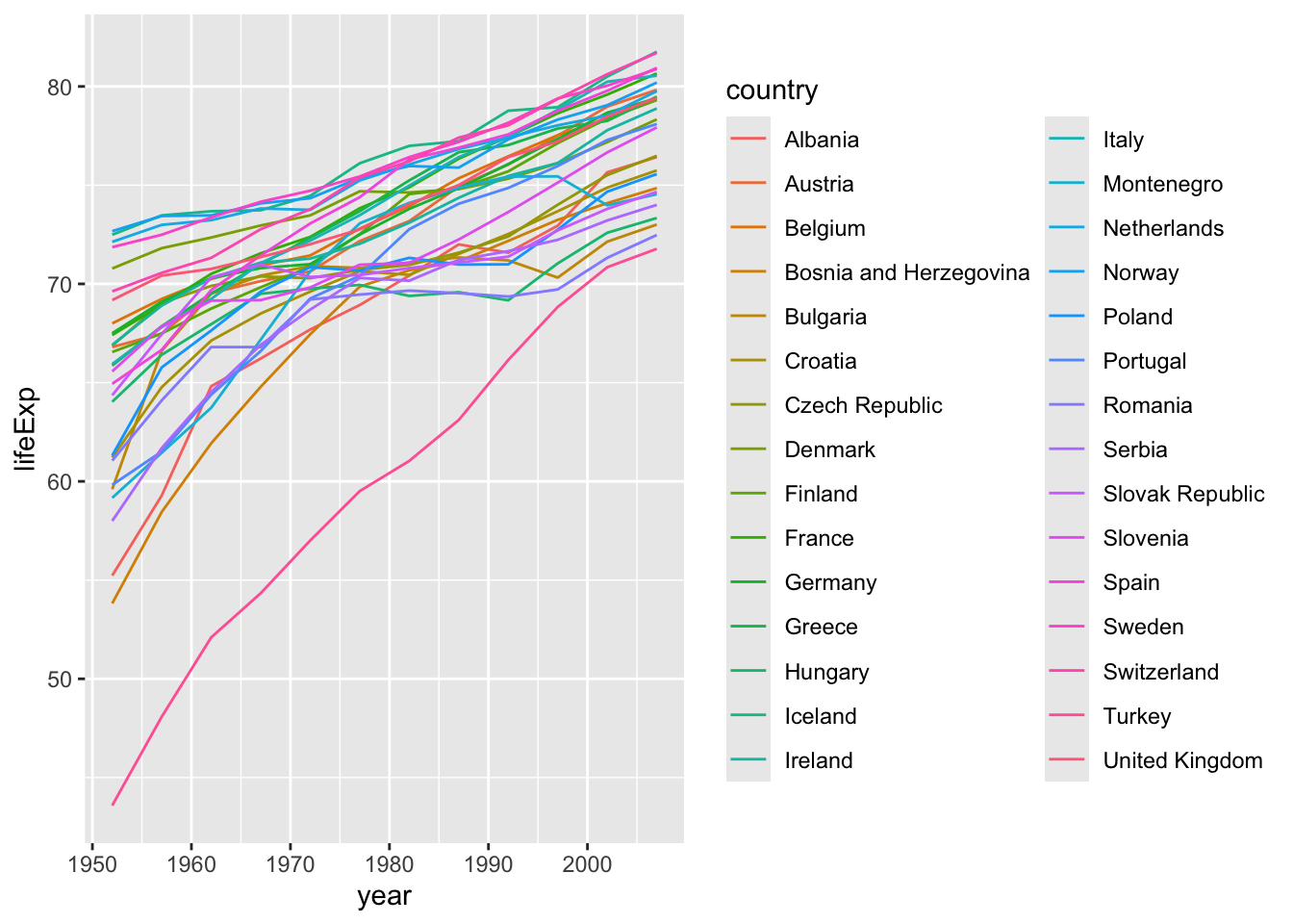
Now let’s visualise these lines for all European countries
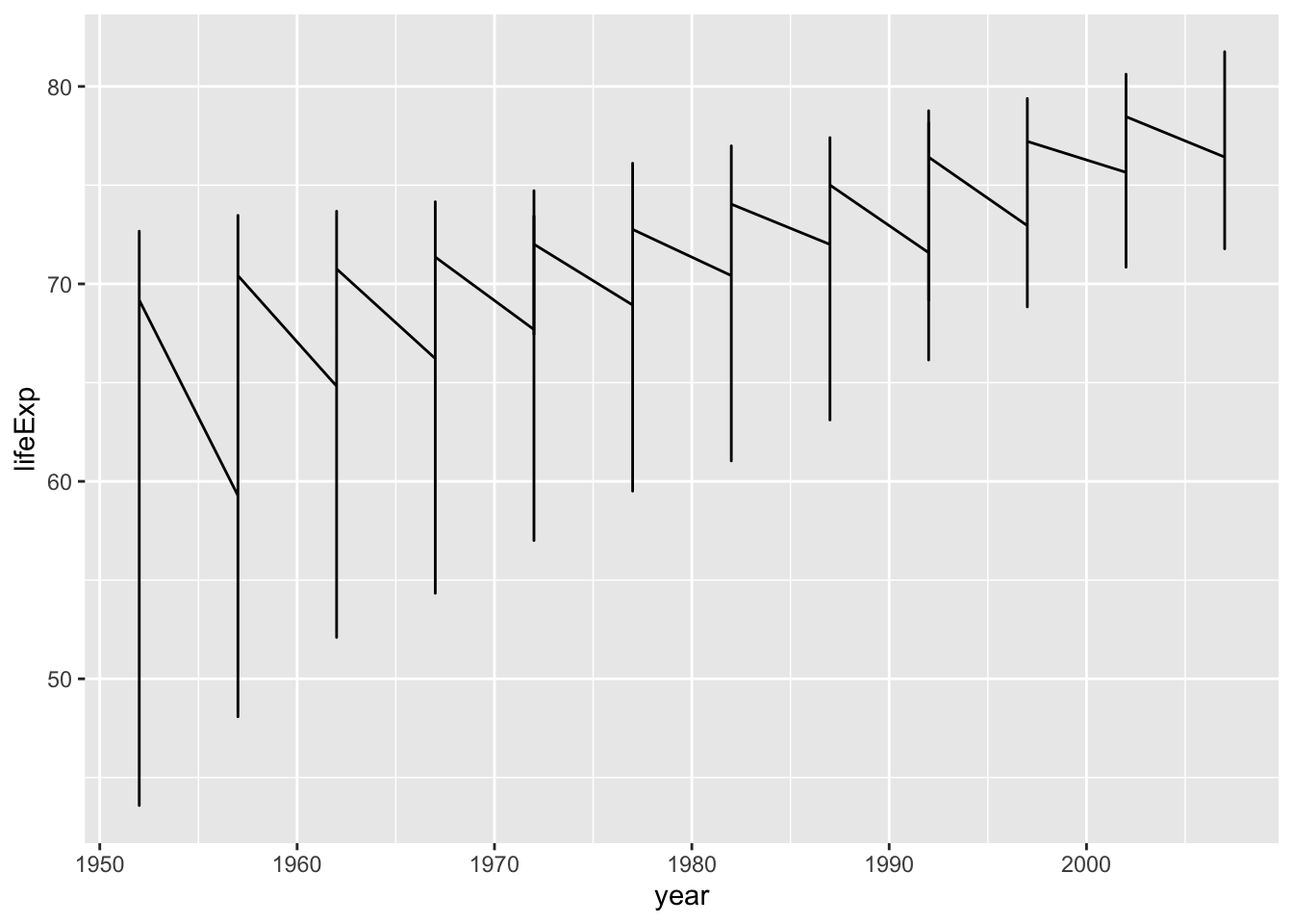
That certainly isn’t what we wanted. Why did this go wrong?
Of course, ggplot doesn’t know these datapoints belong to different countries, if we don’t tell it explicitely. Let’s do so, using a new trick group =:
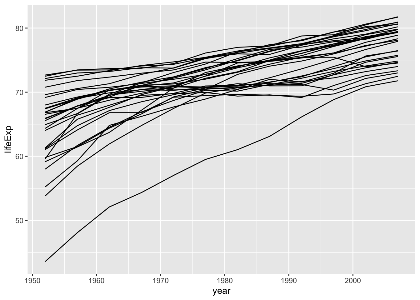
group works rather similar to colour or fill within aes() without adding colours to each group:
Now these life expectancies are of course averages per country, but we could also add a line signifying the average life expectancy of Europeans across time:
ggplot(europe, aes(x = year, y = lifeExp)) +
  geom_line(stat = "summary", fun = "mean") +
  labs(title = "Average life expectancy across Europe")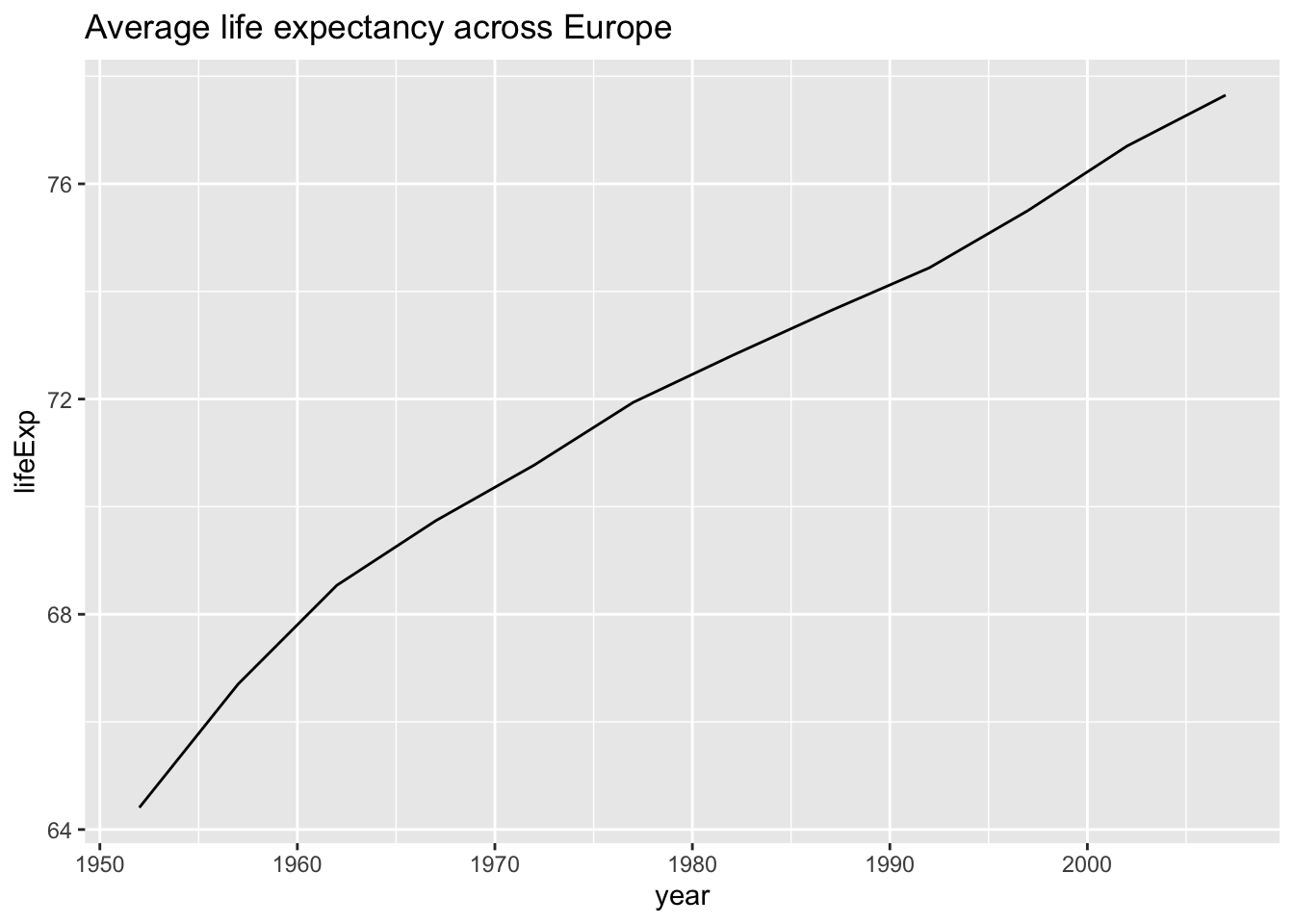
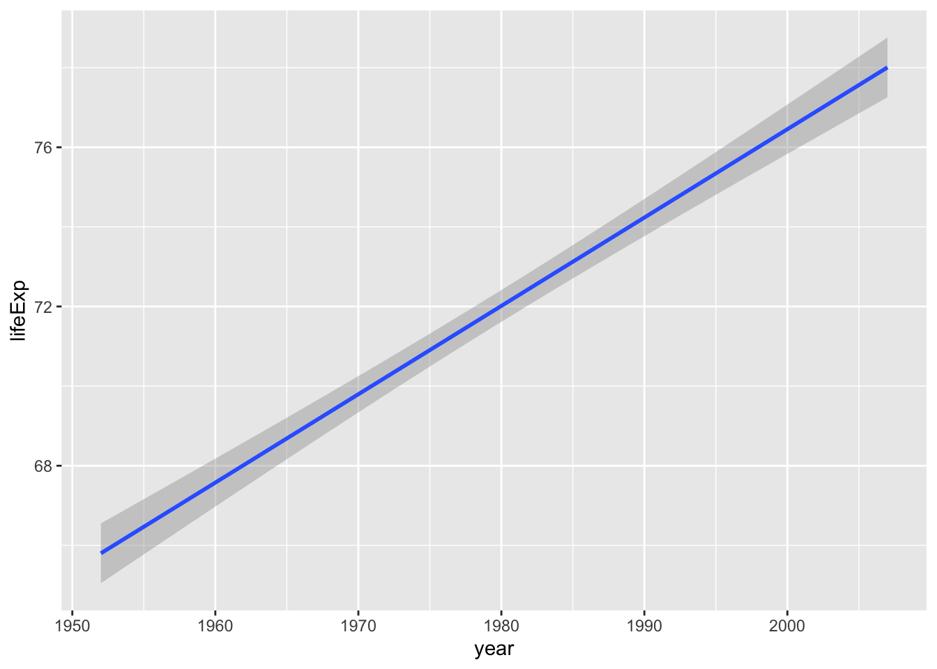
We could instead add a regression line:
## `geom_smooth()` using formula = 'y ~
## x'