Chapter 19 Visualizing two discrete variables
Plotting two discrete variables is a bit harder, in the sense that graphs of two discrete variables do not always give much deeper insight than a table with percentages. Let’s try to make some graphs nonetheless. While doing so, we’ll also learn some more ggplot-tricks.
Let’s see what the relationship is between the class of the car (e.g., suv, minivan, pickup, et cetera) and whether it is a front-, rear, or 4-wheeldrive.
##
##               4  f  r
##   2seater     0  0  5
##   compact    12 35  0
##   midsize     3 38  0
##   minivan     0 11  0
##   pickup     33  0  0
##   subcompact  4 22  9
##   suv        51  0 11
Apparently all pickup-trucks make use of 4-wheel drive, whereas 2seaters are only rear-wheel drive. Fascinating stuff.
19.1 Bar charts
We could make a bar chart! Not a simple bar chart, but a stacked bar! We saw previously that when we specify an x and a y to geom_bar, that we need to make use of stat = "identity". So let’s try:
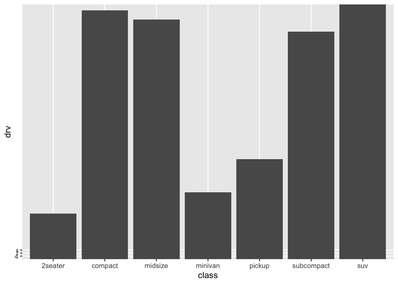
Hhmm, this is certainly not what we want. Also ggplot can’t quite handle this (look at the weird left-bottom-corner, and the lack of values on the y-axis!). Remember, that the stat = identity refers to the fact that we want the bar to have the height of the values we give through a variable (the bar has the identity specified by a variable), namely y = drv. But this is nonsense; drv is not a numerical variable that is useful to take as an ‘identity’ of the bar. If we compare the table to the graph, then there is a sensible pattern in the graph, namely, the number of cases of each category (“2seater” is the category with the fewest cases, while “suv” is the category with the most cases). The scaling seems a bit off though. Let’s explore a bit. Let’s make a table with the counts of each category.
## # A tibble: 7 × 2
## class number_cases
## <chr> <int>
## 1 2seater 5
## 2 compact 47
## 3 midsize 41
## 4 minivan 11
## 5 pickup 33
## 6 subcompact 35
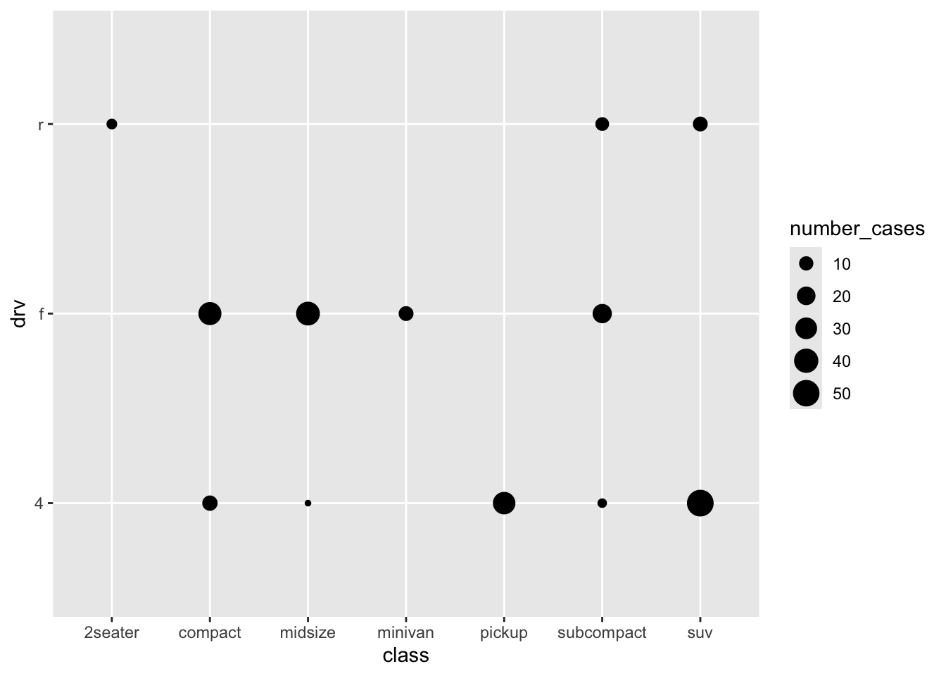
## 7 suv 62Now we can use this newly created variable as our ‘identity’! The ‘identity’ of the bar will be a count (reflecting the number of cases of that group):
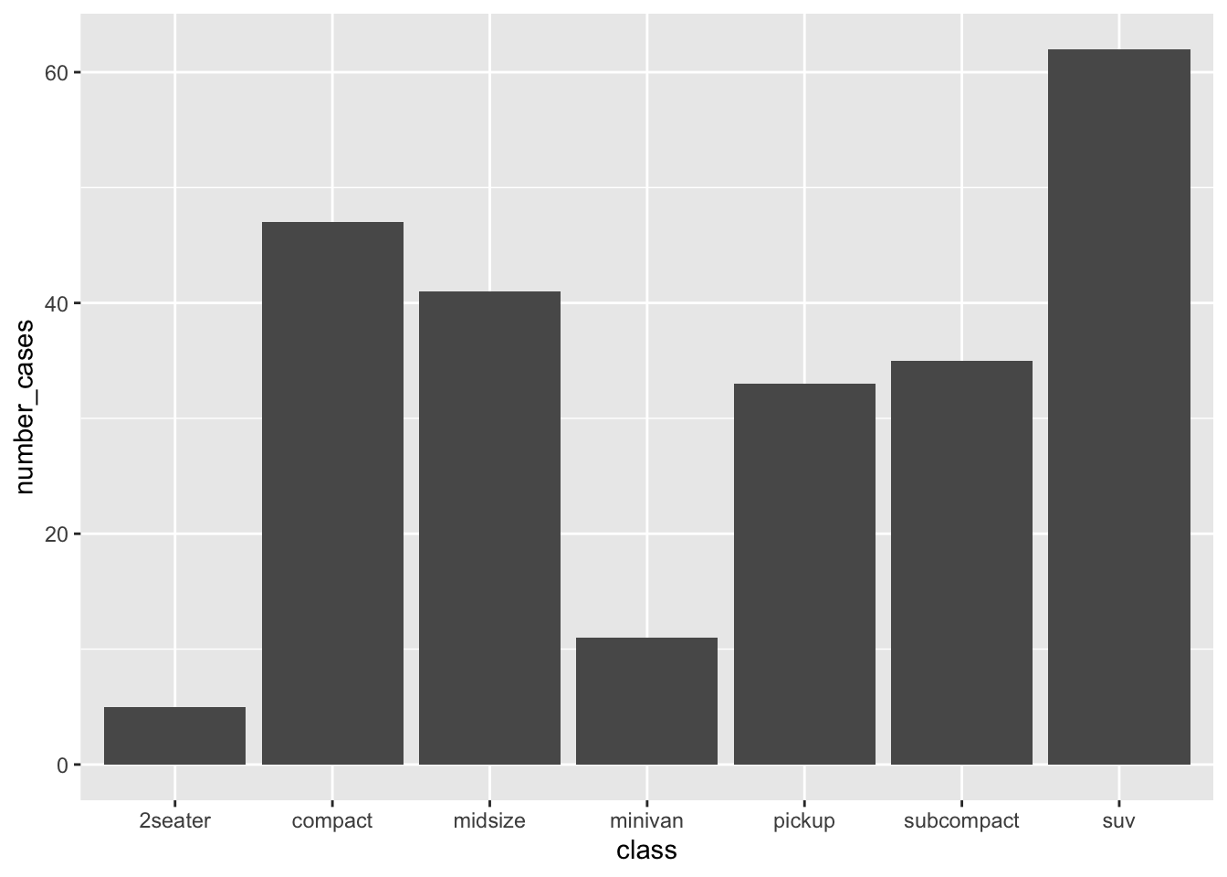
Looks similar to the earlier graph, but not quite the same. At least now, we know exactly what the graph is showing. Incidentally, this is exactly what geom_bar does when you don’t specify anything. This is because the default setting for geom_bar() is to include stat = count:

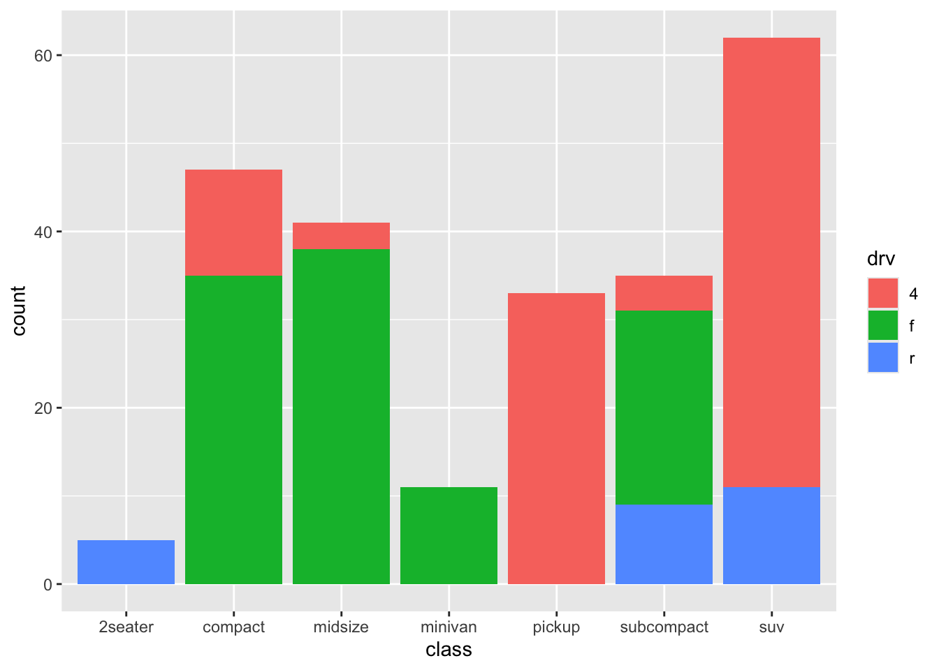
So without any further specification within geom_bar(), ggplot itself creates the table we made, and plots the counts in each group. We have learned something, but of course, we have entirely neglected our variable of interest drv so far. So let’s try different things. Let’s try something else:
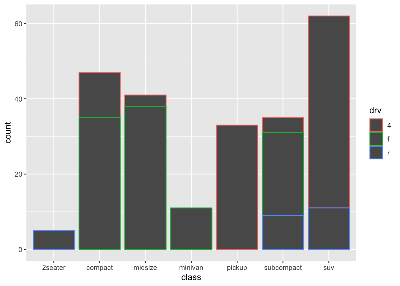
This is more like it! Now we see the counts of each class, with a colour-coding for drv.
This very much resembles one of our earlier histograms; is this surprising?
As was the case for histograms, this works a bit better with fill.

A stacked bar chart!
Again something is happening under the hood that is informative: the default settings also includes position = "stack", so the above code is identical to:
So apparently, we can also choose other options, including dodge and fill. Let’s try both:
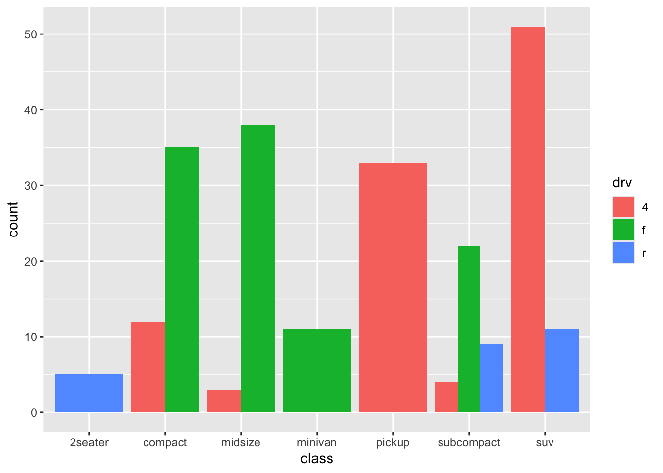
It is clear what is happening, but it is not clear whether it is an improvement.
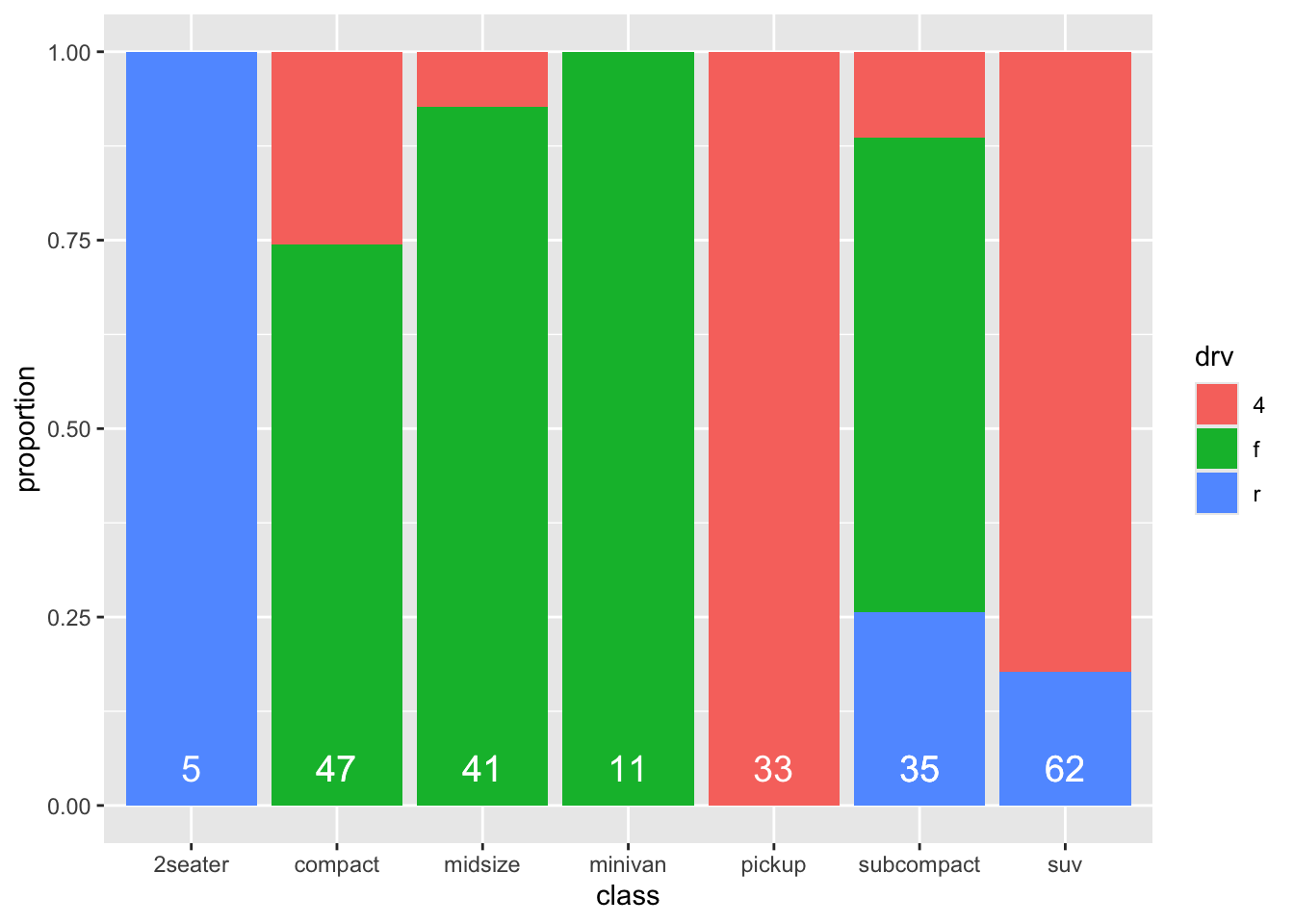
How about “fill”:

This is more like it! A stacker bar chart that is scaled for height/counts! A big advantage of this form, is that the comparisons between the different classes become a bit more obvious. A downside is that we lose information on sample sizes. I quite like stacked bar charts, but in such cases I would always like to include the sample sizes for each group. Luckily, we already made a table with this information! So we can include it in the graph:
ggplot(mpg, aes(x = class, fill = drv)) +
geom_bar(position = "fill") +
geom_text(
data = mpg_count_class,
aes(x = class, y = 0.05, label = number_cases),
size = 5, colour = "white", inherit.aes = FALSE
)
Not bad at all! Note that the label “count” on the y-axis is not accurate anymore!
Try and interpret what is going on with the geom_text()-code.
19.1.1 Recreating the graph with more manual labour
To increase our understanding of ggplot and data manipulation, we will now try to recreate this graph, but this time we will calculate everything ourselves. So we need the percentages of each class for each drv-category.
mpg_stacked_bar <- mpg %>%
  group_by(class, drv) %>% # First we'll create counts for each group
  summarise(number_cases = n()) %>%
  group_by(class) %>% # Group new datafram by class
  mutate(
    total_cases = sum(number_cases),
    proportion = number_cases / total_cases
  ) # Create total counts
mpg_stacked_bar
## # A tibble: 12 × 5
## # Groups: class [7]
## class drv number_cases total_cases proportion
## <chr> <chr> <int> <int> <dbl>
## 1 2seater r 5 5 1
## 2 compact 4 12 47 0.255
## 3 compact f 35 47 0.745
## 4 midsize 4 3 41 0.0732
## 5 midsize f 38 41 0.927
## 6 minivan f 11 11 1
## 7 pickup 4 33 33 1
## 8 subcompact 4 4 35 0.114
## 9 subcompact f 22 35 0.629
## 10 subcompact r 9 35 0.257
## 11 suv 4 51 62 0.823
## 12 suv r 11 62 0.177Now let’s recreate the graph:
ggplot(mpg_stacked_bar, aes(x = class, y = proportion, fill = drv)) +
  geom_bar(stat = "identity", position = "stack") +
  geom_text(aes(x = class, y = 0.05, label = total_cases),
    size = 5, colour = "white", inherit.aes = FALSE
  )
The same graph, but a rather different code.
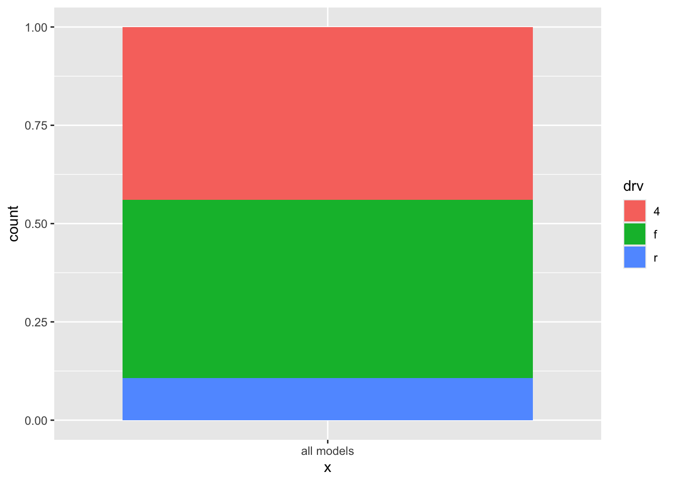
19.1.2 Stacked bar for entire data
Sometimes you want to show to show a stacked bar chart for the entire dataset and not split for different groups. You can do that as follows:
19.1.3 three categorical variables
facets allow you to add a third variable.
Alternatively.
ggplot(mpg, aes(x = class, fill = drv)) +
  geom_bar(position = "fill") +
  facet_wrap(~year, nrow = 2) +
  coord_flip()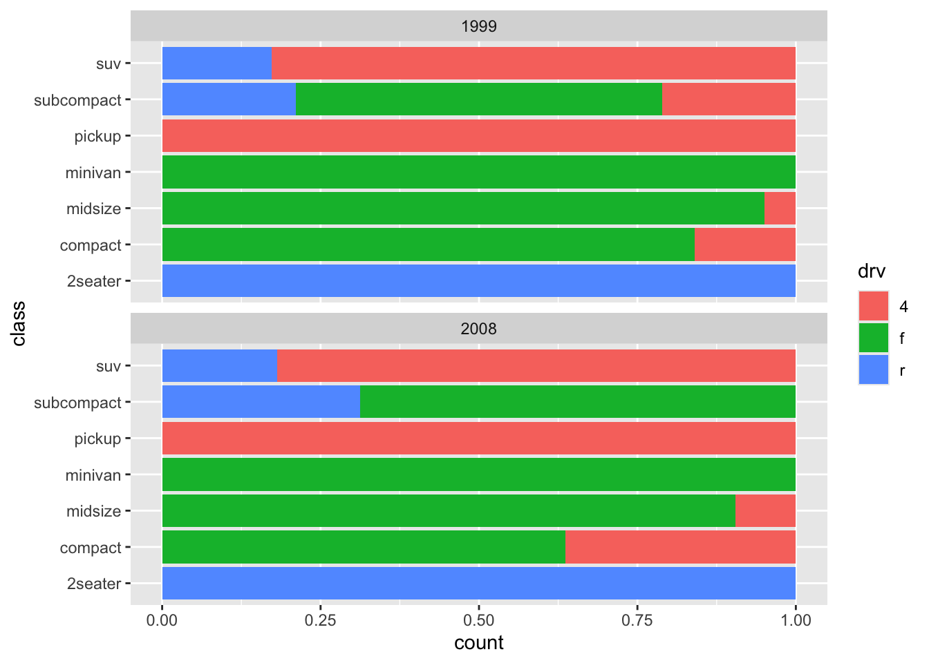
19.1.4 pie charts
We’ve all seen pie-charts been used for this purpose.
ggplot(mpg, aes(x = "all models", fill = drv)) +
  geom_bar(position = "stack") +
  coord_polar("y", start = 0)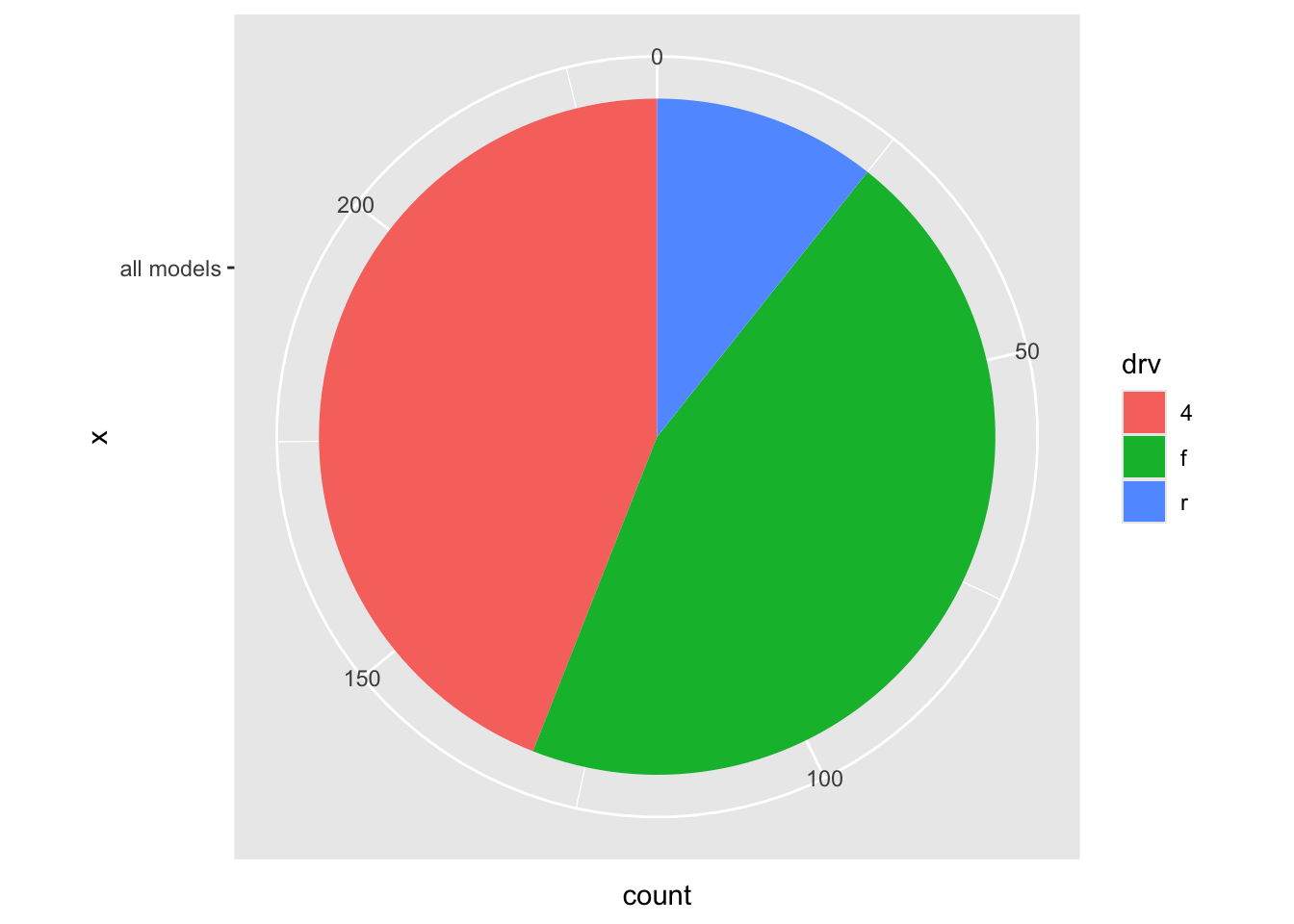
theme_void works well here:
ggplot(mpg, aes(x = "all models", fill = drv)) +
  geom_bar(position = "stack") +
  coord_polar("y", start = 0) +
  theme_void()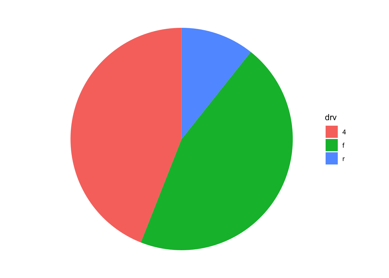
But pie charts are to graphs what comic sans is to fonts. Here’s why:
pie <- data.frame(
  score = c(
    c(17, 18, 20, 22, 23),
    c(20, 20, 19, 21, 20),
    c(23, 22, 20, 18, 17)
  ),
  group = rep(c("A", "B", "C", "D", "E"), 3),
  set = c(rep("I", 5), rep("II", 5), rep("III", 5))
)

ggplot(pie, aes(x = "pie", y = score, fill = group)) +
  geom_bar(stat = "identity") +
  facet_wrap(~set) +
  coord_polar("y", start = 0) +
  theme_void()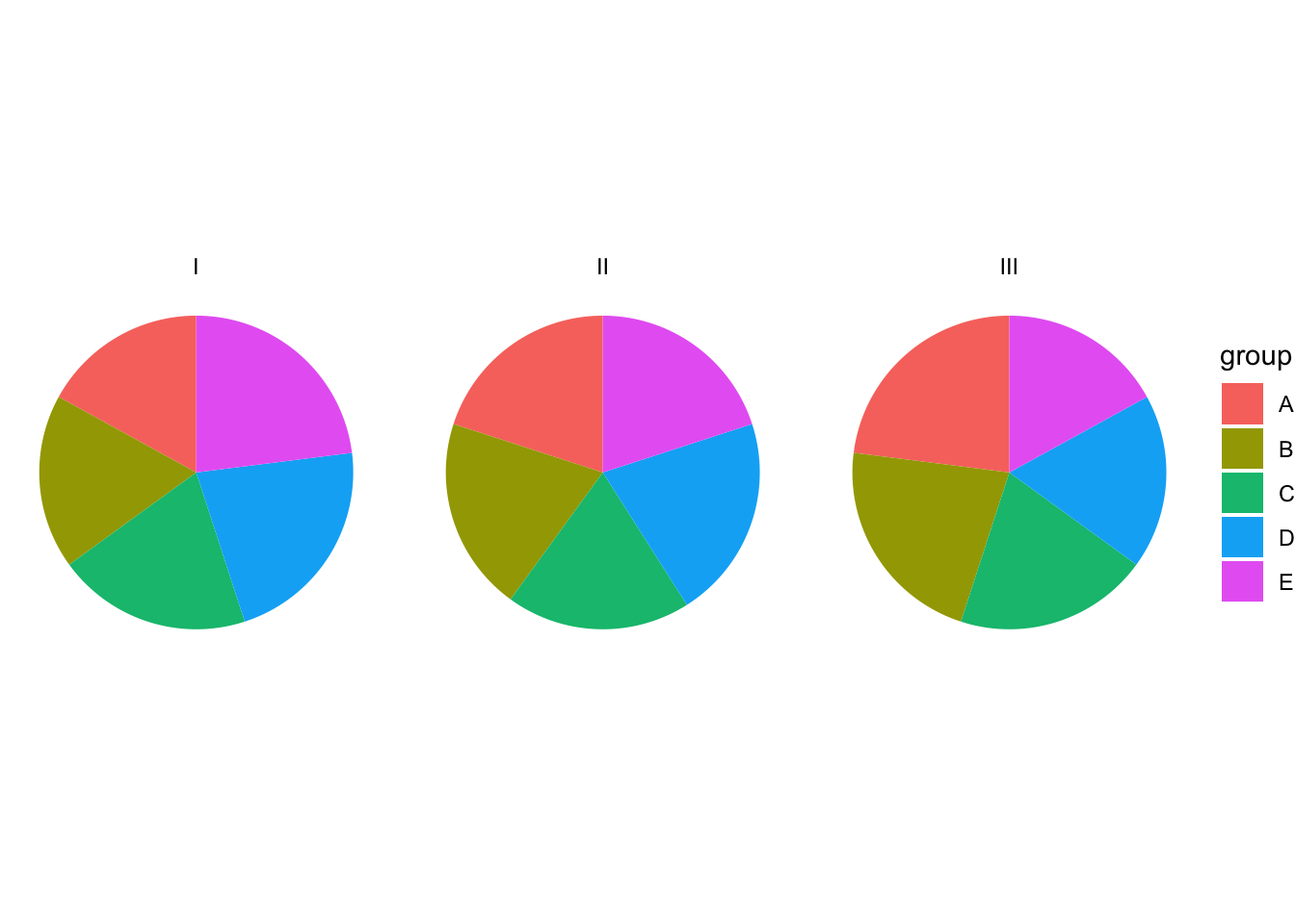
Hardly any difference.
Is a stacked bar better?
ggplot(pie, aes(x = "pie", y = score, fill = group)) +
  geom_bar(stat = "identity") +
  facet_wrap(~set) +
  theme_void()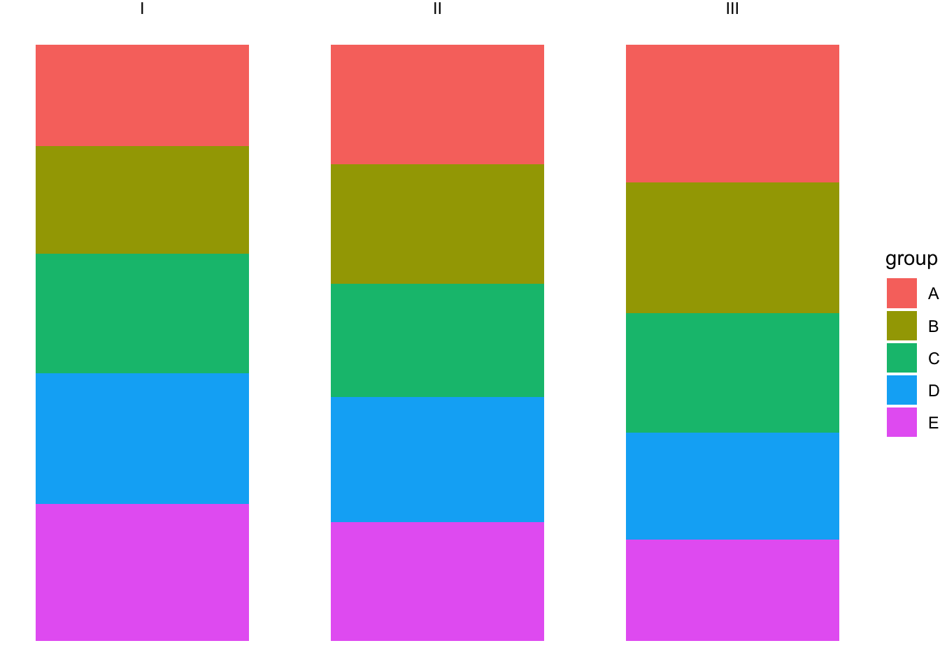
Hhhhmm, not really.
Let’s try normal bars:
ggplot(pie, aes(x = "pie", y = score, fill = group)) +
  geom_bar(stat = "identity", position = "dodge") +
  facet_wrap(~set) +
  theme_void()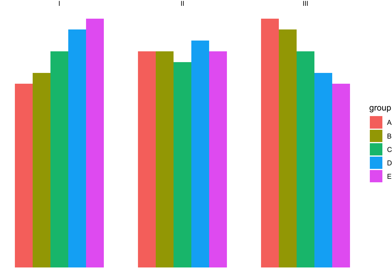
Much better. That certainly wasn’t visible from the pie charts!
19.2 Bubbleplot
An alternative way of visualizing two discrete variables is by using a bubbpleplot. We’ve seen bubbleplots and you wouldn’t immediately think of two discrete variables, but here goes:
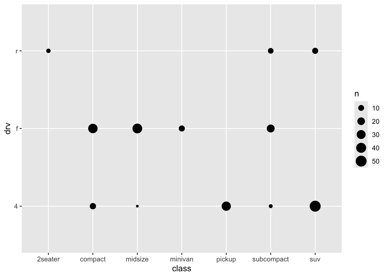
This gives some impression of the data, but it’s not very clear. But first let us get a better understanding of what is plotted and what geom_count does, by recreating it (again with more manual labour). Remember that we already made a table with for each class a count (which is the size of the dots above):
Of course, the different sample sizes in the different classes obscure some of the patterns. So let’s try and scale it to the proportion within each class:
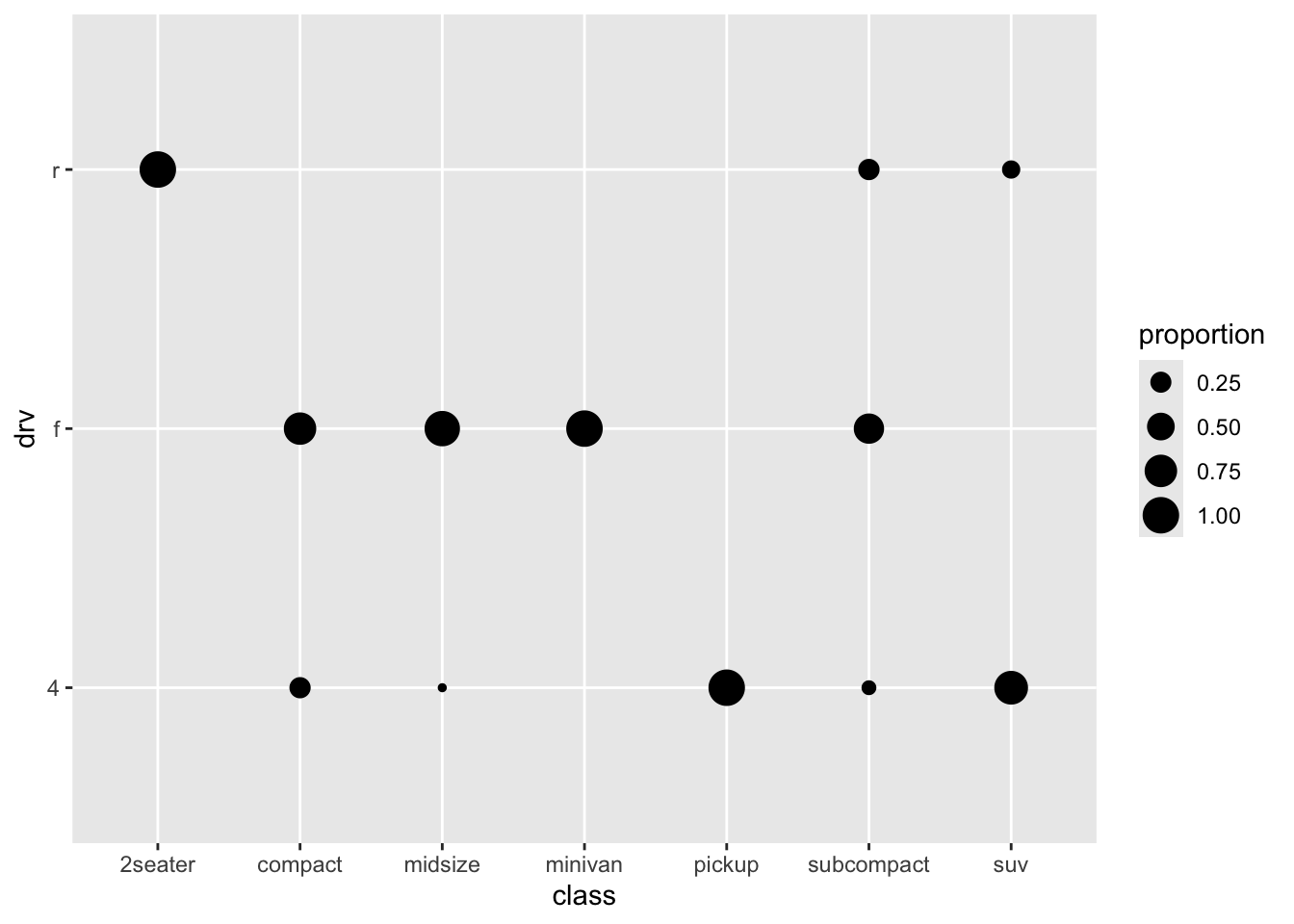
A bit better perhaps.
Let’s see if we can make this a bit better:
ggplot(mpg_stacked_bar, aes(x = class, y = drv)) +
  geom_point(aes(size = 1), colour = "lightgrey") +
  geom_point(aes(size = proportion), colour = "cornflowerblue") +
  scale_size(range = c(0, 10), breaks = seq(0, 1, by = 0.2)) +
  coord_fixed() +
  theme_minimal()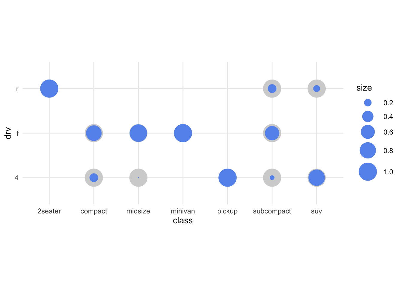
19.3 geom_tile / geom_raster
Let’s try to and do the same, but then with then with tiles/squares
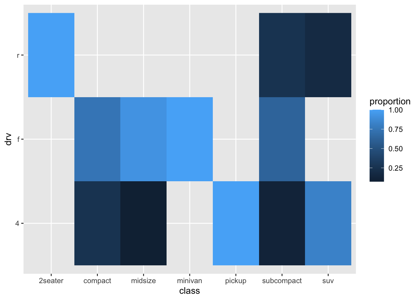
Maybe this works slightly better than the bubbleplot, but it isn’t great. Maybe a bit nicer to have the “tiles” to be squares:

Let’s try to improve further:
ggplot(mpg_stacked_bar, aes(x = class, y = drv, fill = proportion)) +
geom_raster() +
geom_text(
aes(label = paste(round(proportion, 2) * 100, "%", sep = "")),
size = 4, colour = "white"
) +
coord_fixed() +
theme_minimal()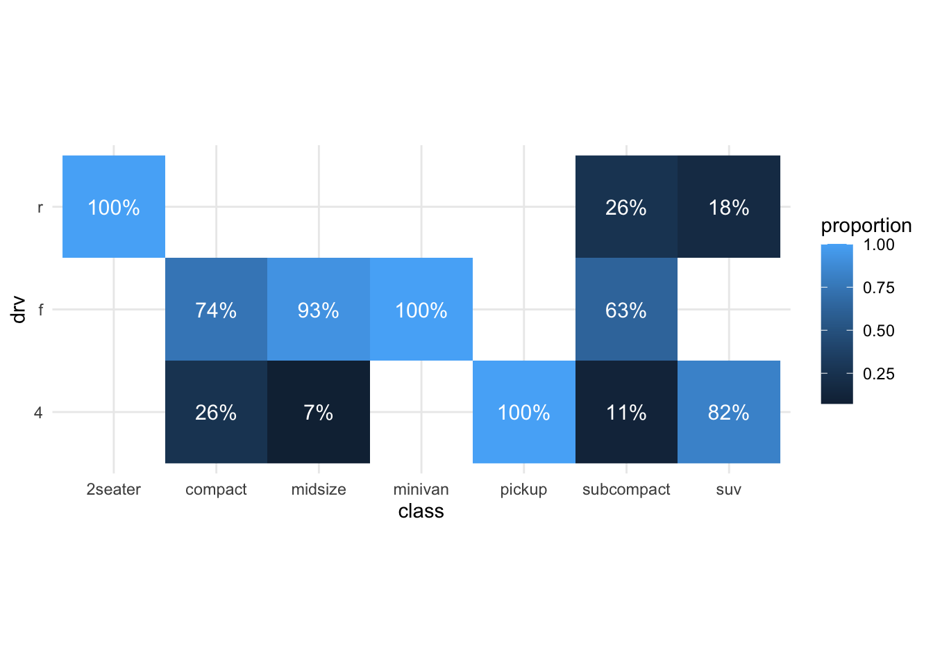
HHhmmm we still haven’t improved our original stack bar I think.
19.4 Mosaic plots
Mosaic plots can also be used to visual two (or more) categorical variables. What mosaic plots do differently, is that the widths of the bars are adjusted according to frequencies of the groups. The area of rectangles then reflects sample sizes.
Let’s use yet another package to produce a mosaic plot:
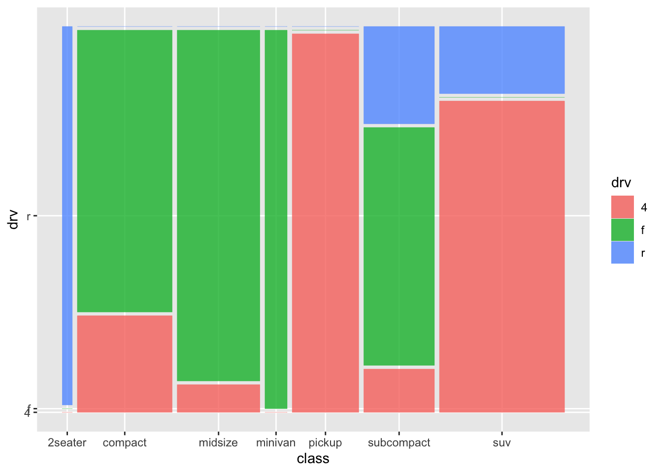
The y-axis looks a bit funky. It’ll be more clear when subcompact is the first category:
order <- c(
  "subcompact", "2seater", "compact", "midsize",
  "minivan", "pickup", "suv"
)

mpg <- mpg %>%
  mutate(class_ord = factor(class, levels = order))

ggplot(mpg) +
  geom_mosaic(aes(x = product(class_ord), fill = drv))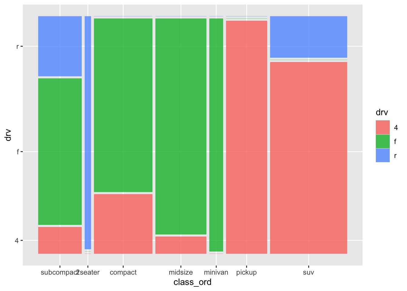
Let’s see another example. Will use a dataset on titanic survivors:
##   PassengerId Survived Pclass
## 1           1        0      3
## 2           2        1      1
## 3           3        1      3
## 4           4        1      1
## 5           5        0      3
## 6           6        0      3
##                                                  Name    Sex Age SibSp Parch
## 1                             Braund, Mr. Owen Harris   male  22     1     0
## 2 Cumings, Mrs. John Bradley (Florence Briggs Thayer) female  38     1     0
## 3                              Heikkinen, Miss. Laina female  26     0     0
## 4        Futrelle, Mrs. Jacques Heath (Lily May Peel) female  35     1     0
## 5                            Allen, Mr. William Henry   male  35     0     0
## 6                                    Moran, Mr. James   male  NA     0     0
##             Ticket    Fare Cabin Embarked
## 1        A/5 21171  7.2500              S
## 2         PC 17599 71.2833   C85        C
## 3 STON/O2. 3101282  7.9250              S
## 4           113803 53.1000  C123        S
## 5           373450  8.0500              S
## 6           330877  8.4583              Q
titanic_train <- titanic_train %>%
mutate(
Pclass = as.character(Pclass),
Survived = as.character(Survived)
)
ggplot(titanic_train) +
geom_mosaic(aes(x = product(Pclass), fill = Survived)) +
facet_wrap(~Sex)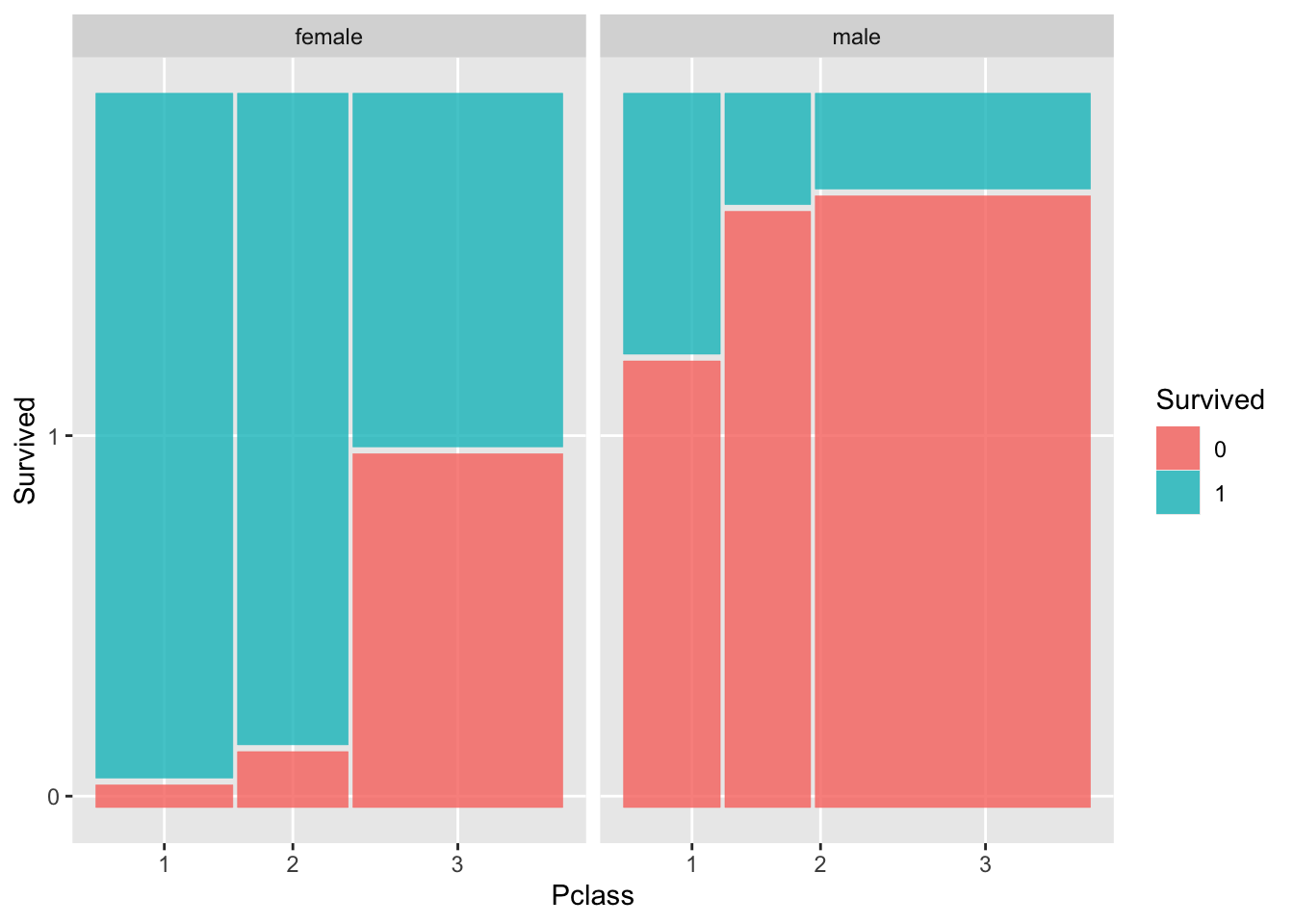
19.5 Alluvial plots
A different way to plot relationships between categorical variables are alluvial plots. Let’s see them in action:
# Requires getting the data in shape
all <- mpg %>%
  select(drv, year, class) %>%
  mutate(year = factor(year),
         value = 1)
all <- gather_set_data(all, 1:3)

ggplot(all, aes(x, id = id, split = y, value = value)) +
  geom_parallel_sets(aes(fill = drv), alpha = 0.3, axis.width = 0.1) +
  geom_parallel_sets_axes(axis.width = 0.1) +
  geom_parallel_sets_labels(colour = 'white')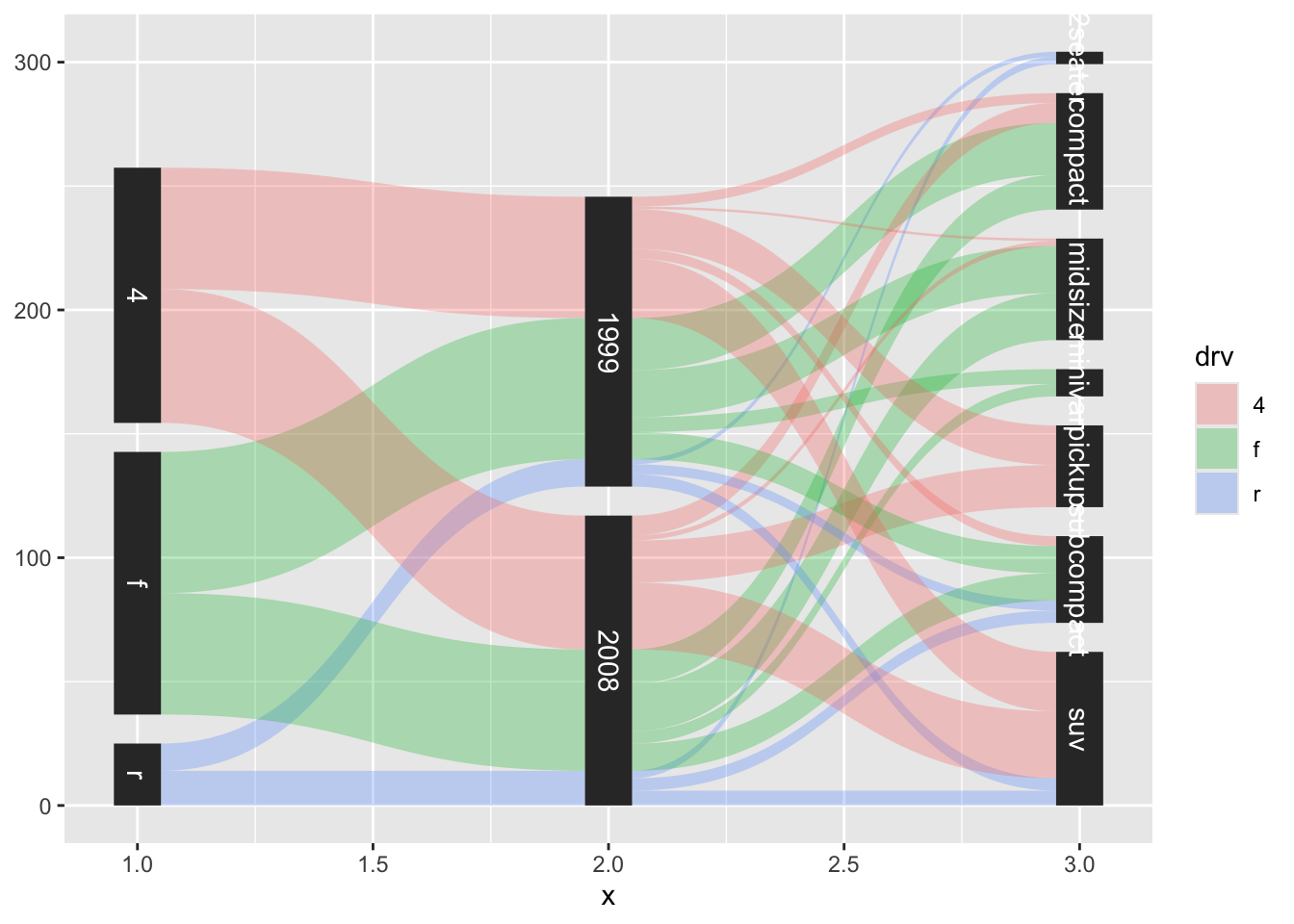
data <- reshape2::melt(Titanic) # Titanic data is in a weird format
data <- gather_set_data(data, 1:4)

ggplot(data, aes(x, id = id, split = y, value = value)) +
  geom_parallel_sets(aes(fill = Sex), alpha = 0.3, axis.width = 0.1) +
  geom_parallel_sets_axes(axis.width = 0.1) +
  geom_parallel_sets_labels(colour = 'white')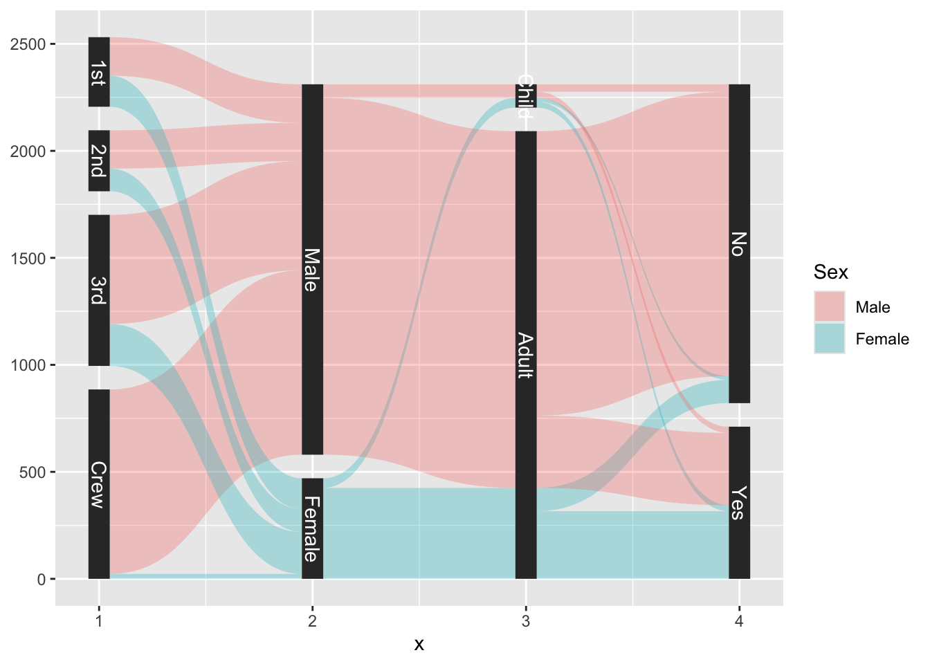
As you can see, visualizing associations between discrete variables is not easy.
19.6 Awesomeness
Let’s go from pie chart to fancy:
data <- structure(list(
  has_child = structure(c(1L, 1L, 1L, 1L, 1L, 1L, 1L, 2L, 2L, 2L, 2L, 2L, 2L, 2L),
                          .Label = c("No children", "Has children"),
                          label = "Do you have children",
                          class = "factor"),
  agreement = structure(c(1L, 2L, 3L, 4L, 5L, 6L, 7L, 1L, 2L, 3L, 4L, 5L, 6L, 7L),
                        .Label = c("Completely disagree",
                                   "Disagree",
                                   "Slightly disagree",
                                   "Neither agree nor disagree",
                                   "Slightly agree",
                                   "Agree",
                                   "Completely agree",
                                   "I don't know",
                                   "Not applicable"),
                        class = "factor"),
  n = c(30L, 35L, 6L, 53L, 66L, 107L, 80L, 86L, 32L, 11L, 20L, 12L, 24L, 14L)),
row.names = c(NA, -14L), class = "data.frame")ggplot(data, aes(x = "", y = n, fill = agreement)) +
geom_bar(stat = "identity", position = "fill") +
coord_polar("y", start = 0) +
facet_wrap(~ has_child) +
labs(fill = "Feels pressure from\nparents to reproduce") +
theme_void()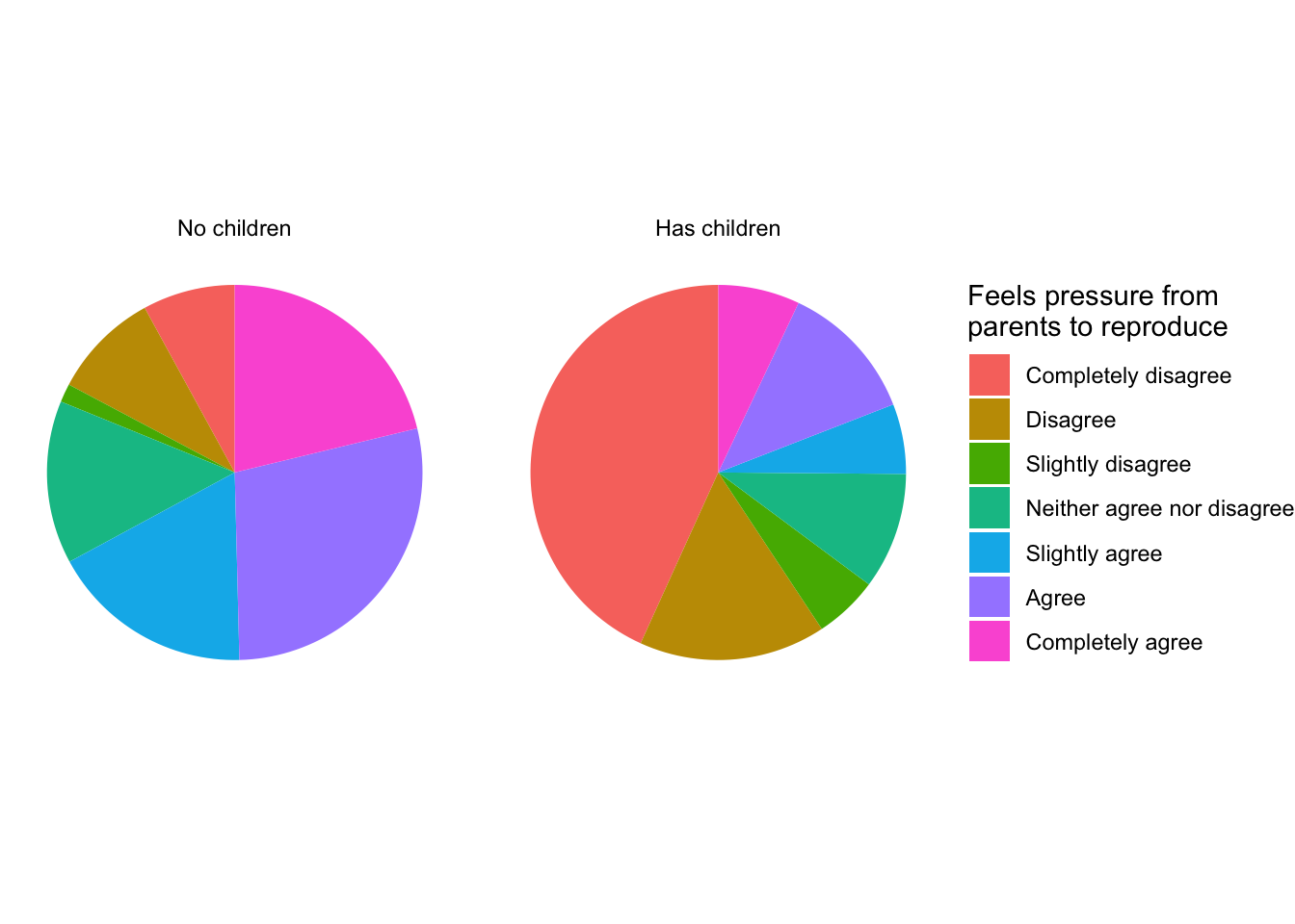
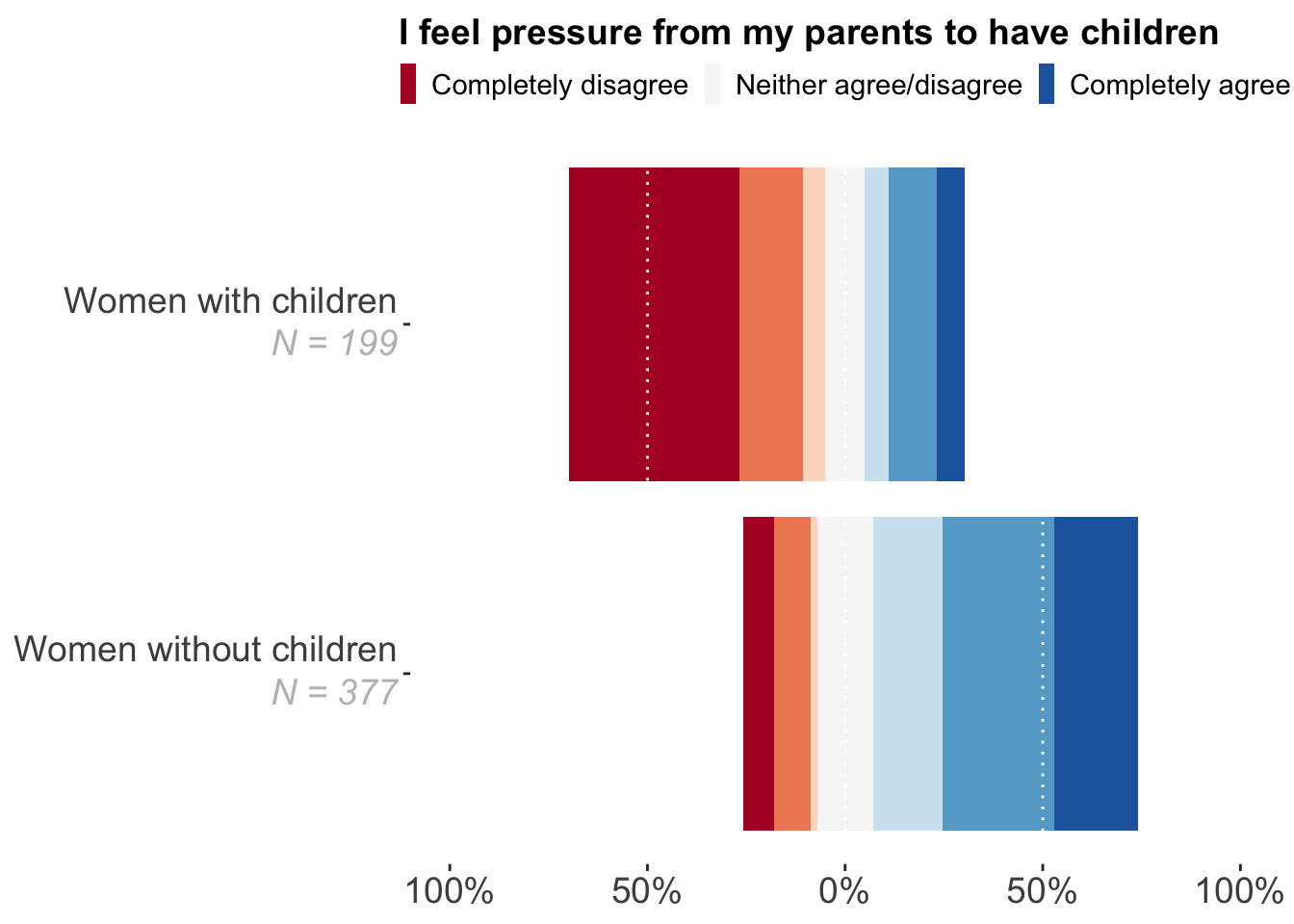
Let’s improve, with some effort:
library(forcats)
data <- structure(list(
  Heeft_Kind = structure(c(1L, 1L, 1L, 1L, 1L, 1L, 1L, 2L, 2L, 2L, 2L, 2L, 2L, 2L),
                         .Label = c("Nee", "Ja"), label = "Hebt u kinderen?", class = "factor"),
  start_y_adj = c(-0.258620689655172, -0.179045092838196, -0.0862068965517241,
                    -0.0702917771883289, 0.0702917771883289, 0.245358090185676,
                    0.529177718832891, -0.698492462311558, -0.266331658291457,
                    -0.105527638190955, -0.050251256281407, 0.050251256281407,
                    0.110552763819095, 0.231155778894472),
  end_y_adj = c(-0.179045092838196, -0.0862068965517241, -0.0702917771883289,
                0.0702917771883289,  0.245358090185676, 0.529177718832891,
                0.741379310344828,  -0.266331658291457, -0.105527638190955,
                -0.050251256281407,  0.050251256281407, 0.110552763819095,
                0.231155778894472,  0.301507537688442),
  outcome_F = structure(c(1L, 2L, 3L, 4L,
    5L, 6L, 7L, 1L, 2L, 3L, 4L, 5L, 6L, 7L),
    .Label = c("Helemaal niet mee eens",  "Niet mee eens", "Een beetje niet mee eens",
               "Niet mee eens/niet mee oneens",  "Een beetje mee eens", "Mee eens",
               "Helemaal mee eens", "Weet ik niet", "Niet van toepassing"),
    class = "factor")),
  row.names = c(NA, -14L), class = "data.frame")

# install.packages("ggtext")
library(ggtext)
ggplot(data, aes(xmin = as.numeric(Heeft_Kind) - 0.45,
                 xmax = as.numeric(Heeft_Kind) + 0.45,
                 ymin = start_y_adj, ymax = end_y_adj,
                 fill = fct_rev(outcome_F))) +
  geom_rect() +
  scale_x_continuous(
    breaks = c(1, 2),
    labels = c("Women without children<br> <i style='color:grey'>N = 377</i>",
              "Women with children<br> <i style='color:grey'>N = 199</i>")
  ) +
  scale_y_continuous(limits = c(-1, 1),
                     breaks = c(-1, -0.5, 0, 0.5, 1),
                     labels = c("100%", "50%", "0%", "50%", "100%")) +
  theme(panel.grid.major = element_blank(),
        legend.position = "top") +
  scale_fill_manual(values = c("Helemaal niet mee eens" = '#b2182b',
                               "Niet mee eens" = '#ef8a62',
                               "Een beetje niet mee eens" = '#fddbc7',
                               "Niet mee eens/niet mee oneens" = '#f7f7f7',
                               "Een beetje mee eens" = '#d1e5f0',
                               "Mee eens" = '#67a9cf',
                               "Helemaal mee eens" = '#2166ac'),
                    breaks = c("Helemaal niet mee eens",
                               "Niet mee eens/niet mee oneens",
                               "Helemaal mee eens"),
                    labels = c("Completely disagree",
                               "Neither agree/disagree",
                               "Completely agree"),
                    guide = guide_legend(title.position = "top")) +
  coord_flip()  +
  labs(fill = "I feel pressure from my parents to have children") +
  theme(
    axis.text = element_text(lineheight = unit(0.7, "lines")),
    axis.title = element_text(hjust = 1),
    axis.text.x = element_markdown(lineheight = 1.2, size = 14),
    axis.text.y = element_markdown(lineheight = 1.2, size = 14),
    legend.title = element_text(size = 14, face = "bold"),
    legend.text = element_text(lineheight = unit(0.7, "lines"), size = 11),
    panel.grid.minor = element_blank(),
    panel.grid.major.y = element_blank(),
    panel.grid.major.x = element_line(colour = "white", linetype = "dotted"),
    panel.background = element_rect(fill = NA),
    panel.ontop = TRUE,
    legend.margin = margin(r = 0, l = 0),
    legend.key.width = unit(0.5, 'lines'),
    legend.key.height  = unit(1.2, 'lines')
  )