Chapter 24 Some extras
24.1 Interactive graphs
One step between static graphs and reactive graphs (shiny) are interactive graphs. We’ll see two packages that we can use to transform any ggplot-graph into an interactive graph: plotly and ggiraph.
24.1.1 plotly
With the plotly-package you can turn any ggplot-object into an interactive plotly-object with the function ggplotly. See some ace example here. Let’s try it ourselves.
Let’s try another:
my_plot2 <- ggplot(gapminder, aes(x = pop)) +
  geom_histogram(bins = 25) +
scale_x_continuous(trans = "log10")Ok let’s step it up a bit, but now we deviate from the ggplot-style:
gapminder %>%
  plot_ly(
    x = ~gdpPercap,
    y = ~lifeExp,
    size = ~pop,
    color = ~continent,
    frame = ~year,
    text = ~country,
    hoverinfo = "text",
    type = 'scatter',
    mode = 'markers'
  ) %>%
  layout(
    xaxis = list(
      type = "log"
    )
  )
It’s even reactive (sort of).
24.1.2 ggiraph
ggiraph is a different way of making your graph interactive. It’s not as straightforward as plotly, but it allows more flexibility. Also, it works with shiny such that users can select points in a graph to further work with. See here for more information.
24.2 Animated graphs
There is another step between interactive graphs and static graphs, and those are animated graphs. In essence, movies made of several static graphs that allows exploring another dimension. The gganimate package is fantastic. See here
Let’s look at the relationship between GDP and life expectancy for the different continents:
my_plot4 <- ggplot(filter(gapminder, year == 2007),
                   aes(x = gdpPercap, y = lifeExp, colour = continent)) +
  geom_point(size = 4, alpha = 0.7) +
  scale_colour_brewer(palette = "Set2") +
  scale_x_continuous(trans = "log10") +
  guides(colour = "none")
my_plot4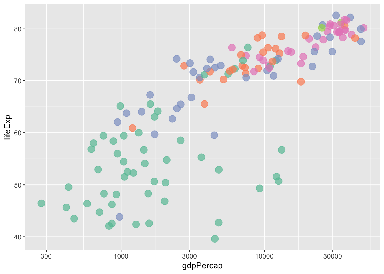
my_plot4 +
  transition_states(continent,
                    transition_length = 2,
                    state_length = 1) +
  ggtitle('Now showing {closest_state}')
Let’s do another one, examining the earlier relationship over time.
my_plot5 <- ggplot(gapminder,
                   aes(x = gdpPercap, y = lifeExp, colour = continent)) +
  geom_point(alpha = 0.7) +
  scale_colour_brewer(palette = "Set2") +
  scale_x_continuous(trans = "log10") +
  facet_wrap(~ continent, nrow = 1) +
  guides(colour = "none")
my_plot5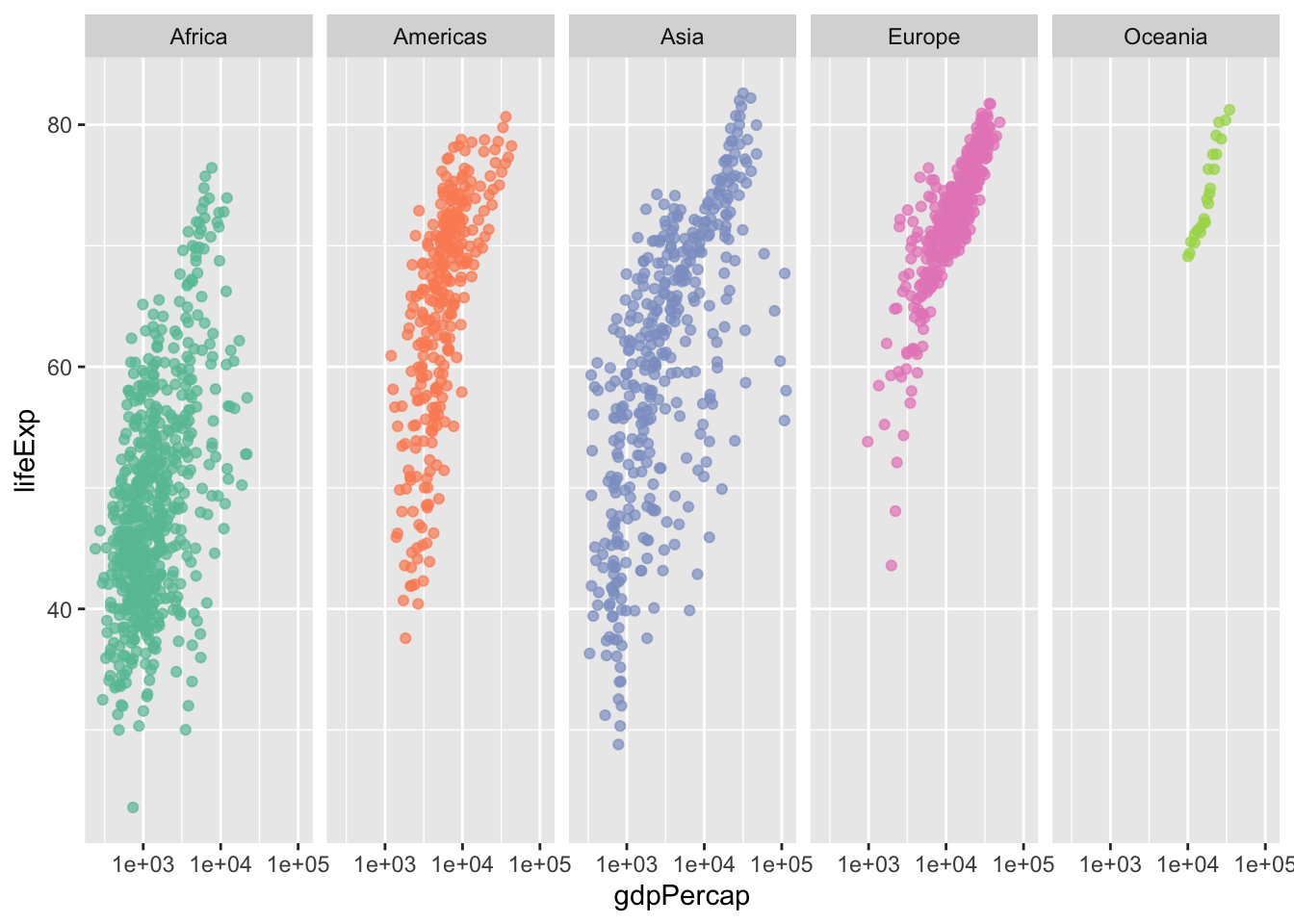
Now let’s see this across time. For this we’ll use some gganimate specific code
my_plot5 +
  labs(title = 'Year: {frame_time}', x = 'GDP per capita', y = 'life expectancy') +
  transition_time(year) +
  ease_aes('linear')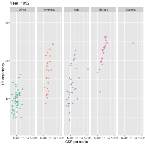
Let’s try something a bit more funky (from here)
library(viridis)
ggplot(gapminder, aes(x = gdpPercap, y=lifeExp,
                           size = pop, colour = country)) +
  geom_point(alpha = 0.7) +
  scale_color_viridis_d() +
  scale_size(range = c(2, 12)) +
  scale_x_continuous(trans = "log10") +
  guides(colour = "none", size = "none") +
  theme_minimal() +
  labs(x = "GDP per capita", y = "Life expectancy") +
  transition_time(year) +
  labs(title = "Year: {frame_time}") +
  shadow_wake(wake_length = 0.1, alpha = FALSE)
24.3 Maps
Map-data comes in all shapes and forms and can be difficult to work with. Here just some example where we make use of a package maps that includes amongst others, a world-map.
This package includes a worldmap (or a dataframe with latitude and longitude coordinates for the borders of a country!):
##        long      lat group order region subregion
## 1 -69.89912 12.45200     1     1  Aruba      <NA>
## 2 -69.89571 12.42300     1     2  Aruba      <NA>
## 3 -69.94219 12.43853     1     3  Aruba      <NA>
## 4 -70.00415 12.50049     1     4  Aruba      <NA>
## 5 -70.06612 12.54697     1     5  Aruba      <NA>
## 6 -70.05088 12.59707 1 6 Aruba <NA>ggplot(world_map, aes(x = long, y = lat, group = group)) +
geom_polygon(fill = "lightgray", colour = "white")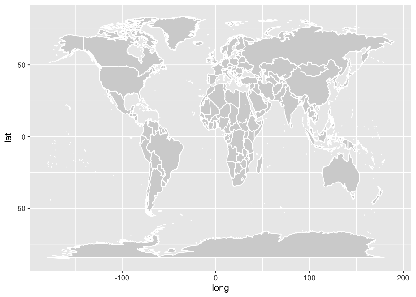
Works best with theme_void
ggplot(world_map, aes(x = long, y = lat, group = group)) +
geom_polygon(fill = "lightgray", colour = "white") +
theme_void()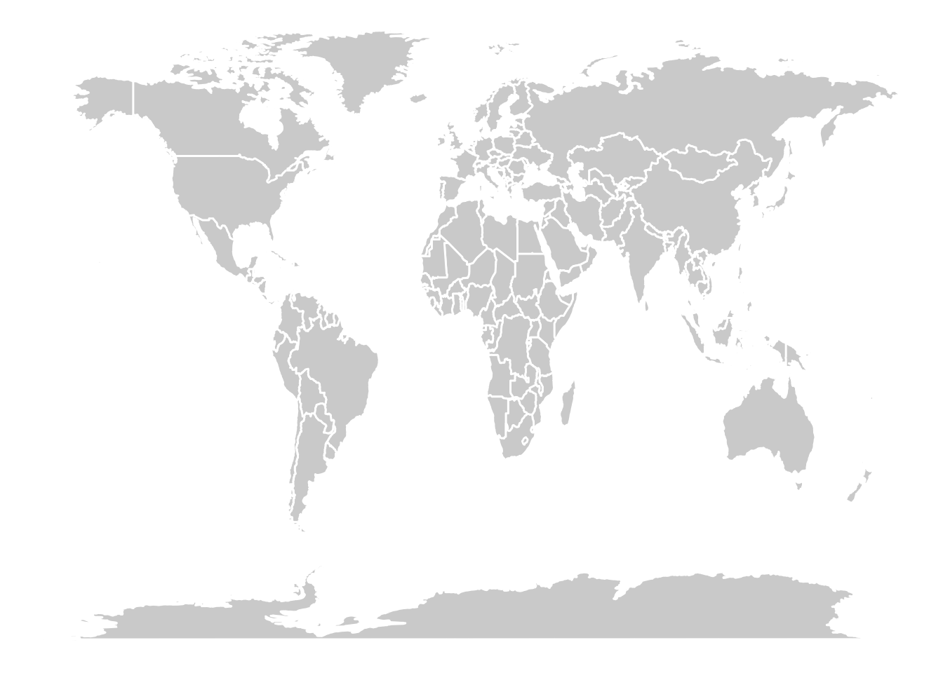
Let’s focus on the Netherlands:
NL <- world_map %>% filter(region == "Netherlands")

ggplot(NL, aes(x = long, y = lat, group = group)) +
  geom_polygon(fill = "orange", colour = "white") +
  annotate("label", x = 6.567958, y = 53.219197, label = "grunn") +
  theme_void()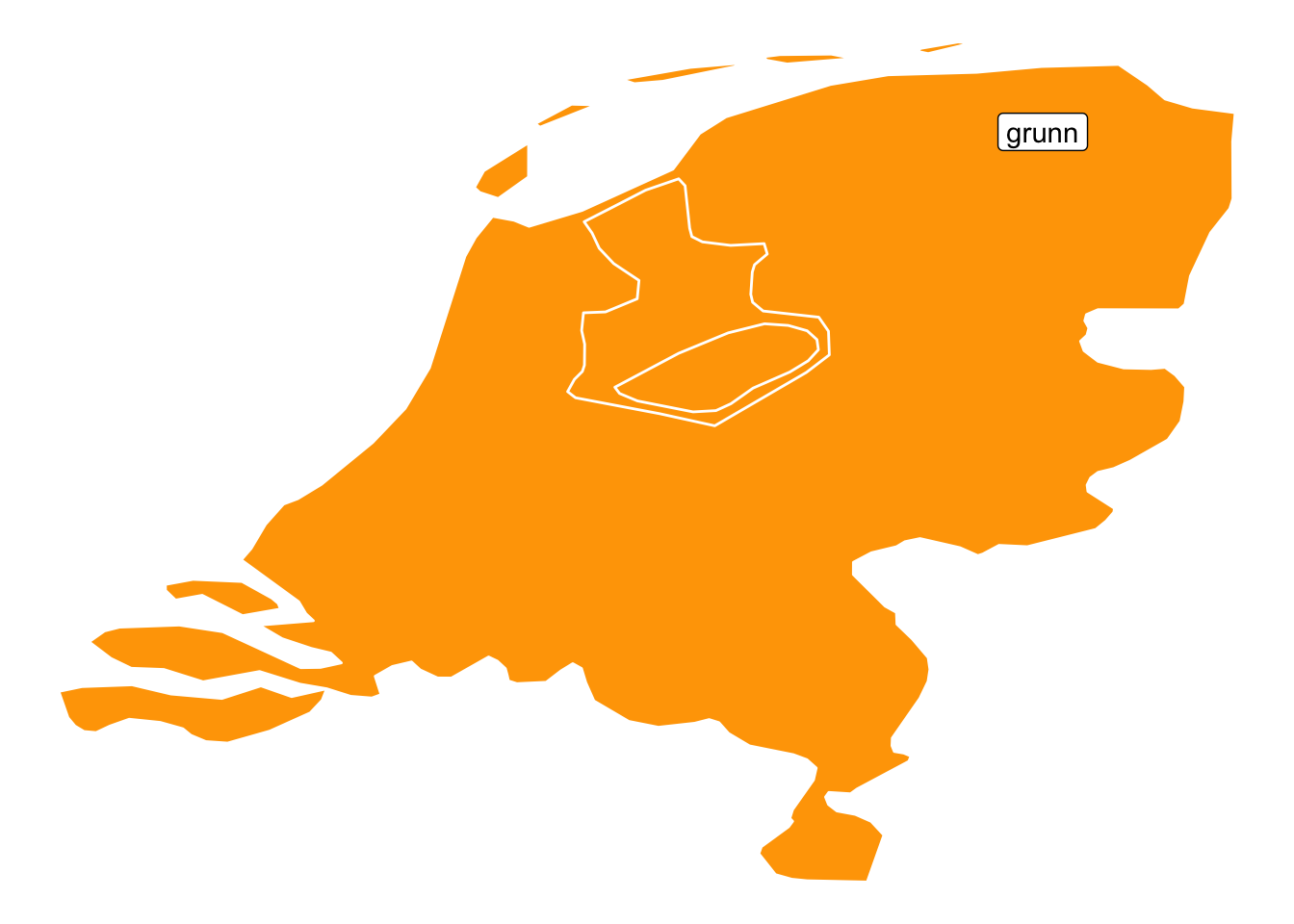
Something more fancy (from here):
# Some EU Countries
part_of_EU <- c(
  "Portugal", "Spain", "France", "Switzerland", "Germany",
  "Austria", "Belgium", "UK", "Netherlands", "Luxembourg",
  "Denmark", "Poland", "Italy",
  "Croatia", "Slovenia", "Hungary", "Slovakia",
  "Czech Republic"
)

# Retrieve the map data
EU <- world_map %>% filter(region %in% part_of_EU)ggplot(EU, aes(x = long, y = lat)) +
geom_polygon(aes(group = group, fill = region)) +
#geom_text(aes(label = region), data = region.lab.data, size = 3, hjust = 0.5)+
scale_fill_viridis_d() +
theme_void() +
guides(fill = "none")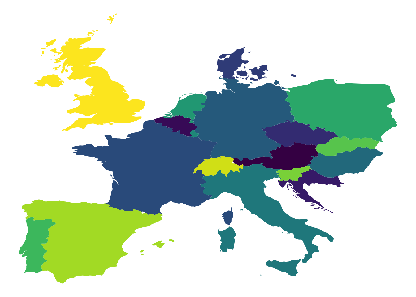
Different coordinate systems:
ggplot(EU, aes(x = long, y = lat)) +
  geom_polygon(aes(group = group, fill = region)) +
  scale_fill_viridis_d() +
  theme_void() +
  guides(fill = "none") +
  coord_map(projection = "mercator")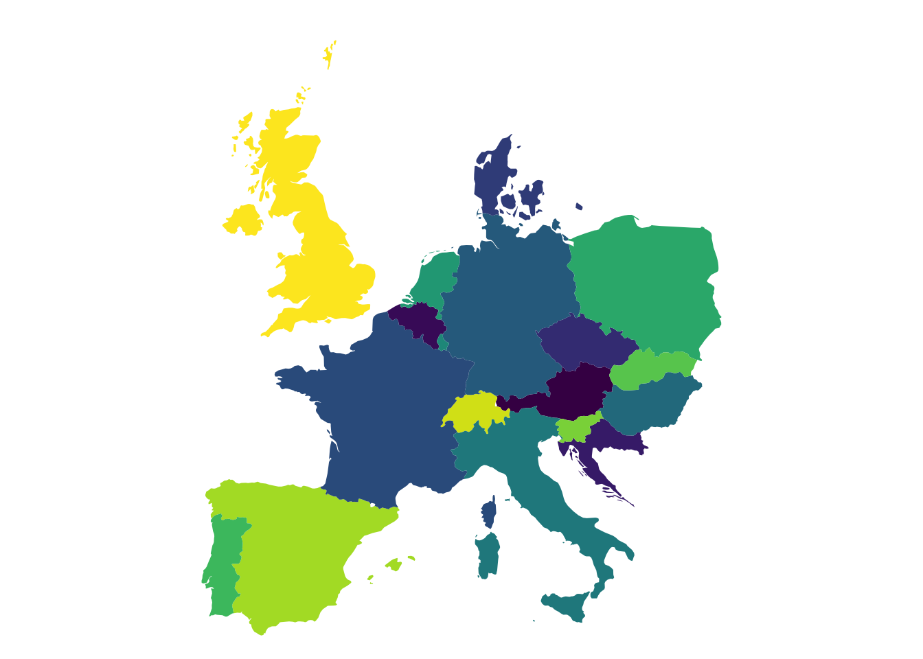
ggplot(EU, aes(x = long, y = lat)) +
  geom_polygon(aes(group = group, fill = region)) +
  scale_fill_viridis_d() +
  theme_void() +
  guides(fill = "none") +
  coord_map(projection = "orthographic") +
  theme(panel.grid.major = element_line(colour = "lightgrey"))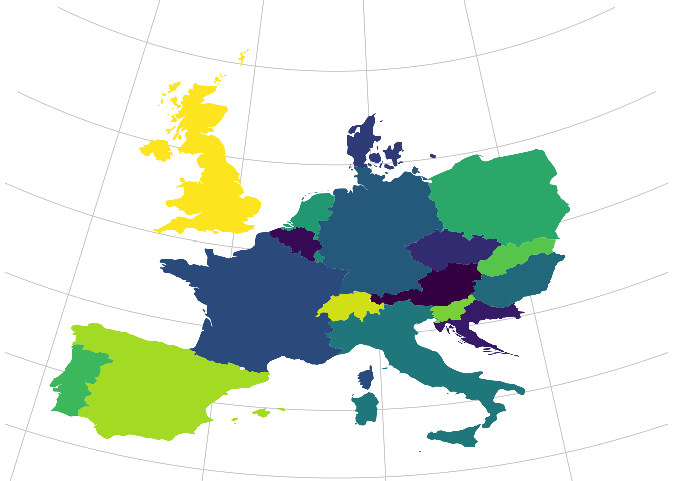
24.3.1 geofacet
A nifty little package that deals with maps is geofacet (see here). Let’s see it in action.
ggplot(eu_gdp, aes(year, gdp_pc)) +
  geom_line(color = "steelblue") +
  facet_geo(~ name, grid = "eu_grid1", scales = "free_y") +
  scale_x_continuous(labels = function(x) paste0("'", substr(x, 3, 4))) +
  ylab("GDP Per Capita in Relation to EU Index (100)") +
  theme_bw()
24.4 Networks
Networks are gaining in popularity. We need to put a bit more effort in to get a network graph. We will require these packages:
df_edges <- data.frame(
  from = c(
    "Gert",
    "Gert",
    "Gert",
    "Gert",
    "Gert",
    "Ben",
    "Anne"
  ),
  to = c(
    "Anne",
    "Ben",
    "Winy",
    "Vera",
    "Laura",
    "Winy",
    "Vera"
  )
)
df_nodes <- data.frame(
  name = c("Gert", "Anne", "Ben", "Winy", "Vera", "Laura"),
  relation = c(
    "Ego", "Partner", "Family", "Family",
    "Friend", "Friend"
  )
)

df_network <- tbl_graph(
  nodes = df_nodes,
  edges = df_edges,
  directed = FALSE
)
df_network
## # A tbl_graph: 6 nodes and 7 edges
## #
## # An undirected simple graph with 1 component
## #
## # A tibble: 6 × 2
## name relation
## <chr> <chr>
## 1 Gert Ego
## 2 Anne Partner
## 3 Ben Family
## 4 Winy Family
## 5 Vera Friend
## 6 Laura Friend
## #
## # A tibble: 7 × 2
## from to
## <int> <int>
## 1 1 2
## 2 1 3
## 3 1 4
## # ℹ 4 more rowsLet’s visualise!
## Warning: Using the `size` aesthetic in this
## geom was deprecated in ggplot2
## 3.4.0.
## ℹ Please use `linewidth` in the
##   `default_aes` field and elsewhere
##   instead.
## This warning is displayed once every
## 8 hours.
## Call
## `lifecycle::last_lifecycle_warnings()`
## to see where this warning was
## generated.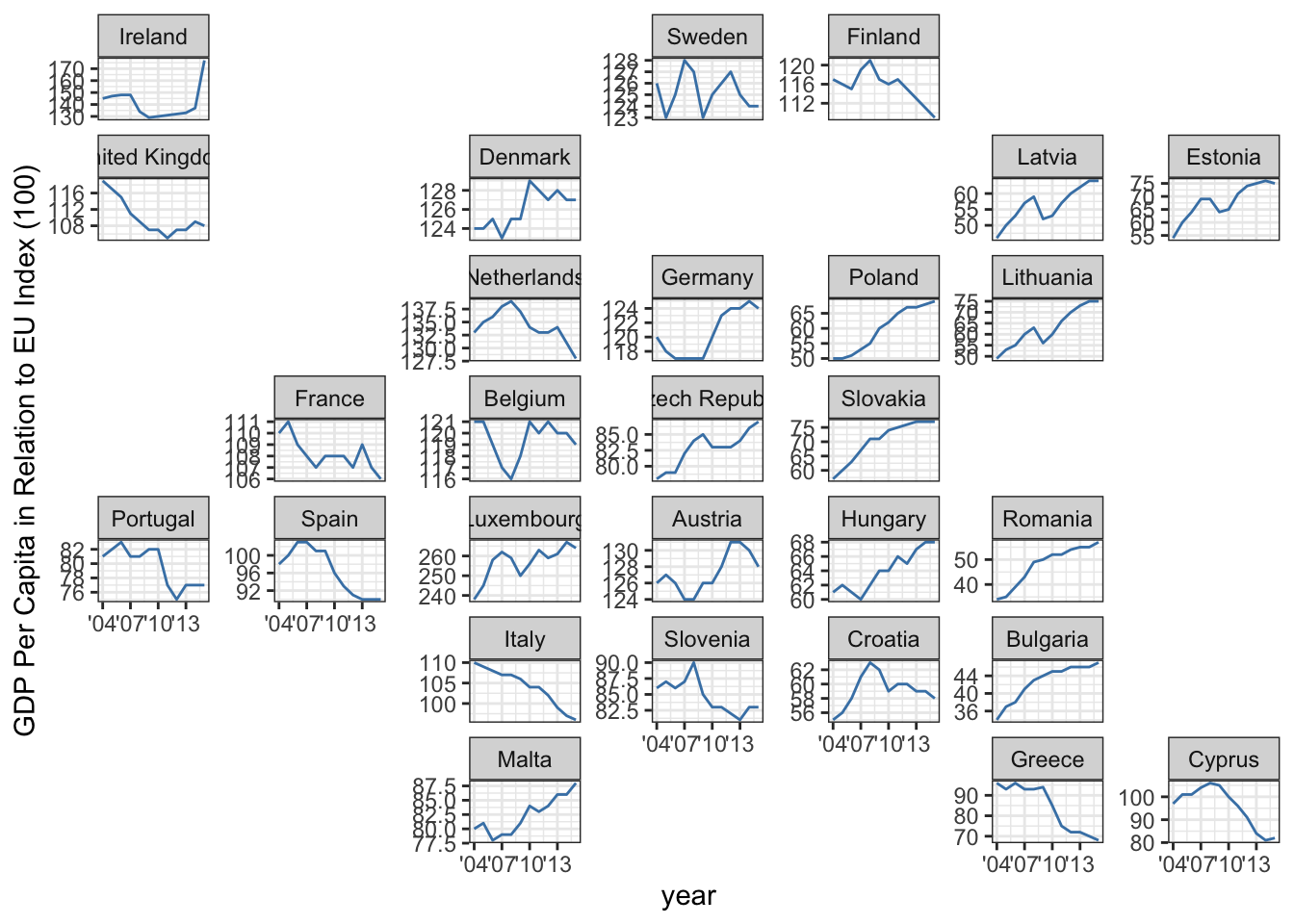
Let’s improve
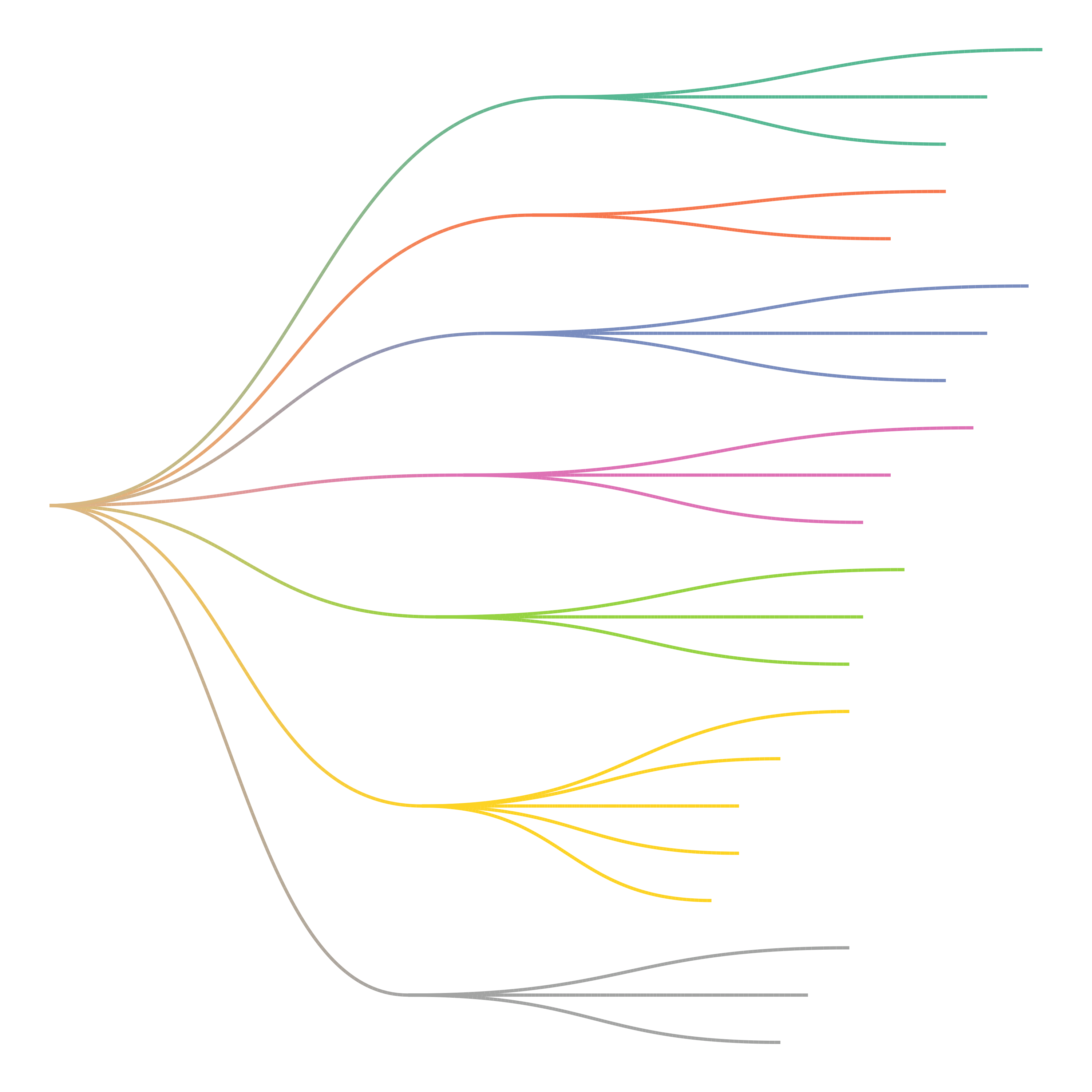
ggraph(df_network, layout = "kk") +
  geom_edge_link() +
  geom_node_point(aes(colour = relation), size = 13) +
  geom_node_text(aes(label = name), colour = "white") +
  theme_void() +
  scale_color_brewer(palette = "Set2")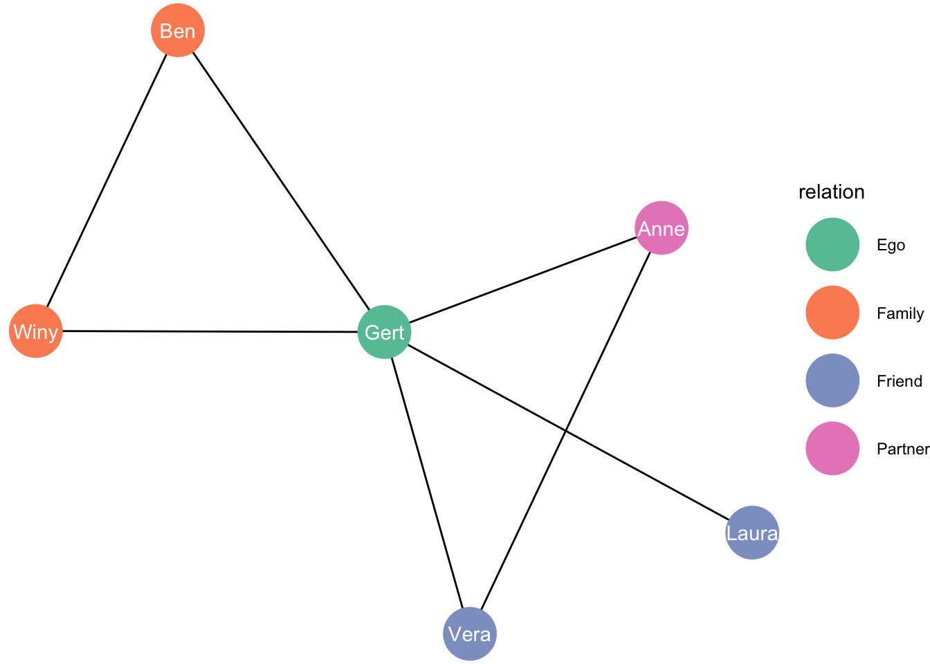
Let’s see another example (from here):
# Create graph of highschool friendships
graph <- as_tbl_graph(highschool) %>%
    mutate(Popularity = centrality_degree(mode = 'in'))

# plot using ggraph
ggraph(graph, layout = 'kk') +
    geom_edge_fan(aes(alpha = stat(index)), show.legend = FALSE) +
    geom_node_point(aes(size = Popularity)) +
    facet_edges(~year) +
    theme_graph(foreground = 'steelblue', fg_text_colour = 'white')
## Warning: `stat(index)` was deprecated in
## ggplot2 3.4.0.
## ℹ Please use `after_stat(index)`
## instead.
## This warning is displayed once every
## 8 hours.
## Call
## `lifecycle::last_lifecycle_warnings()`
## to see where this warning was
## generated.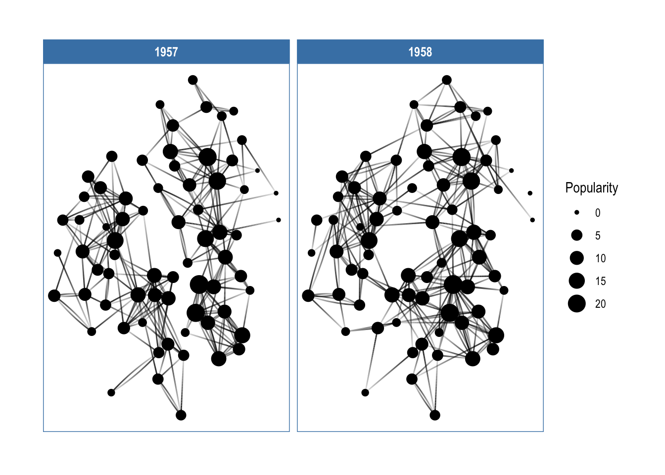
You can do amazing things with this package. Check out here, here, and here.
You can do all sorts of stuff, like creating your family tree: