Chapter 8 Comparing distributions
Visualizing the distribution of our variables is an important first step in exploring and analyzing data. Often, a next step would be to compare the distributions of two or more groups. Often, our statistical tests tried to uncover whether there is a difference between two groups (e.g., control versus experimental group). First we’ll learn how to do that with histograms and density plots that we have already learned about. We’ll also learn some novel ways that are often a bit more informative.
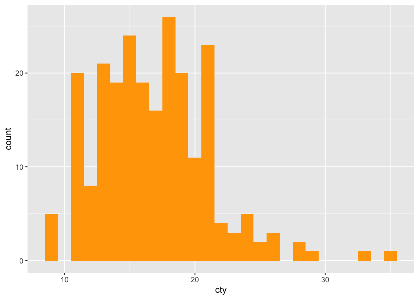
8.2 Histogram
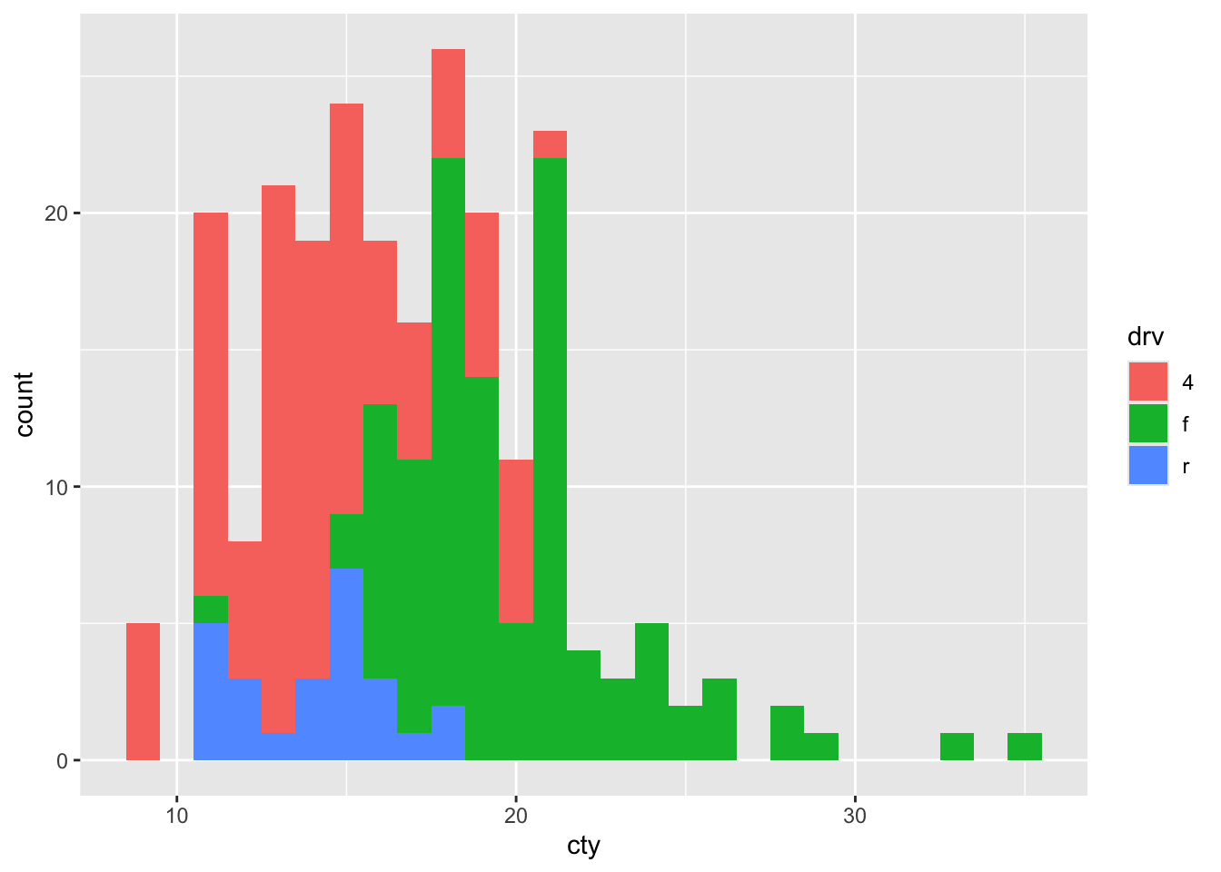
We can compare two or more distributions by ‘mapping’ the variables to colours. For this, we have to specify the fill or colour within the aes(). Let’s see whether the fuel efficiency depends on whether the car is a front-, rear, or 4-wheel drive (measured by the drv variable).
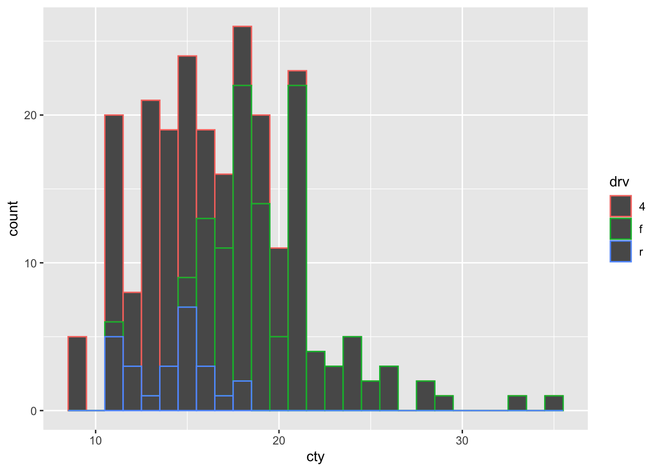
Hhhmm, if we try hard, we can see that red (representing 4-wheel drives) is more on the left of the histogram (less fuel-efficient) and that the green (representing front-wheel drives) is more on the right (more fuel-efficient), but this graph is hardly ideal. This graph would be a bit more clearer, if the fill of the bars were also coloured, rather than black, so let’s try and improve:
8.2.1 Position = stack/dodge/fill/identity
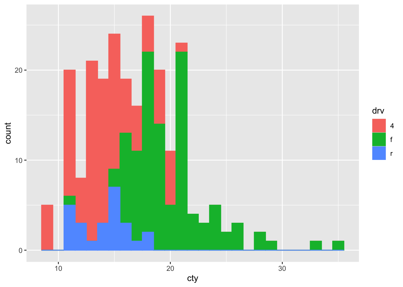
This histogram is fine, but it’s probably not what we wanted. The bars are stacked on top of each other, but we’d rather have them side ways, or maybe overlapping.
Something is happening under the hood that is informative: the default setting of geom_histogram also includes position = "stack" (check by typing ?geom_histogram). This means that the above code is identical to:
ggplot(mpg, aes(x = cty, colour = drv, fill = drv)) +
  geom_histogram(binwidth = 1, position = "stack")
So apparently, we can also choose other options, including dodge, fill, and identity. Let’s try all:
ggplot(mpg, aes(x = cty, colour = drv, fill = drv)) +
  geom_histogram(binwidth = 1, position = "dodge")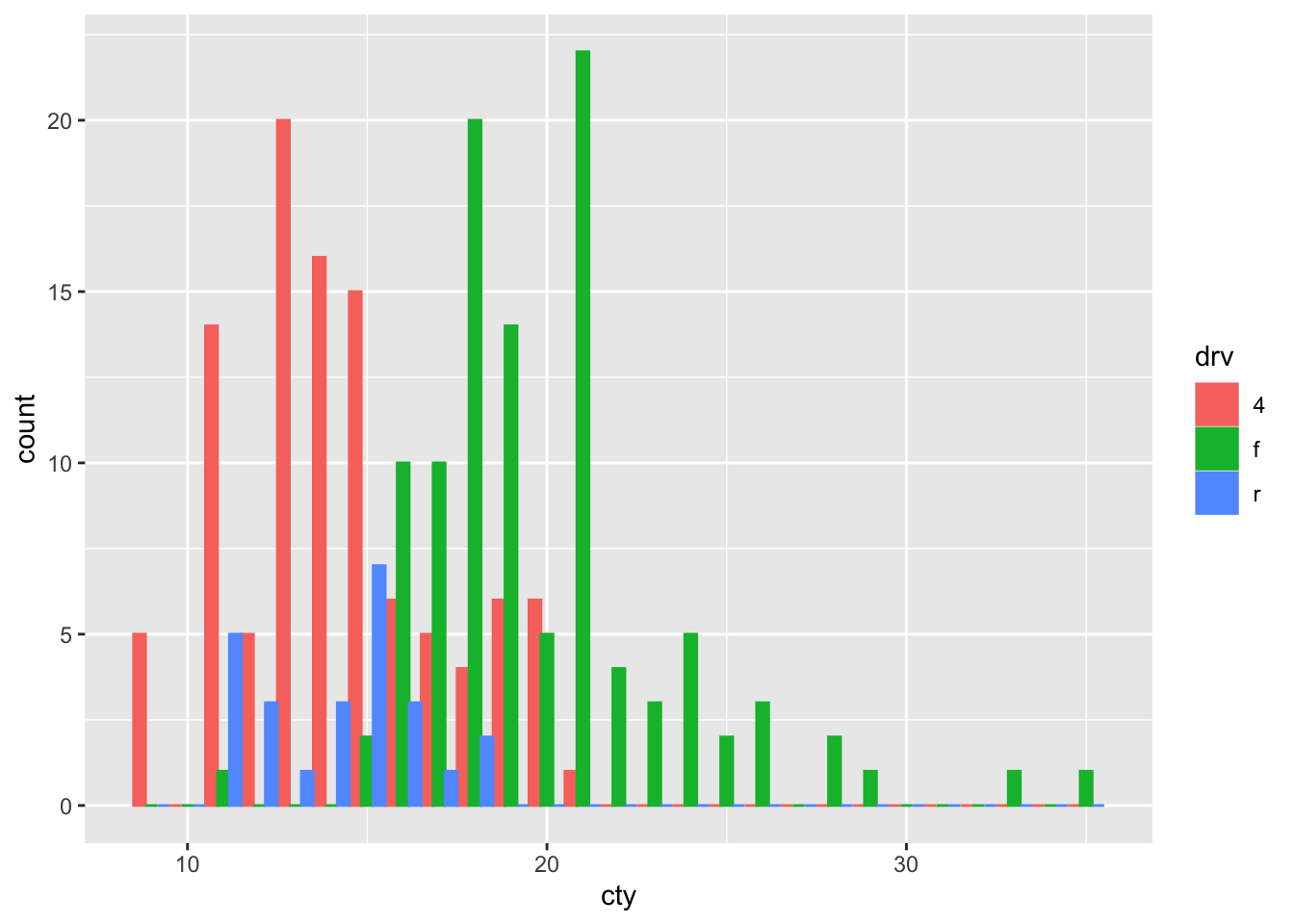
Better!
How about fill:
ggplot(mpg, aes(x = cty, colour = drv, fill = drv)) +
  geom_histogram(binwidth = 1, position = "fill")
## Warning: Removed 18 rows containing missing
## values or values outside the scale
## range (`geom_bar()`).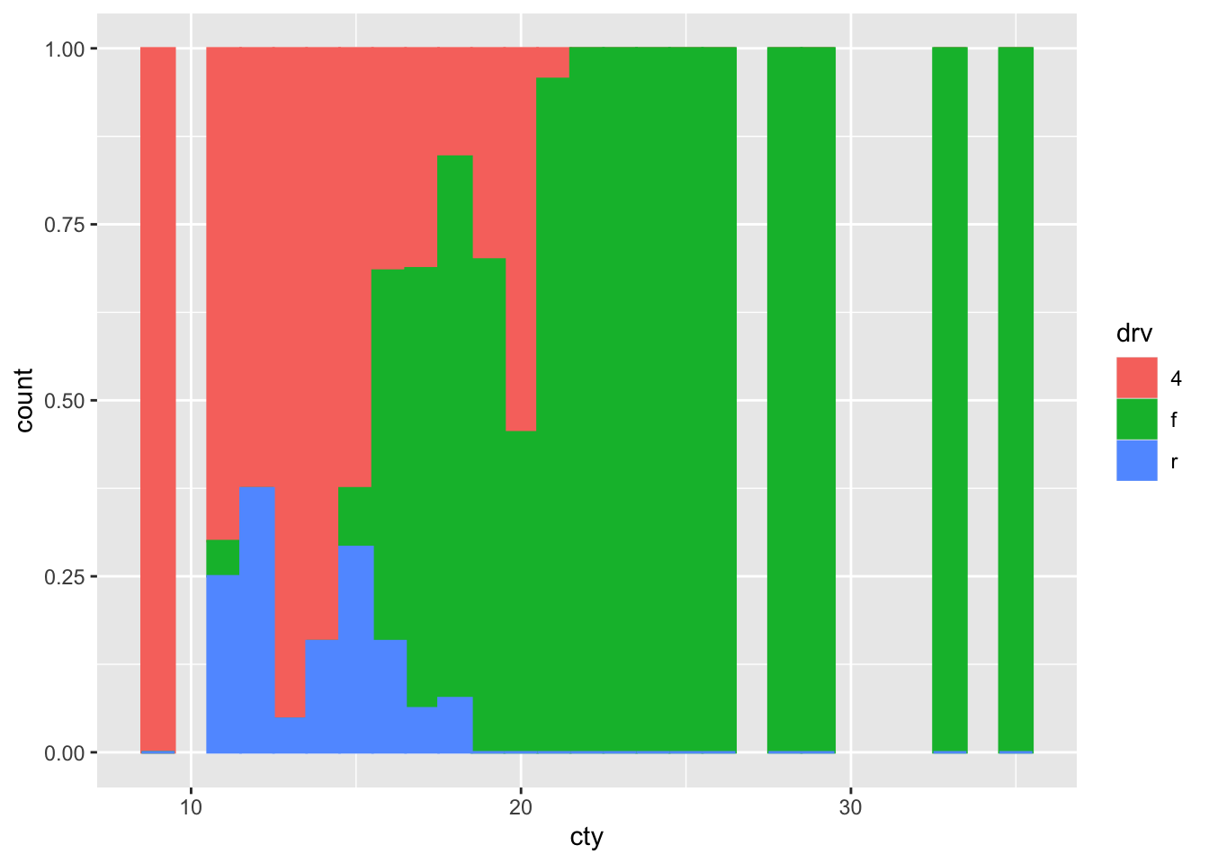
Hhhhmmm probably not what we wanted.
Last one, identity:
ggplot(mpg, aes(x = cty, colour = drv, fill = drv)) +
  geom_histogram(binwidth = 1, position = "identity")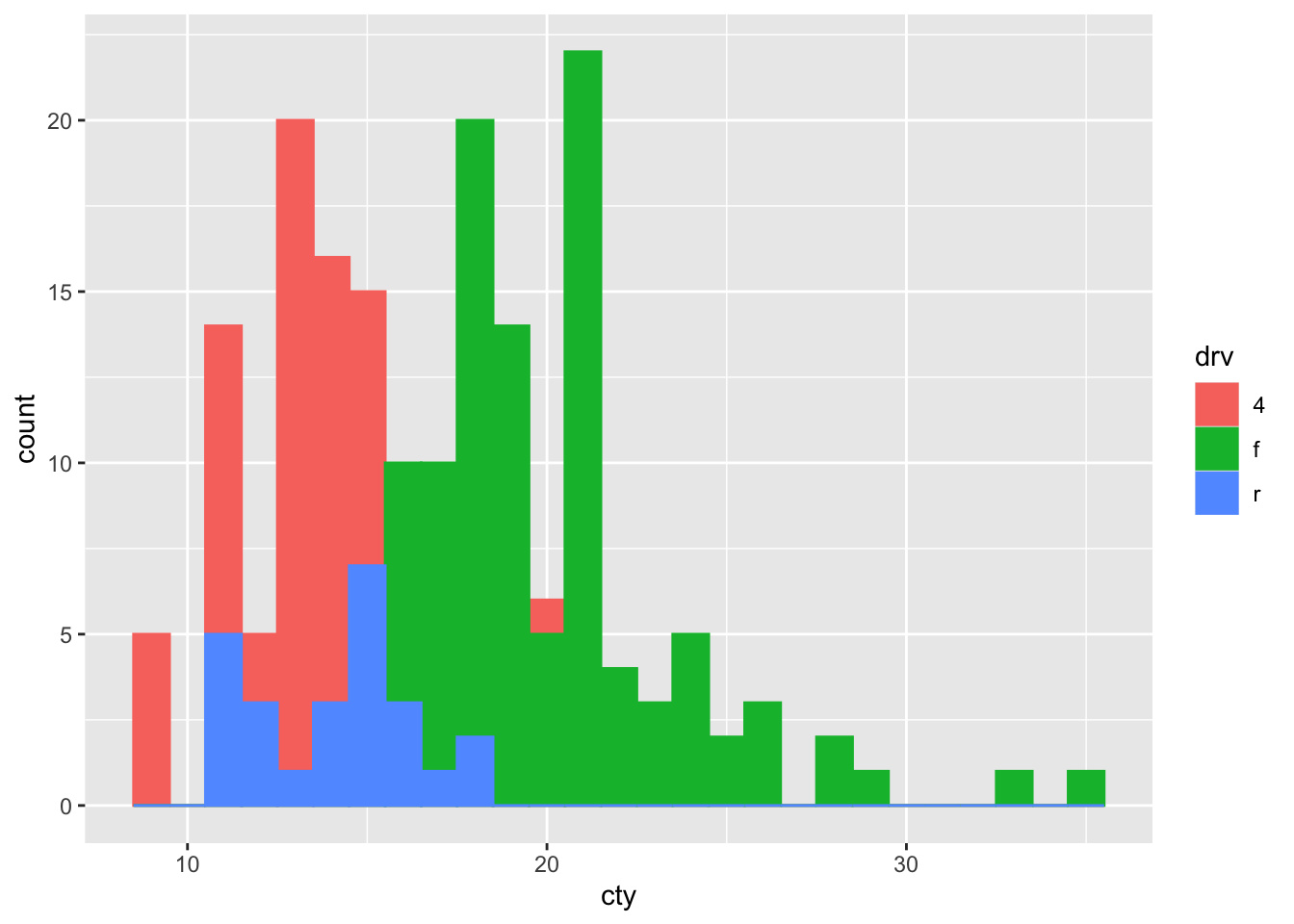
Better or worse? Let’s try to improve:
ggplot(mpg, aes(x = cty, colour = drv, fill = drv)) +
  geom_histogram(binwidth = 1, position = "identity", alpha = 0.5)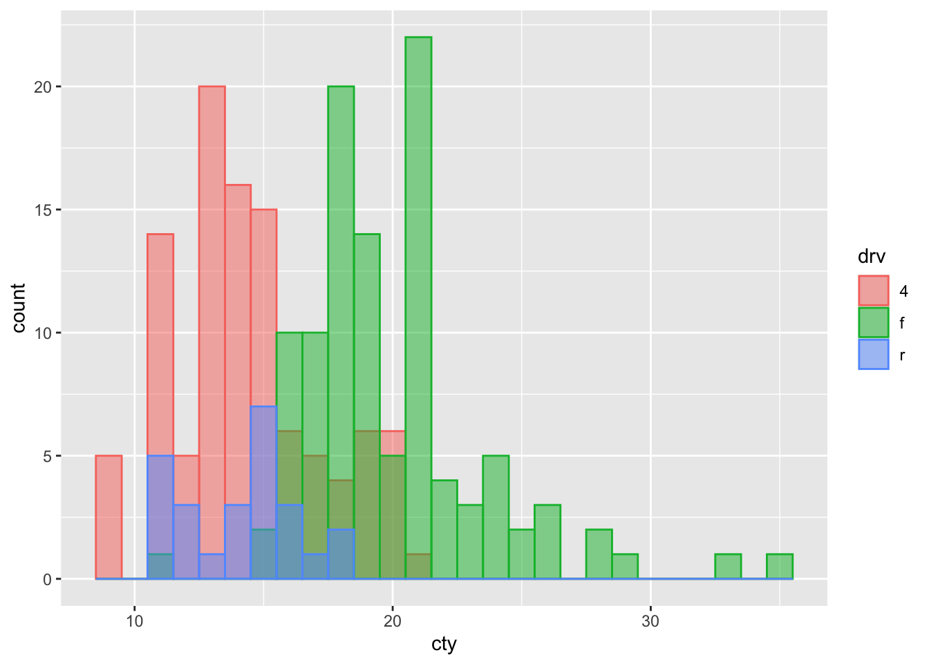
8.2.2 Frequency polygon?
Is this a case where the frequency polygon (that represent the same information as a histogram), is a bit better?
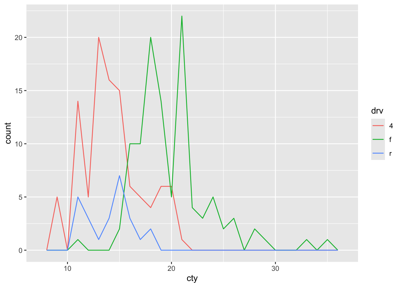
Note that the frequency polygon has no fill, so the below code is more appropriate for the geom_freqploy() function, which will lead to the identical graph.
How is the frequency polygon different to the histogram in this case?
8.2.3 Mapping versus setting colour
We have now seen two uses of colour within the ggplot code. It’s important to learn the distinction between these ways.
We can ‘set’ the colour of particular feature in our graph, by specifying a particular colour:
Or we can ‘map’ values of a variable to colours. This needs to be done with the aes():
The distinction is rather evident.
What happens when we ‘set’ a colour using a variable?
Error in layer(data = data, mapping = mapping, stat = stat, geom = GeomBar, : object 'drv' not foundThis doesn’t work, because when we are setting a particular feature, R expects a name of a colour, not a variable. It doesn’t even know what drv is, because it’s not looking in the dataset.
What happens when we ‘map’ the aesthetics to a colour-value?
Woah, that is quite unexpected.
What’s going on here?
8.3 Density plots
Histograms can be used to compare distributions, but they are not always ideal. Sometimes, density plots are more informative:
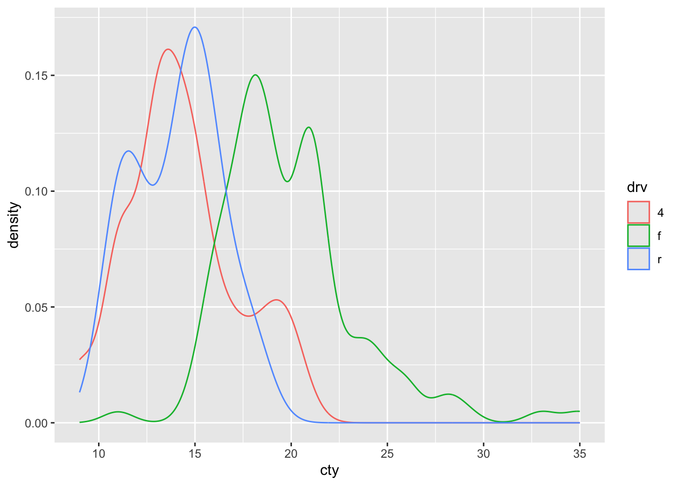
This looks a bit like our frequency polygon and like our histograms with the position = "identity".
What’s the difference between the frequency polygon and this density plot?
Let’s try to improve a bit:
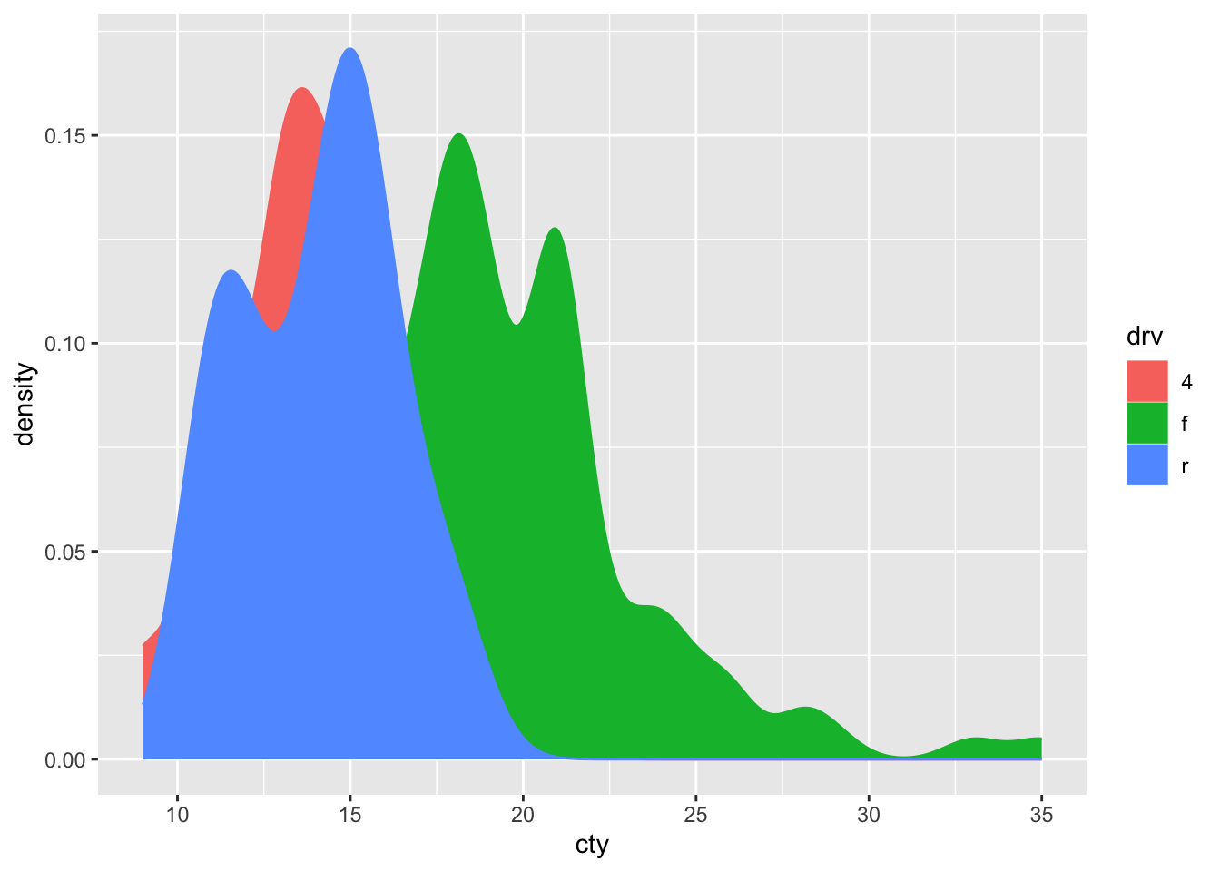
This looks quite pretty! But too bad that the red distribution is almost completely covered by the others! Perhaps we can make the colours a bit see-through:
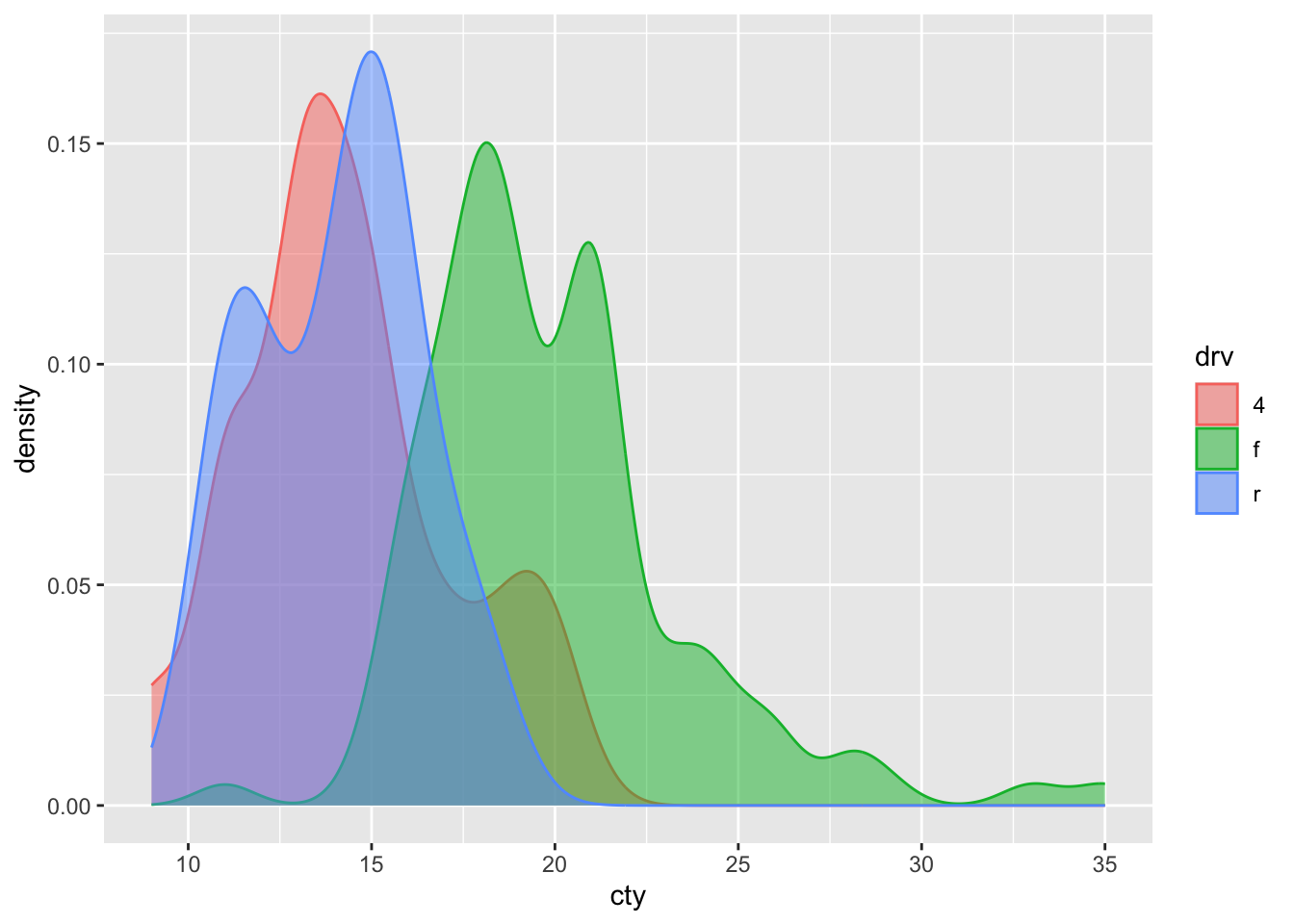
Not bad! It’s very clear that front-wheel drives are much more fuel-efficient than both rear- and 4-wheel drives.
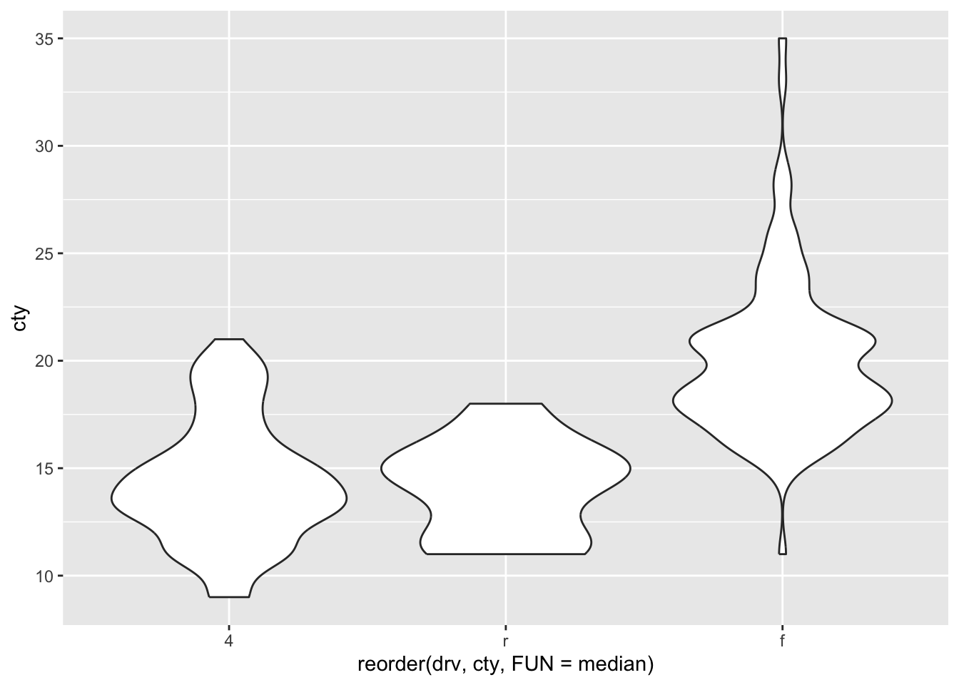
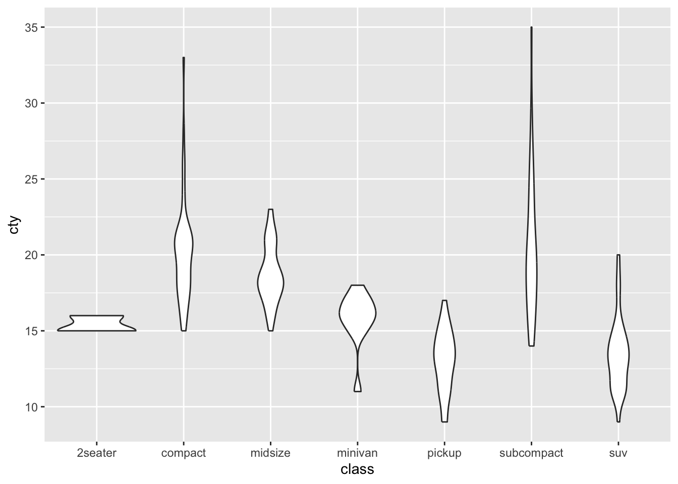
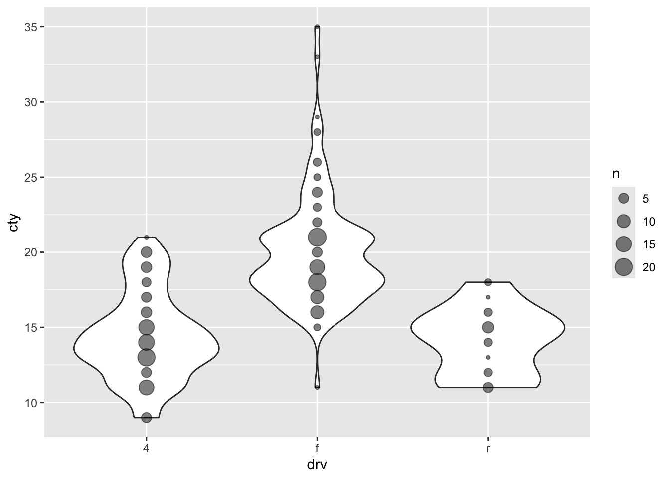
8.4 Violin plots
A particular neat way of visualizing a comparison of distributions, is to use “violin plots”. These are essentially density plots next to one another (rather than overlapping). Note that we are now specifying an x-variable and a y-variable:
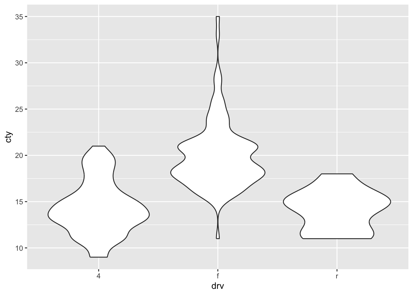
This gives us a rather quick impression of the different distributions.
If we want the different distributions to have different colours (similar to the density plots), then we can similary ‘map’ it to the variable “drv”:
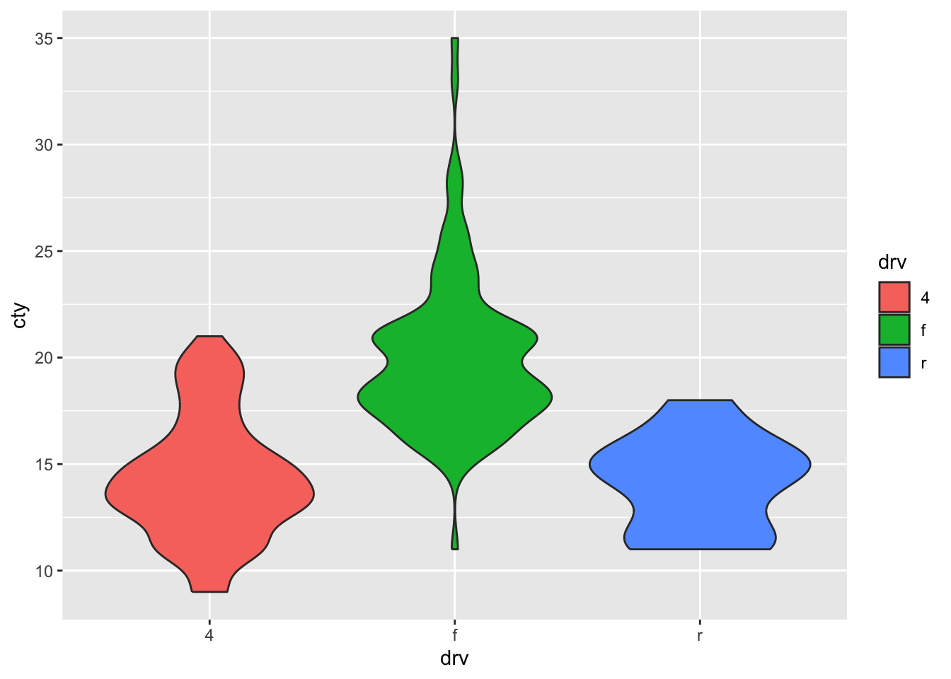
It looks a bit prettier now. There are distinct views on whether this is a ‘appropriate’ thing to do: one the hand, some argue that the colour variable adds zero new information. The distinction of the different type of drives is already on the x-axis, and need not also be specified by different variable. Such people would think the colours lead to more distraction. On the other hand, there are those that think redundancy is a good thing. Also, the colours might be more attractive, such that the perceiver shows more interest / has more attention for the graph. I think both sides have a point. Perhaps for scientific publications, stick to the more basic version without the distraction, perhaps for presentations you can consider pretty colours that prevent people from nodding off.
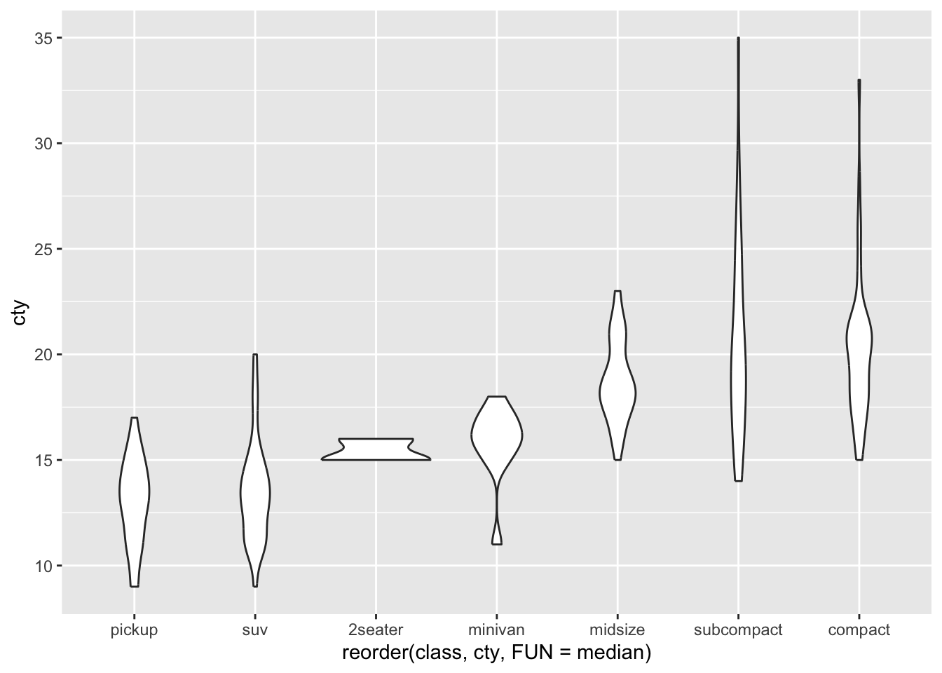
8.4.1 Sorting the x-axis
Sometimes you’d like the x-axis to be sorted on some group characteristic like the median, or mean. Let’s try and do this:
Another example:
Ordering the x-axis on the median:
8.4.2 Setting our own order
Let’s say we want to specify our own order.
We can now use this vector with our own specified order for the x-axis in two ways:
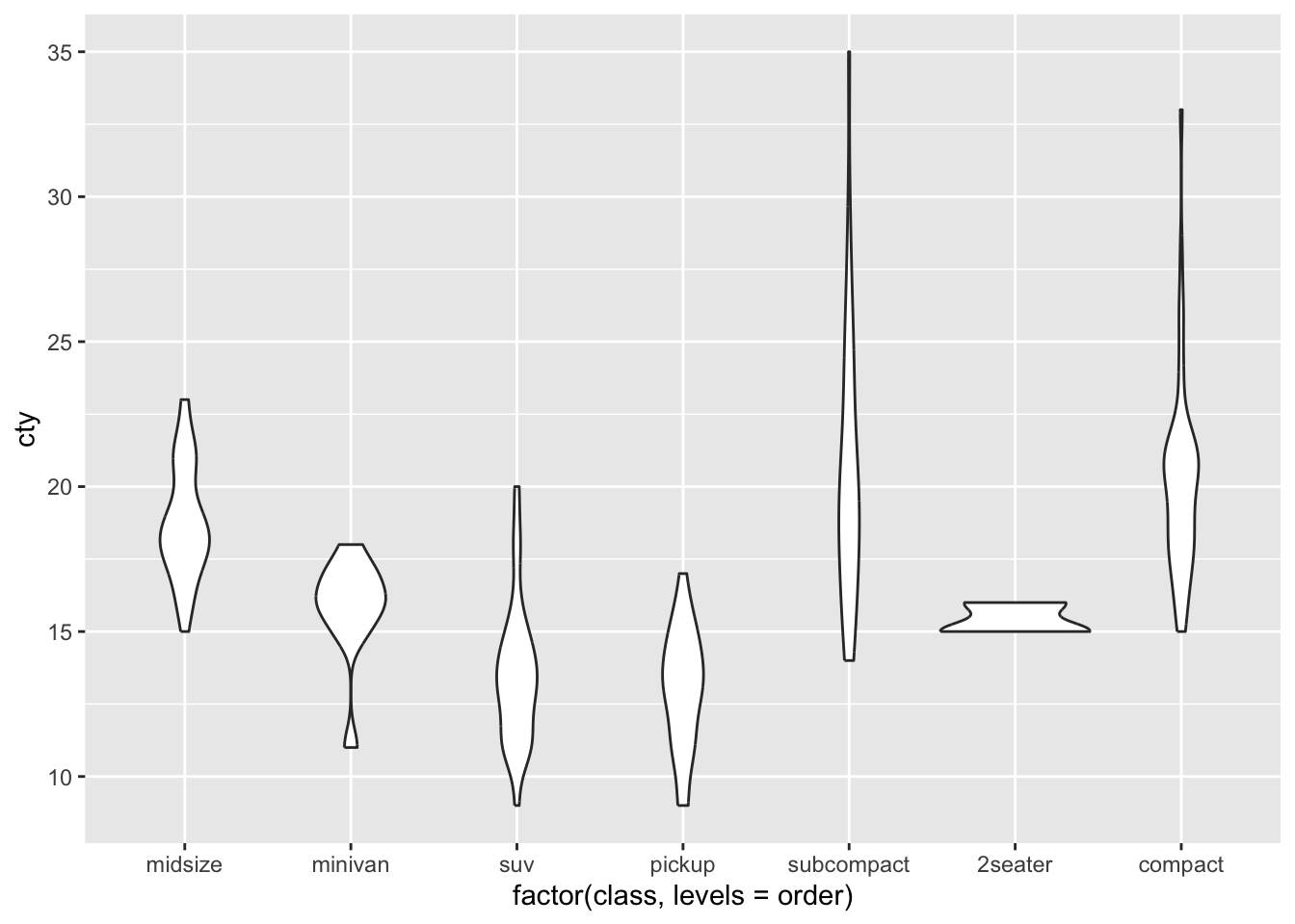
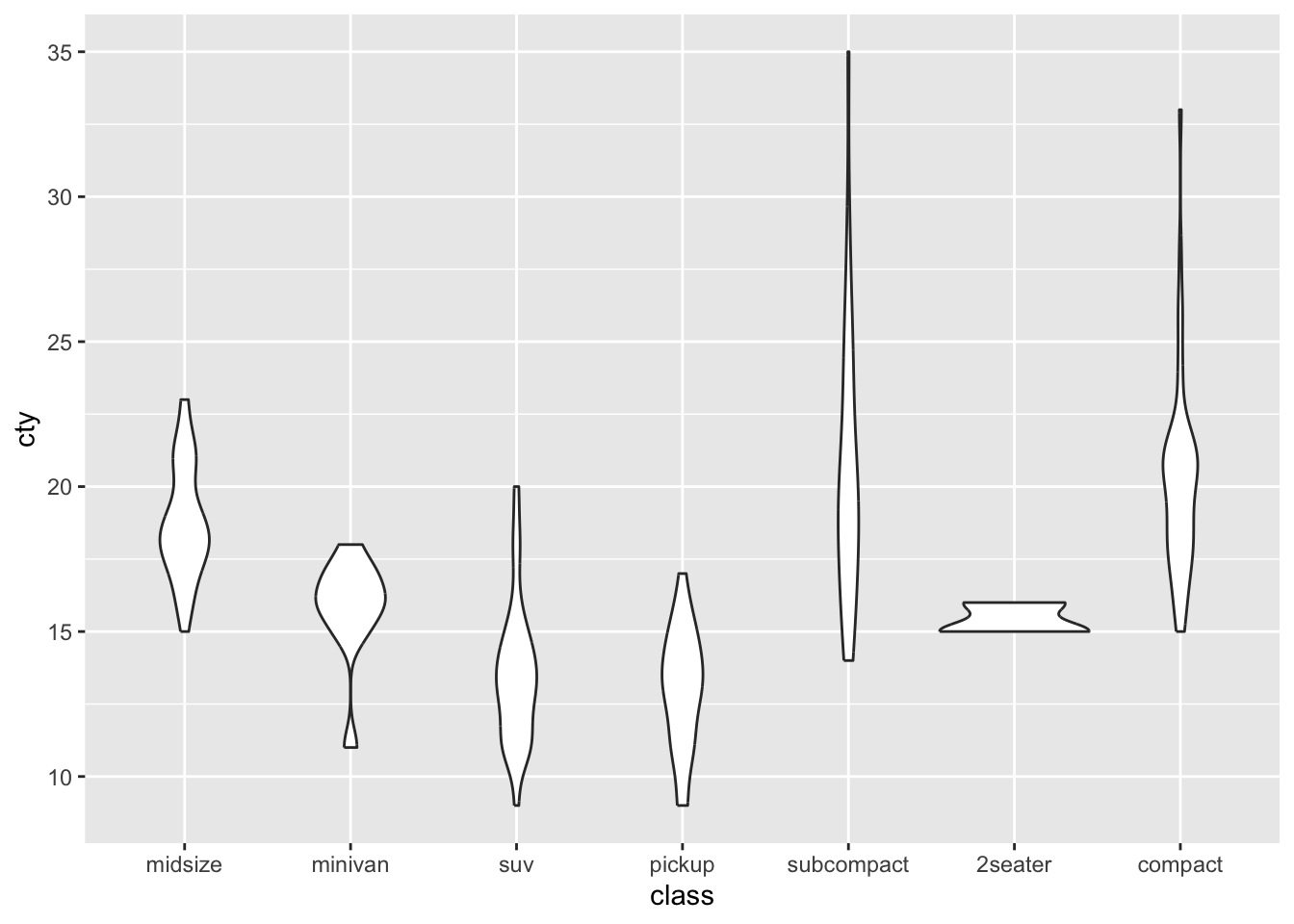
One of the disadvantages of violin plots becomes a bit more apparent here: it’s unclear how many cases / datapoints exist for each class, so we don’t know how reliable or distributions are.
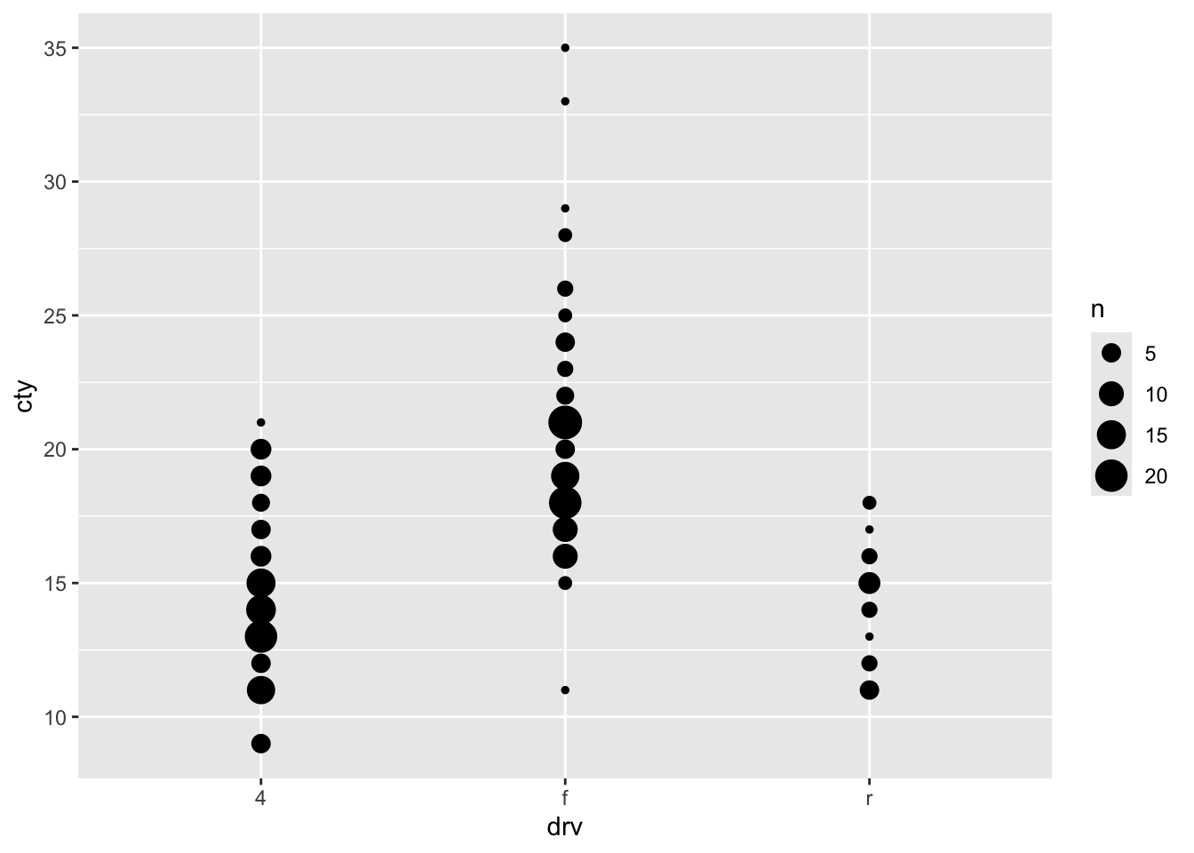
8.5 Scatter plots
An underused but particularly useful way of comparing distributions is by use of a scatterplot:
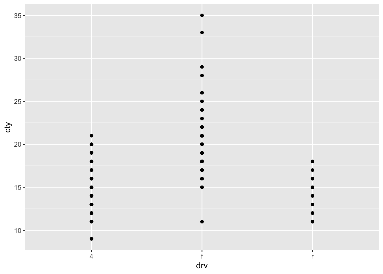
A somewhat problematic feature of this graph, is that there are many more datapoints in the dataset, than we can see in the graph. This is because the datapoints are overlapping. Two ways for resolving this are to jitter the point (add a bit of random noise to the data, so that the datapoints will deviate slightly) or to adjust the size of the points dependent on their frequency.
8.5.1 Jitter
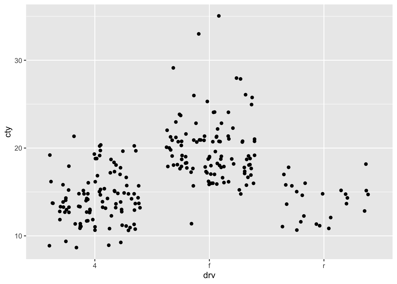
What is a disadvantage of a jitter-plot?
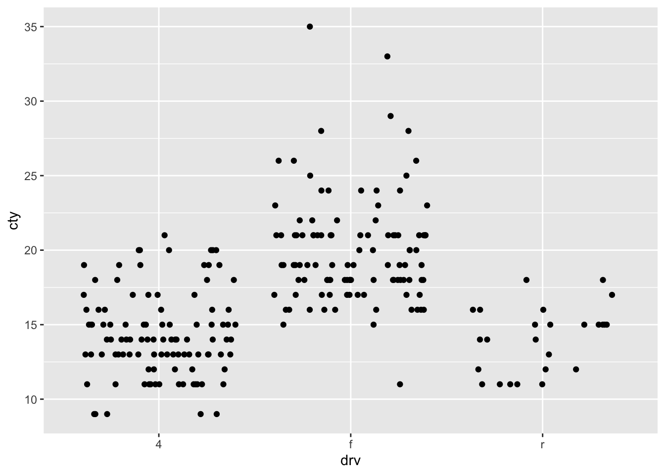
If we make use of the geom_jitter without any specification, the function will jitter the data-points in both the horizontal and vertical dimension. This is not ideal, because, in this case, randomly shifting them in the vertical dimension, means that we cannot retrieve the raw data. So let’s try and only jitter in the horizontal direction:
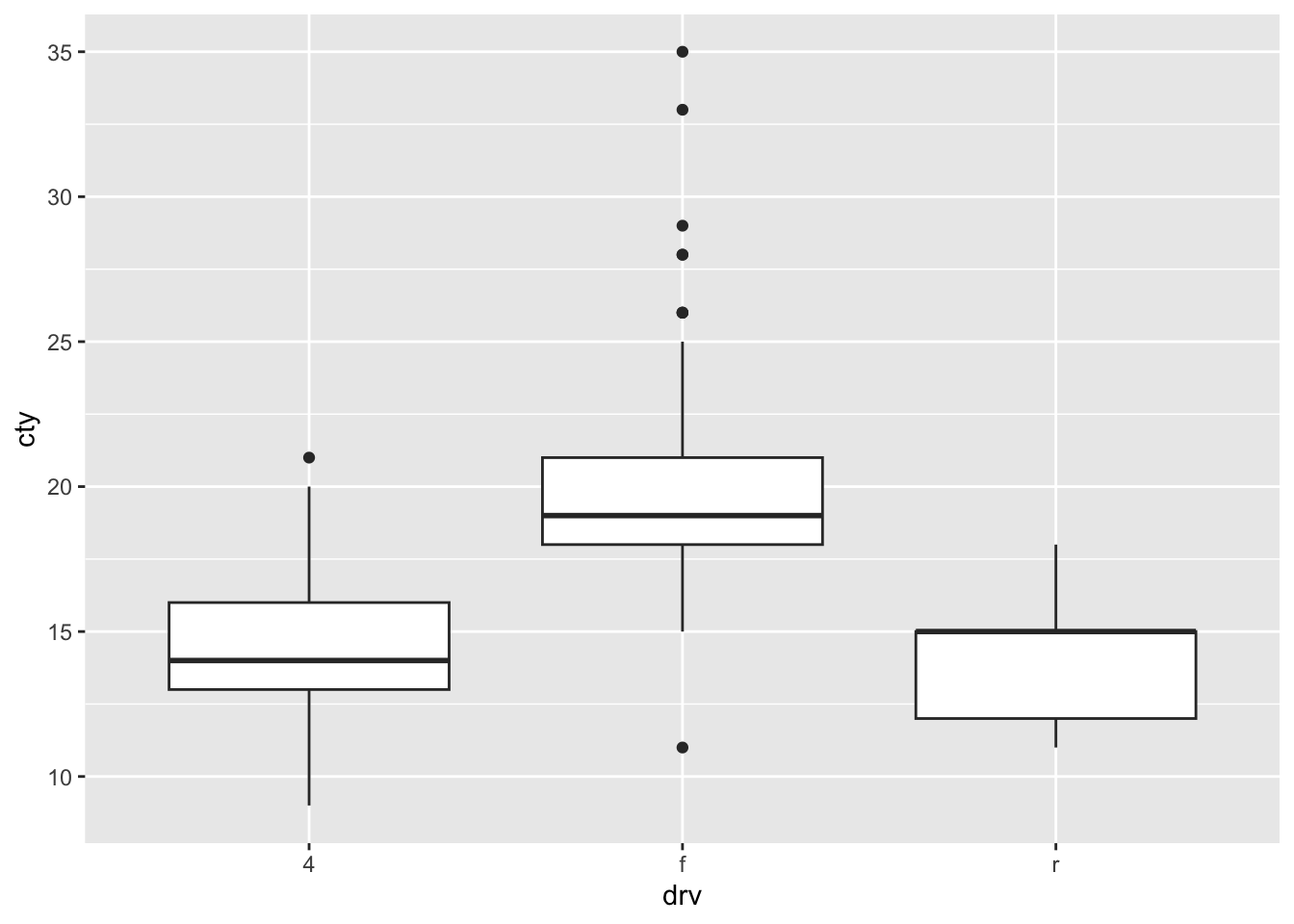
8.6 Boxplots
A different ways of comparing distributions is through boxplots. In contrast to the above graphs, with boxplots the actual distributions are not displayed, but several summary statistics of the distributions (e.g., median, interquartile range, outliers). Still boxplots are incredibly useful to get a quick view of the differences between the groups, where the bulk of the data lies between, and whether there are outliers:
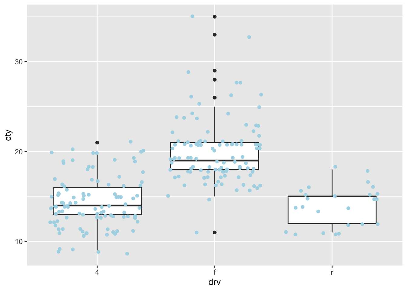
8.7 Comparing distributions 2.0
My strong preference when it comes to graphs is to show the raw data in addition to some sort of summary based on the data. This almost always involves showing the raw datapoints with geom_point() (or geom_jitter() or geom_count() when points are overlapping). Two examples:
Create a plot with three layers: first a violin plot, then a boxplot, and then scatter/jitter dots. On the x-axis put
manufacturerand on the y-axis puthwy. Sort the x-axis on the median value ofhwy.