Chapter 20 Annotate graphs
Sometimes we want to annotate our graph with some text or we would like to highlight something particularly interesting. We can do that by using adding an annotate-layer. You can add any geom you’d like with annotate
Let’s see it in action. We are going to highlight the drastic change in GDP for Kuwait using the gapminder dataset [see also assignment 3].
library(gapminder)
asia <- gapminder %>% filter(continent == "Asia")
kw <- gapminder %>% filter(country == "Kuwait")ggplot(asia, aes(x = year, y = gdpPercap, group = country)) +
geom_line(colour = "lightgrey") +
geom_line(data = kw, colour = "orange")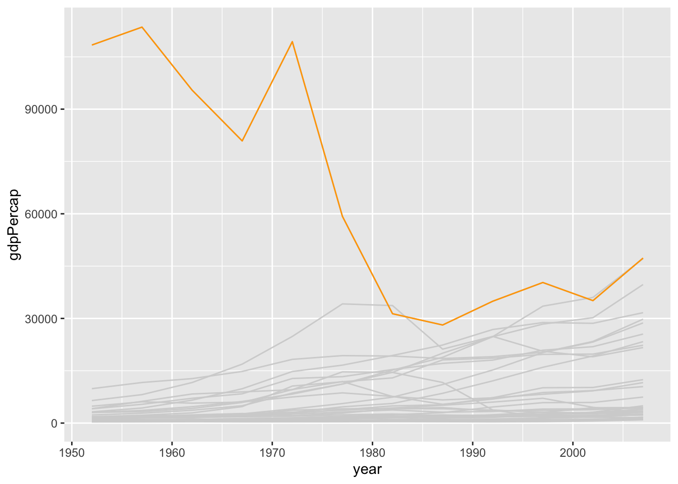
Now let’s add a text-label that reads “Kuwait”:
ggplot(asia, aes(x = year, y = gdpPercap, group = country)) +
  geom_line(colour = "lightgrey") +
geom_line(data = kw, colour = "orange") +
annotate("text", x = 1952, y = 100000, label = "Kuwait")
Now let’s add a label that reads “Kuwait”:
ggplot(asia, aes(x = year, y = gdpPercap, group = country)) +
  geom_line(colour = "lightgrey") +
  geom_line(data = kw, colour = "orange") +
  annotate("label", x = 1952, y = 100000, label = "Kuwait")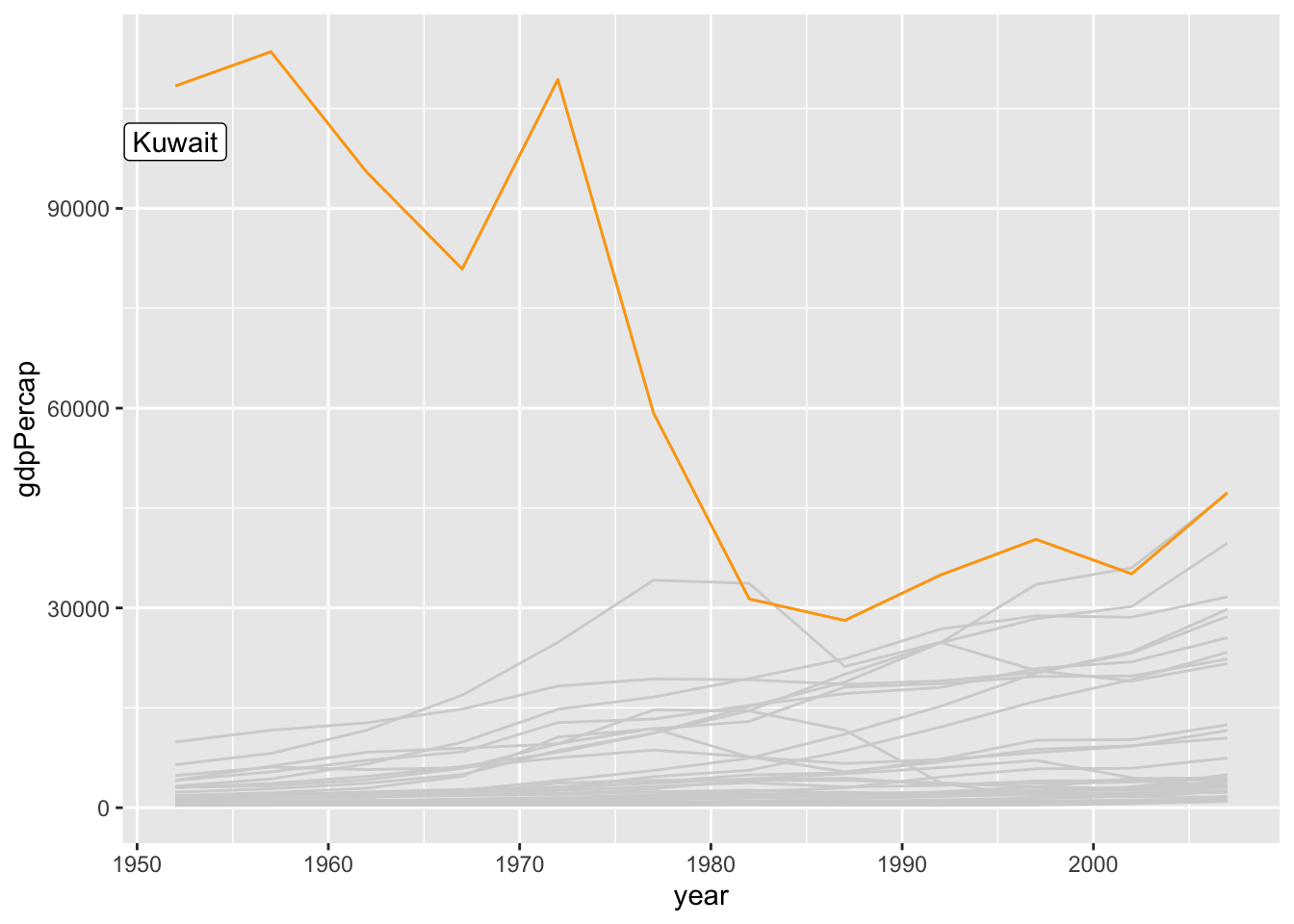
Let’s do another one
ggplot(asia, aes(x = year, y = gdpPercap, group = country)) +
  geom_line(colour = "lightgrey") +
  geom_line(data = kw, colour = "orange") +
  annotate("text", x = 1980, y = 45000, label = "Kuwait", angle = -55)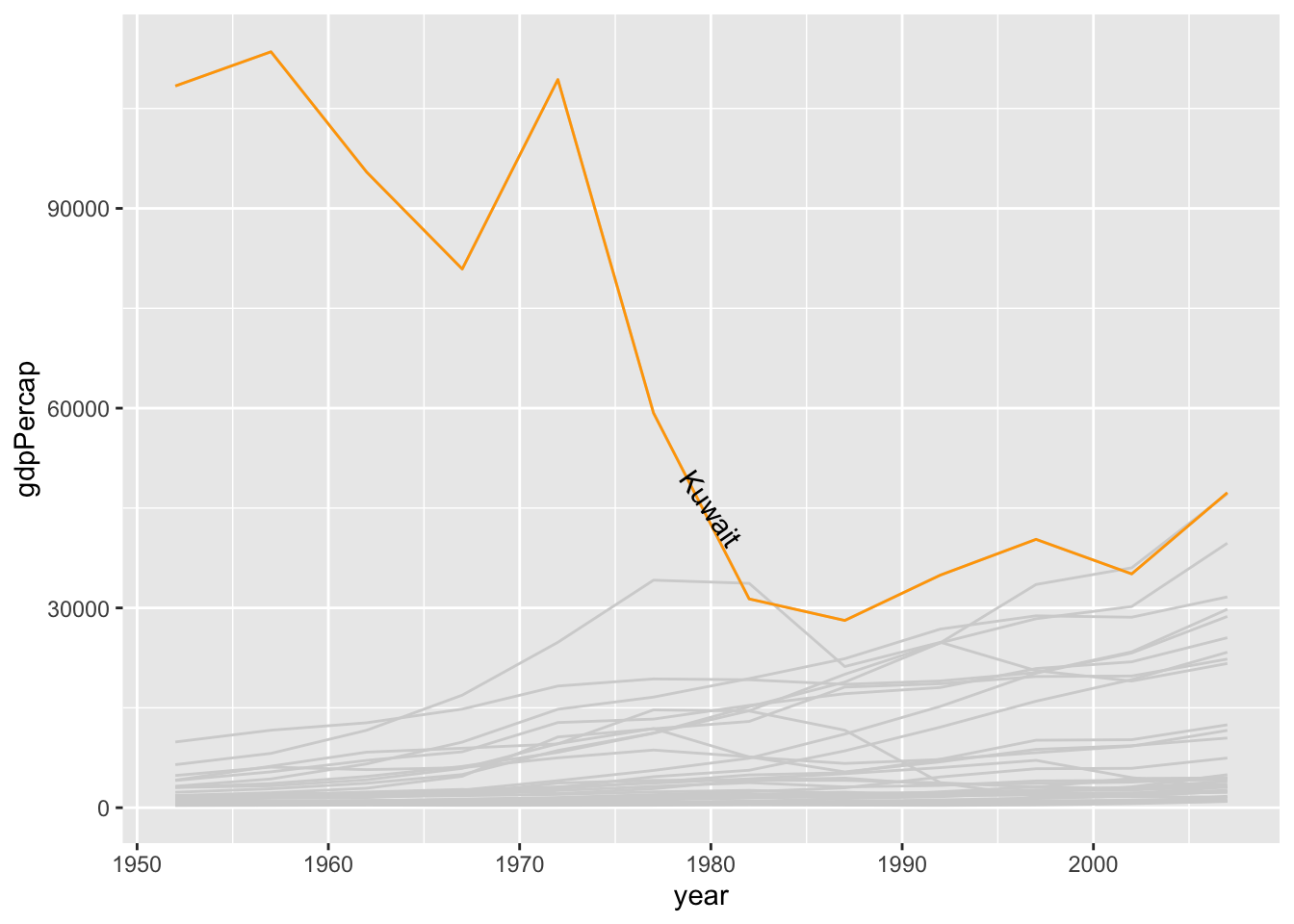
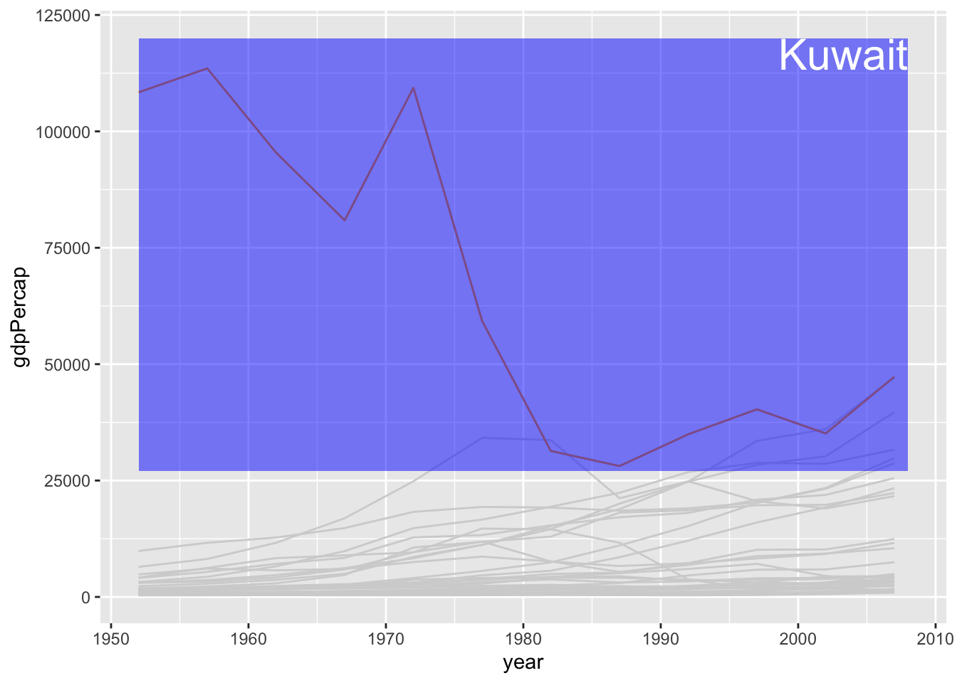
Or something more radical:
ggplot(asia, aes(x = year, y = gdpPercap, group = country)) +
  geom_line(colour = "lightgrey") +
  geom_line(data = kw, colour = "orange") +
  annotate("rect",
    xmin = 1952, xmax = 2008, ymin = 27000, ymax = 120000,
    alpha = 0.5, fill = "blue"
  ) +
  annotate("text",
    x = 2008, y = 120000, label = "Kuwait", colour = "white",
    size = 8, vjust = 1, hjust = 1
  )
Or something like:
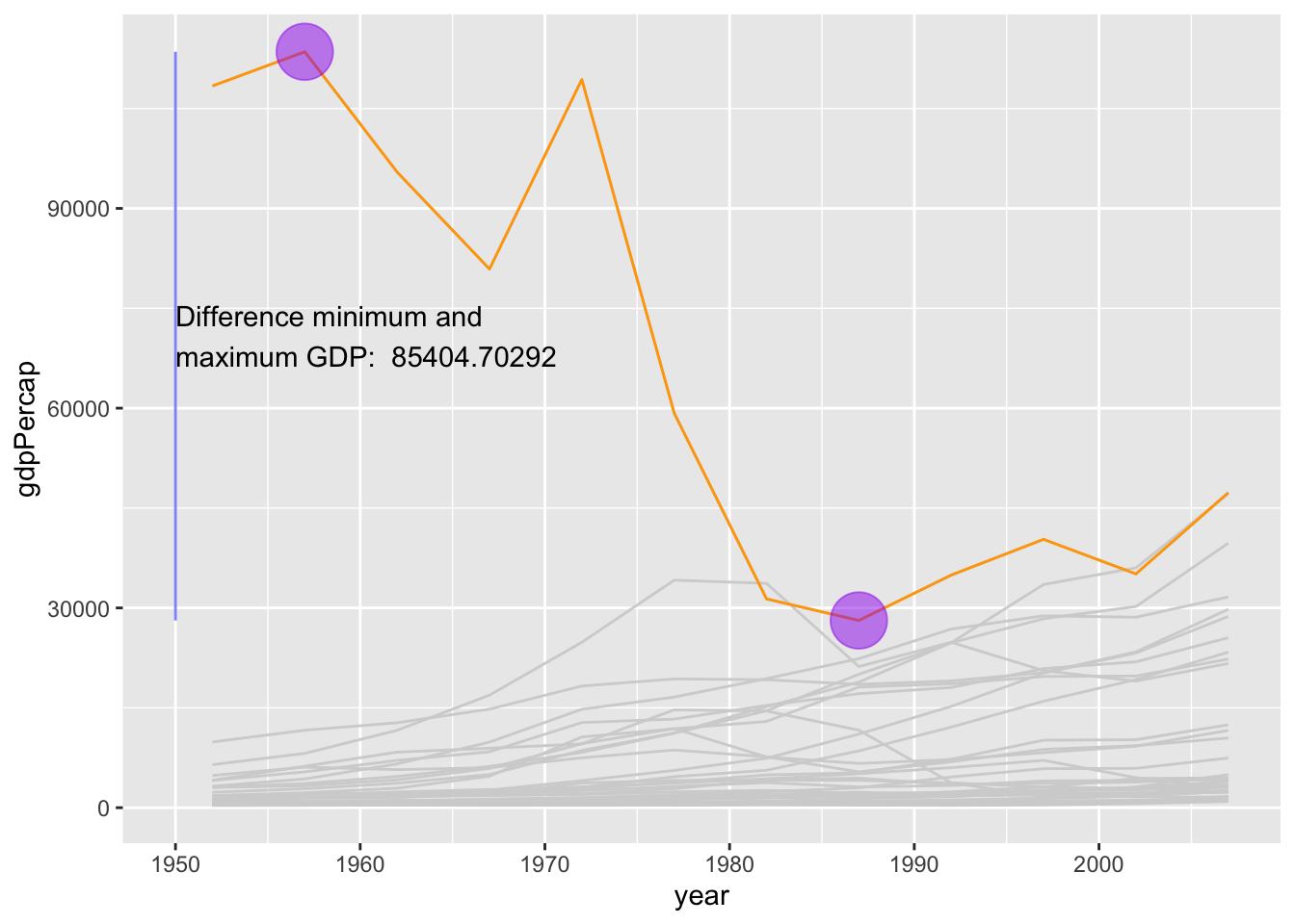
max_kw <- max(kw$gdpPercap)
# extract x-coordinate (year) for maximum
x_max <- kw[kw$gdpPercap == max_kw, ]$year

min_kw <- min(kw$gdpPercap)
# extract x-coordinate (year) for minimum
x_min <- kw[kw$gdpPercap == min_kw, ]$year

ggplot(asia, aes(x = year, y = gdpPercap, group = country)) +
  geom_line(colour = "lightgrey") +
  geom_line(data = kw, colour = "orange") +
  annotate(
    "segment",
    x = 1950, xend = 1950, y = min_kw, yend = max_kw,
    alpha = 0.5, colour = "blue"
  ) +
  annotate(
    "text",
    x = 1950, y = (min_kw + max_kw) / 2,
    label = paste("Difference minimum and\nmaximum GDP: ", max_kw - min_kw),
    hjust = 0
  ) +
  annotate(
    "point",
    x = x_max, y = max_kw, alpha = 0.5,
    size = 10, colour = "purple"
  ) +
  annotate(
    "point",
    x = x_min, y = min_kw, alpha = 0.5,
    size = 10, colour = "purple"
  )