Chapter 15 Visualizing two continuous variables
15.1 Scatterplots
Scatterplots are a popular and good way to visualize the relationship between two continuous variables. We’ll go into them quite a bit, because scatterplots lend themselves well for incorporating information from other variables and for changing features of the geoms.
Let’s plot the relationship between fuel efficiency (cty) and the engine displacement (in litres; displ):
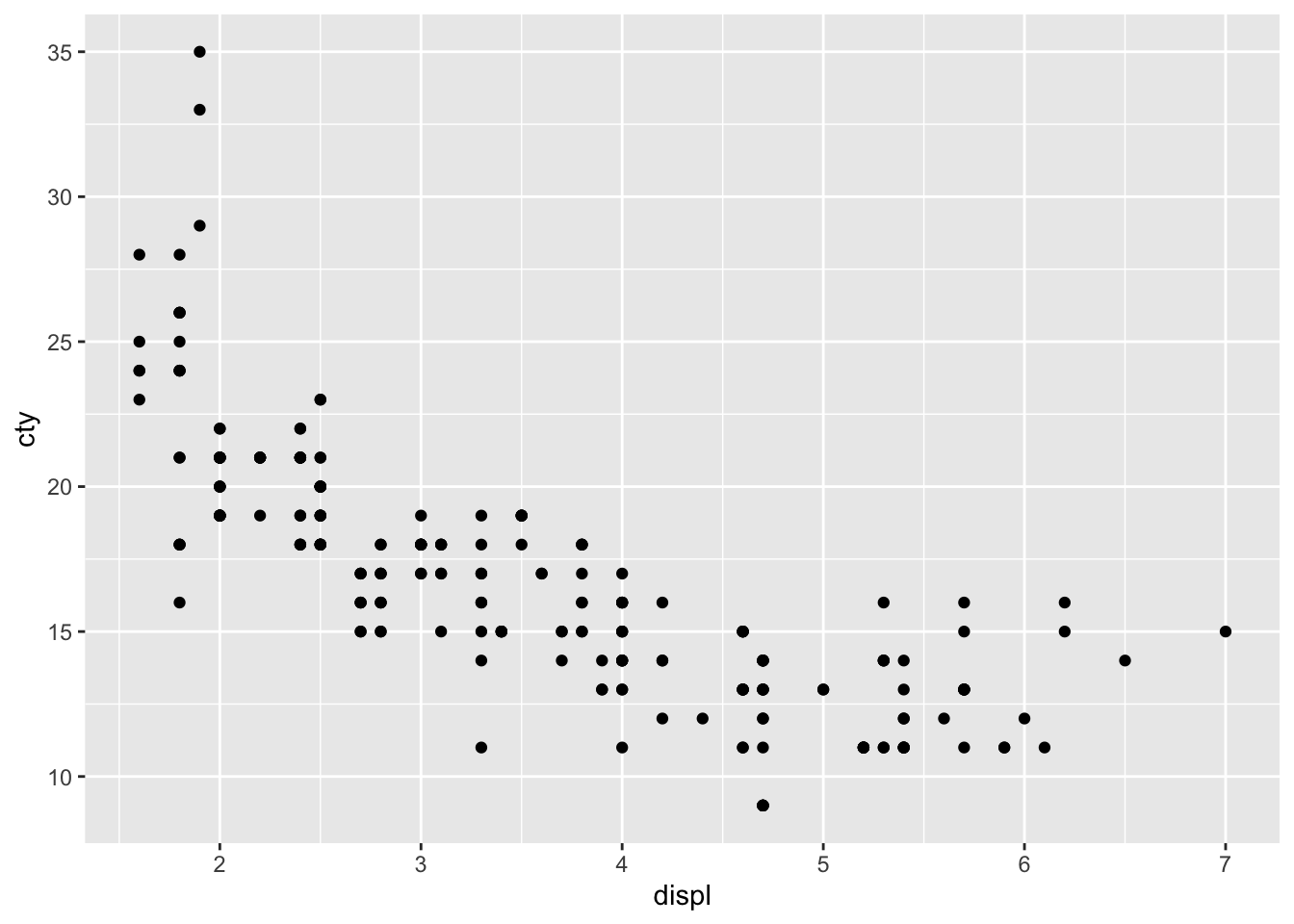
Looks like there is a strong pattern in the data; cars with higher engine displacement have lower fuel efficiency. The relationship doesn’t seem to be entirely linear, because the curve flattens in the lower right corner. If we want to delve a bit more into this pattern, we can also try visualizing how type of car (front-, rear-, 4-wheel drive; drv) affects this pattern. This is rather easy:
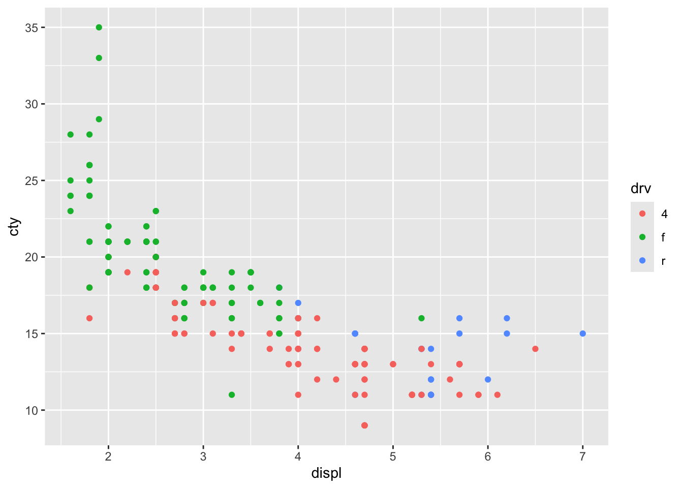
We have given the points a colour depending on the type of drive of the car! It’s clear that front-wheel drives have lowest displacement and highest fuel efficiency! Now let’s do something similar, but now we want to incorporate fuel efficiency on the highway (“hwy”) as our colour variable:
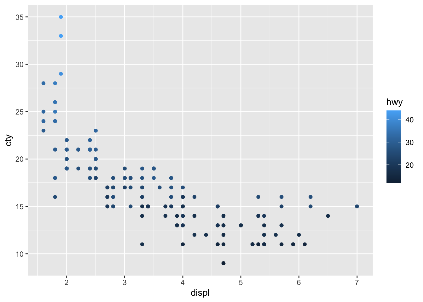
This looks rather different! Why? What does the graph tell us?
Let’s do another one with the variable year (note that year only has two value: 1999 and 2008).
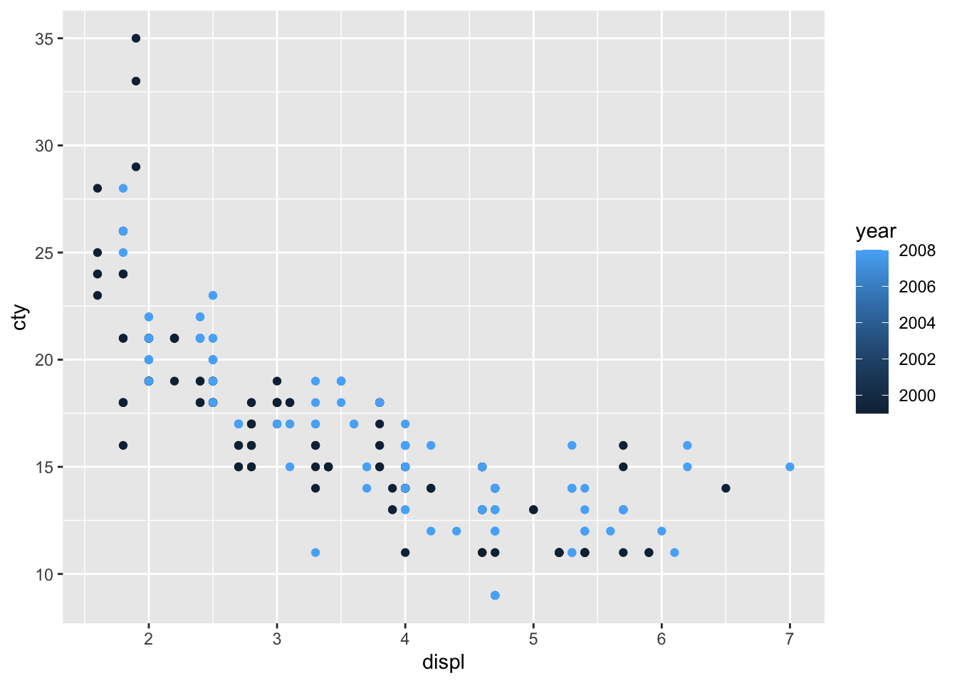
Hhhmm, while the graph seems fine, it is not quite appropriate that the year is signified as a sliding colour chart, because there are only two values. The reason why this happens, is because R makes a sliding colour chart automatically when the variable consists of numbers. When we examine the ‘class’ of the variable, we see that year is an integer (whole number) variable:
## [1] "integer"It’s better to view this variable as either a character or factor variable:
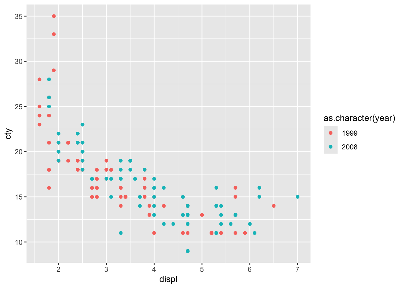
This looks more reasonable!
15.1.1 Adding regression lines
We’ve seen previously how easy it was to add a prediction line to a scatterplot:
## `geom_smooth()` using method =
## 'loess' and formula = 'y ~ x'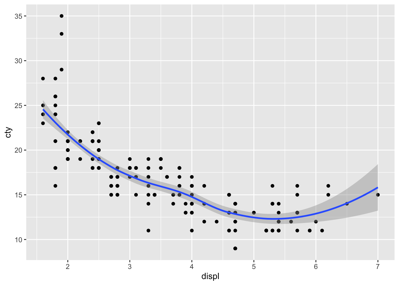
geom_smooth() defaults to the loess-method of fitting and includes confidence interval around the prediction line. Let’s change it to a linear regression model without confidence intervals and in red:
ggplot(mpg, aes(x = displ, y = cty)) +
geom_point() +
geom_smooth(method = "lm", se = FALSE, colour = "red")## `geom_smooth()` using formula = 'y ~
## x'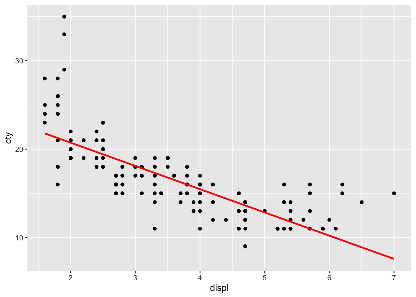
The line doesn’t quite seem to fit the most left and right parts of the graph.
15.1.2 Manually adding regression lines
Let’s see if we can recreate the regression line ourselves. We have to run a linear regression, and retrieve the intercept and slope from the model, and draw a line in ggplot based on those estimates. Let’s try:
##
## Call:
## lm(formula = cty ~ displ, data = mpg)
##
## Coefficients:
## (Intercept) displ
## 25.99 -2.63This is how we can get those estimates:
## (Intercept)
## 25.99147## displ
## -2.630482Let’s add the line with a new geom: geom_abline:
ggplot(mpg, aes(x = displ, y = cty)) +
geom_point() +
geom_smooth(method = "lm", se = FALSE, colour = "red") +
geom_abline(
intercept = model$coefficients["(Intercept)"],
slope = model$coefficients["displ"],
linetype = "dashed", colour = "blue", size = 2, alpha = 0.5
)## `geom_smooth()` using formula = 'y ~
## x'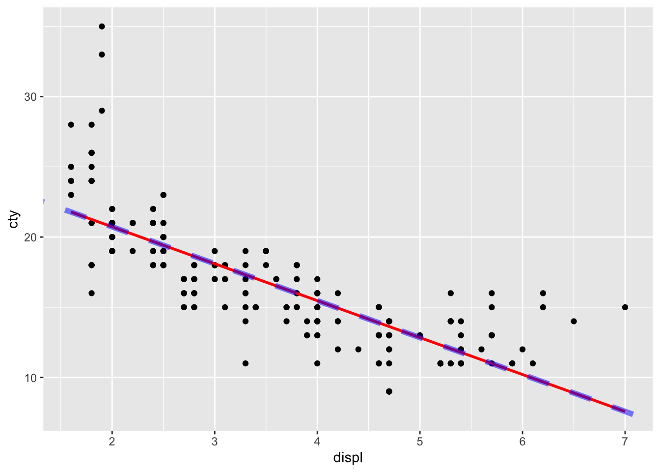
15.1.3 Regression lines for different groups
The beauty of ggplot is that adding regression lines are drawn for the different groups too:
ggplot(mpg, aes(x = displ, y = cty, colour = drv)) +
geom_point() +
geom_smooth(method = "lm", se = FALSE)## `geom_smooth()` using formula = 'y ~
## x'
15.1.3.1 inherite.aes
A very nice feature indeed! But what if we want to draw the overall regression line? At this point it becomes important to learn a bit about the “inheritance” of the features specified in ggplot()! Everything that is specified within ggplot() is inherited or passed down to all the other functions (typically geom_something() functions) in the code. Thus:
ggplot(mpg, aes(x = displ, y = cty, colour = drv)) +
geom_point() +
geom_smooth(method = "lm", se = FALSE)Effectively means:
ggplot(data = mpg, aes(x = displ, y = cty, colour = drv)) +
geom_point(data = mpg, aes(x = displ, y = cty, colour = drv)) +
geom_smooth(data = mpg, aes(x = displ, y = cty, colour = drv), method = "lm", se = FALSE)Which is also the same as:
ggplot(mpg, aes(x = displ, y = cty, colour = drv)) +
geom_point(aes(x = displ, y = cty, colour = drv)) +
geom_smooth(aes(x = displ, y = cty, colour = drv), method = "lm", se = FALSE)Which can also be written as:
ggplot(mpg) +
geom_point(aes(x = displ, y = cty, colour = drv)) +
geom_smooth(aes(x = displ, y = cty, colour = drv), method = "lm", se = FALSE)Or as:
ggplot() +
geom_point(data = mpg, aes(x = displ, y = cty, colour = drv)) +
geom_smooth(data = mpg, aes(x = displ, y = cty, colour = drv), method = "lm", se = FALSE)Study these different ways of writing the same thing. Do you see the pattern?
Let’s look at one more way of writing the above code. The default for ggplot is to inherit the aes() features. In fact, within the geom_something() functions, the code inherit.aes = TRUE is set as default (and the defaults are not always displayed). So when we turn to our original code, what it actually reads is:
ggplot(mpg, aes(x = displ, y = cty, colour = drv)) +
geom_point(inherit.aes = TRUE) +
geom_smooth(method = "lm", se = FALSE, inherit.aes = TRUE)This gives us a very important clue as to what should happen when we do NOT want our geom_something to inherit the aesthetics. Simply change it to FALSE. Let’s try:
ggplot(mpg, aes(x = displ, y = cty, colour = drv)) +
geom_point(inherit.aes = TRUE) +
geom_smooth(method = "lm", se = FALSE, inherit.aes = FALSE)Hhhmmm, this leads to the following error:
Because we have told geom_smooth() to ignore the aes(x = displ, y = cty, colour = drv) defined in ggplot(), it doesn’t know what to plot! So we need to explicitely define x and y again.
ggplot(mpg, aes(x = displ, y = cty, colour = drv)) +
geom_point(inherit.aes = TRUE) +
geom_smooth(
aes(x = displ, y = cty, colour = drv),
method = "lm", se = FALSE, inherit.aes = FALSE
)## `geom_smooth()` using formula = 'y ~
## x'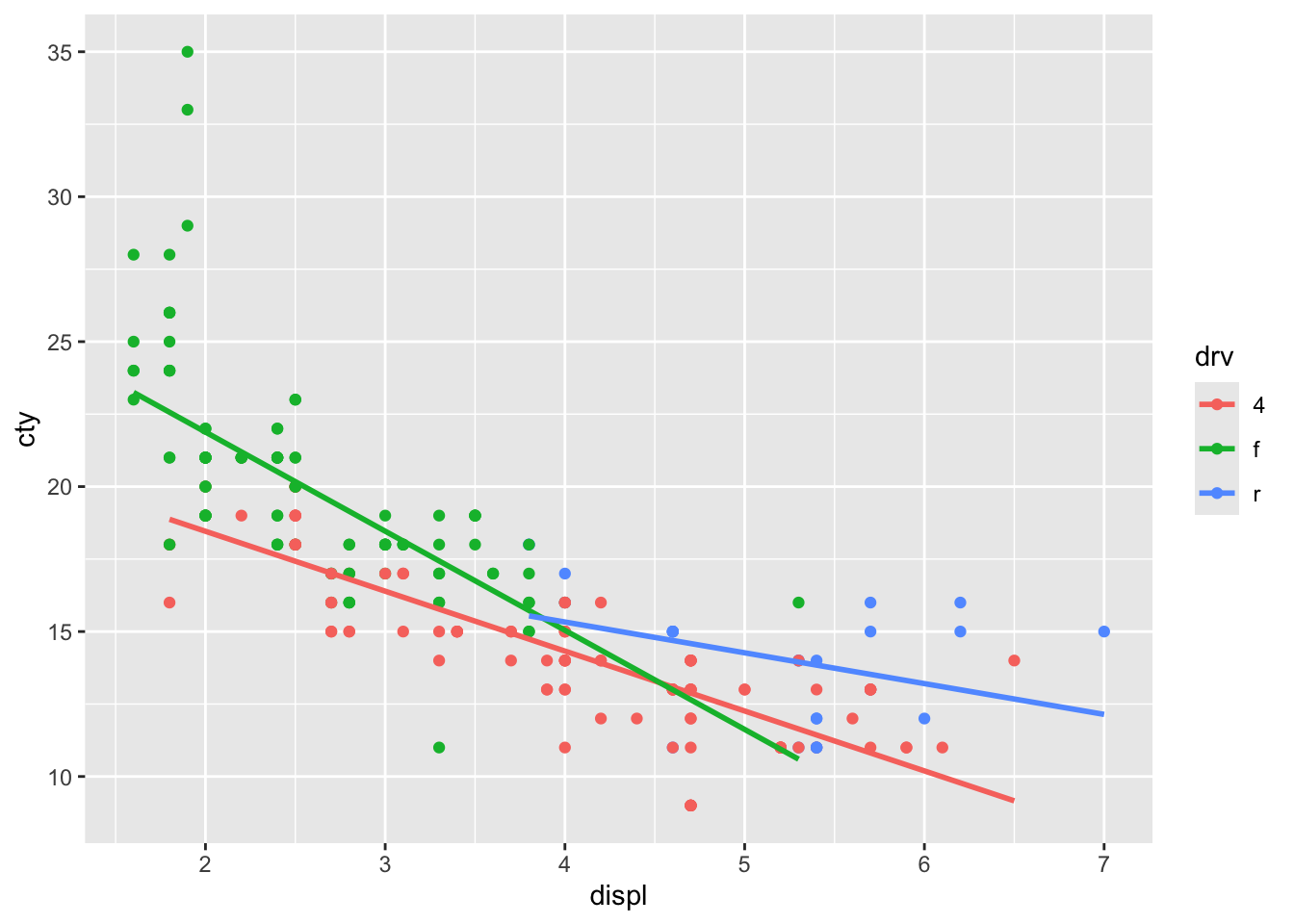
It worked, and we have reproduced the outcome of the original code. But this opens up possibilities, because we do not have to specify the same variables. In fact, to return to our original idea of plotting the overall regression line, we can refrain from adding colour = drv:
ggplot(mpg, aes(x = displ, y = cty, colour = drv)) +
geom_point(inherit.aes = TRUE) +
geom_smooth(
aes(x = displ, y = cty),
method = "lm", se = FALSE, inherit.aes = FALSE
)## `geom_smooth()` using formula = 'y ~
## x'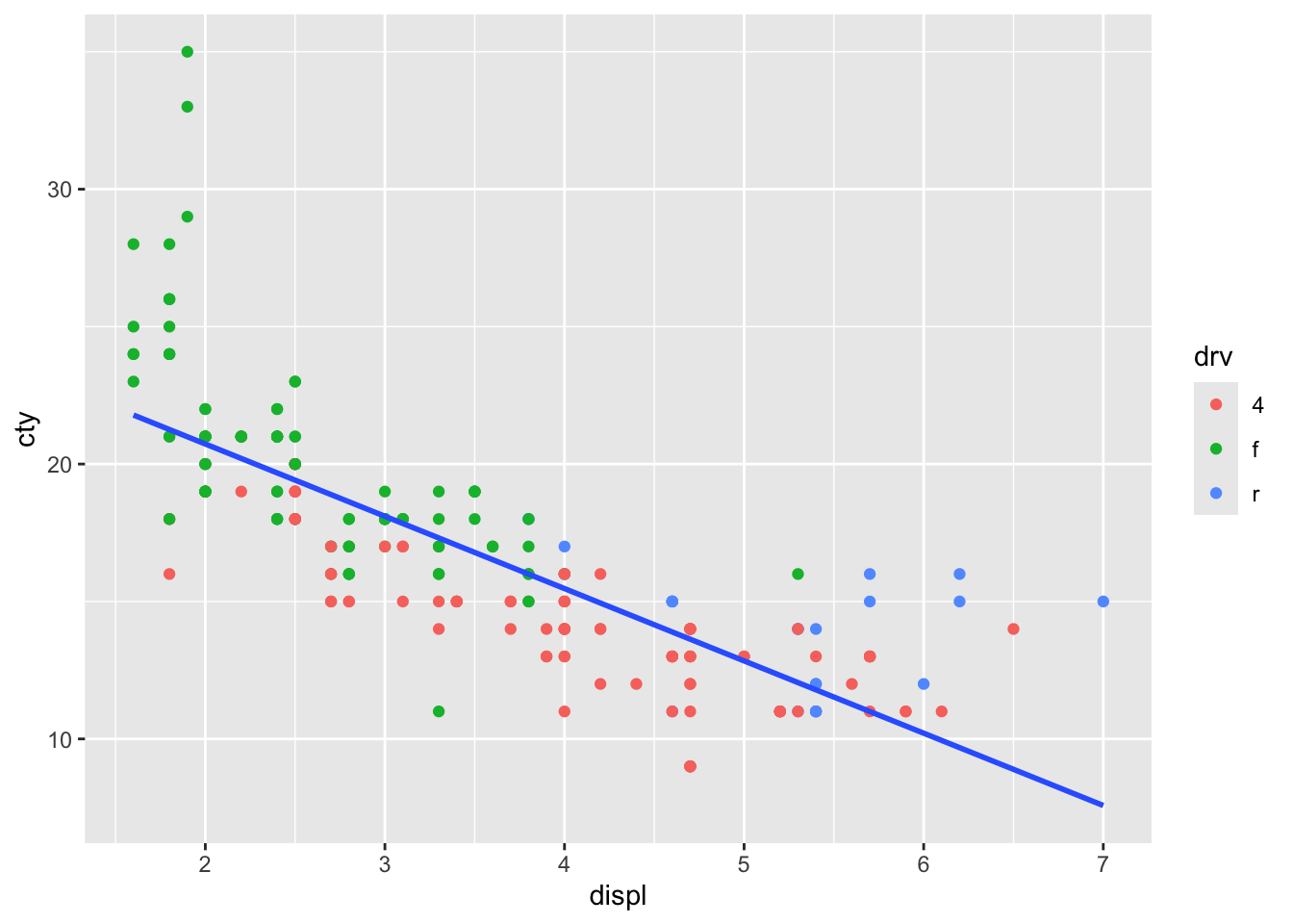
We could have also plotted a regression line between two different variables:
ggplot(mpg, aes(x = displ, y = cty, colour = drv)) +
geom_point(inherit.aes = TRUE) +
geom_smooth(
aes(x = displ, y = hwy),
method = "lm", se = FALSE, inherit.aes = FALSE
)## `geom_smooth()` using formula = 'y ~
## x'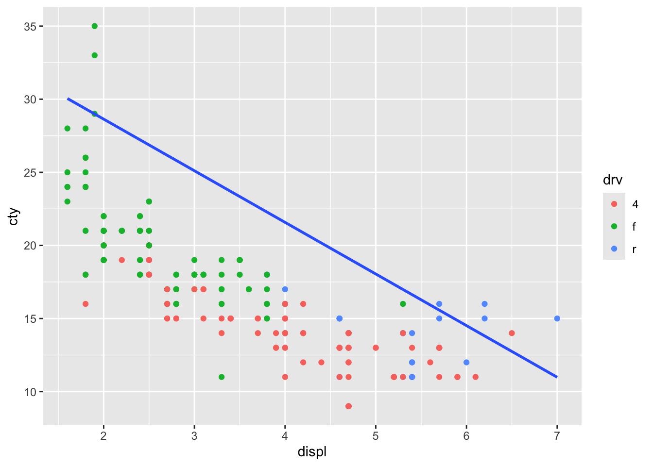
Which is not particularly helpful in this case, but it’s good to know we can.
Can you imagine situation in which this would be helpful?
But understanding the inheritance of features gives us quite some flexibility. For a sensible graph, one could for instance do:
ggplot(mpg, aes(x = displ, y = cty, colour = drv)) +
geom_point() +
geom_smooth(method = "lm", se = FALSE) +
geom_smooth(
aes(x = displ, y = cty),
method = "lm", se = FALSE, inherit.aes = FALSE,
colour = "black", size = 1, linetype = "dashed"
)## `geom_smooth()` using formula = 'y ~
## x'
## `geom_smooth()` using formula = 'y ~
## x'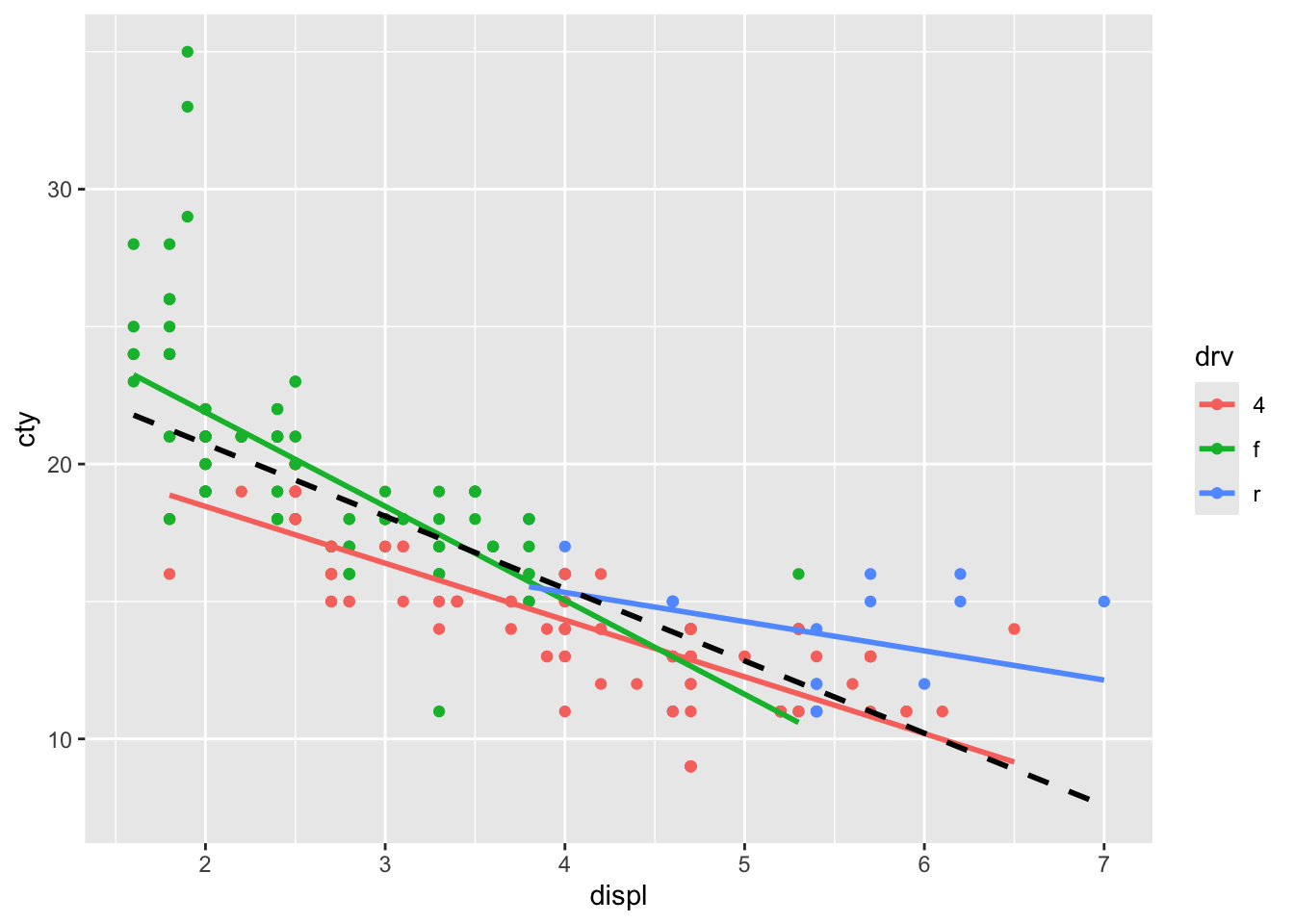
The regression line for rear-while drive seems to diverge a bit from the overall regression line.
There is another way of achieving the same without specifying inherit.aes = FALSE. In this case, geom_smooth inherits the aesthetical features from ggplot() (the x, y, and colour), but you explicitly state that you will change the colour-aesthetic:
ggplot(mpg, aes(x = displ, y = cty, colour = drv)) +
geom_point() +
geom_smooth(method = "lm", se = FALSE) +
geom_smooth(
aes(colour = NULL),
method = "lm", se = FALSE,
colour = "black", size = 1, linetype = "dashed"
)## `geom_smooth()` using formula = 'y ~
## x'
## `geom_smooth()` using formula = 'y ~
## x'
This is a little bit less typing, but a bit less explicit.
15.2 Scatterplots with text
15.2.1 geom_text()
Often it is nice to annotate some (or all) of the datapoints with text. Let’s look at some possibilities. We’ll learn more about the inheritance as well.
With geom_text() we can add text in our graph for each datapoint. In addition to expecting an x and y, it expects a label:
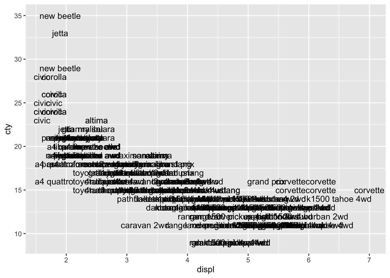
We see the same pattern, but it’s not very clear. Let’s try and do something about that:
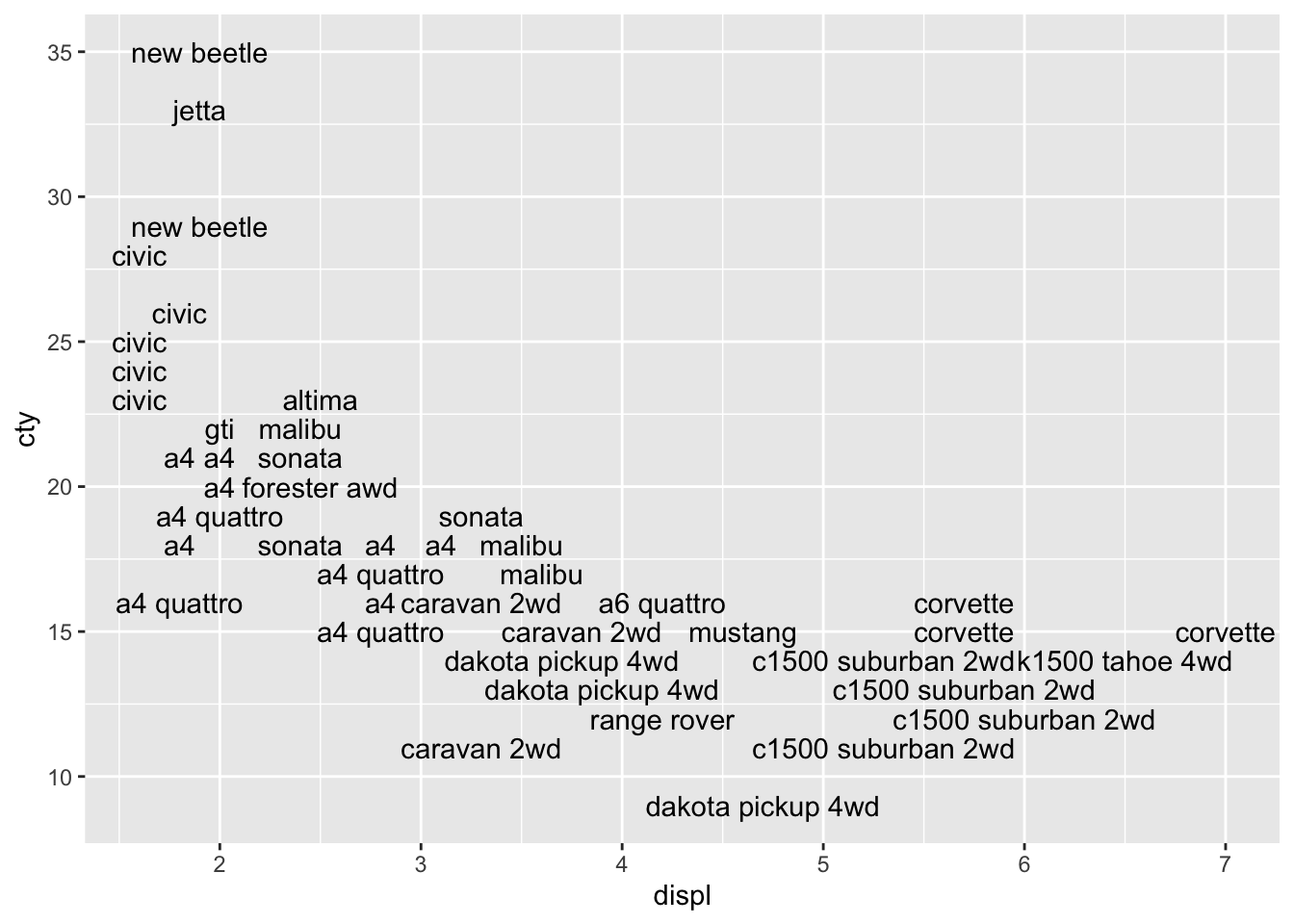
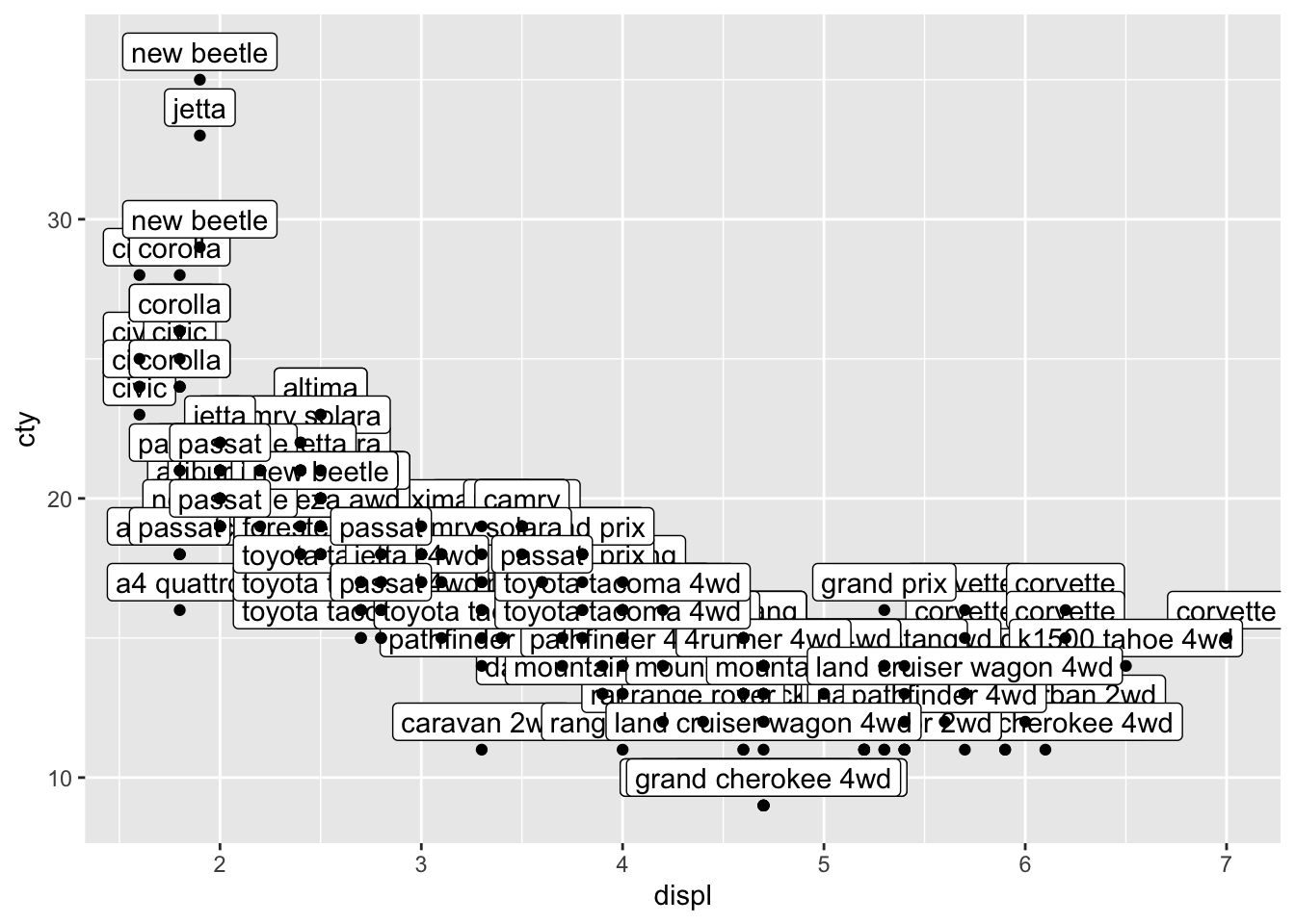
This looks better, because all the overlapping datalabels are removed. However, it also means in this case that a substantial number of datapoints is removed! Perhaps we can add the datapoints to the graph in order to avoid the problem of not having all the data in the graph:
ggplot(mpg, aes(x = displ, y = cty, label = model)) +
geom_text(check_overlap = TRUE) +
geom_point()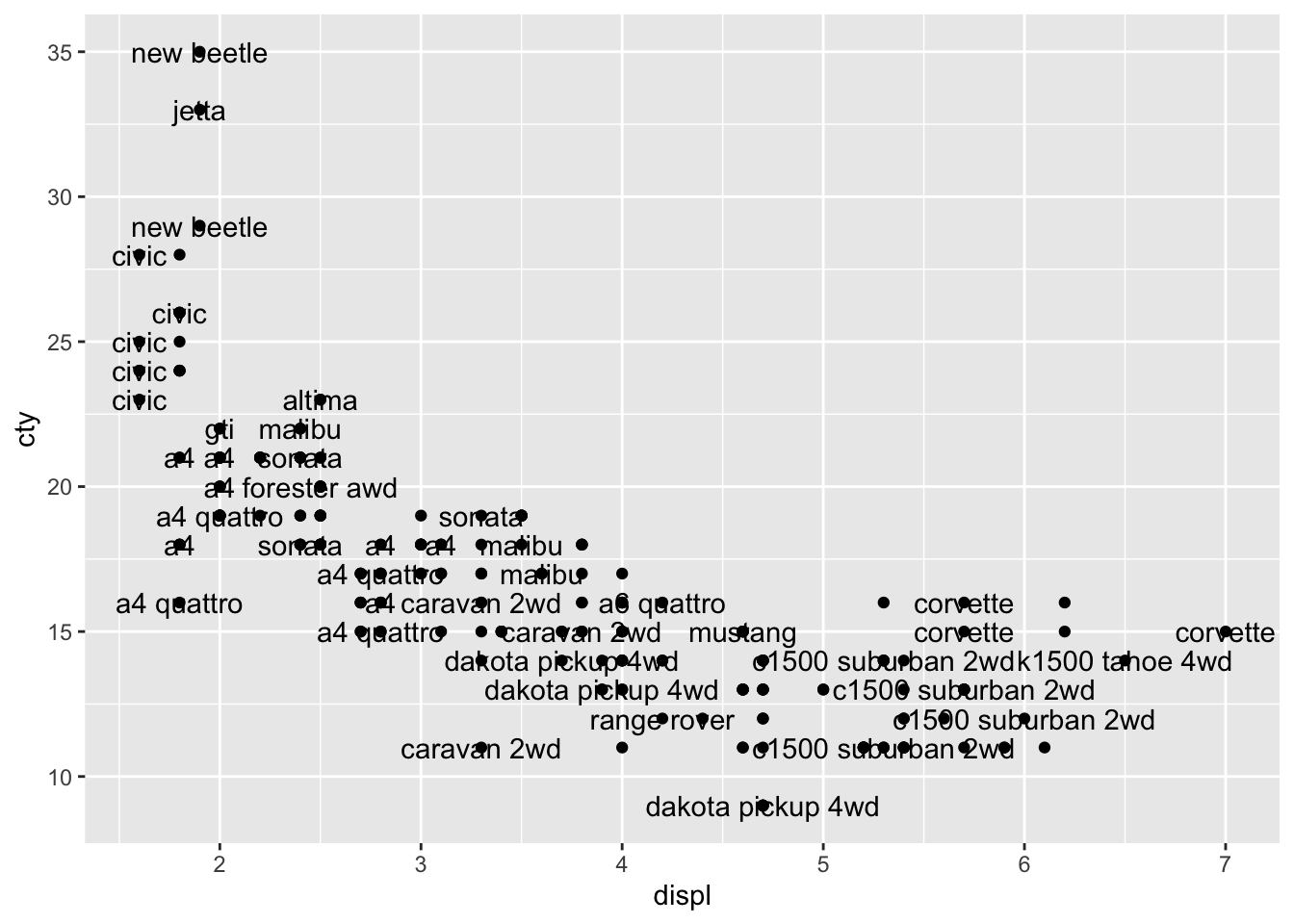
HHhhmm, not very clear.
geom_pointinherits the featuresaes(x = displ, y = cty, label = model); should this result in problems?
Maybe it helps if we put the labels above the datapoints:
ggplot(mpg, aes(x = displ, y = cty, label = model)) +
geom_text(check_overlap = TRUE, nudge_y = 1) +
geom_point()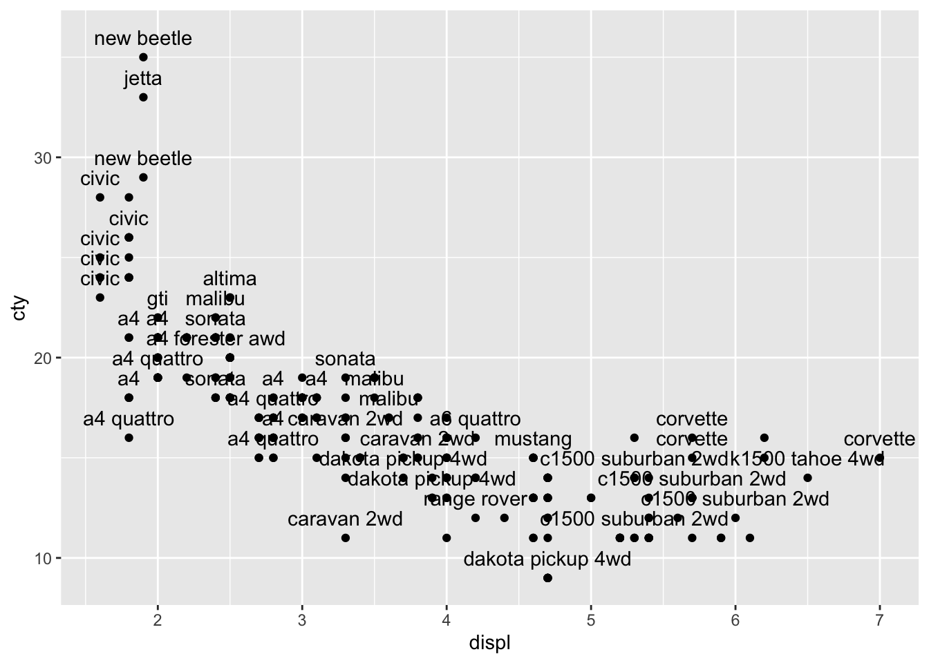
15.2.2 geom_label()
geom_label() works very similar to geom_text() but looks a bit different.
Well that certainly is no improvement, although the labels look a bit nicer than the text (I think). Text and labels work much better if you have few datapoints, or when you select a couple of datapoints that you’d like to highlight. Let’s select the variables with the highest or lowest scores on either cty and displ, and save the results in a new dataframe.
mpg_reduced <- mpg %>%
filter(displ == max(displ) | displ == min(displ) | cty == max(cty) | cty == min(cty))
mpg_reduced## # A tibble: 12 × 11
## manufacturer model displ year cyl trans drv cty hwy fl class
## <chr> <chr> <dbl> <int> <int> <chr> <chr> <int> <int> <chr> <chr>
## 1 chevrolet corvette 7 2008 8 manu… r 15 24 p 2sea…
## 2 dodge dakota pi… 4.7 2008 8 auto… 4 9 12 e pick…
## 3 dodge durango 4… 4.7 2008 8 auto… 4 9 12 e suv
## 4 dodge ram 1500 … 4.7 2008 8 auto… 4 9 12 e pick…
## 5 dodge ram 1500 … 4.7 2008 8 manu… 4 9 12 e pick…
## 6 honda civic 1.6 1999 4 manu… f 28 33 r subc…
## 7 honda civic 1.6 1999 4 auto… f 24 32 r subc…
## 8 honda civic 1.6 1999 4 manu… f 25 32 r subc…
## 9 honda civic 1.6 1999 4 manu… f 23 29 p subc…
## 10 honda civic 1.6 1999 4 auto… f 24 32 r subc…
## 11 jeep grand che… 4.7 2008 8 auto… 4 9 12 e suv
## 12 volkswagen new beetle 1.9 1999 4 manu… f 35 44 d subc…You can read the the above code as follows: filter (or select) cases from the mpg-dataset
with the condition that the case either has the maximum or minimum value on either displ or cty. The | stands for “or”.
Apparently, there are twelve cases that suffice these conditions. Let’s plot these 12 cases as labels. But we should remember that we have created a new dataframe mpg_reduced:
ggplot(mpg_reduced, aes(x = displ, y = cty, label = model)) +
geom_label(nudge_y = 1) +
geom_point()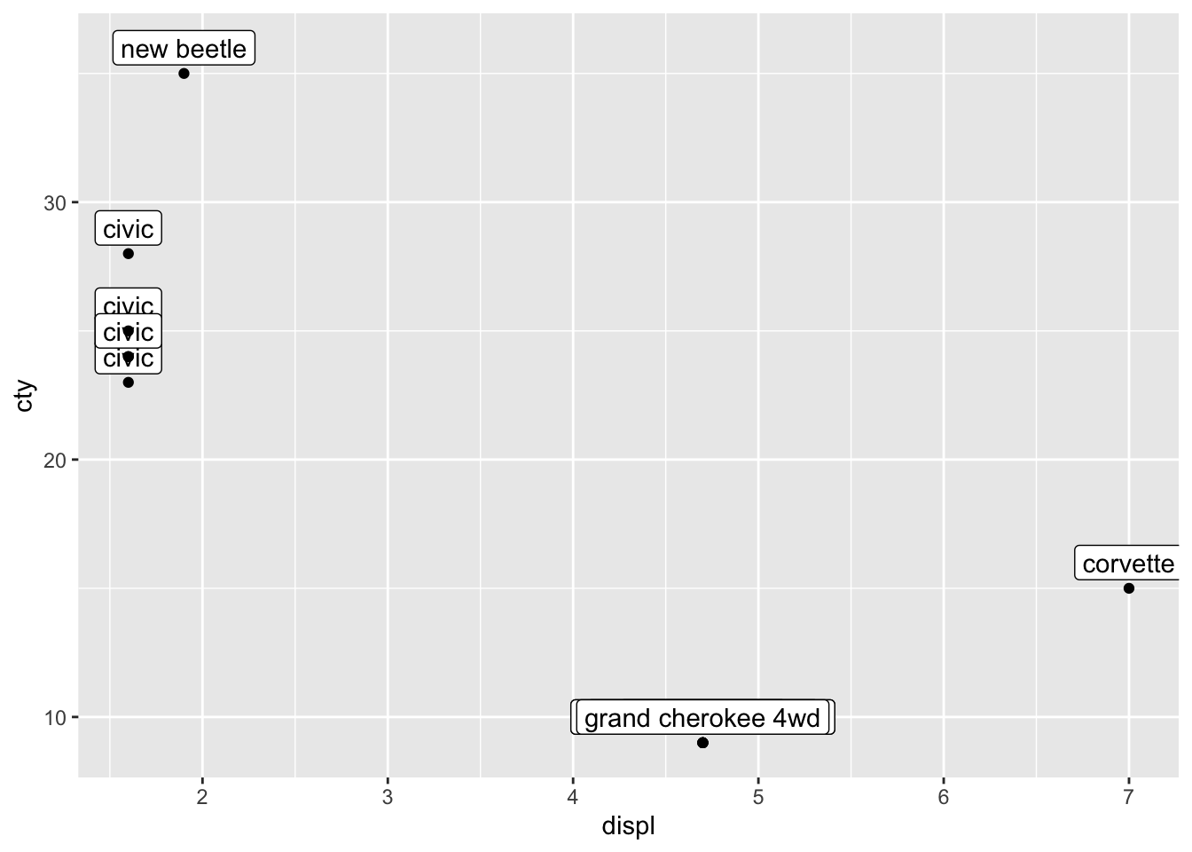
This is somewhat similar to what we want, but there are two problems: 1) only 12 datapoints are plotted and 2) only 7 of those 12 are visible). Let’s first deal with the first problem.
The reason why only 12 datapoints are plotted, is because geom_point inherits from ggplot, and thus it inherits the dataset mpg_reduced that has only 12 values in them! So we need to tell geom_point that it should make use of the full dataset!
ggplot(mpg_reduced, aes(x = displ, y = cty, label = model)) +
geom_label(nudge_y = 1) +
geom_point(data = mpg)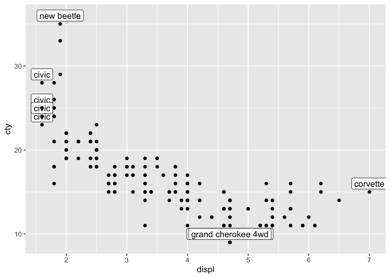
I would typically write this a bit differently (which amounts to exactly the same), where I would first specify all the data, and in a later layer, specifying the annotations. Thus:
ggplot(mpg, aes(x = displ, y = cty)) +
geom_point() +
geom_label(data = mpg_reduced, aes(label = model), nudge_y = 1)
The second problem we faced, is the overlap of the datapoints. We have already learned how to resolve this; with jitter or geom_count; let’s choose the latter:
ggplot(mpg, aes(x = displ, y = cty)) +
geom_count() +
geom_label(data = mpg_reduced, aes(label = model), nudge_y = 1)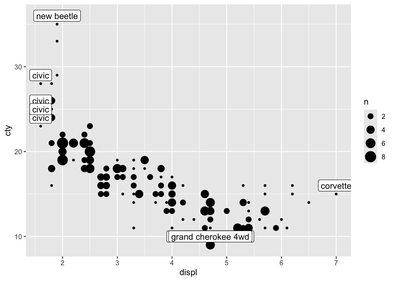
15.2.3 OOPS!
We now realise that we also had the problem of overlapping datapoints in our earlier graphs. So we must adjust those as well. Perhaps to something like:
ggplot(mpg, aes(x = displ, y = cty, colour = drv)) +
geom_count() +
geom_smooth(method = "lm", se = FALSE) +
geom_smooth(
aes(colour = NULL),
method = "lm", se = FALSE,
colour = "black", size = 1, linetype = "dashed"
)## `geom_smooth()` using formula = 'y ~
## x'
## `geom_smooth()` using formula = 'y ~
## x'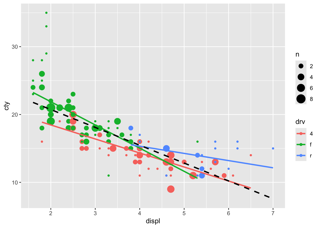
An alternative solution is to add jitter and make the points see through:
ggplot(mpg, aes(x = displ, y = cty, colour = drv)) +
geom_jitter(size = 2, alpha = 0.5) +
geom_smooth(method = "lm", se = FALSE) +
geom_smooth(
aes(colour = NULL),
method = "lm", se = FALSE,
colour = "black", size = 1, linetype = "dashed"
)## `geom_smooth()` using formula = 'y ~
## x'
## `geom_smooth()` using formula = 'y ~
## x'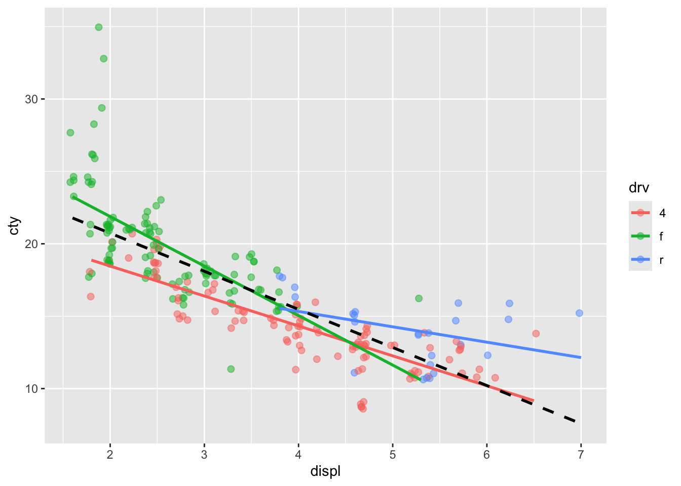
Hhhmm doesn’t quite work.
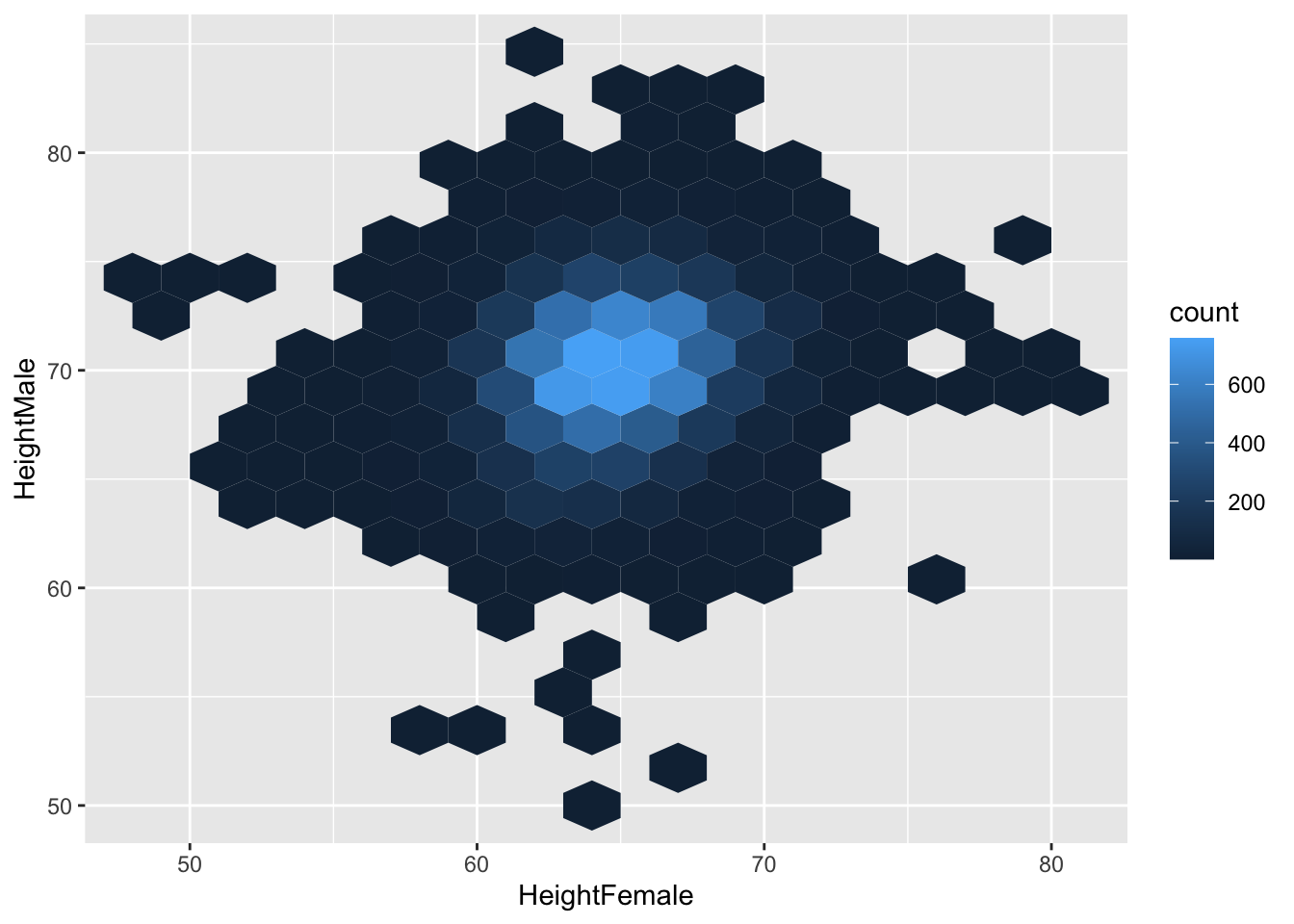
15.3 Other ways to visualize two continuous variables
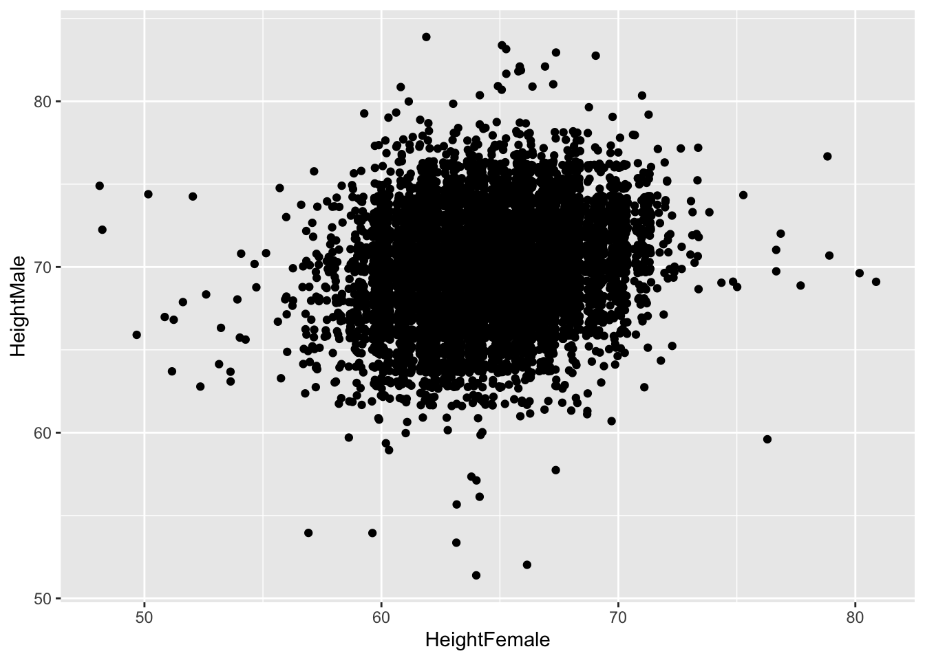
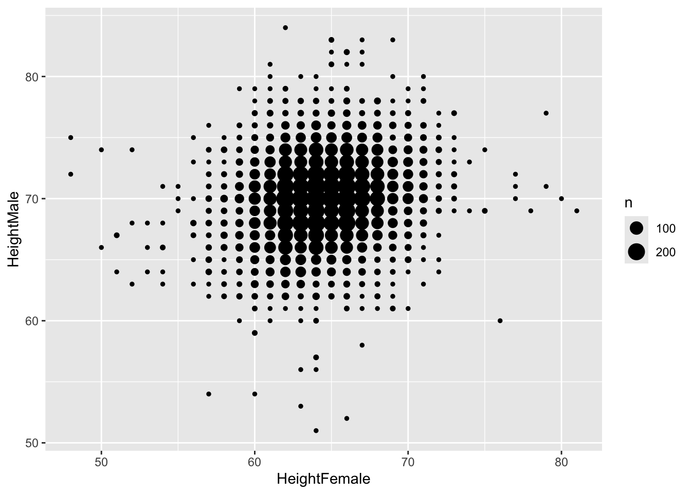
Let’s briefly look at another way of visualizing the relationship between two continuous variables. These graphs work well when there are many cases and there is considerable overlap between points. We’ll look at the heights of 12502 British couples (in inches) to see whether taller women are married to taller men.
##   HeightFemale HeightMale
## 1           62         74
## 2           61         78
## 3           61         66
## 4           62         71
## 5           63         70
## 6           63         66
Let’s make a scatterplot:
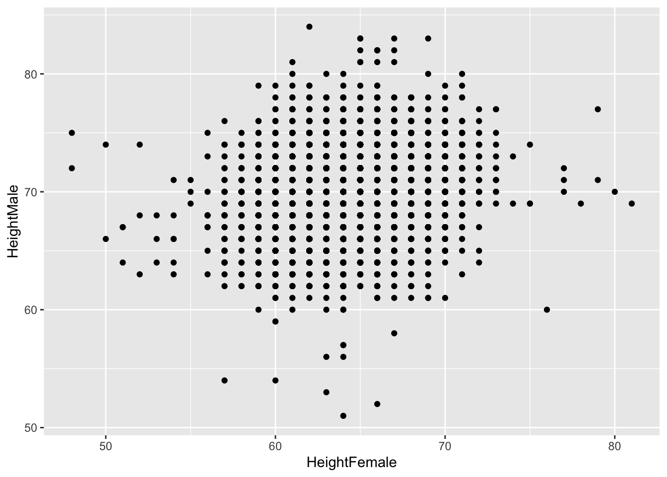
Jittering doesn’t really improve it:
Neither do bubble-plots
15.3.1 geom_bin2d
geom_bin2d bins the x- and y-variables, and counts the occurence of those bins smilar to histograms for one variable. Frequent occuring combinations of x and y get different colours than less frequent occuring combinations. This function creates heatmaps. [there is also a 2 dimensional density variant geom_density2d, see here for further information]
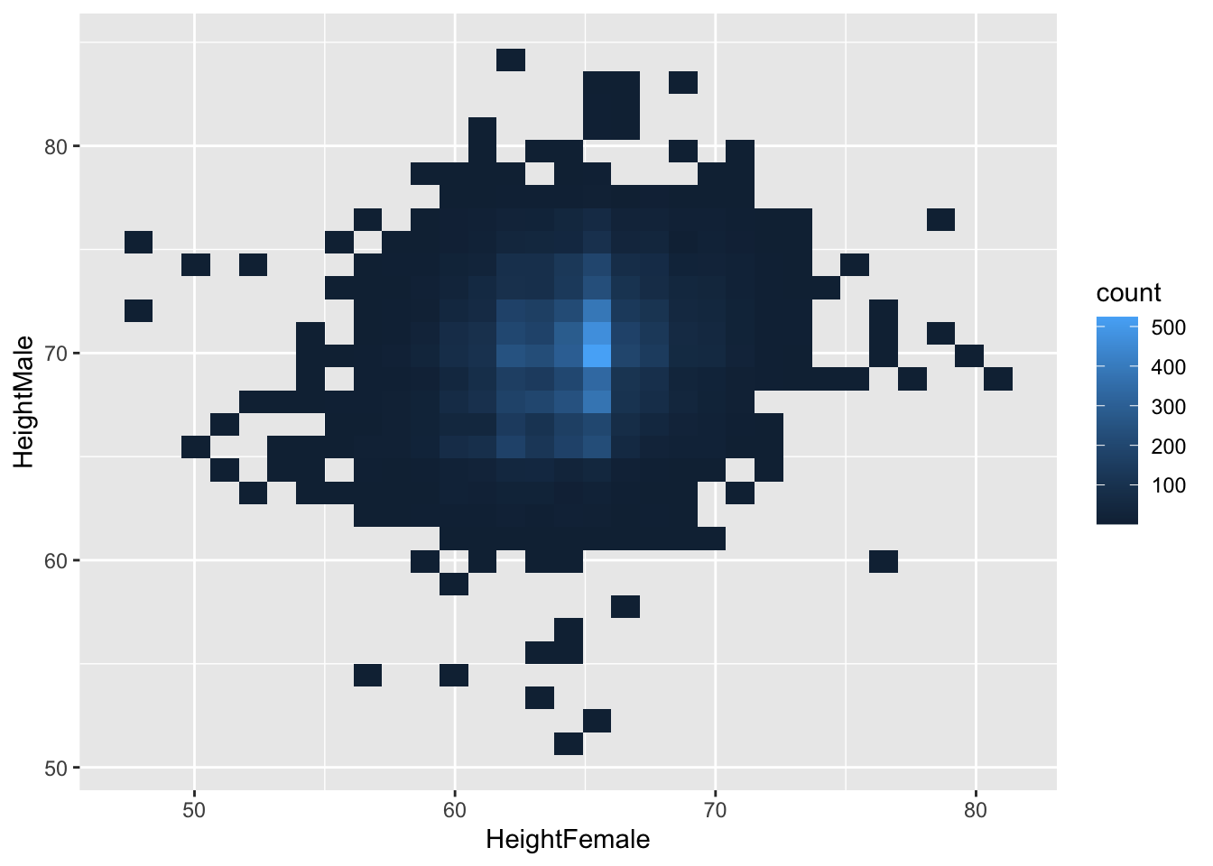
We can specify binwidth, like we do with histograms. But now we have to specify two binwidths, one for the x-dimension, and one for the y-dimension:

There isn’t a very clear pattern. Let’s add a regression line.
ggplot(heights, aes(x = HeightFemale, y = HeightMale)) +
geom_bin2d(binwidth = c(1, 1)) +
geom_smooth(method = "lm")## `geom_smooth()` using formula = 'y ~
## x'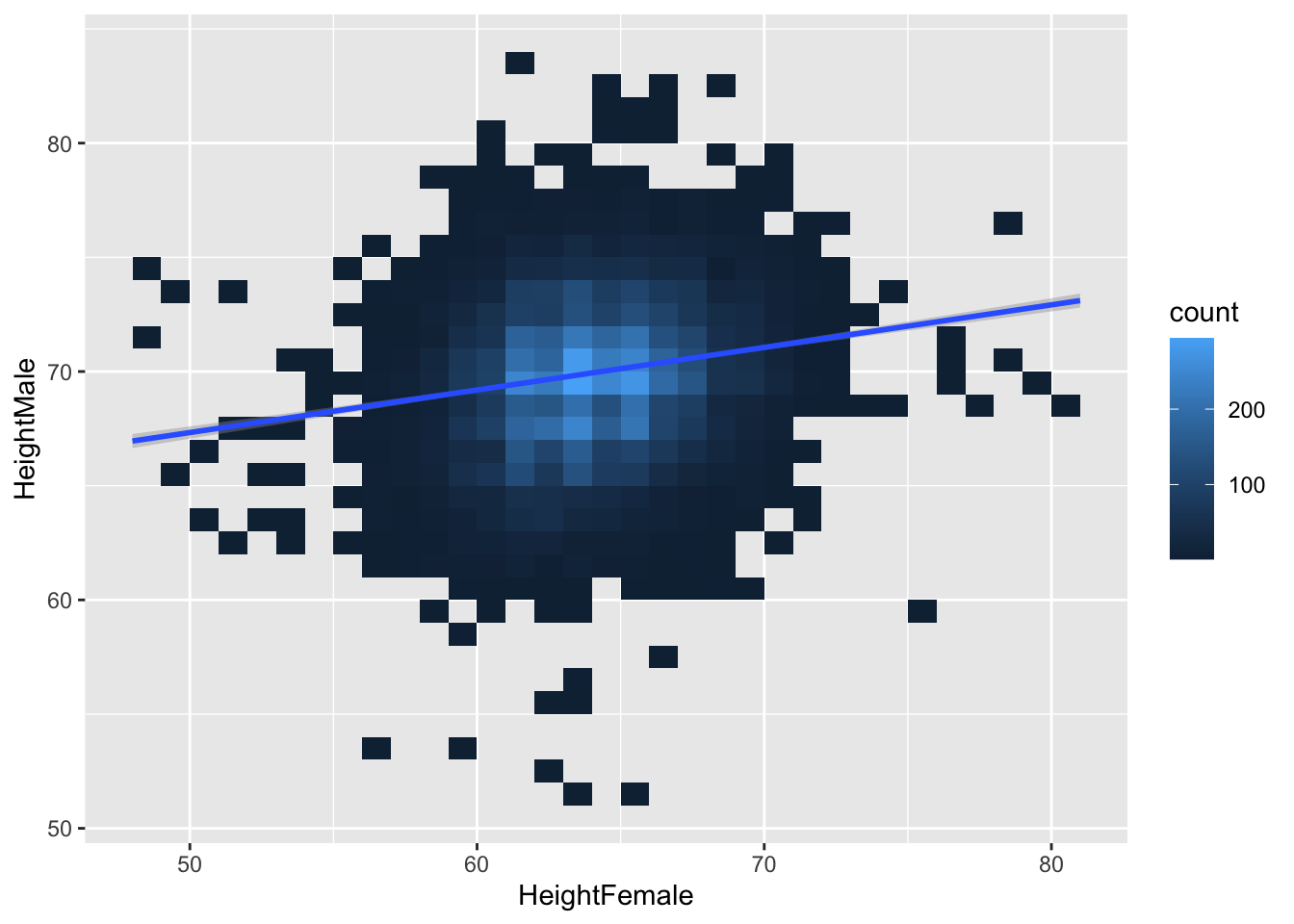
15.3.2 geom_hex
geom_hex does something similar, but makes hexagons
# install.packages("hexbin") # possibly you need to install this.
ggplot(heights, aes(x = HeightFemale, y = HeightMale)) +
  geom_hex(binwidth = c(2, 2))